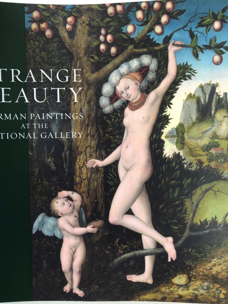
WHAT?
Having looked up and read the suggested essays by Benjamin and Freud (see course materials for reference), I came across details of an exhibition at the Barbican Centre, London, 12th Feb – 25th May 2015: “Magnificent Obsessions – The Artist as Collector”, curated by Lydia Lee.
SO WHAT?
Lilias Wigan, reviewing the exhibition for the 3rd March, 2015 edition of Country Life magazine, said it looked at three questions:
- – “how has the practice of collecting aided artists’ researches
- – How has it inspired artistic progression
- – How have artists assimilated their collecting into their own work?”The exhibition ranged from carefully assembled presentations, such as Edmund de Waal’s netsuke, made into artworks in their own right, through to Andy Warhol’s obsessive collections of unappreciated objects; apparently he shopped every day. The reviewer says “…each room has its own character as an opening into the psychology of a particular artist’s collecting obsession.”Reviewer Iranzu Baker (www.iranzubaker.com) was struck by Sol Lewitt’s 1980 work Autobiography, in which the artist documented his entire flat in black and white photographs, even down to the plugs. Baker remarks on the unbounded curiosity about the world around them which is revealed by these collections.Reading the articles and the reviews about this exhibition has made me reflect on my own collecting habits. Books are my main one – in my view, no house is complete without floor to ceiling books, dating back I think to my bookish only-childhood spent in the library, and maybe also to my Mum’s gradual blindness – books were her passion too, and the biggest loss that she mourned as her sight went. So, writing implements and notebooks, also. So I may not have to shop every day like Andy Warhol, but I cannot pass a bookshop, stationers or art shop without going in and buying something.I’m also a sucker for natural objects – sticks, shells, leaves, acorns – which sit around in plates and bowls until they disintegrate; and I can’t pass by a feather without harvesting it. People talk about feathers as gifts from angels etc, which really doesn’t chime with me – I think I collect them because my best friend at school (now a historian) would always turn any feather she acquired into a quill and used it to write with (she still does), so I suppose I have thought from childhood that feathers, despite their fragility, were useful and should be hoarded against a future need to write something down.
- NOW WHAT?
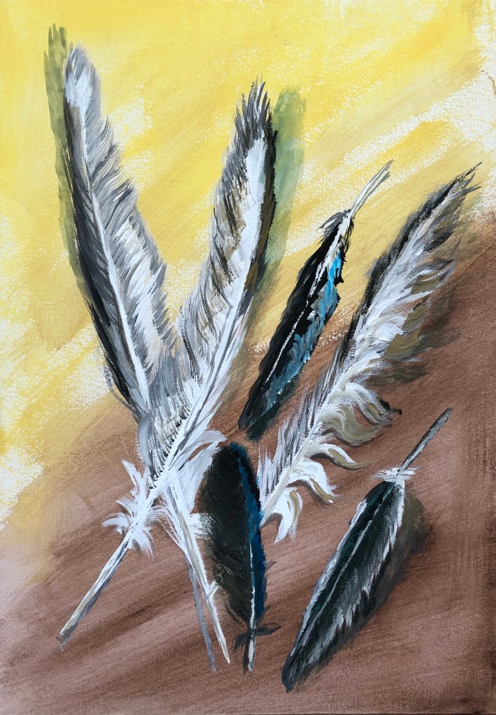
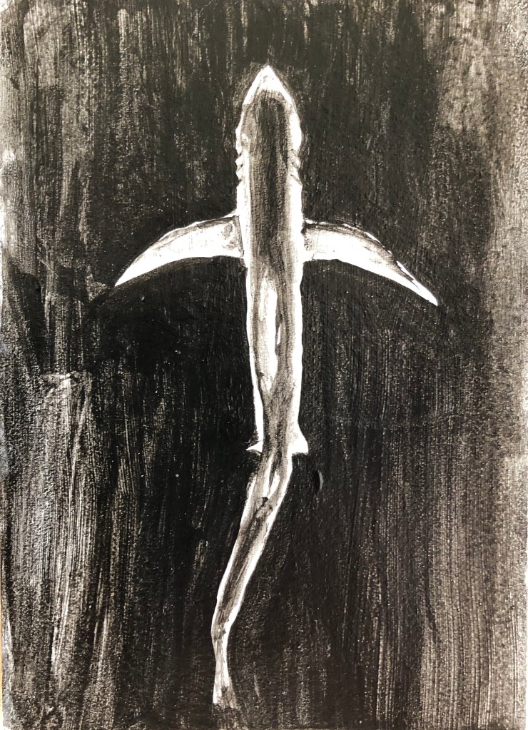
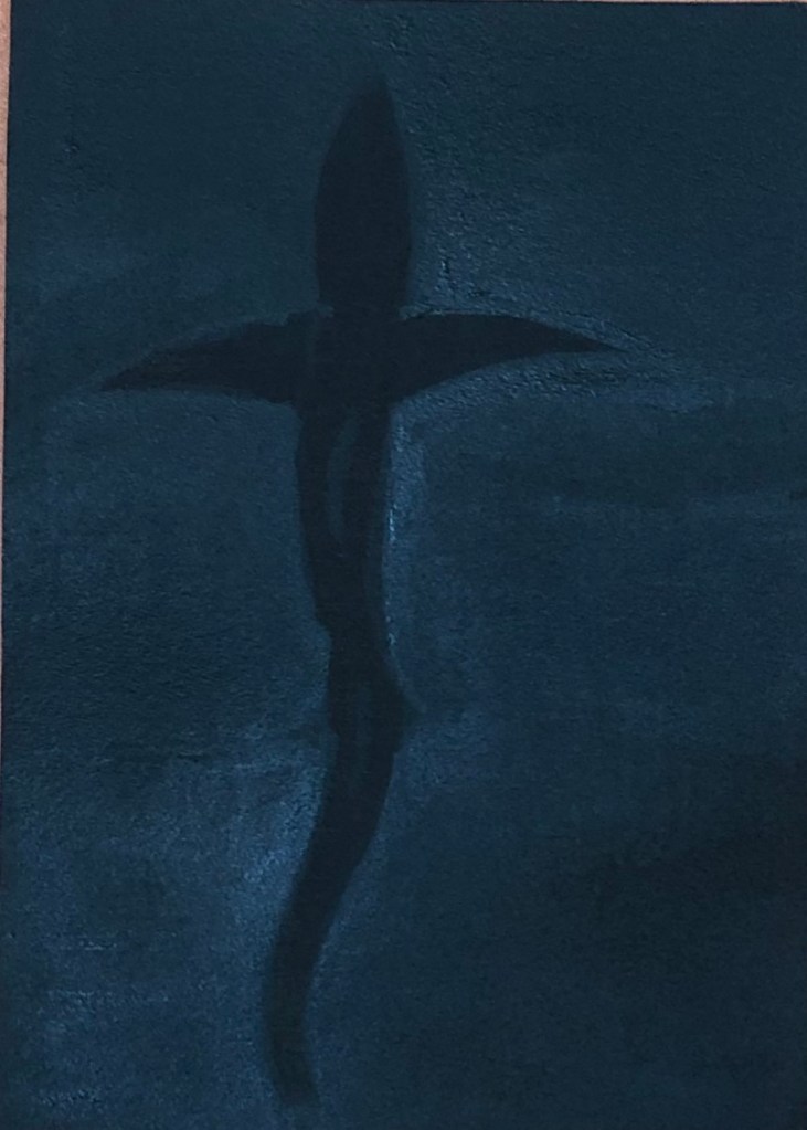
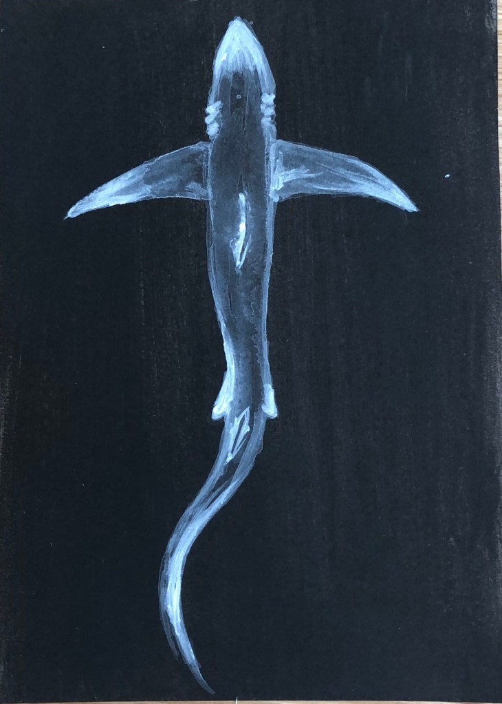
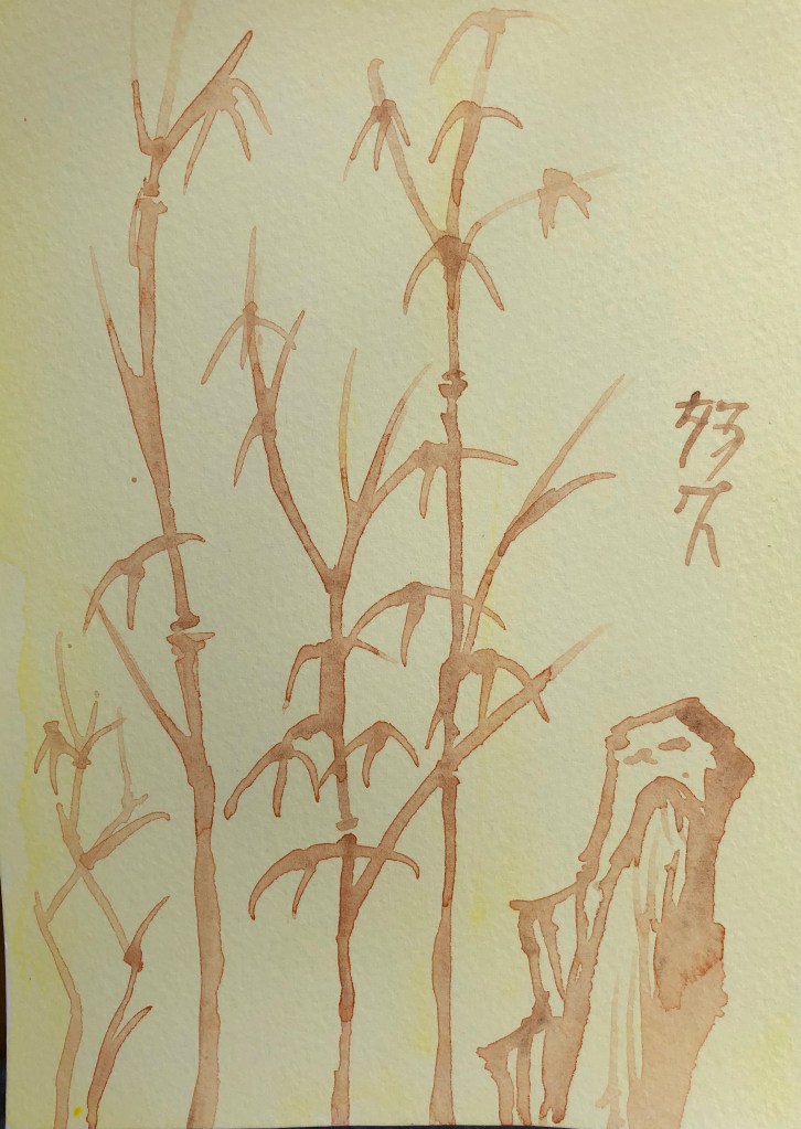
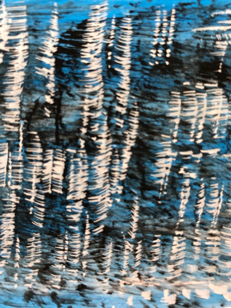
All this made me dig out my vase of feathers and paint some of them. I had a stretched A3 sheet with an egg tempera ground (Naples yellow and Vandyke brown – recently acquired and wanted to see what they were like) sitting around. I chose to work in gouache – limited palette of permanent white, lamp black, neutral grey, raw umber and cyan. I started with size 2 rigger and fan brush, but they were too small for what I wanted – so did the vast majority of the painting in a half-inch soft flat.
Light coming from all ways – picture windows beside and behind, big skylights above – so shadow position a bit random, depending on the way the feathers were leaning on the table.
Tried to keep loose but directional marks and overlaid layers – gouache is really good for letting you do this quickly.
Likes:
– Some of the brushmarks, especially where I’ve managed to get the right weight and feathery-ness (usually brush quite dry, but not always)
To improve:
– Also some of the brushstrokes! – where I’ve got the brush too wet and then picked up too much paint, marks rather clunky.
********************************************************
WHAT?
Lisa Milroy
I found some of her paintings of collections. Objects like shoes didn’t interest me so I wasn’t immediately pulled in to those paintings, but I liked her grid layouts, the way she introduces very slight variations in placing to “make you look” – almost like those “spot the difference” puzzles – and especially this one:
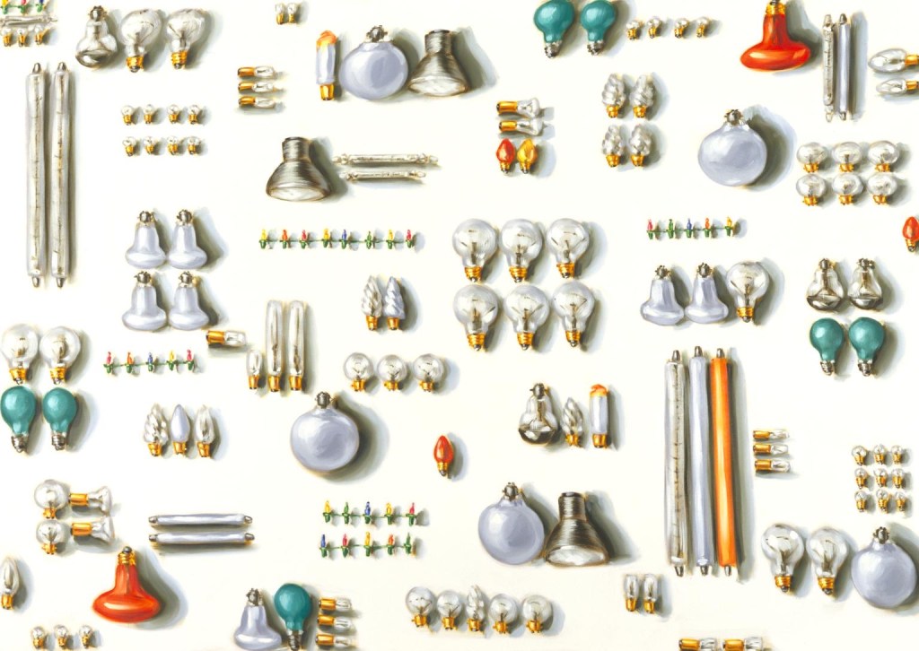
“Light Bulbs”, 1988 Oil on canvas
203 x 285 cm
Tate collection
Light bulbs don’t really interest me either…so I think I was drawn to this because:
- – I do like round things.
- – The variety of orientationsand groupings made the image something you had to decode, presenting the viewer with a challenge to get their teeth into.
- SO WHAT?
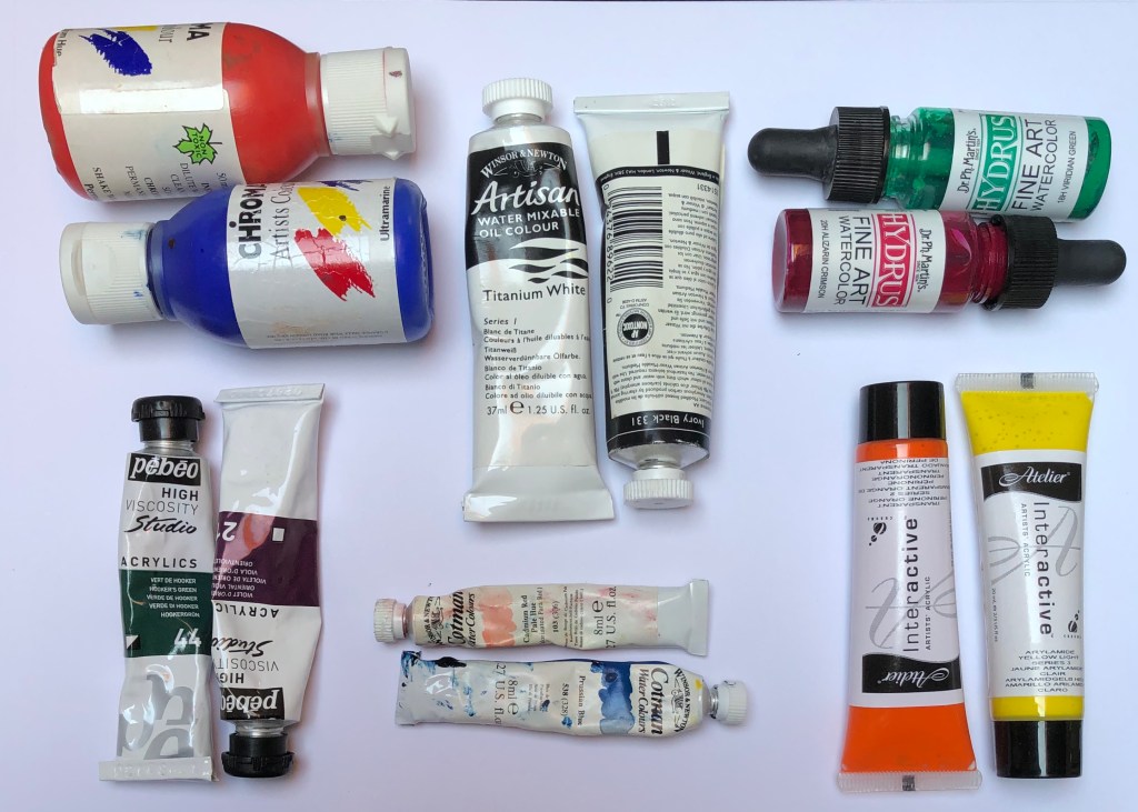
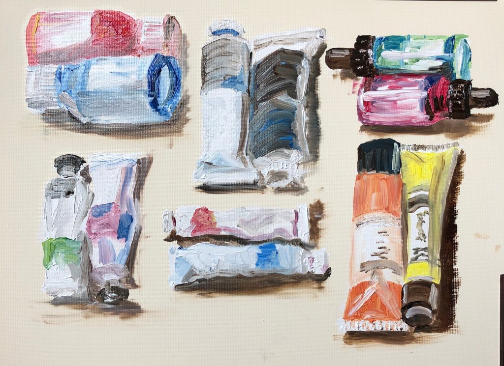
- Having recently acquired a set of
long handled oil brushes, I made
myself a small grid of paints,
varying the shape of container
and the orientation, as Lisa had,
yet keeping the neatness and control of the organisation. I broke out some Cobra water-mixable oils (white, lemon yellow, burnt umber, cobalt blue and pyrrole red), and set off, painting on A4 oil paper so that my images were roughly life size (as Lisa sometimes paints).
- NOW WHAT?I have learned that:
- – Painting with long-handled brushes is something I am going to have to work hard to get good at – my right arm (because of my previously broken shoulder) doesn’t have the freedom of movement, and my left hand/arm is just not used to wielding paintbrushes (although fine with charcoal!) and will need some training up.
- – I enjoyed the loose mark-making possible with the oils, got really into the zone, and this is something I want to do more of.
- ****************************************************************************
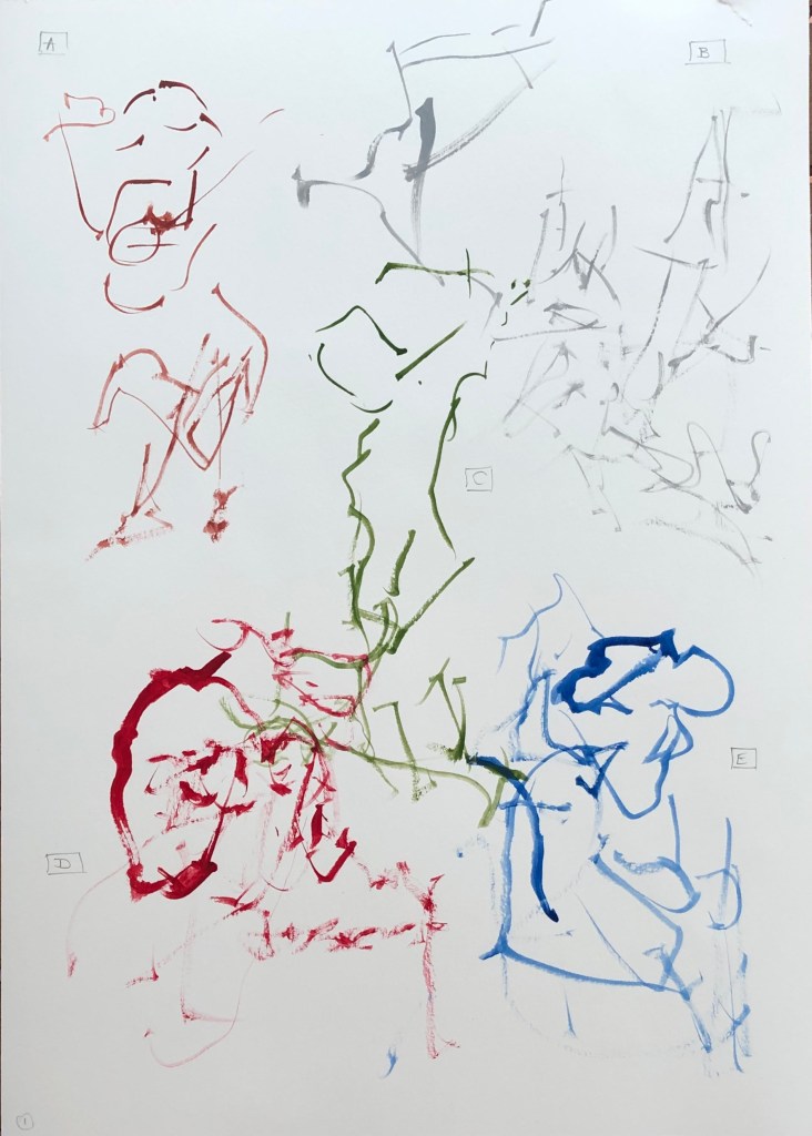
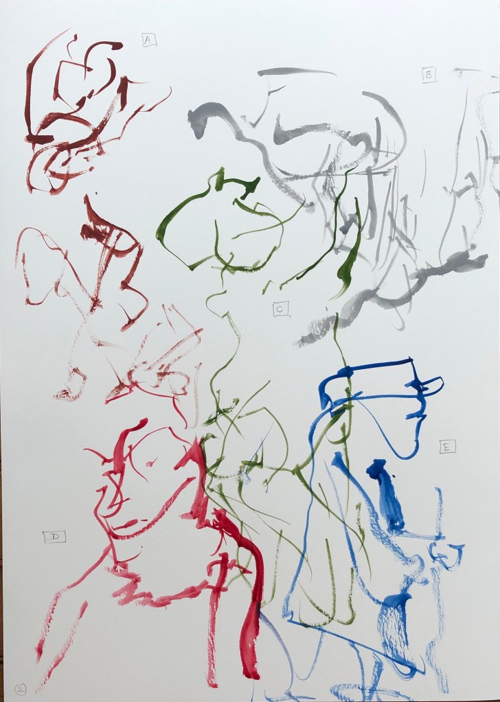
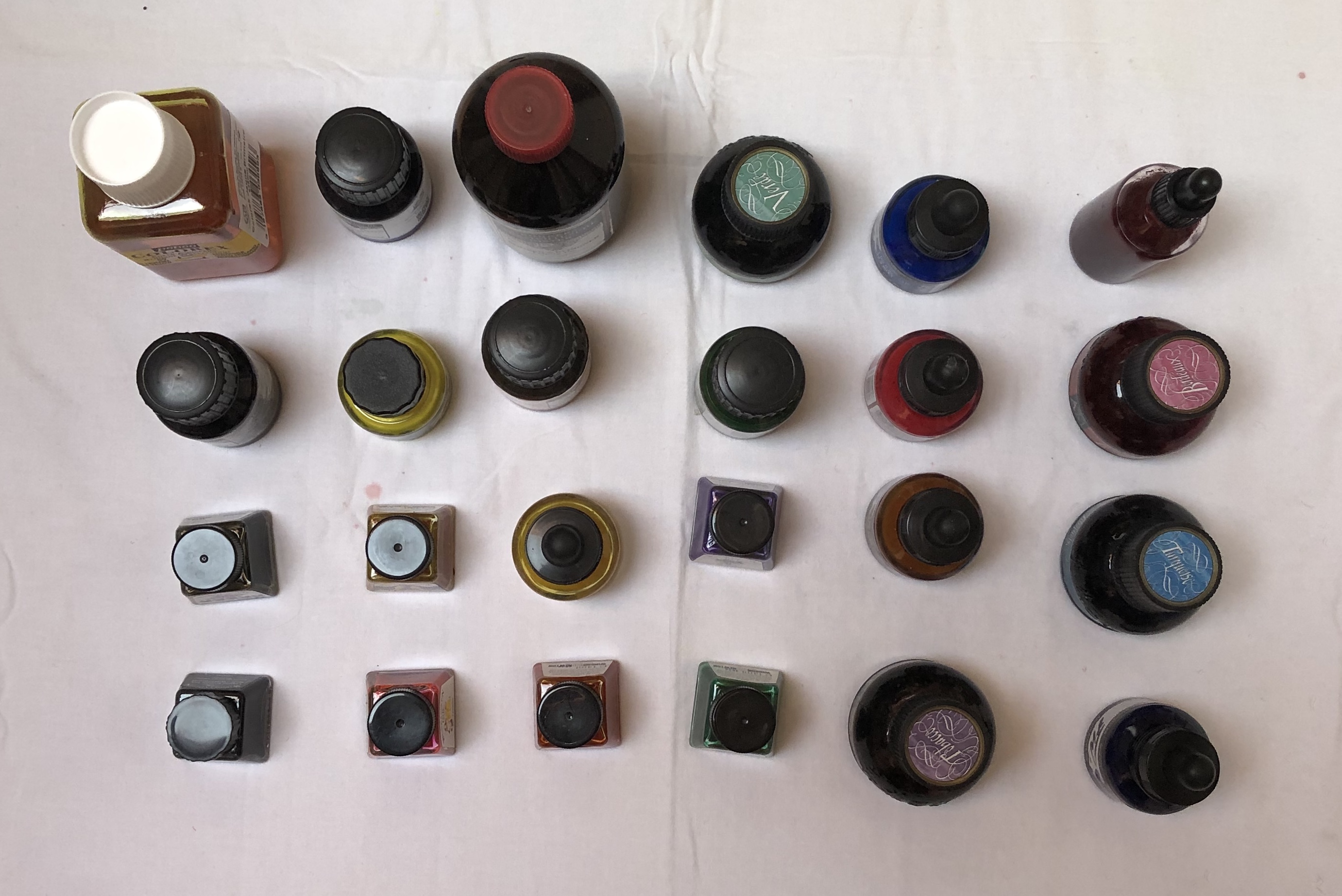
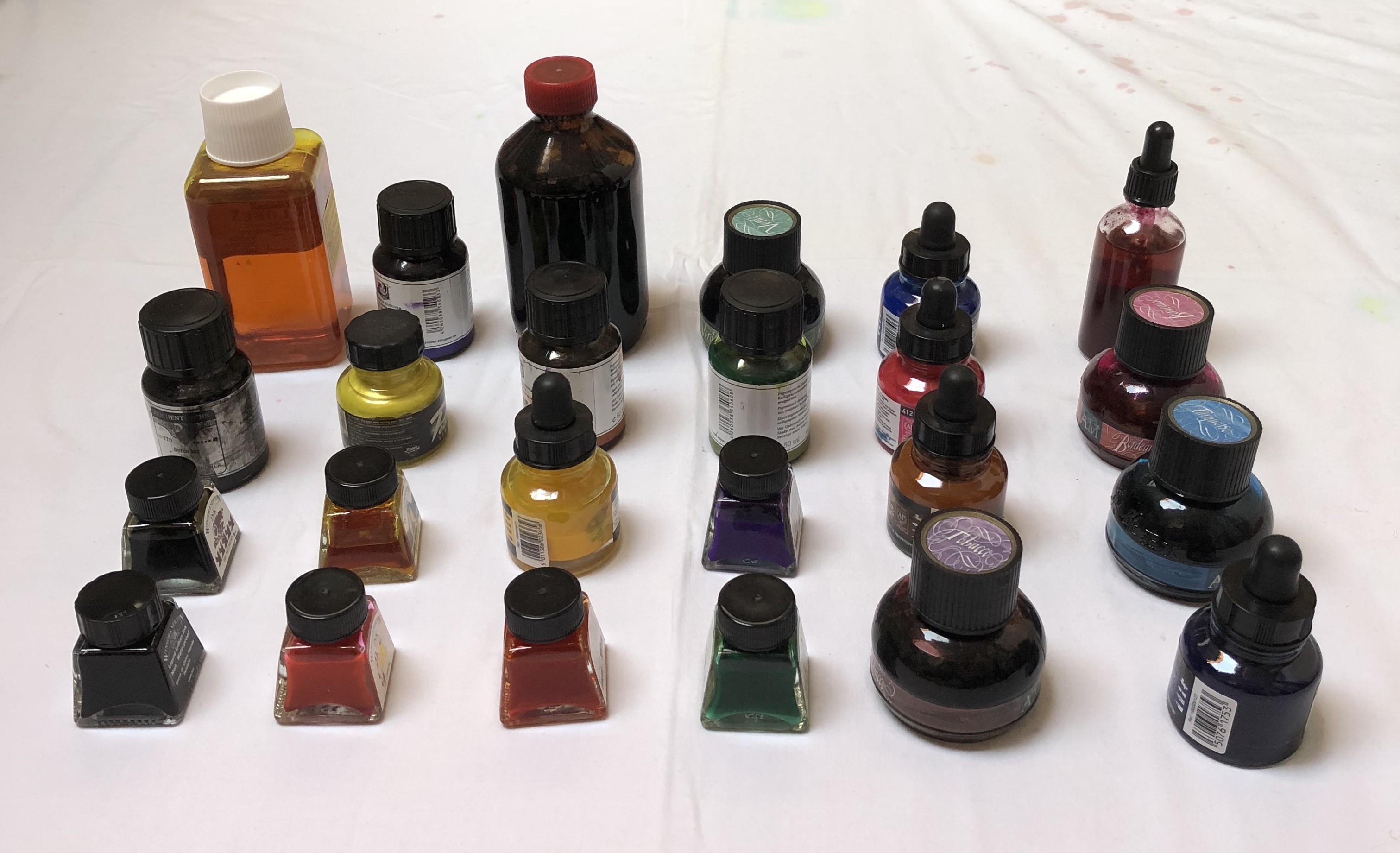
WHAT? - Lisa’s grid arrangements (see above) reminded me of a Zoom workshop through one of the OCA’s regional groups which I attended, led by OCA tutor Neil Musson “Building the unfamiliar with the unfamiliar in unfamiliar times”, 13.6.20. He talked about KNOLLING – sorting and arranging like objects in a grid, and gave us some examples from his own work and that of other artists – Motoi Yamamoto’s salt patterns, Cornelia Parker’s “Thirty Pieces ofSilver”, 1988-9, silver and copper wire, Tate Collection, and the sculptures of Tony Cragg, e.g.“Cumulus” , 1998 Glass
265 x 120 x 120 cm Tate collection
- SO WHAT?I made a grid arrangement of bottles of ink on a white surface and photographed them from different angles:
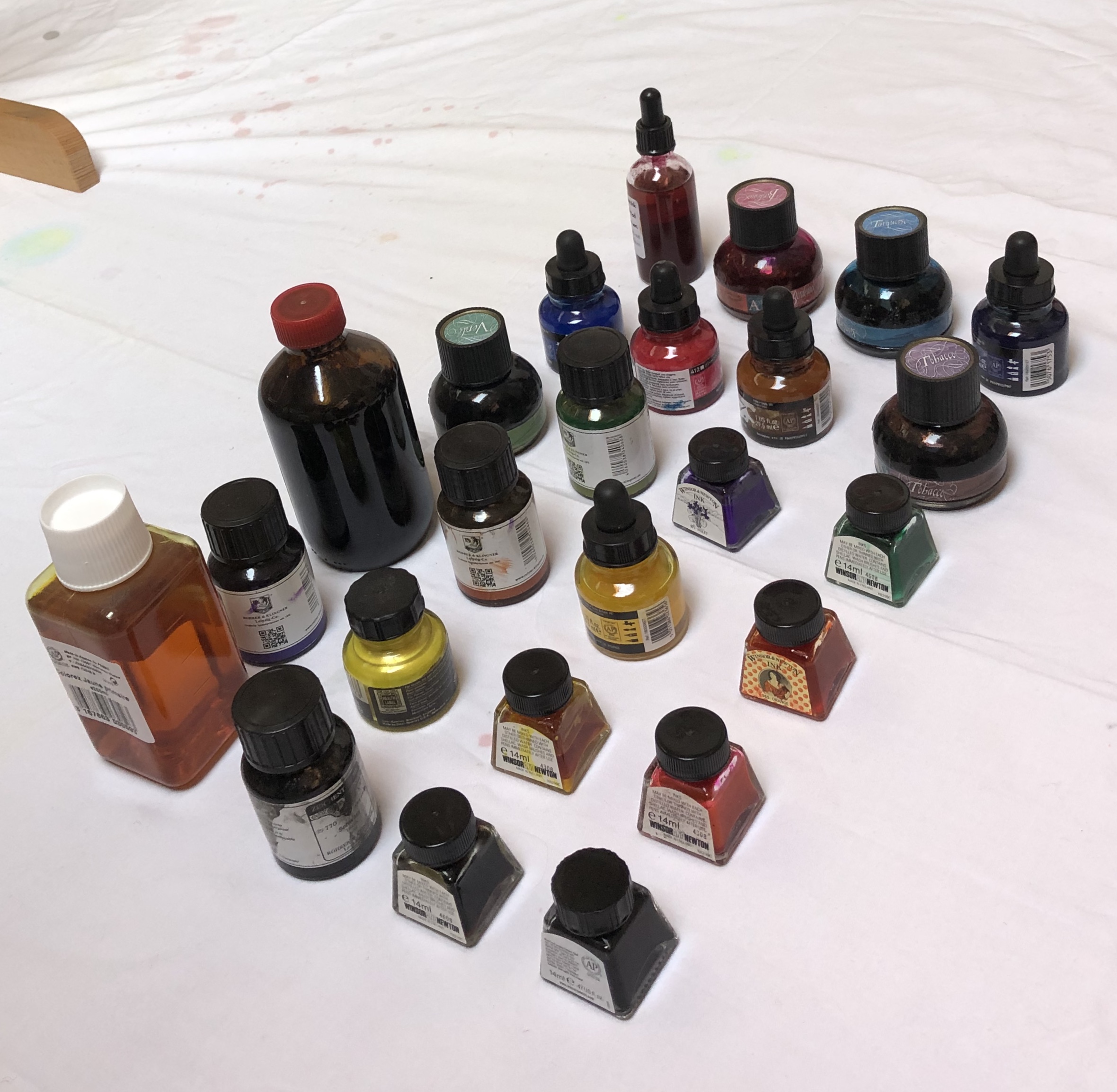

NOW WHAT?
I intend to use these images as part of my reference material for the Exercises in Part 2.
****************************************************************************************
WHAT?
I looked at the work of Tabitha Moses, particularly on her own website, www.tabithamoses.co.uk. Her collections are of sometimes unusual objects – article by Alex Michon (quoted on the above website) describes her as “a rag and bone archivist of the peripheral.” Her work often relates to her own experiences, either personal or her professional research.
SO WHAT?
Having been for a rather painful blood test this morning resulting in several punctures of the skin, I was interested in her section of work looking at the skin as a threshold, which derived from her discussions with eczema and psoriasis sufferers.

After studying “itchy
and prickly painful”,
2012, calico, sawdust,
blackout fabric, plastic,
thread, entomology
pins from her
Threshold: The
sublime skin series
(see website), I
decided to use a piece
of silk as a threshold and explore painting on to it with various media. The silk was loosely taped onto a glass table.
– Dr Ph Martin’s liquid watercolour, Indian Red, applied with the bottle stopper, gave a lovely blood-like gloopy appearance when applied – very satisfying. It sat on the surface for a while, gradually seeping in and spreading and eventually drying looking disappointingly less dramatic
- – FW acrylic ink, sepia, again applied with the dropper, began to penetrate the surface straight away, quickly spreading – it only “blobbed” and retained clear lines where the silk was not touching the table
- – Handmade natural dye pigment ink (Cochineal Red), dropped into the shapes drawn with the sepia acrylic, above, behaved very differently – it seemed repelled by the silk surface, I couldn’t draw with it, it just sat on the surface in droplets. Ithas only soaked in in a couple of places (where I think the acrylic solvent has undermined it), and has dried to an unappealing yet very convincing resemblance to clots of dried blood. Nice.
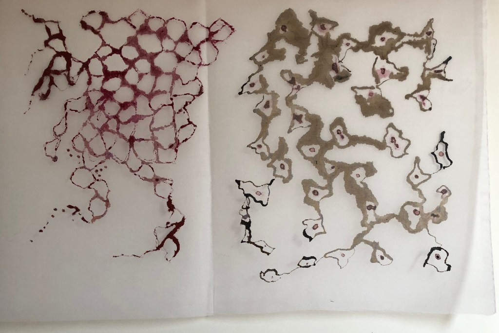
- NOW WHAT?I have learned that:
– a collection can be of quotes around an idea or situation – it doesn’t have tobe of actual objects
– there is huge scope for investigation of a concept, eg. the effectiveness of asupport as a threshold
***************************************************************
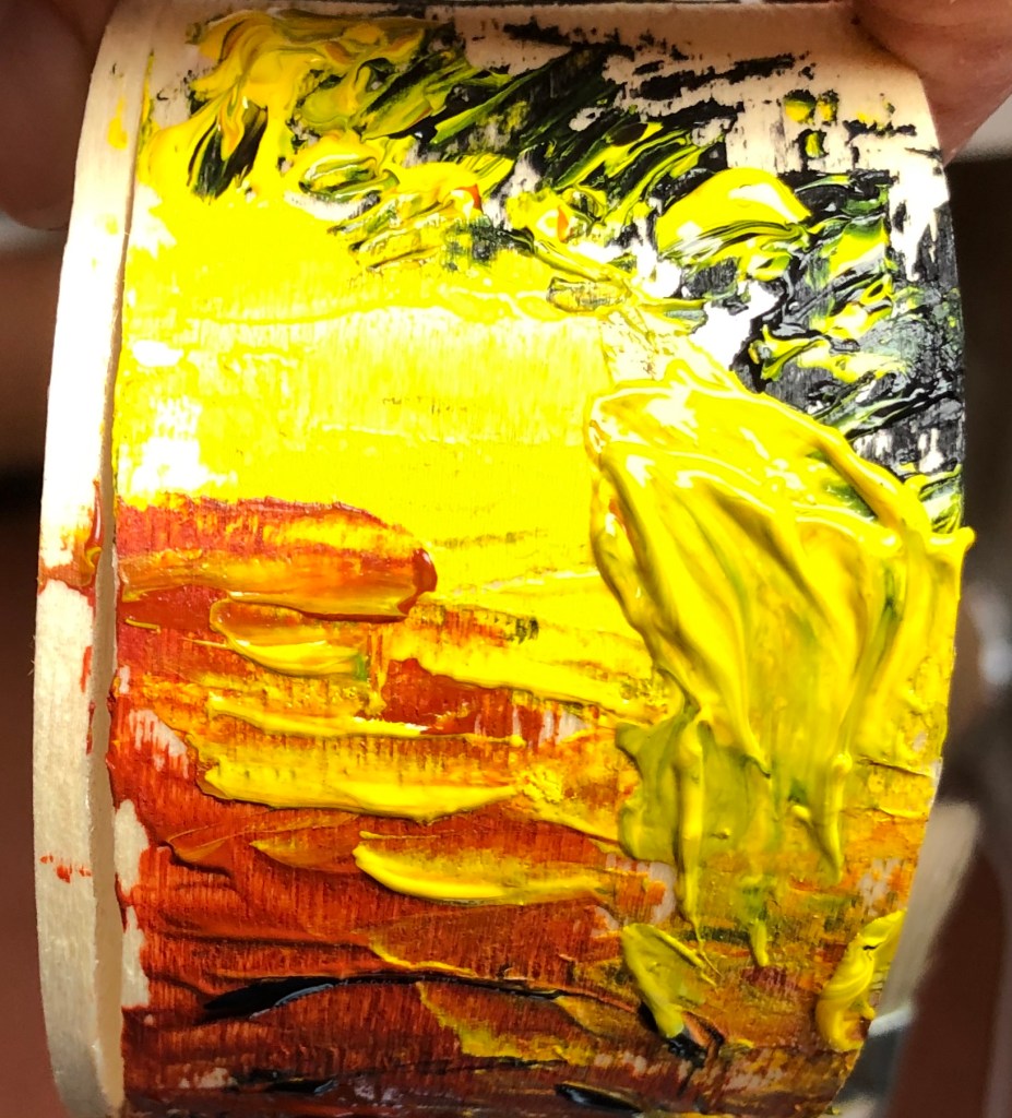
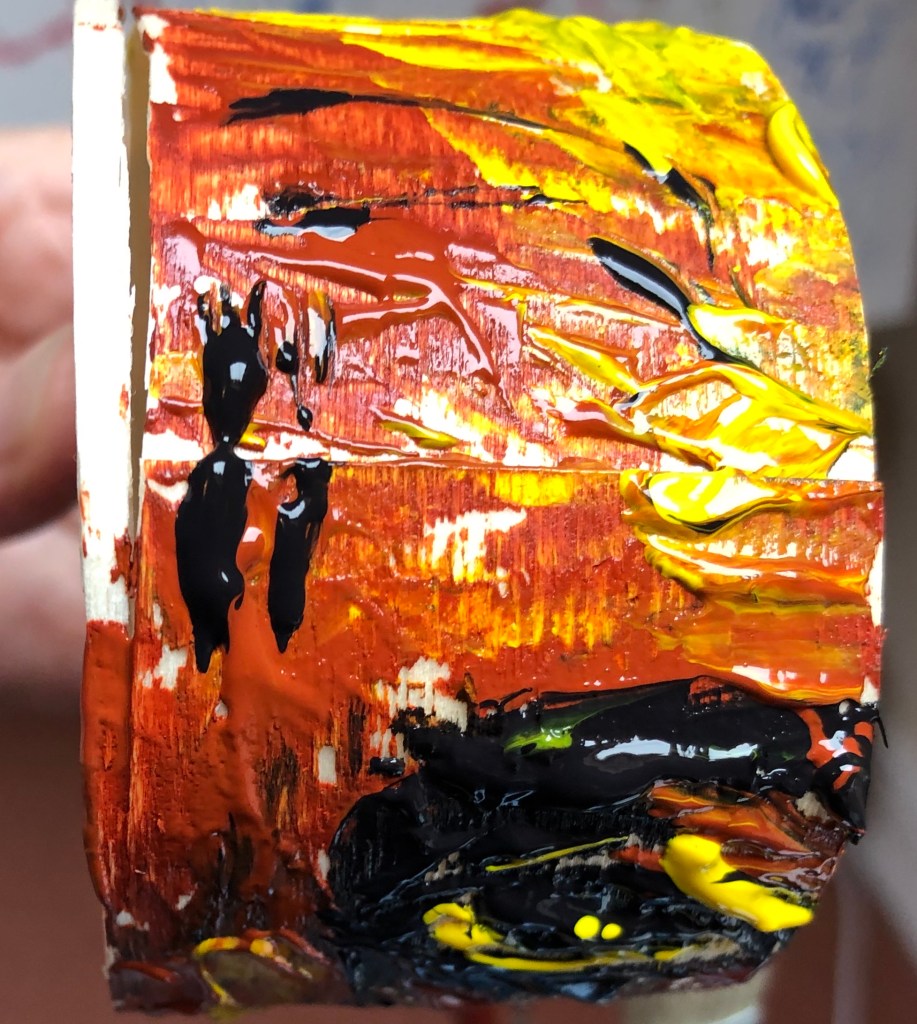
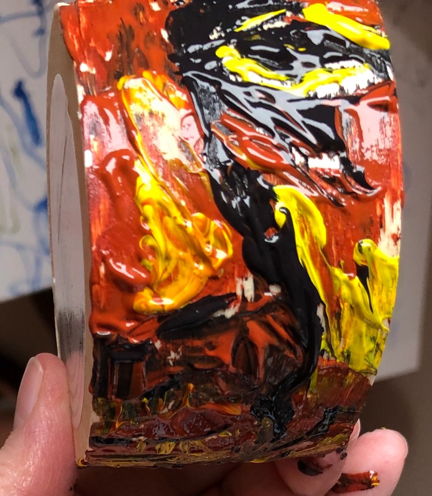
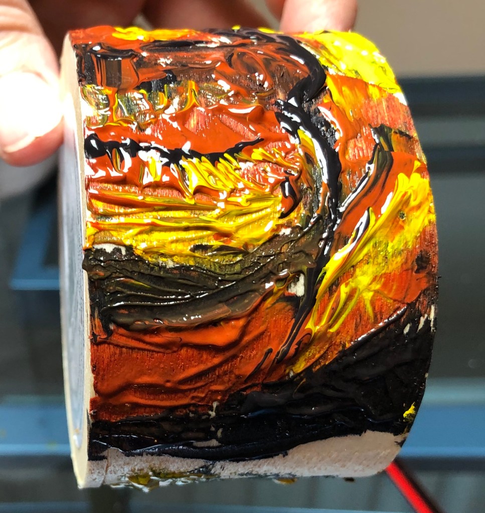
WHAT?
I looked at the work of Paul Westcombe on www.paulwestcombe.com and also on www.saatchigallery.com. His ideas are inventive – to create a work of art on something usually considered “throwaway” like a paper cup or a ticket, i.e. to give a value to something otherwise valueless (although the saatchi gallery suggests that this is actually not the significance and his work is simply a demonstration of his compulsive need to draw) – and the pieces are colourful and inviting to the initial glance, although his subject matter did not appeal to me close up.
SO WHAT?
Wasn’t quite sure how to respond to this apart from the obvious – only had a cardboard roll to hand, so tried a quick design on that of plants in the garden with leftover gouache paint in my palette plus raw sienna and burnt sienna watercolour.
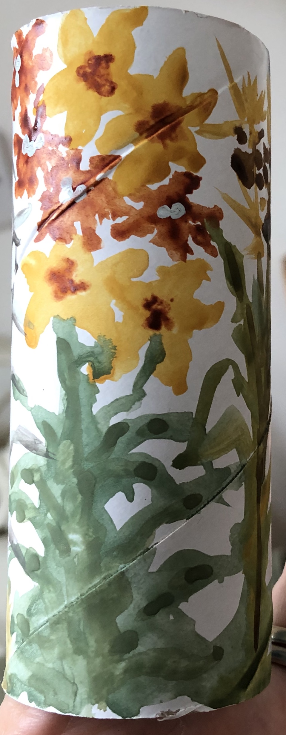
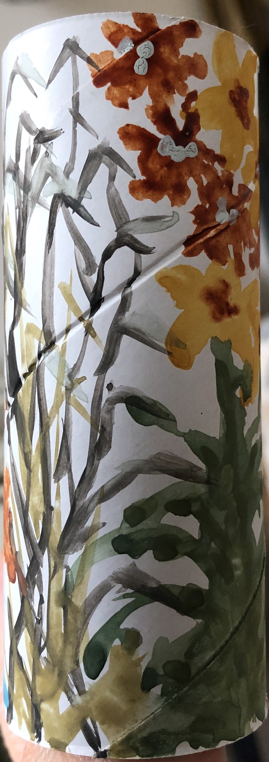
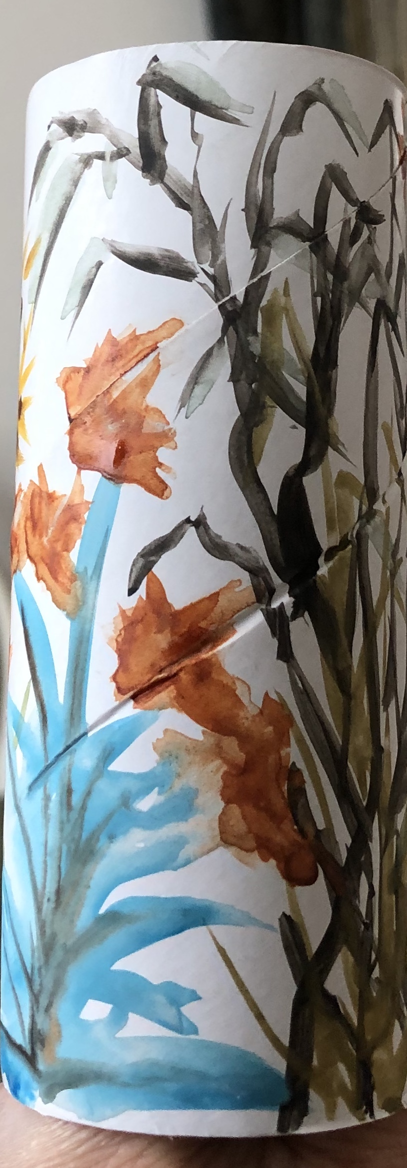
My design was very adaptable to that tricky part of painting round a cylinder, i.e. meeting up with where you started – and hats off to Paul W, he was doing figures telling a story of sorts on a truncated cone, so he must have developed a technique for dealing with that.
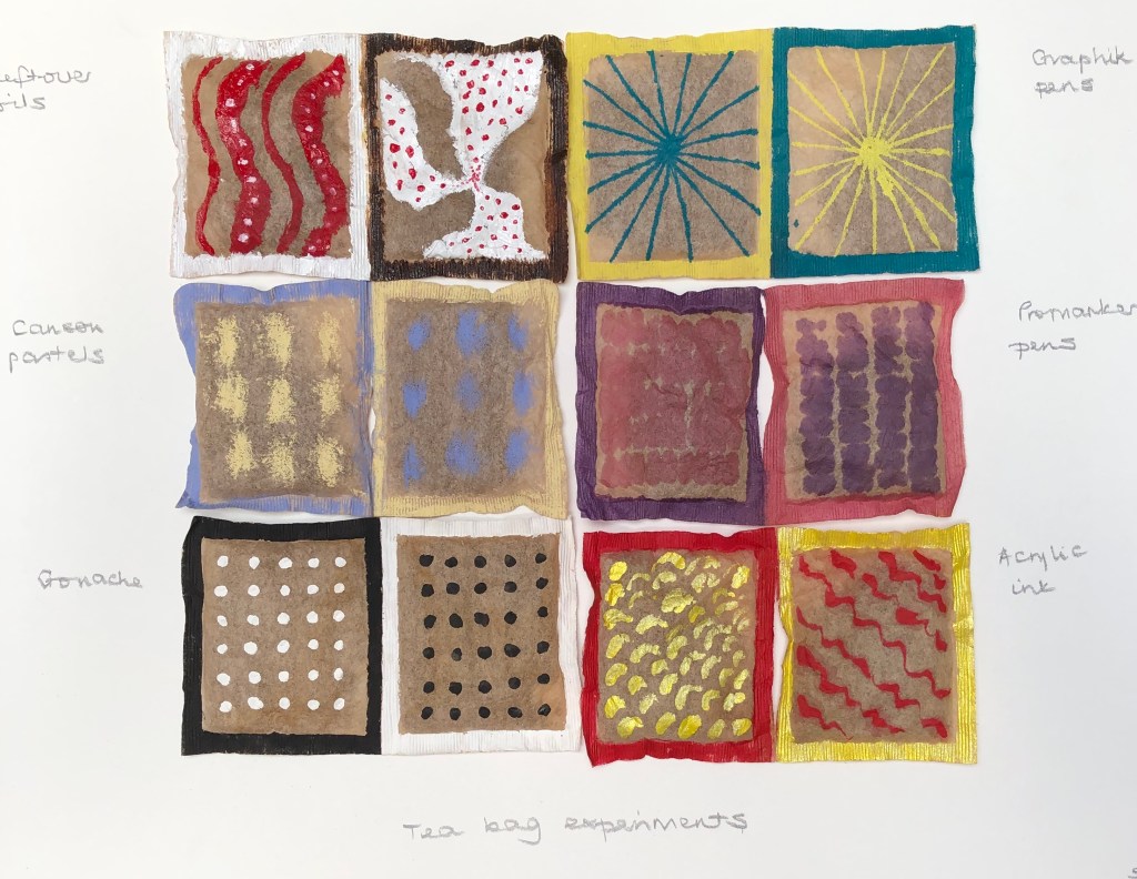
Also had some old dried used teabags (still containing tea) so tried a design on those (using various media – oil paint, Promarkers, Graphix pens, soft pastels, gouache and acrylic ink)….but felt I was playing around with random detritus because I had to.
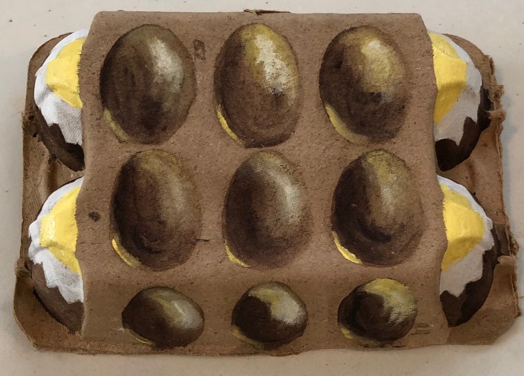
Had a bit of a breakthrough with an empty eggbox though which I was just about to put out for recycling – decided to paint eggs on it – using egg tempera (what else?!) using white, Naples yellow and Vandyke Brown. It is rather surreal (my husband says it’s “a bit Dali”…not sure if that’s good or not), but I was pleased with my eggs which are reasonably 3D – it is displayed on my shelf.
NOW WHAT?
I have learned….
– I’m potentially going to struggle with the “off-piste” aspects of this Part – it’s not apparently in my nature…or rather, it feels a bit like the sort of thing I would have done with the children back when I was teaching, and therefore not proper “Art”. Guess I need to loosen up a bit and let go – I did enjoy the eggs, so it can be done.
******************************************************************************************
WHAT?
I looked up the Ornament exhibition held at the Transition Gallery in Huntergather, London, Oct-Nov 2013, and found examples of painting on handbags by various artists, including Cathy Lomax and Alli Sharma.
They have all painted to the theme of handbags as part of female adornment, whereas I decided just to experiment to see if I could actually physically paint on a handbag, and how this might be done.
SO WHAT?
After a recent sort-out we had a few bags which were designated for Oxfam – including one small leather/leather effect handbag (not sure which) – so this was my experimental support. The surface had a kind of raised floral chasing, so I decided to try and create some fantastical and shiny flora, in the style of Raqib Shaw (not following the existing chasing). I picked acrylics for robustness when dry, choosing some old Chroma acrylics as they were fairly liquid – this way I thought I would be able to apply them easily undiluted. I wasn’t sure if I needed to prepare the surface with gesso or something beforehand, so just went straight in and tried applying the paint so see if it would stick; and it did. It sunk into the surface a little but not too badly, retaining most of its wet colour.

Pleased with this, I thought I would go the whole Raqib-Shaw-hog and add sparkle – the gold acrylic ink stood out much better than the silver watercolour silk ink I tried, but even that showed up reasonably, although better when applied over the top of the dried acrylic paint.
NOW WHAT?
I have learned:
- – Making up doodly out-of-my-head images is not a strength, I am better at painting “something” defined – my foliage and flowers are more folk art than fantastical Raqib Shaw.
- – I should not dismiss supports other than paper/board/canvas as too difficult to try painting on.
- ******************************************************************************************* WHAT?
- Julian Walker has made some interesting collections. I thought his:
Detail from Collection: Acts of Faith by Julian Walker(Series: Living with medical science), 2003object, Hand-carved pills, glass and board Medicine Now (Permanent exhibition) 2015-16
Wellcome Collection, Londonwas fascinating – he has taken all sorts of
pills and carved into them the part of the body they are intended to fix (based on a

medieval doctrine that the efficiency of a medicine depended on how closely its shape resembled that of the ailing body part). Appealed to me, as the taker of many pills!
I also enjoyed his site-specific collections, such as this example:
Collection: Norwich Street
A site-specific installation for the offices of Macfarlanes,
10, Norwich Street, London EC4
Joint First Prize-winner in the 2002 Art & Work Awards
He has taken ordinary everyday objects and turned them into a work of art by his meticulous
arrangement.
SO WHAT?
I laid out in a grid and photographed some objects from my drawer of bits which I fondly imagined I would use as props for drawing or painting one day. To make it more Julian Walker-ish, I would (a) give the relative placements more thought (as to what went beside/above/under what) and (b) consider something to make each component individual as well as part of a whole, e.g. a label with place of finding, or a quotation from a poem….possibilities are endless
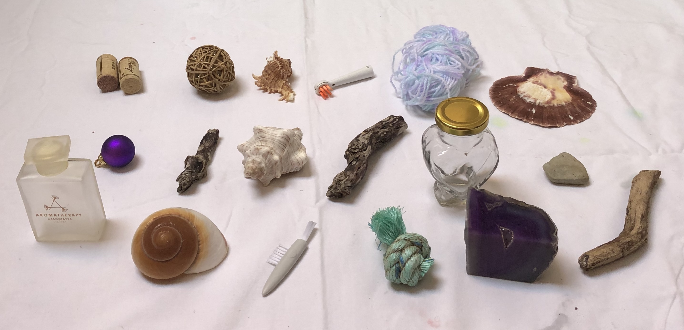
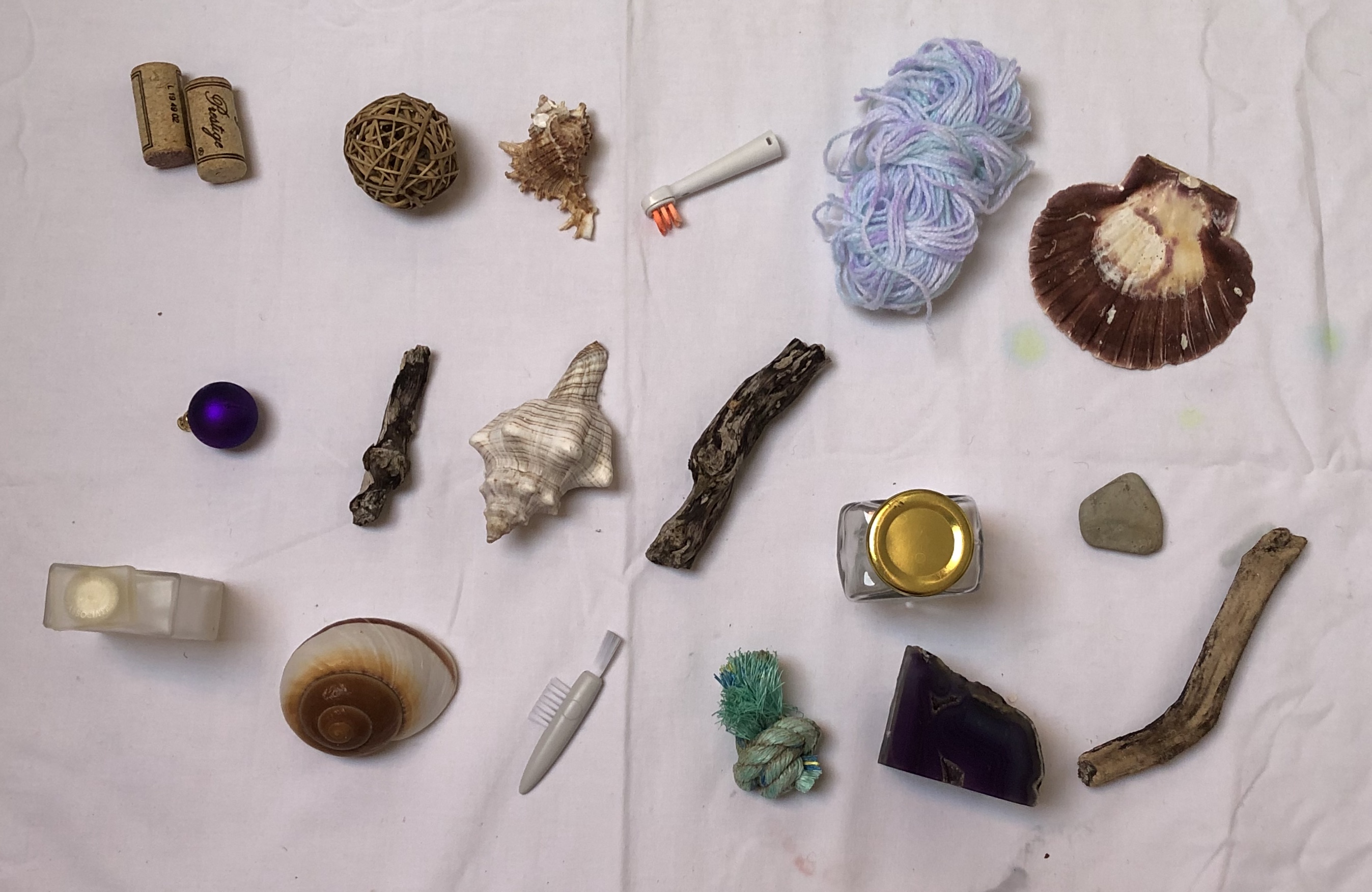
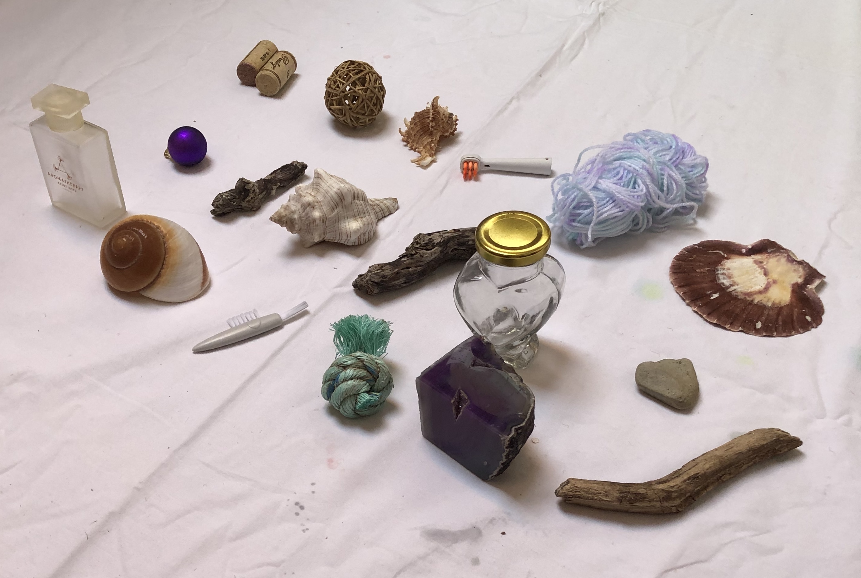
NOW WHAT?
– This whole “grid” mentality is interesting…I am a very organised person and it is second nature to me to arrange things tidily in grids…..so the making of grids from collections of things is going to be my ideal…..but on the other hand, I am rather an impatient painter, and am aware that I can be a bit “right, done that, what’s next?”. Painting a few things as a collection in a grid should be fine (e.g. the paint tubes and bottles in the Lisa Milroy section, above)…but will I become a bit frustrated with a bigger collection in one picture? I thought back to the 20-piece work I did for Assignment 1, but my interest was maintained throughout that by the fact that each individual picture was very different. Self-knowledge can sometimes be an unsettling thing….
**************************************************************
WHAT?
I looked at several of David Dipre’s paintings online, particularly on www.saatchiart.com. His favourite subjects are portraits, including self-portraits, with heavy impasto brushstrokes.

SO WHAT?
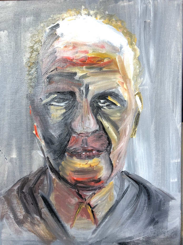
I had been studying the work of Frank Auerbach and, as part of my practice reflecting on my tutor’s feedback on Assignment 1, I had tried an oil portrait of Auerbach painted only from a drawing (see separate blog post).
I decided to use this painting as a basis for a new painting in the style of David Dipre. My support was a small thin wooden pot (previously used to hold a Camembert), and I wanted to paint the right-hand side of the face (as you look at it) onto the side of the pot so that you had to turn it to get the full image.
I used acrylic paint in a limited palette of three colours (roughly based on the Zorn palette work I had also been doing as part of my “feedback” action points) – Payne’s Grey, Burnt Sienna and Cadmium Yellow. Using a springy palette knife I applied the paint thickly and quickly, going more for an impression than a faithful representation.
This is the start – top of the head and hair, moving down to forehead wrinkles…..
down to eyebrows and mid-brow furrows…
…..eye and nose….
…..mouth and chin – you can just see the start of the hair at the top of the head starting again at the bottom.
Some bits went well:
- – Enormous fun
- – Eye and nose
- – Overall placement, i.e. it filled the space and was reasonably wellproportioned ….and some less well:
- – Mouth and chin
- – Green hair (grey and yellow mix)
- NOW WHAT?
- – I’m gradually getting into the idea of painting on non-traditional supports – am starting to look around my studio and think “Hmm….wonder what it would be like to paint on that…..”
- – I have been trying to make paintings being decisive and economic following my feedback from Assignment 1. “Decisive” is going well and I am feeling bolder about making bold marks. “Economic” is going less well, for two reasons:
- – In trying to loosen up my mark-making I have got into a “go for it” trance-like mode, when I’m in the moment and almost instinctive rather than thoughtful – it all has to happen now
- – I’m aware of the above and I have tried to make myself pause, step back and take note, when I’ve completed the image if not before – but when I’ve done so I’ve found a “decisive” mark which I don’t like, and am then in a dilemma as to whether to let it stand as honest and authentic, or sort it out, which is when I fall to tweaking and fiddling and trying to wipe bits out and the thing becomes a bit of a mess and decidedly un-economic.Not quite sure how to sort this out…more practice…? ******************************************************************************
- WHAT?
- Lee Edwards’ work is quite wide ranging, but I particularly enjoyed his little figures emerging from wood, e.g.“Fades to memory”
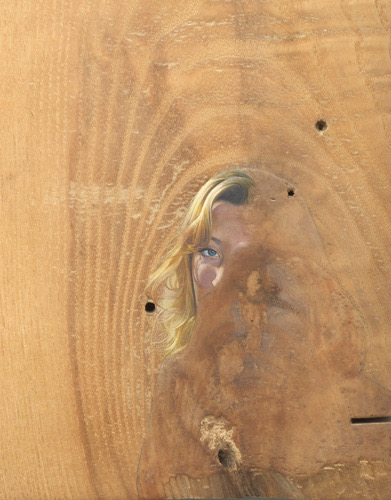
2011
Oil on oak
18 x 15 x 2 cm
seen on his website, www.leeedwardsart.co.uk
I like the way he has used the pattern of the support as part of the image, almost as though his figure were conjured up like a genie from under the surface.
SO WHAT?
Seems a bit of a trite connection, and I do want to try painting using wood like this for a support later, but for now I had just received a few tiny pots of Humbrol enamel paint – so was looking for a tiny project to try them out. An interesting cork from a wine bottle was my support, and I applied my paints using a rigger. The paint sticks well to the surface, but really doesn’t do well mixing with water and I got my brush into rather a mess and had to find some turps, which I hate, at the back of a cupboard to get it clean (I have ordered some Zest-It as I enjoyed the vibrant colours of the paint and want to experiment with it more).
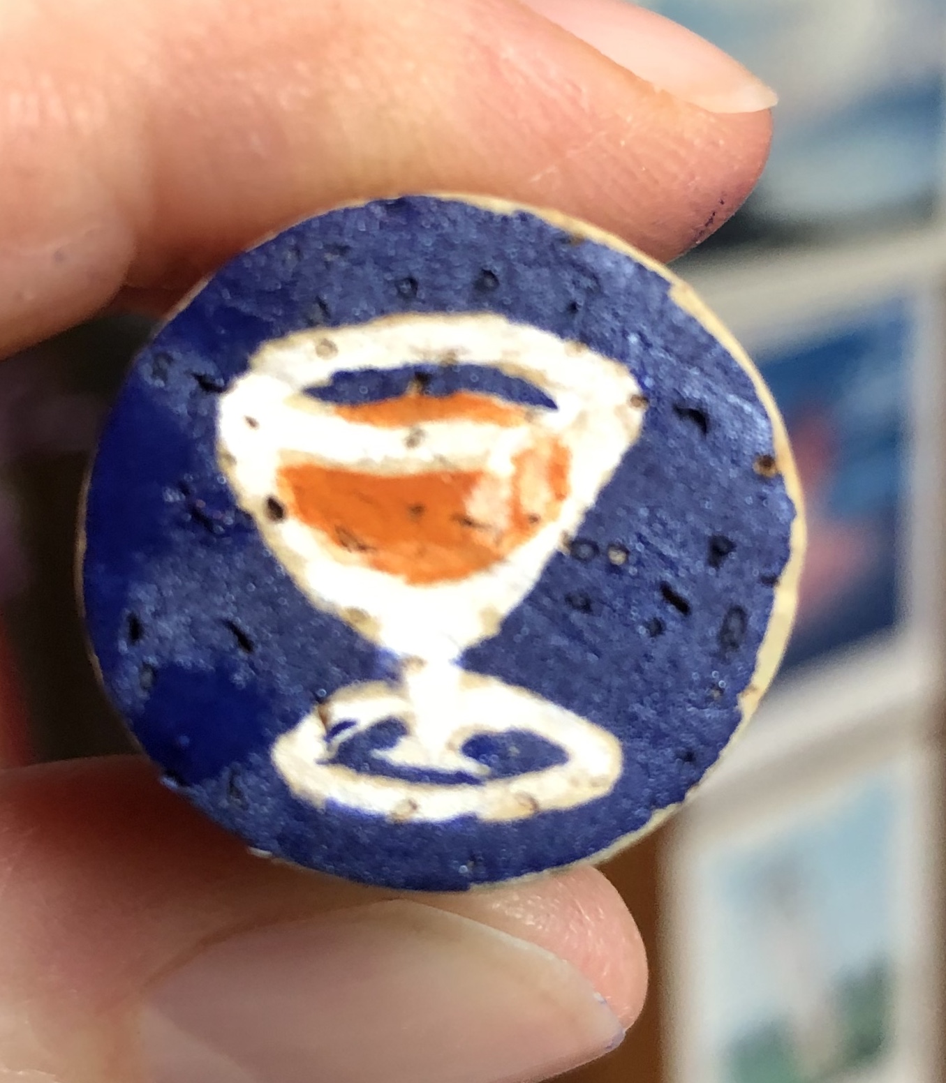
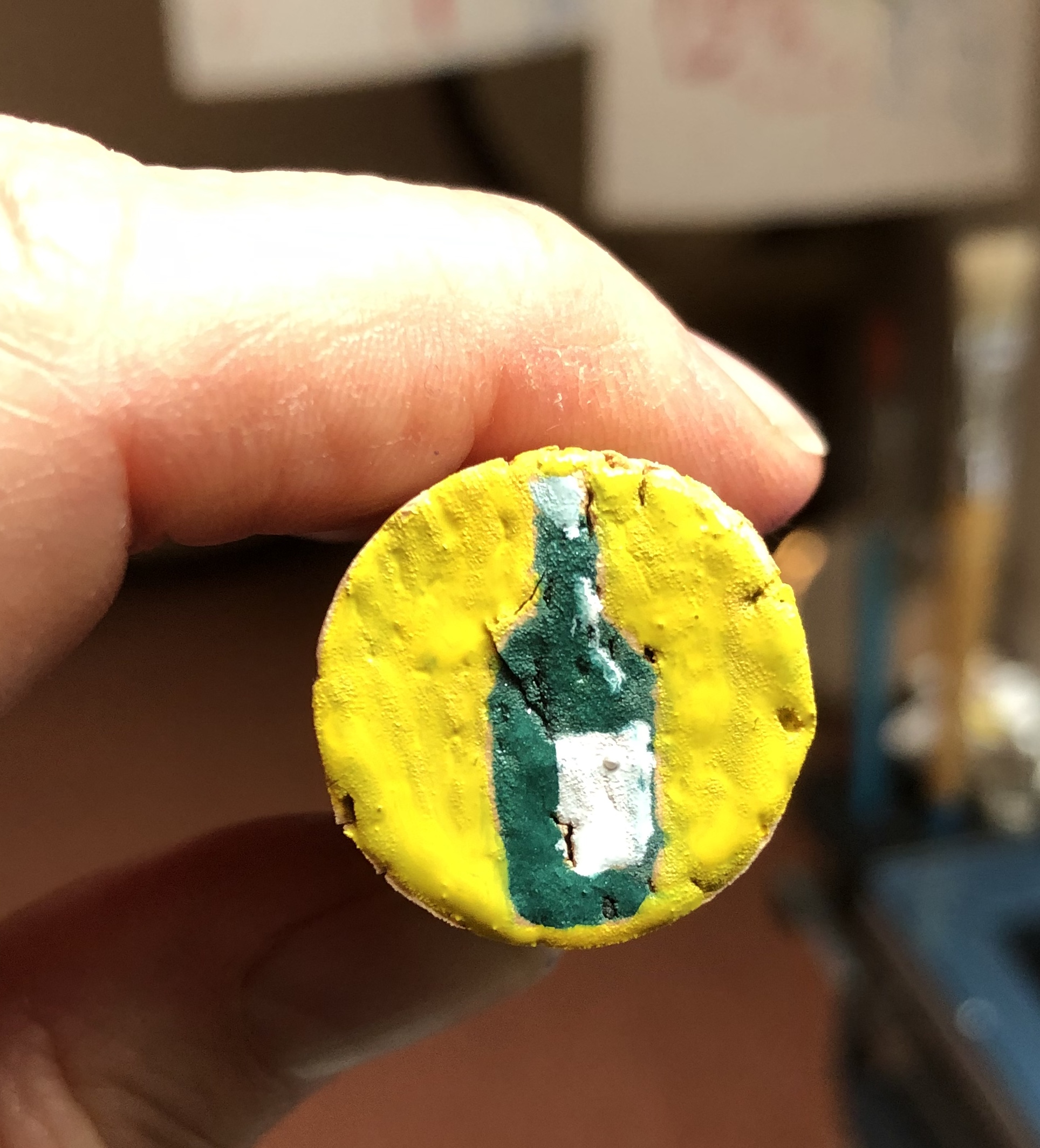
NOW WHAT?
– Well, painting as small as this certainly makes for decisive and economic mark making! – The enamel paint has a solid opacity to it
which I find pleasing – it’s a bit like liquid gouache or runny acrylic. I have bought a small and quite random selection of matt, gloss and metallic finishes, so will be interested to play more and see if I can tell the difference once the Zest-It cleaner arrives.
– The paint is quite smelly which might prove an issue for me personally due to my asthma; however, I have been attracted to the enamel paint pictures by Raqib Shaw who does get some very vibrant effects, and I hope to be able to achieve something working towards his style (if much less detailed and intricate!).