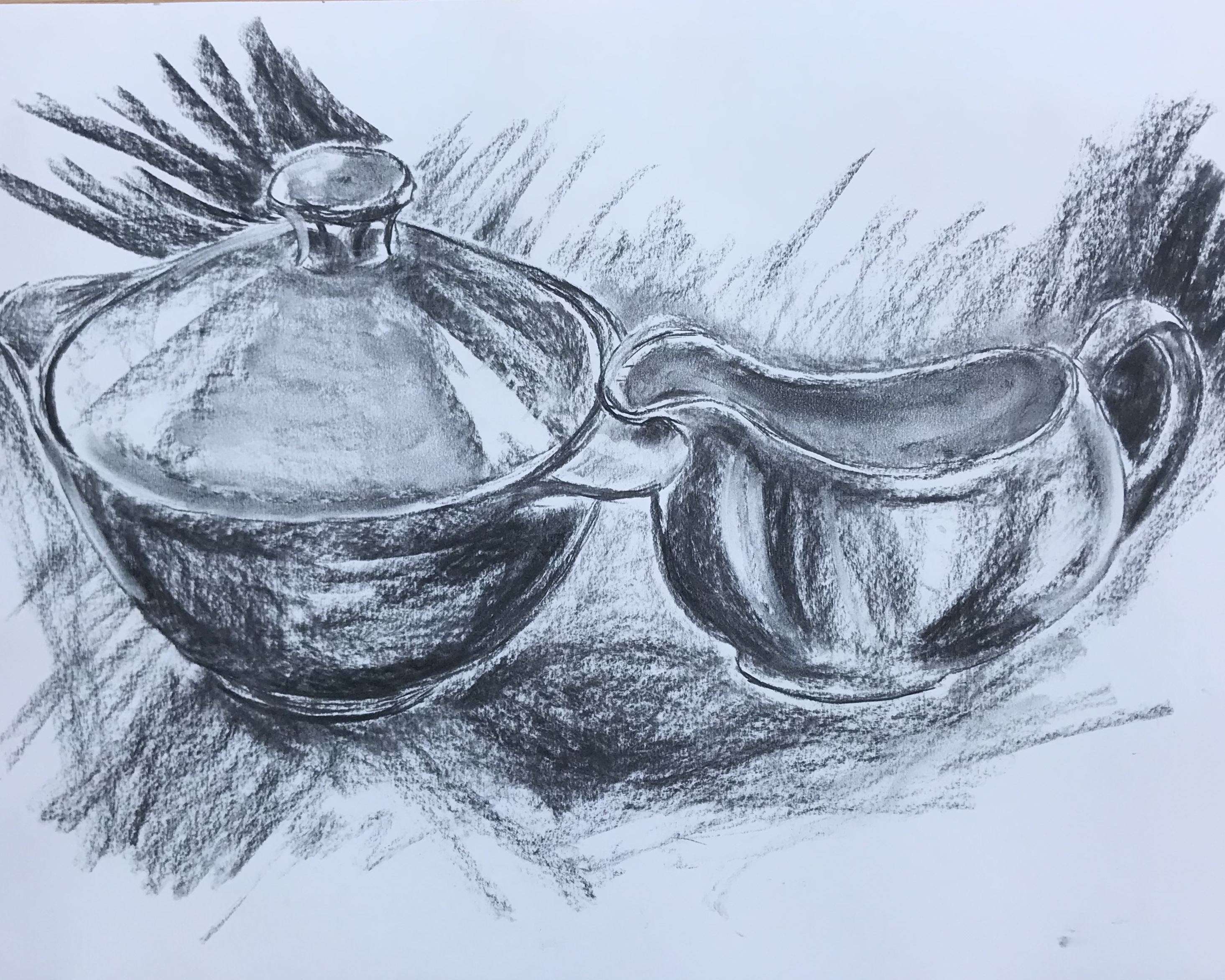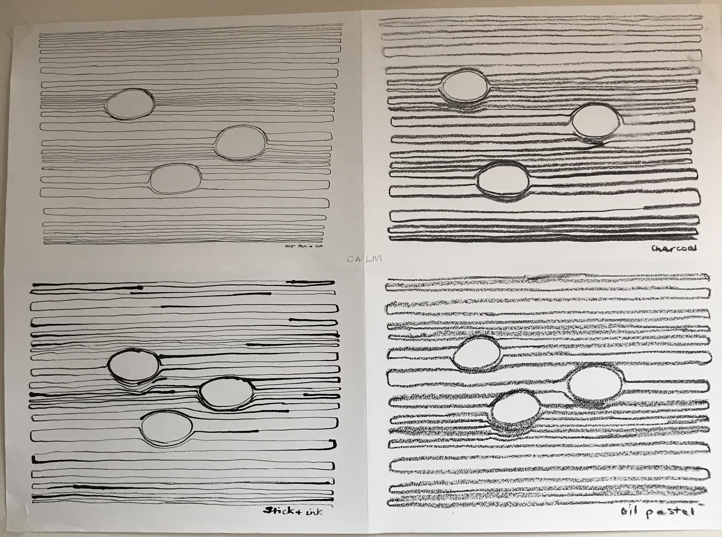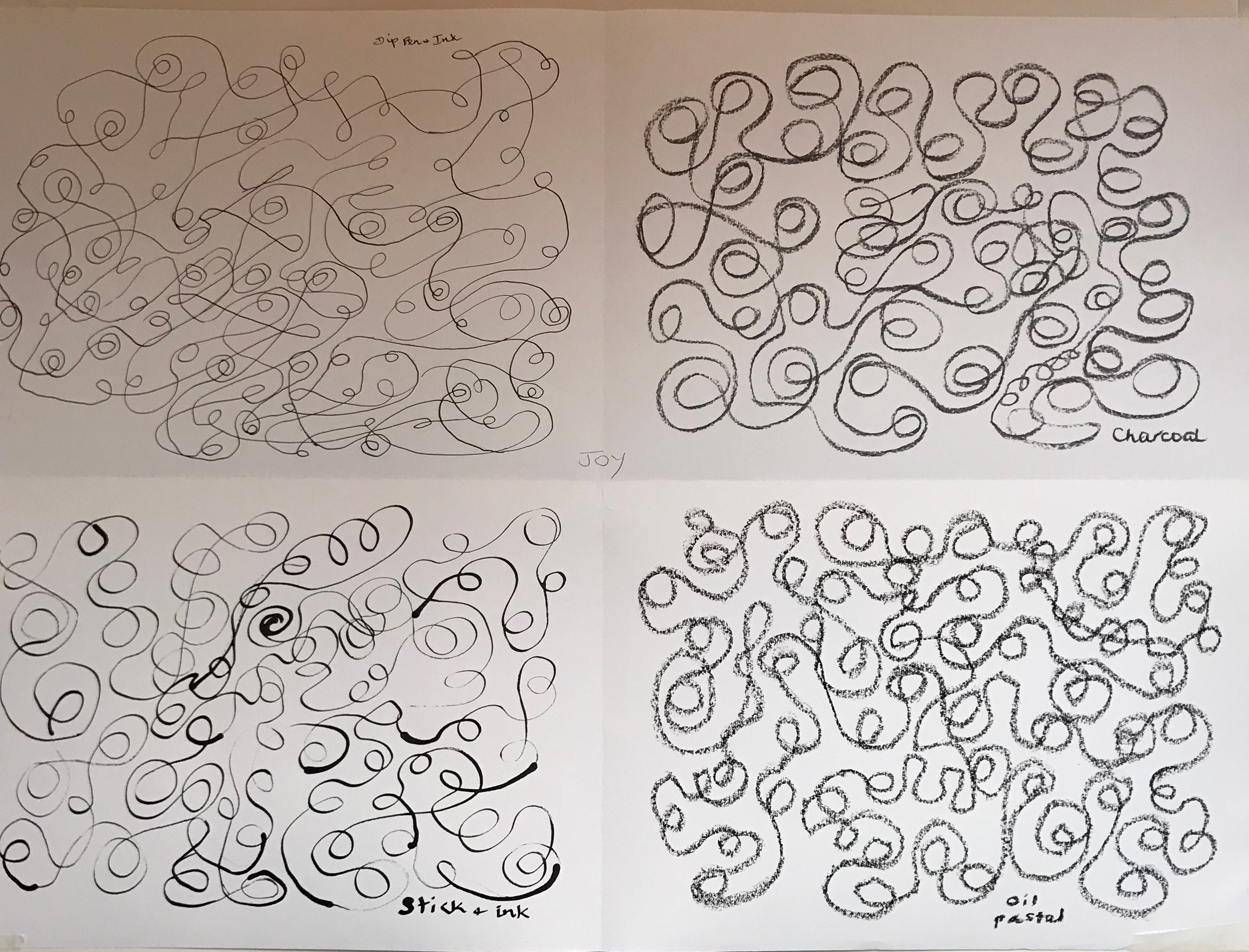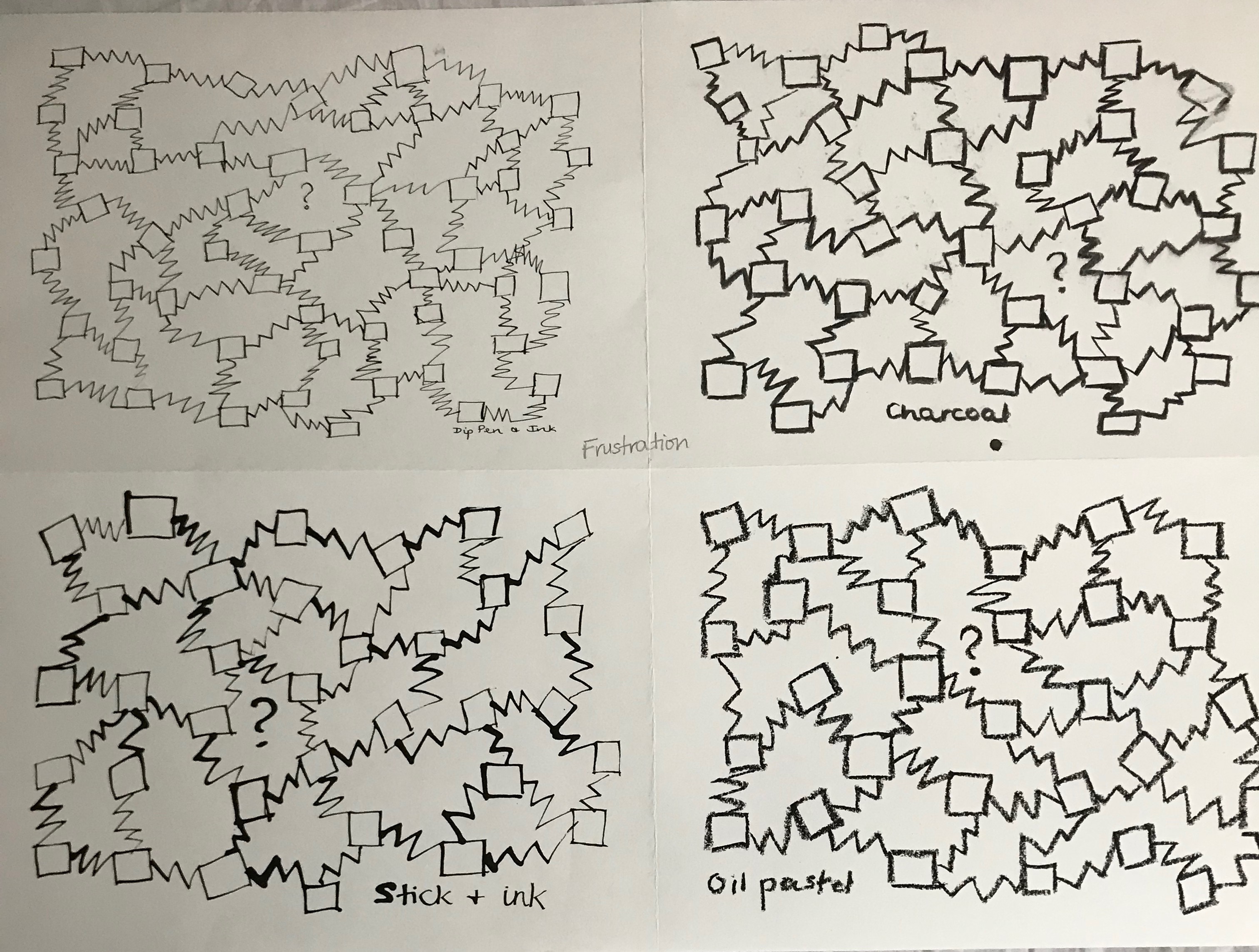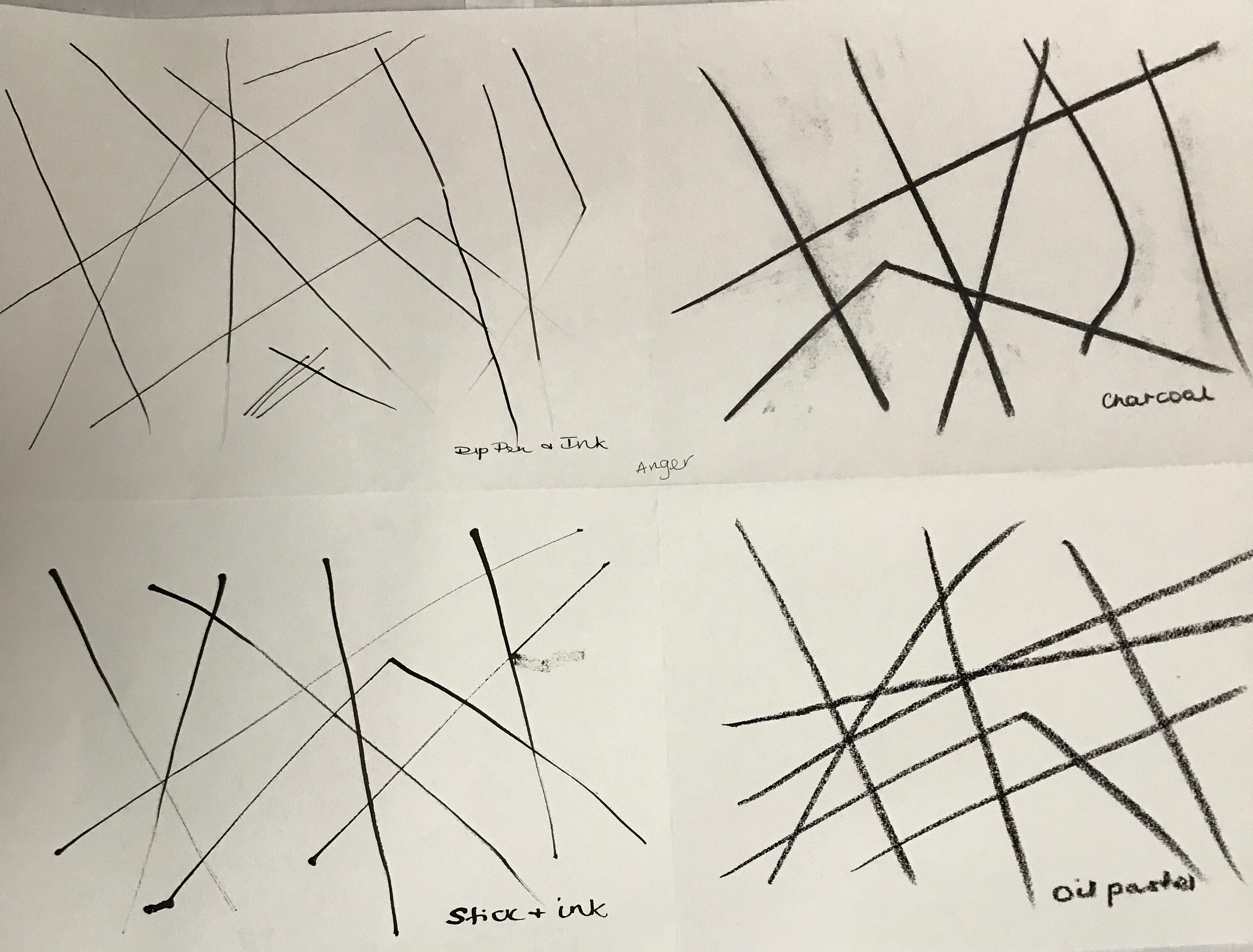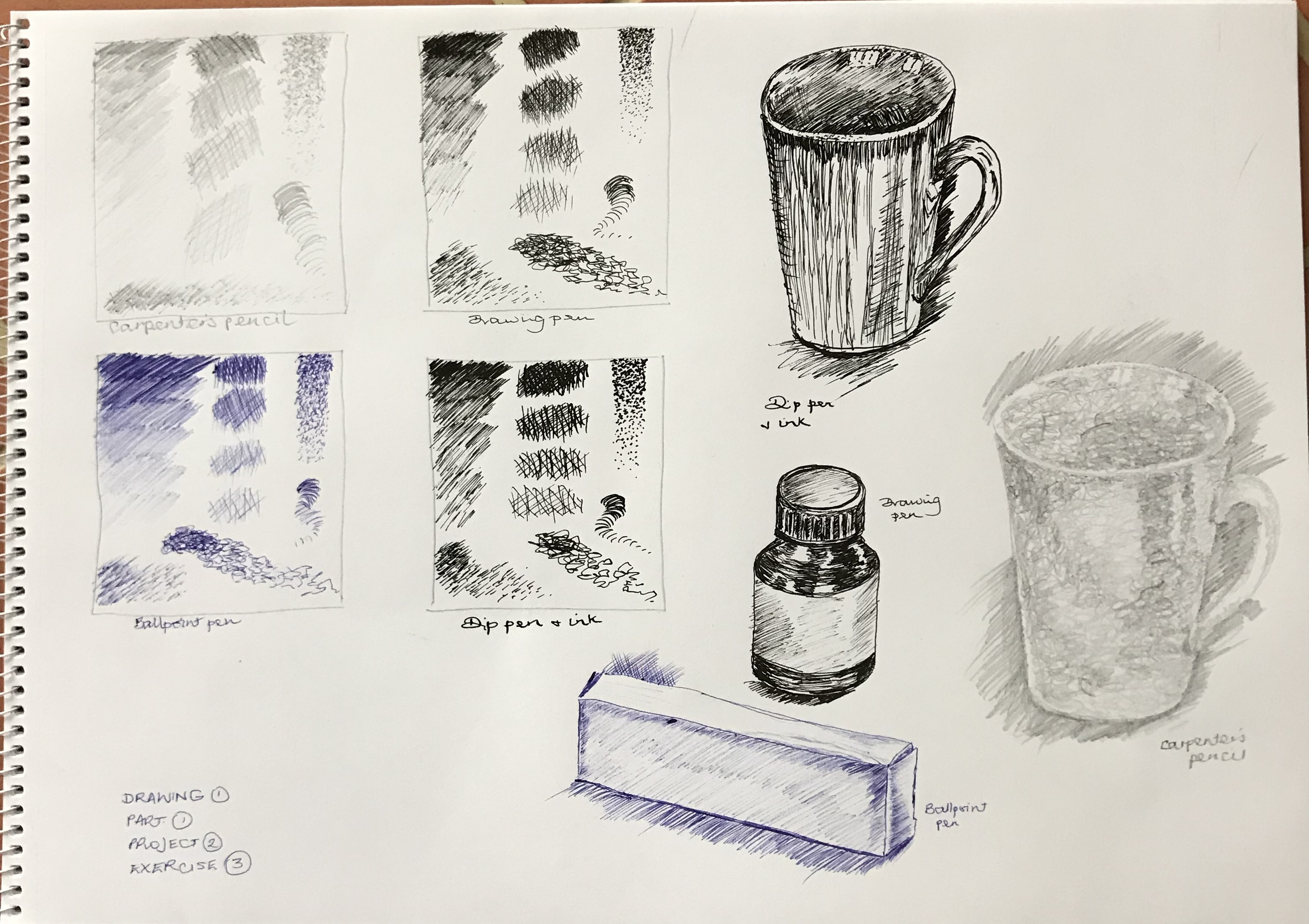
I’ve had a go at shading exercises in boxes or strips like this before, but it was good to revisit and to compare side-by-side the effects which can be achieved using different media. As well as lines and dots I added in a scribbly stroke which I have seen demonstrated at an art group (by local artist Ian Pethers – see www.glenrockstudios.co.ukand www.drawntothevalley.co.uk/artists/detail/ian–pethers/); I have hitherto used this to some effect in landscape drawings.
I had a go at the mug, a curved shape, using straight hatching lines with a dip pen, some quite long, some very short – not a complete success – I’ve got the lights and darks but not much of a mid-tone. Then I tried the same mug using my scribble stroke; the carpenter’s pencil I was using doesn’t allow much variety of tone by way of pressure, so you have to do it with increased coverage – at close quarters the effect is frankly weird, it looks like a mug made of wool, but at a distance I prefer it to the pen-and-ink version, I think I’ve achieved more gradations of tone.
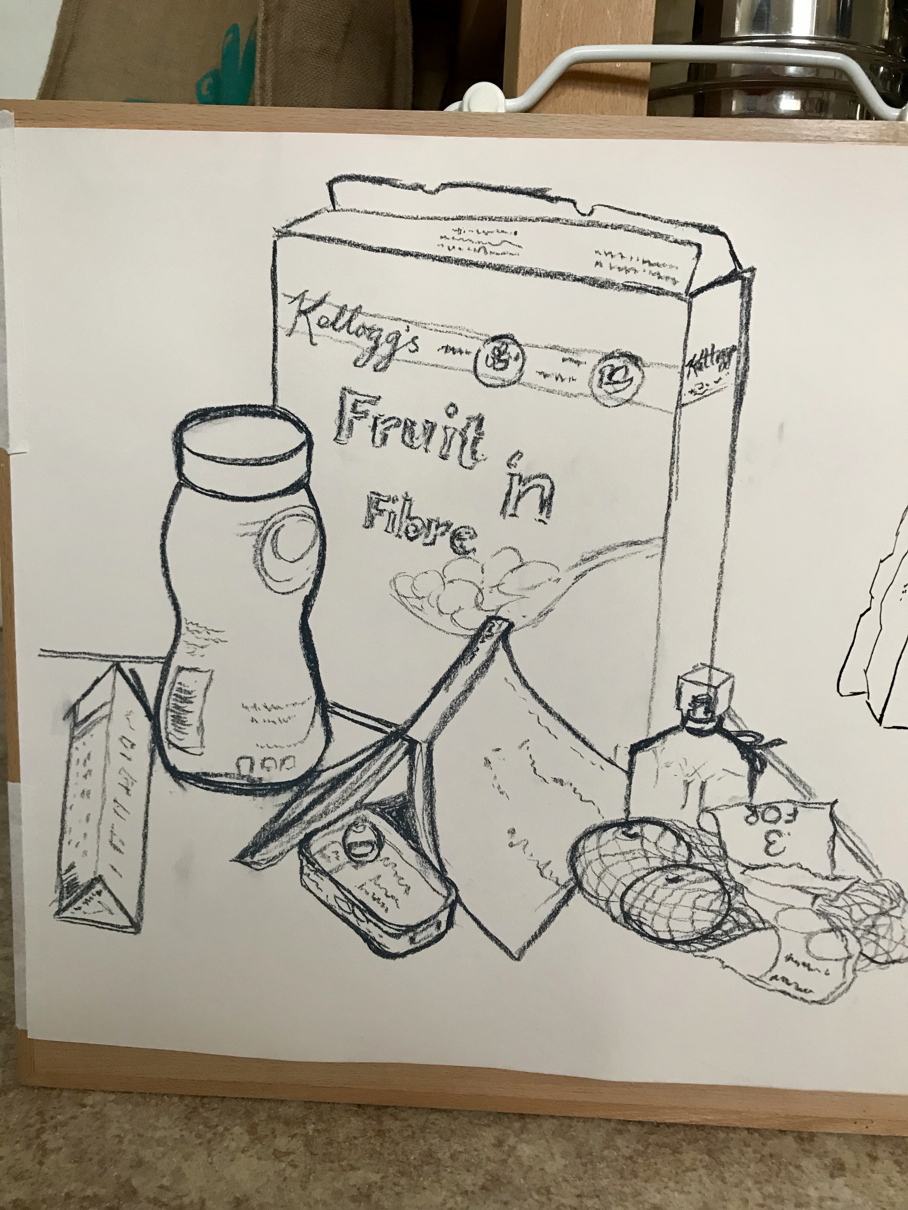
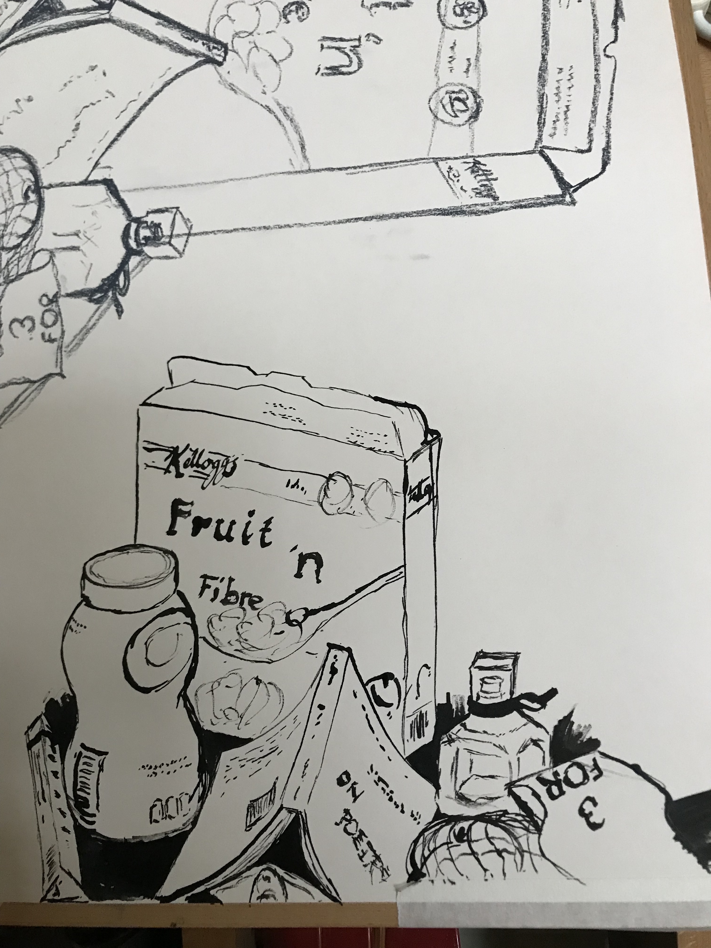
Next I tried the box in ballpoint pen. I quite often sketch in ballpoint pen when I’m out and about, usually because it’s all I can find in my handbag or pocket – it is good for hatching, but with the downside of the occasional blob. I made my life difficult by drawing my charcoal box, which had a strong black and white design, so much squinting was needed to pick out the bits which really were dark – but I’m pleased with the effect, I do feel I’ve made it 3D.
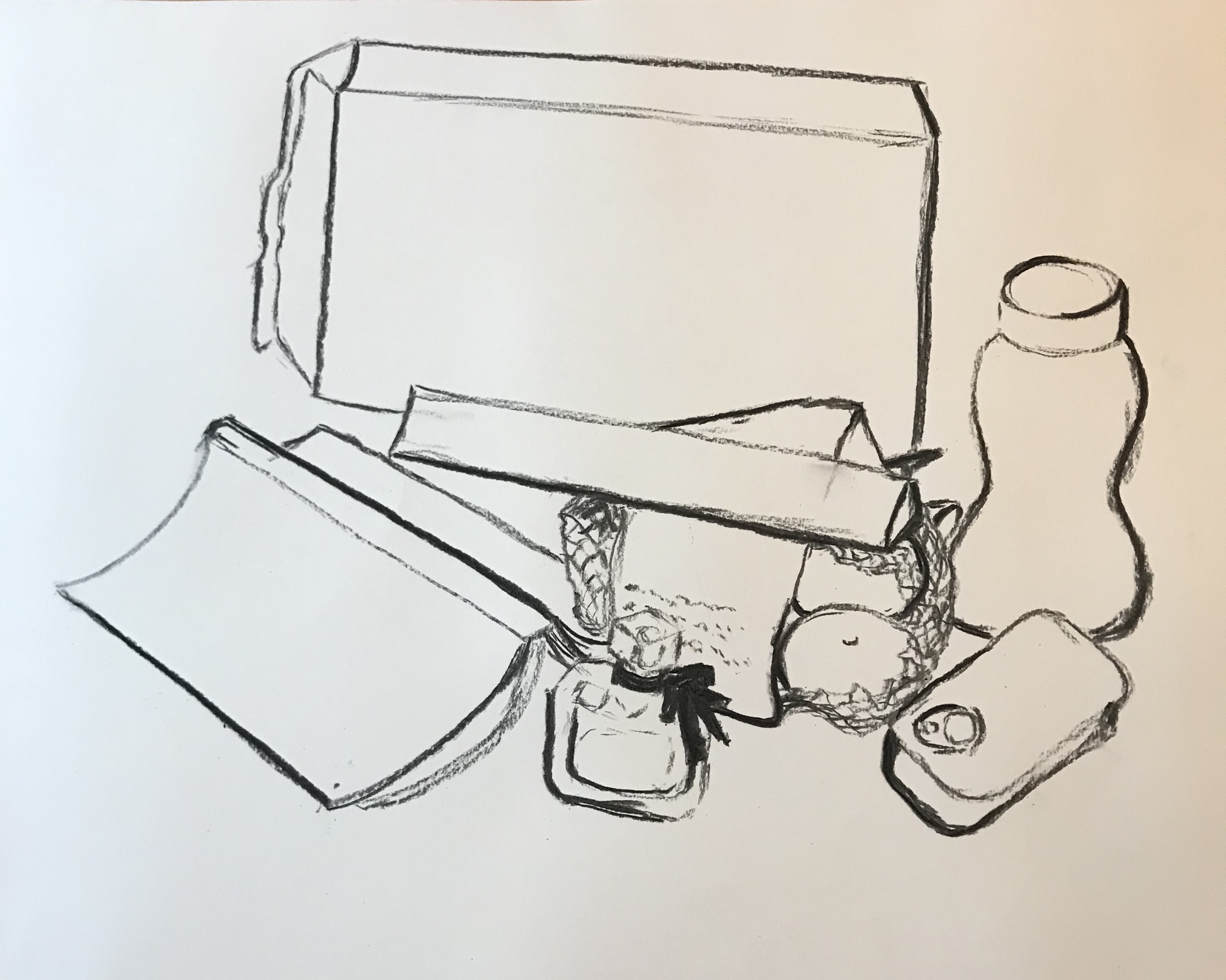
The bottle of black ink was the last and the quickest drawing (near the end of our allotted art group time) and I wondered if I’d made the same mistake as with the charcoal box – but no, the shiny plastic of the lid and the glass bottle showed clear lights and darks. I used curved lines for the curved surface and I feel that this is the most 3D of all the drawings (even though slightly wonky).
So, what have I learned from this?
- Vary the shading mark according to the shape and texture of the object you are shading
- Look carefully where a light comes up against a dark – is it actually a straight transition from one to the other, or should there be a mid tone in between?