I read the recommended blog post on the Zorn palette, and also found a series of 4 articles on it in the Artists & Illustrators Magazine (beginning with the Summer 2020 palette) by Ann Witheridge of London Fine Art Studios.
SO WHAT?
I experimented with colour mixing as suggested in the articles by making a colour chart using egg tempera and these colours: Zinc White, Ivory Black, Naples Yellow and Alizarin Crimson. I started with the raw colour at the top of each column then added white each time as I progressed. This particular combination was good for flesh colours; the browns ended up quite purply and a picture needing a lot of blues would need to substitute the black for a blue, as mentioned in the article.
NOW WHAT?
I shall try using the Zorn palette for some paintings.
I wanted to look at the preparatory drawings by some of the painters my tutor suggested. Purpose was threefold:
Read about and observe their drawing style in terms of line and tone
Try some drawings using something like their style
Make a painting from my drawing, as suggested by my tutor
Factors to remember:
Use different tools and gestures
Focus on tone
Remember: “decisive and economic”
SO WHAT?
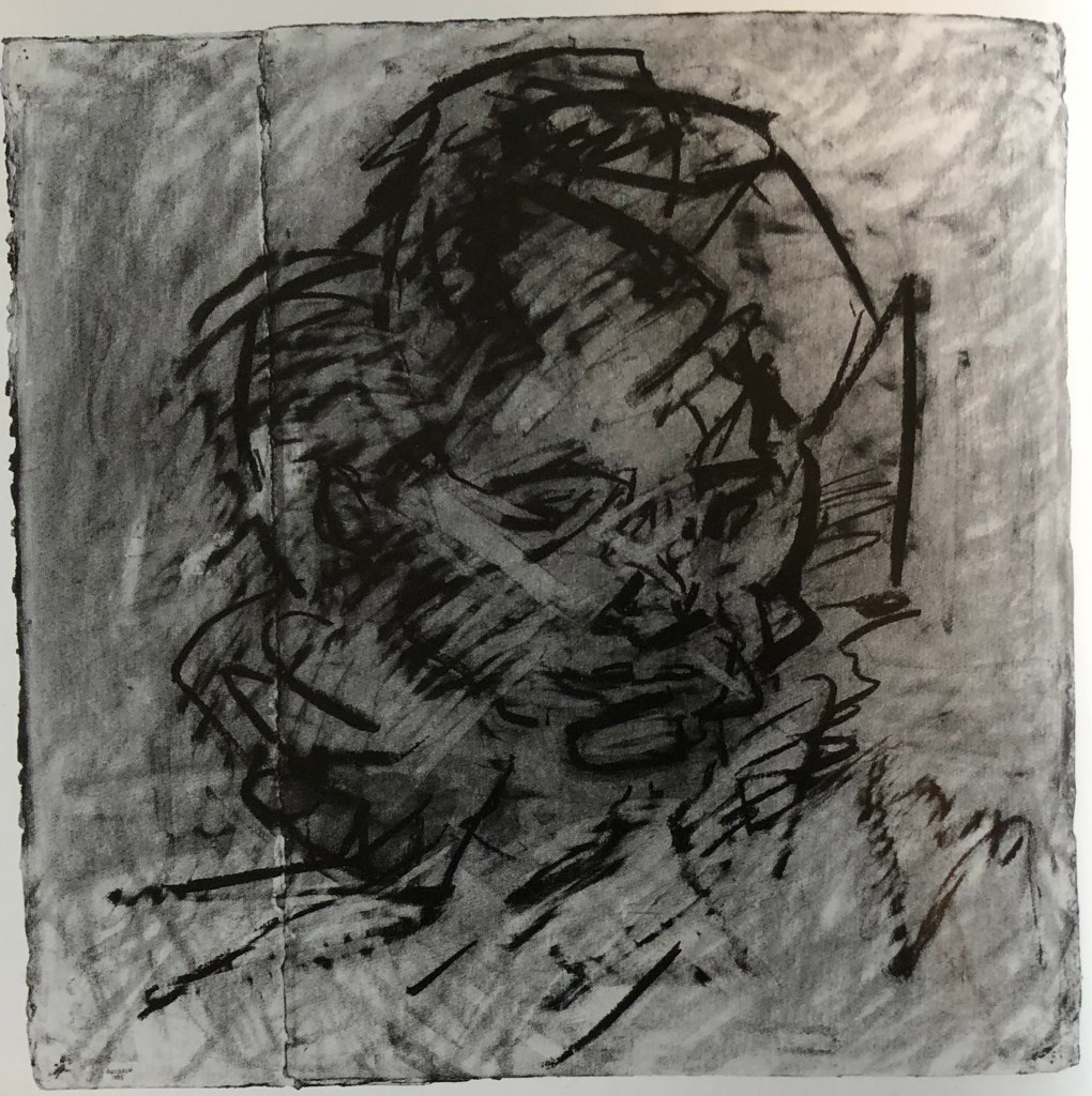
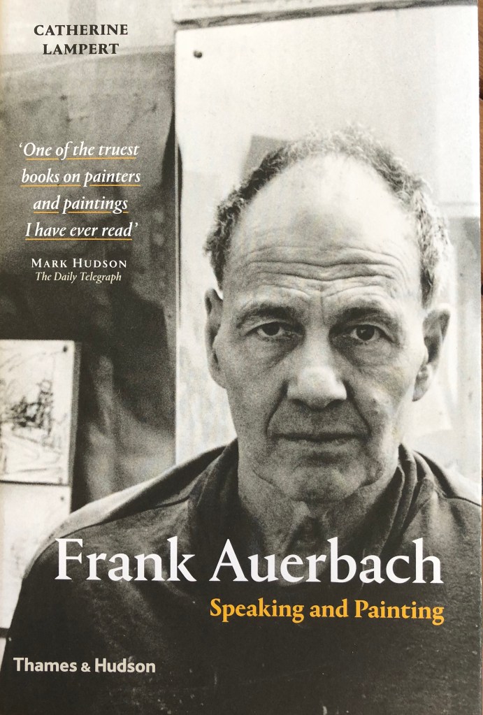
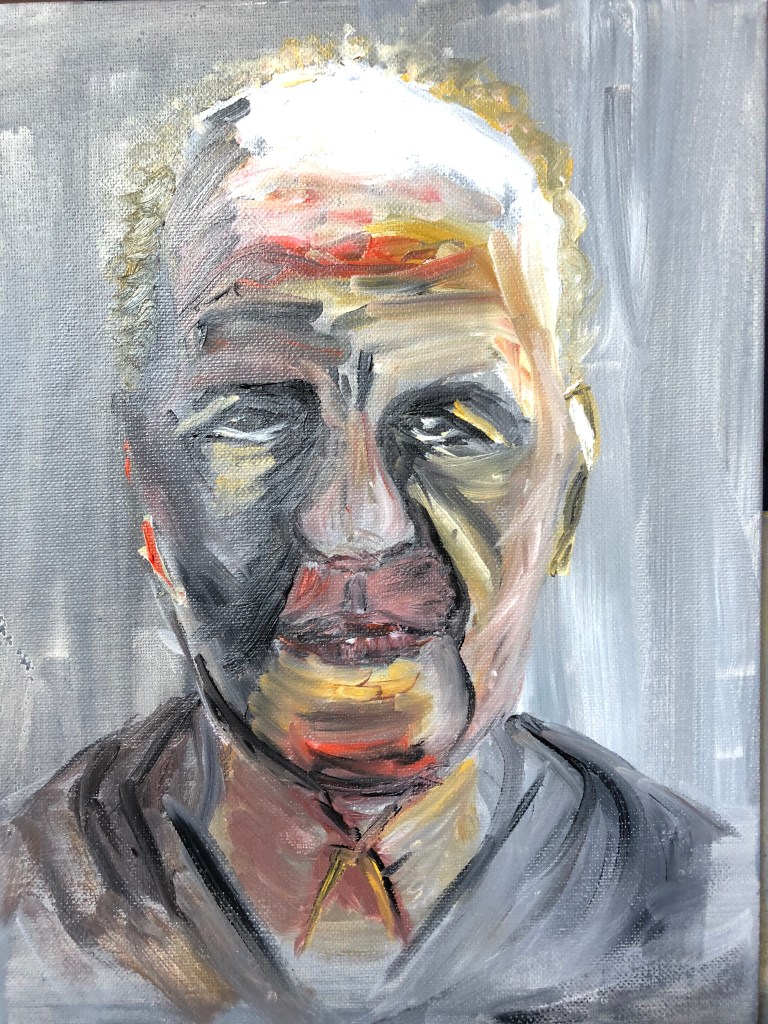
I looked at drawings by Frank Auerbach; for example, this one of the author of a recently-acquired book about his life and work: Lampert, Catherine, 2015, “Frank Auerbach, Speaking and Painting”. Thames & Hudson, London.
“Head of Catherine Lampert”
1985
Charcoal and chalk on paper
76.2 x 76.2 cm
Private collection
He seems to go over the drawing again and again, adding and then removing, as if trying to get the essence of the sitter into his head.
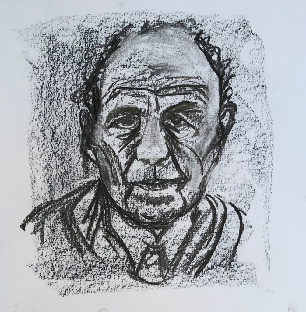
I had a go on paper, using a Conte crayon grey roughly shaded background and willow charcoal to draw with, plus a putty rubber to remove.
Even though mine is quite scribbly, it’s still “neat” by comparison. It’s the photograph of Auerbach from the front cover of the book.
My next step was to try and paint solely from my drawing – I’ve only rarely done this before, usually having photographic backup or the actual object in front of me, so thought this would be a good test of my drawing/looking.
Also, even though the book cover was in black and white, I wanted to add some colour and use my Zorn palette.
And I wanted to give my new oil long-handled brushes an outing, but this time using them with my left (non-dominant) hand to develop control.
I laid out my Zorn palette, light to dark, with water mixable oils: Titanium white, yellow ochre, cadmium red, black.
Using black and white and a dilute mix, I laid a loose ground onto primed board using broad vertical and horizontal strokes.
The painting of the figure was done using undiluted paint. I worked quickly, trying to make marks decisive – it went well for a while until I came to the mouth, which is where my portraits often fall apart, and this was the case here. The trouble in fact was with my drawing – I had not indicated the tones around the mouth correctly, but when I tried to paint them in accordance with the drawing, I could see it wasn’t right and fell to tinkering to try and make it better. When I came downstairs again and looked at the book cover, I could see immediately what my issue was.
NOW WHAT?
I learned a lot there!
If you’re going to paint solely from a drawing, then get the drawing right!!
And then, trust your drawing – I can see bits where I haven’t (e.g. the darkness of the hair on the left)
If a painting’s going wrong, trust your gut to put it right, but DON’T FIDDLE
I have been decisive in places, but I’ve not always been economic
The Zorn palette definitely works for portraits
I am better at being decisive with my left hand because I have to concentrate on each mark as I worry I lack the control over a long handled brush; when I’m unsure of what I’m painting, I kept catching myself reverting to the right hand and moving the hand nearer the ferrule, and that’s where I fiddled.
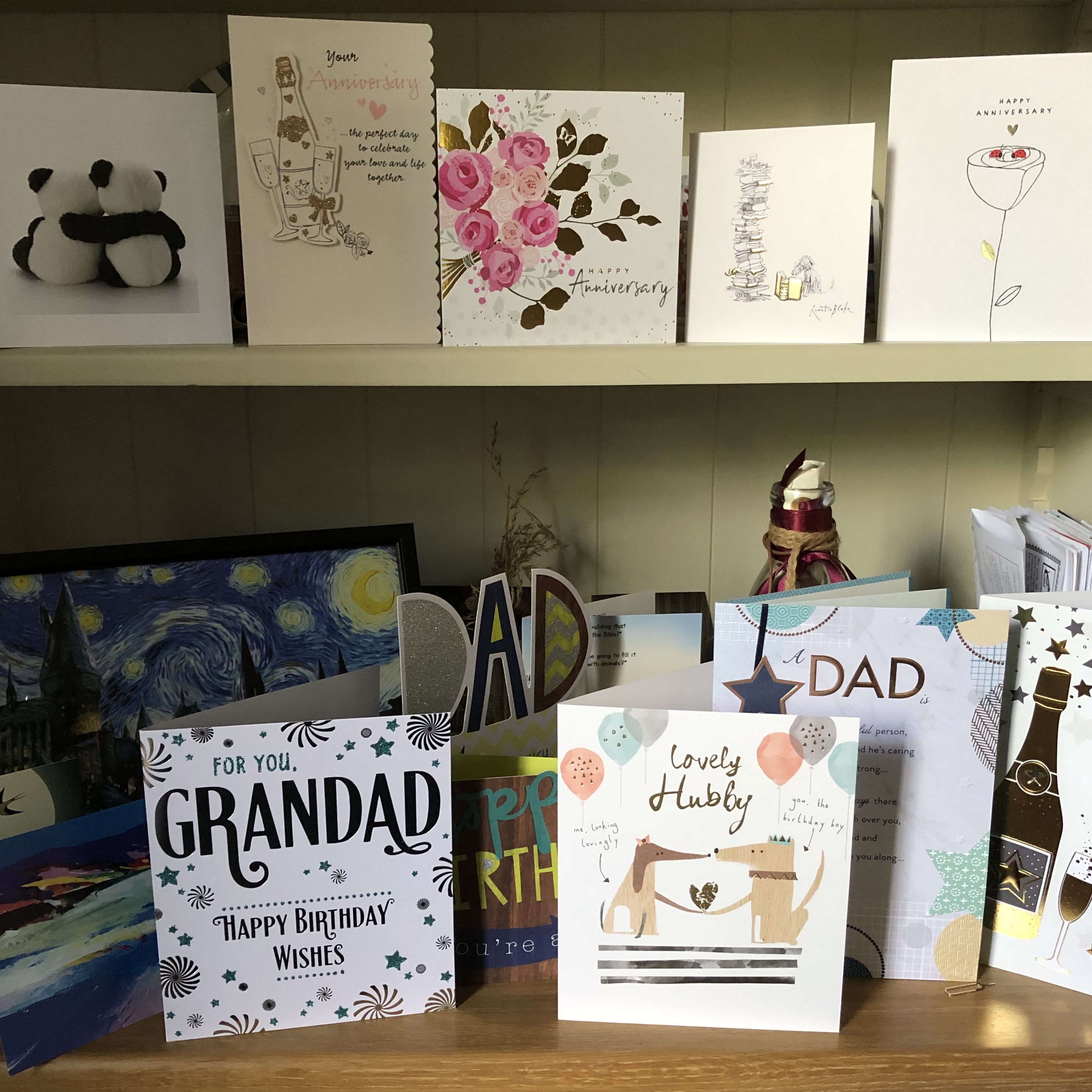
Once I had taken on board the fact that collections can be formal but also might be informal, I began to see them everywhere in the house. Many of the pictures which follow are of these “found” collections.
SO WHAT?
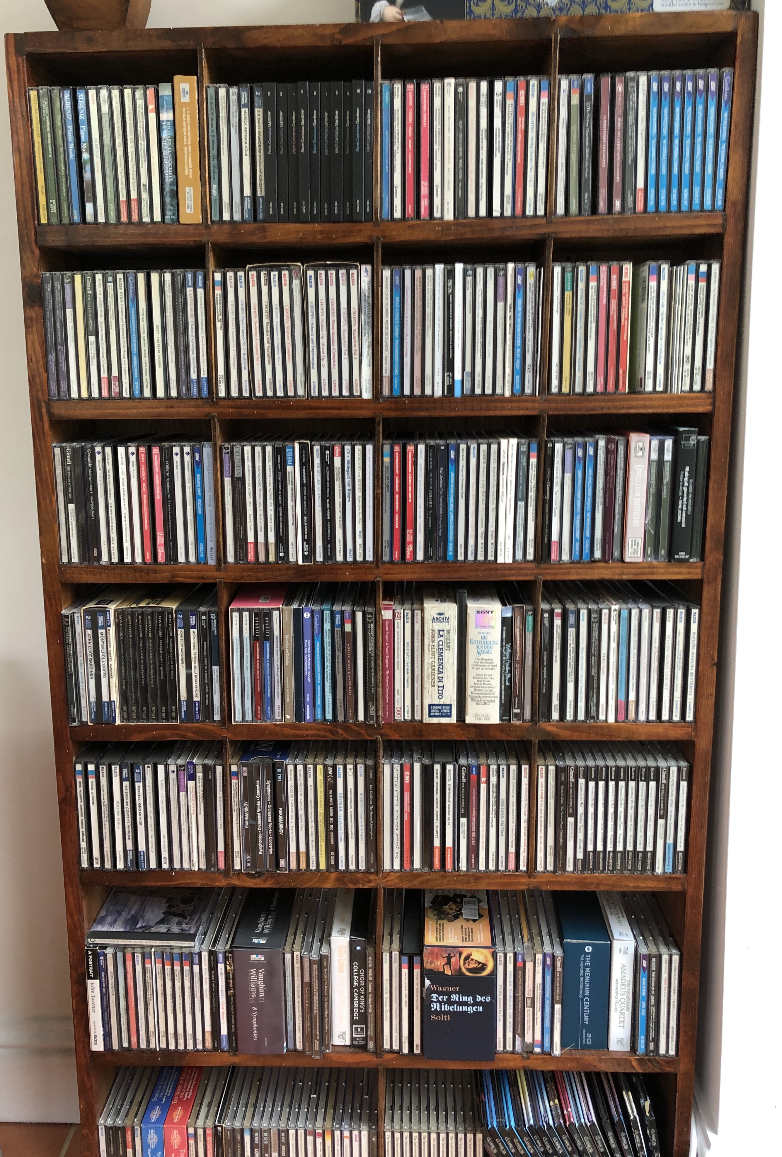
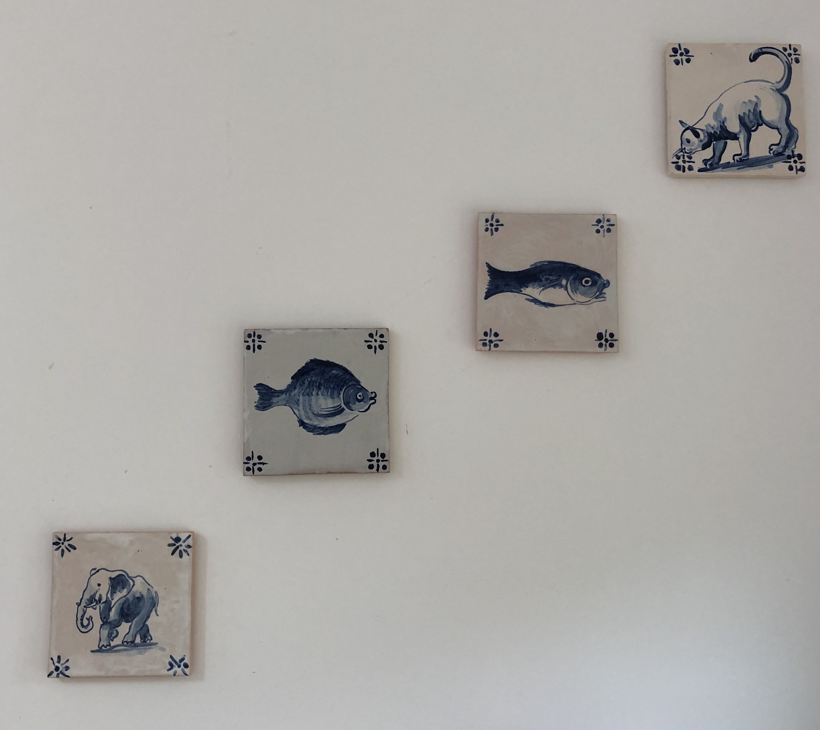
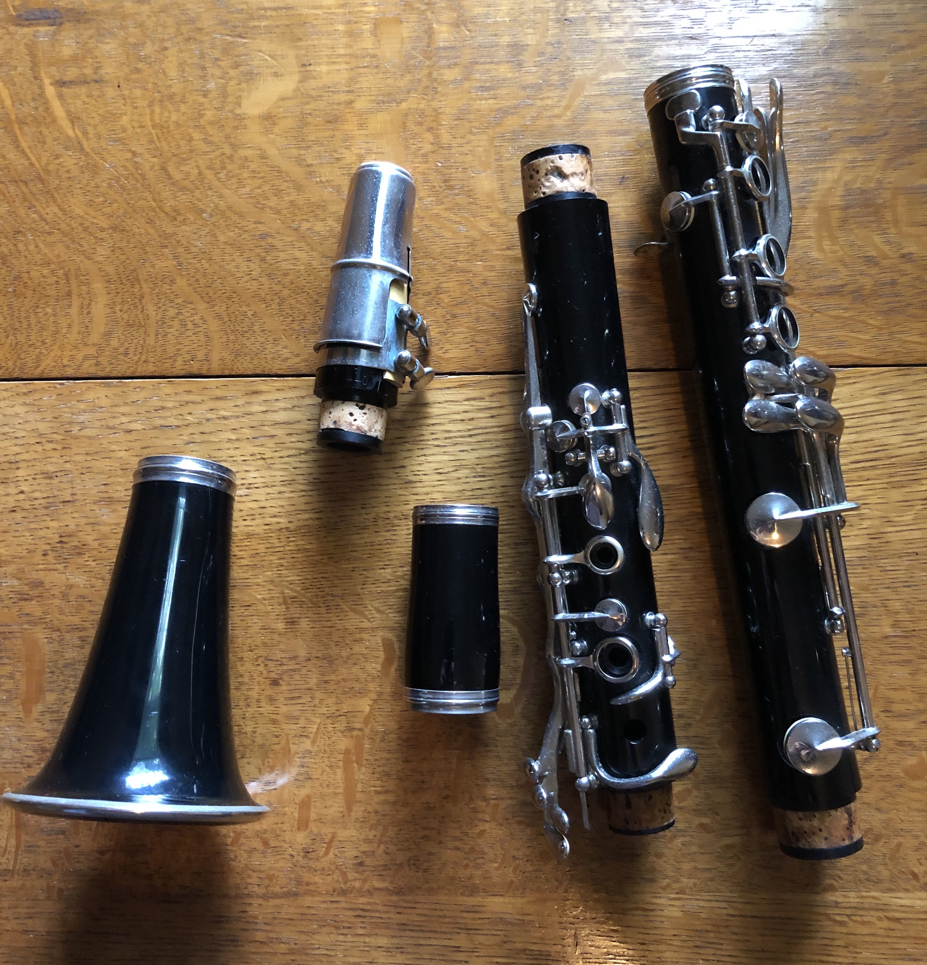
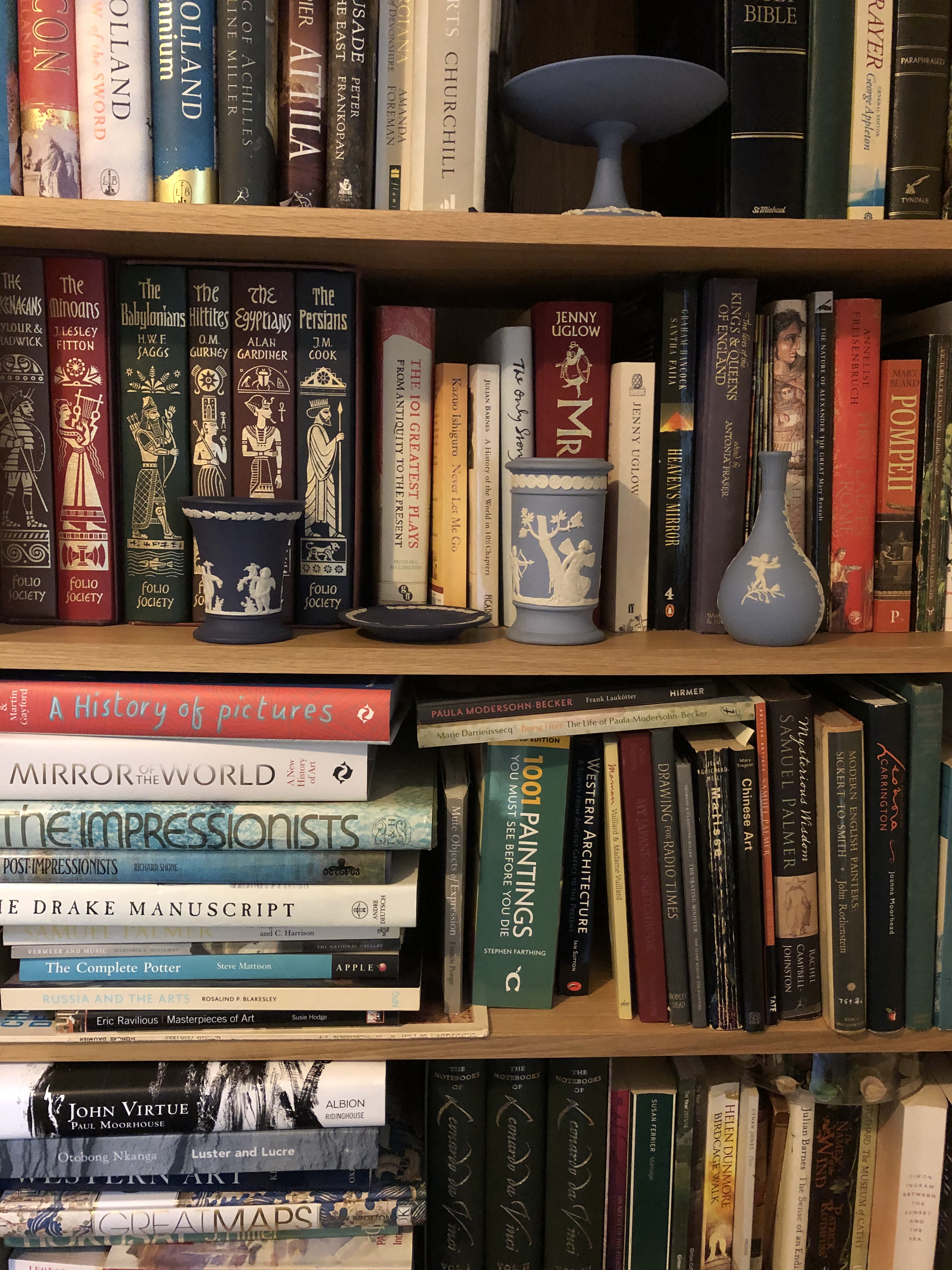
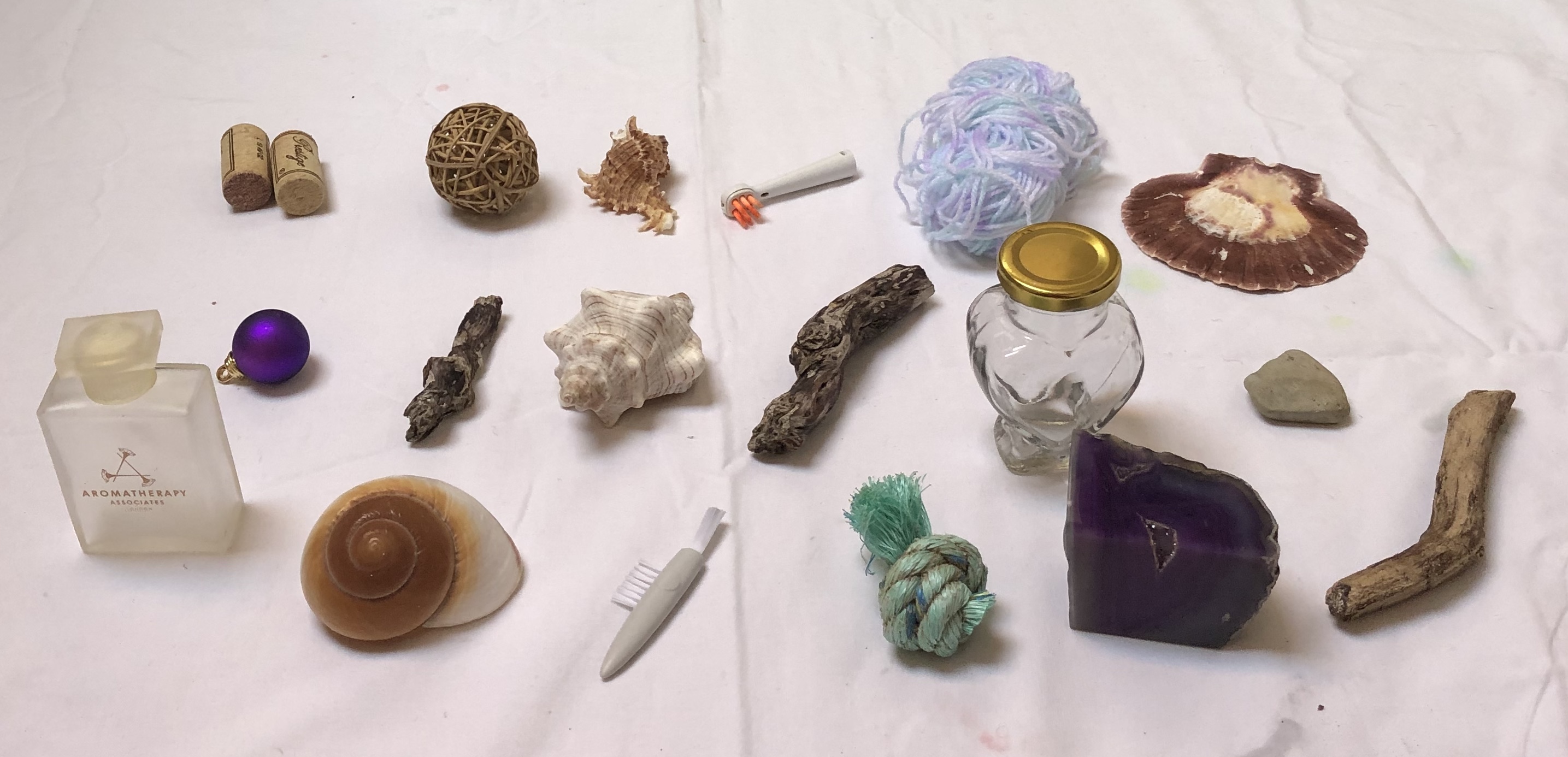
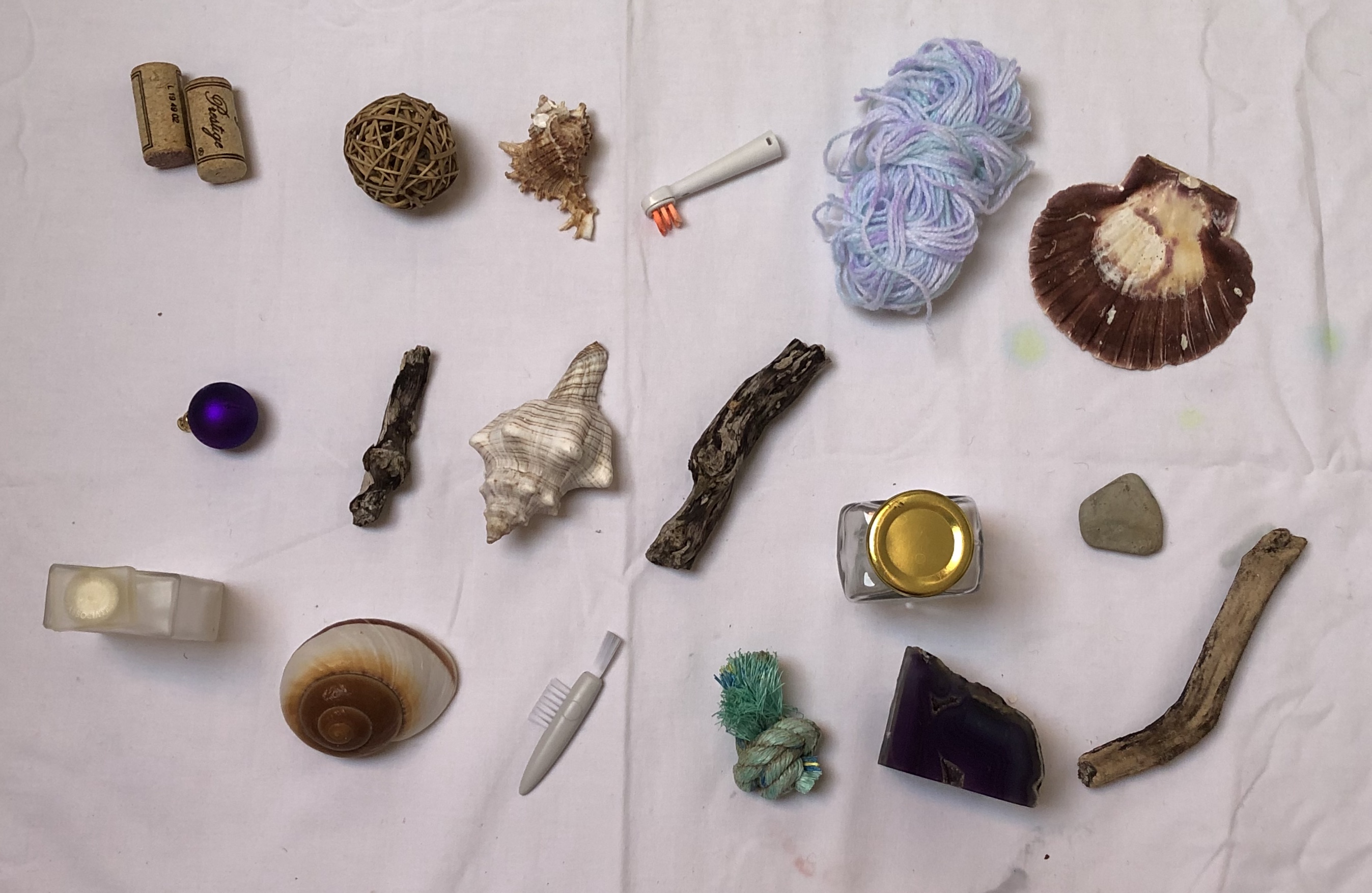
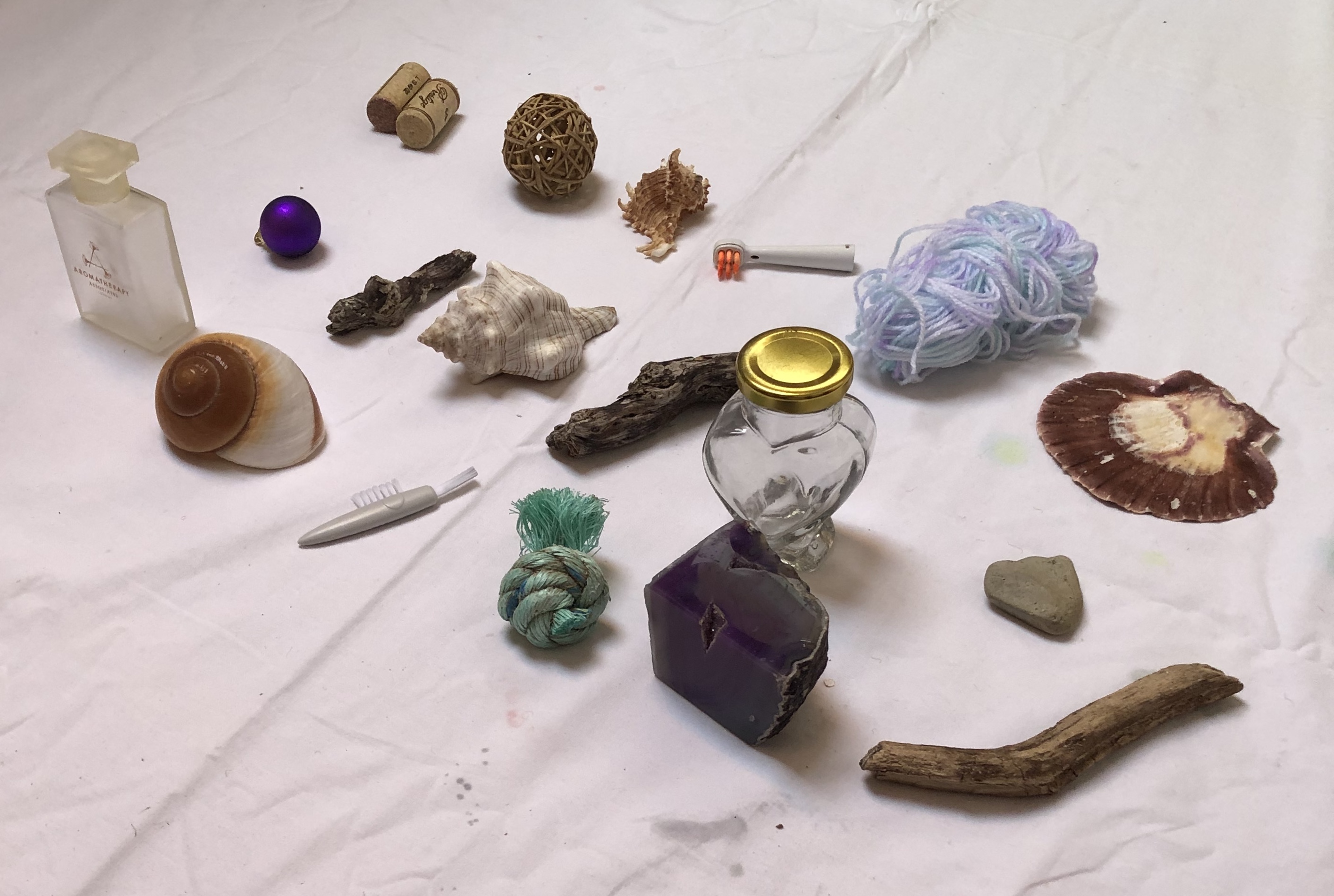
I have photographed a number of collections from around the house; some have “staged” backgrounds but the majority are on/in the vicinity of their existing locations.
NOW WHAT?
I’m looking forward to using some of these images in the exercises , as well as the collections discussed in my research blog (especially the “bottles of ink” and the “things to paint”). I might choose to rearrange some, or to select a few from each collection, depending on the task; and obviously, with an arranged collection, you have more control over the background.
I’ve tried to pick a favourite collection from the selection above, purely as an image, and I can’t – although the one I’m most looking forward to having a go at painting is the parts of a clarinet (probably the most fiddly, so I’m going to go with a lot of implication to avoid tying myself in knots).
Having looked up and read the suggested essays by Benjamin and Freud (see course materials for reference), I came across details of an exhibition at the Barbican Centre, London, 12th Feb – 25th May 2015: “Magnificent Obsessions – The Artist as Collector”, curated by Lydia Lee.
SO WHAT?
Lilias Wigan, reviewing the exhibition for the 3rd March, 2015 edition of Country Life magazine, said it looked at three questions:
– “how has the practice of collecting aided artists’ researches
– How has it inspired artistic progression
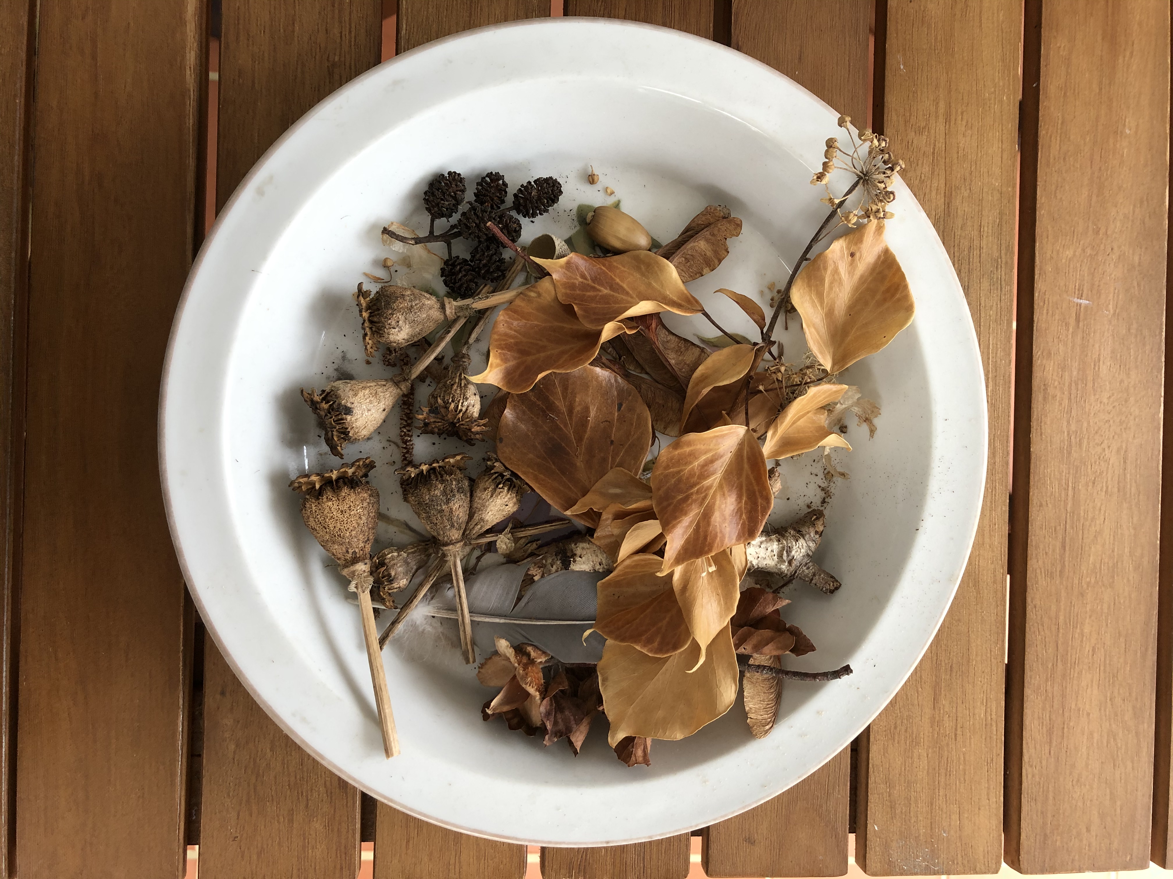
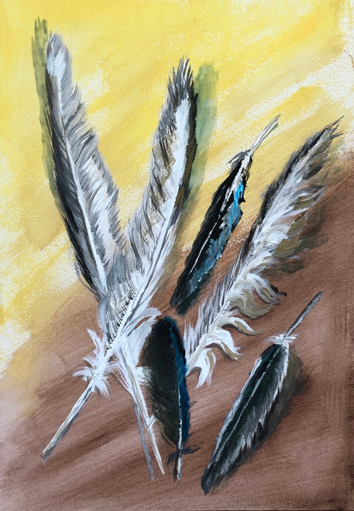
– How have artists assimilated their collecting into their own work?”The exhibition ranged from carefully assembled presentations, such as Edmund de Waal’s netsuke, made into artworks in their own right, through to Andy Warhol’s obsessive collections of unappreciated objects; apparently he shopped every day. The reviewer says “…each room has its own character as an opening into the psychology of a particular artist’s collecting obsession.”Reviewer Iranzu Baker (www.iranzubaker.com) was struck by Sol Lewitt’s 1980 work Autobiography, in which the artist documented his entire flat in black and white photographs, even down to the plugs. Baker remarks on the unbounded curiosity about the world around them which is revealed by these collections.Reading the articles and the reviews about this exhibition has made me reflect on my own collecting habits. Books are my main one – in my view, no house is complete without floor to ceiling books, dating back I think to my bookish only-childhood spent in the library, and maybe also to my Mum’s gradual blindness – books were her passion too, and the biggest loss that she mourned as her sight went. So, writing implements and notebooks, also. So I may not have to shop every day like Andy Warhol, but I cannot pass a bookshop, stationers or art shop without going in and buying something.I’m also a sucker for natural objects – sticks, shells, leaves, acorns – which sit around in plates and bowls until they disintegrate; and I can’t pass by a feather without harvesting it. People talk about feathers as gifts from angels etc, which really doesn’t chime with me – I think I collect them because my best friend at school (now a historian) would always turn any feather she acquired into a quill and used it to write with (she still does), so I suppose I have thought from childhood that feathers, despite their fragility, were useful and should be hoarded against a future need to write something down.
NOW WHAT?
All this made me dig out my vase of feathers and paint some of them. I had a stretched A3 sheet with an egg tempera ground (Naples yellow and Vandyke brown – recently acquired and wanted to see what they were like) sitting around. I chose to work in gouache – limited palette of permanent white, lamp black, neutral grey, raw umber and cyan. I started with size 2 rigger and fan brush, but they were too small for what I wanted – so did the vast majority of the painting in a half-inch soft flat.
Light coming from all ways – picture windows beside and behind, big skylights above – so shadow position a bit random, depending on the way the feathers were leaning on the table.
Tried to keep loose but directional marks and overlaid layers – gouache is really good for letting you do this quickly.
Likes: – Some of the brushmarks, especially where I’ve managed to get the right weight and feathery-ness (usually brush quite dry, but not always)
To improve: – Also some of the brushstrokes! – where I’ve got the brush too wet and then picked up too much paint, marks rather clunky.
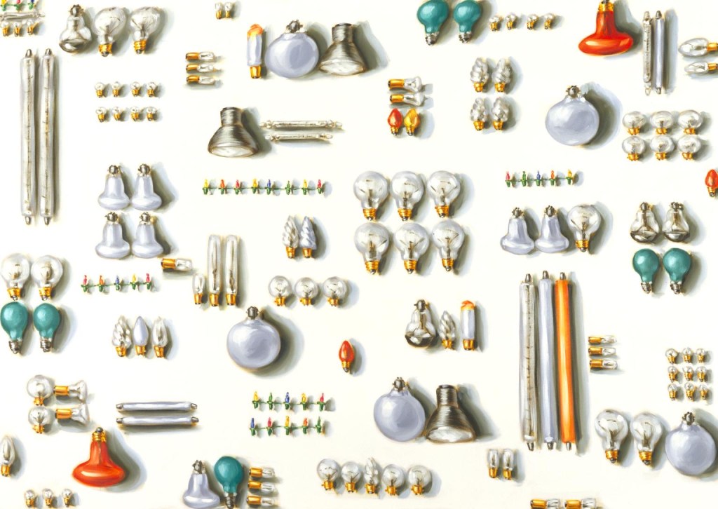
Lisa Milroy I found some of her paintings of collections. Objects like shoes didn’t interest me so I wasn’t immediately pulled in to those paintings, but I liked her grid layouts, the way she introduces very slight variations in placing to “make you look” – almost like those “spot the difference” puzzles – and especially this one:
“Light Bulbs”, 1988 Oil on canvas 203 x 285 cm Tate collection
Light bulbs don’t really interest me either…so I think I was drawn to this because:
– I do like round things.
– The variety of orientationsand groupings made the image something you had to decode, presenting the viewer with a challenge to get their teeth into.
SO WHAT?
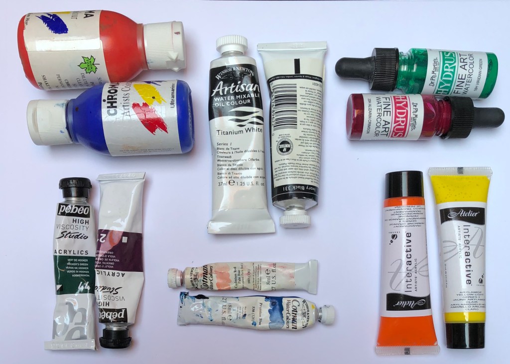
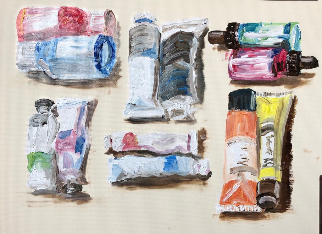
Having recently acquired a set of long handled oil brushes, I made myself a small grid of paints, varying the shape of container and the orientation, as Lisa had, yet keeping the neatness and control of the organisation. I broke out some Cobra water-mixable oils (white, lemon yellow, burnt umber, cobalt blue and pyrrole red), and set off, painting on A4 oil paper so that my images were roughly life size (as Lisa sometimes paints).
NOW WHAT?I have learned that:
– Painting with long-handled brushes is something I am going to have to work hard to get good at – my right arm (because of my previously broken shoulder) doesn’t have the freedom of movement, and my left hand/arm is just not used to wielding paintbrushes (although fine with charcoal!) and will need some training up.
– I enjoyed the loose mark-making possible with the oils, got really into the zone, and this is something I want to do more of.
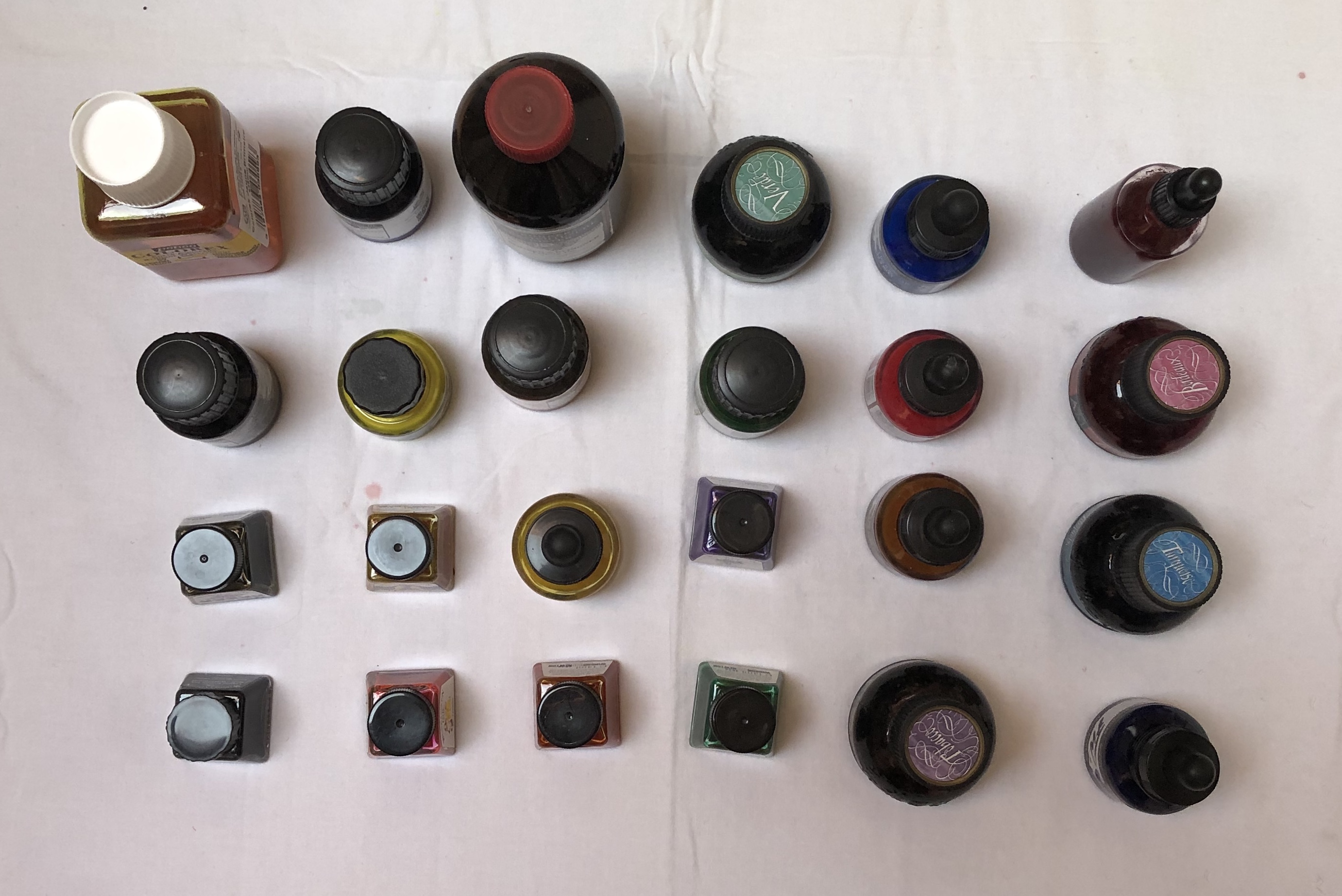
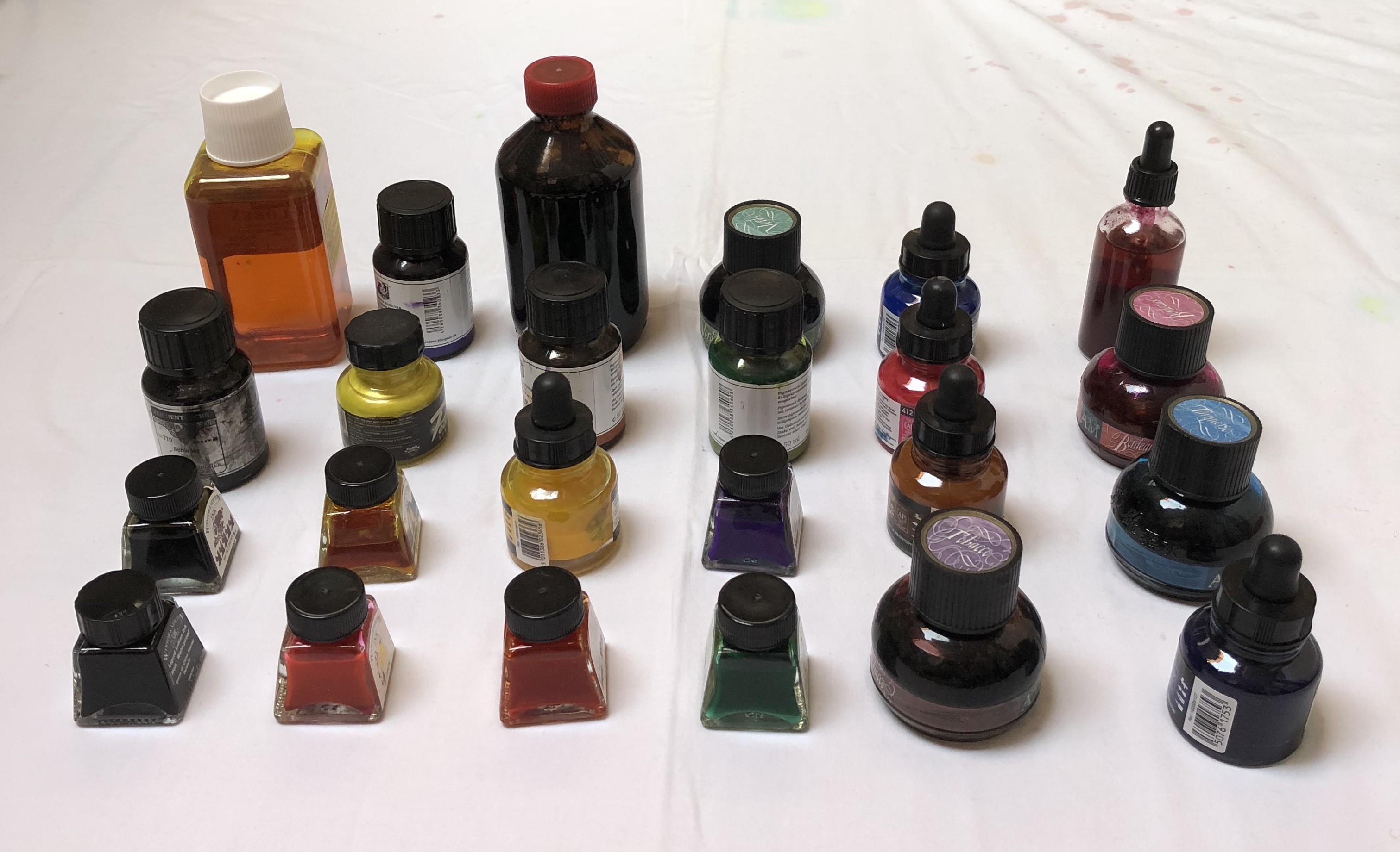
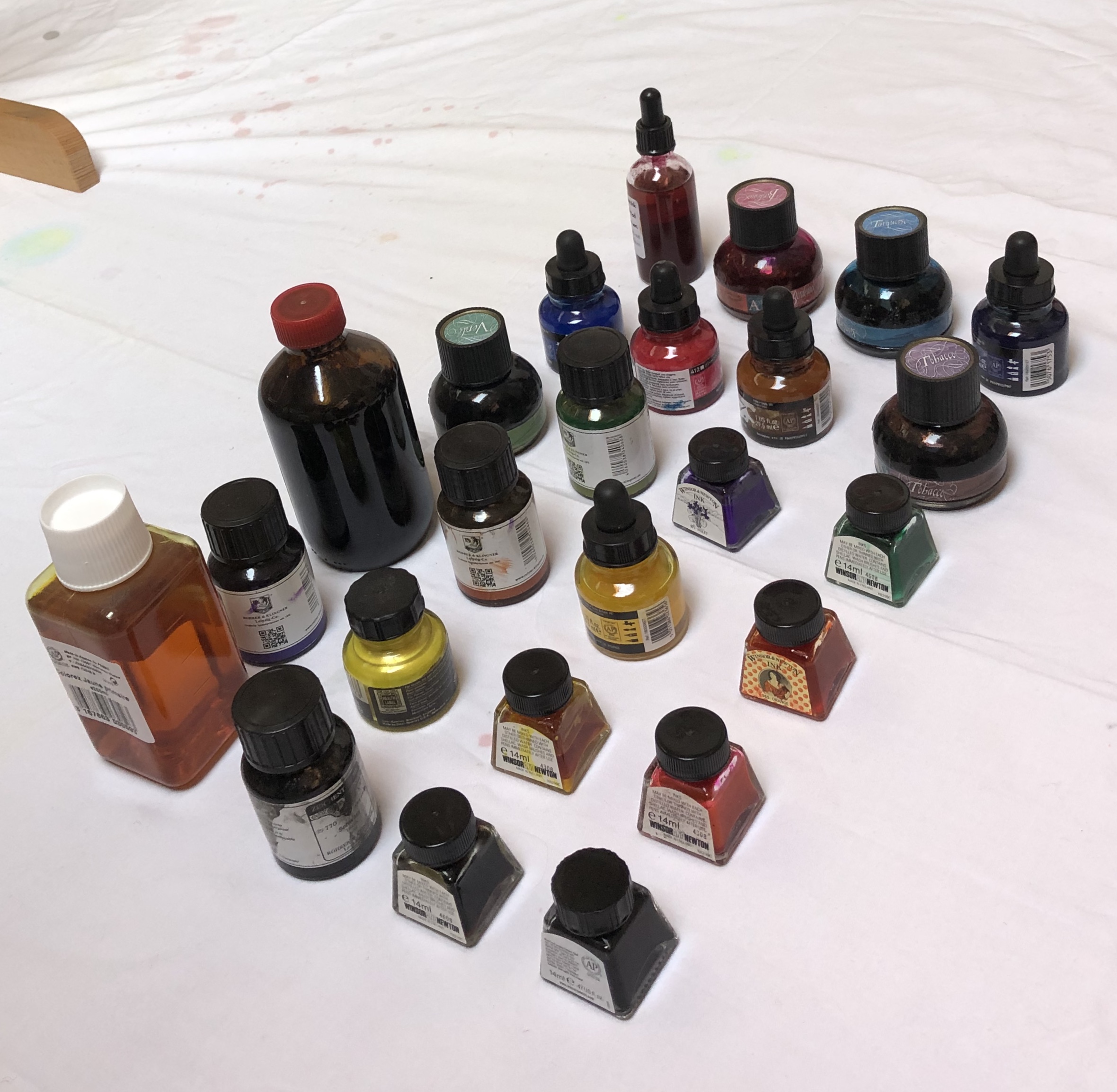
Lisa’s grid arrangements (see above) reminded me of a Zoom workshop through one of the OCA’s regional groups which I attended, led by OCA tutor Neil Musson “Building the unfamiliar with the unfamiliar in unfamiliar times”, 13.6.20. He talked about KNOLLING – sorting and arranging like objects in a grid, and gave us some examples from his own work and that of other artists – Motoi Yamamoto’s salt patterns, Cornelia Parker’s “Thirty Pieces ofSilver”, 1988-9, silver and copper wire, Tate Collection, and the sculptures of Tony Cragg, e.g.“Cumulus” , 1998 Glass 265 x 120 x 120 cm Tate collection
SO WHAT?I made a grid arrangement of bottles of ink on a white surface and photographed them from different angles:
NOW WHAT?
I intend to use these images as part of my reference material for the Exercises in Part 2.
**************************************************************************************** WHAT? I looked at the work of Tabitha Moses, particularly on her own website, www.tabithamoses.co.uk. Her collections are of sometimes unusual objects – article by Alex Michon (quoted on the above website) describes her as “a rag and bone archivist of the peripheral.” Her work often relates to her own experiences, either personal or her professional research.
SO WHAT?
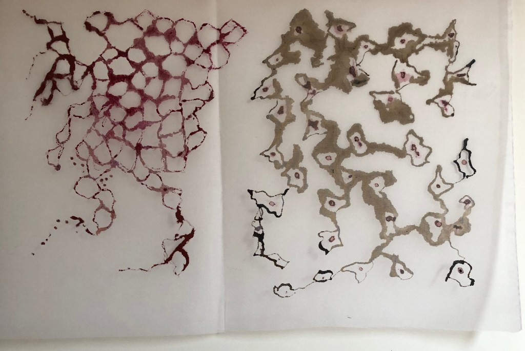
Having been for a rather painful blood test this morning resulting in several punctures of the skin, I was interested in her section of work looking at the skin as a threshold, which derived from her discussions with eczema and psoriasis sufferers.
After studying “itchy and prickly painful”, 2012, calico, sawdust, blackout fabric, plastic, thread, entomology pins from her Threshold: The sublime skin series (see website), I decided to use a piece of silk as a threshold and explore painting on to it with various media. The silk was loosely taped onto a glass table.
– Dr Ph Martin’s liquid watercolour, Indian Red, applied with the bottle stopper, gave a lovely blood-like gloopy appearance when applied – very satisfying. It sat on the surface for a while, gradually seeping in and spreading and eventually drying looking disappointingly less dramatic
– FW acrylic ink, sepia, again applied with the dropper, began to penetrate the surface straight away, quickly spreading – it only “blobbed” and retained clear lines where the silk was not touching the table
– Handmade natural dye pigment ink (Cochineal Red), dropped into the shapes drawn with the sepia acrylic, above, behaved very differently – it seemed repelled by the silk surface, I couldn’t draw with it, it just sat on the surface in droplets. Ithas only soaked in in a couple of places (where I think the acrylic solvent has undermined it), and has dried to an unappealing yet very convincing resemblance to clots of dried blood. Nice.
NOW WHAT?I have learned that: – a collection can be of quotes around an idea or situation – it doesn’t have tobe of actual objects – there is huge scope for investigation of a concept, eg. the effectiveness of asupport as a threshold
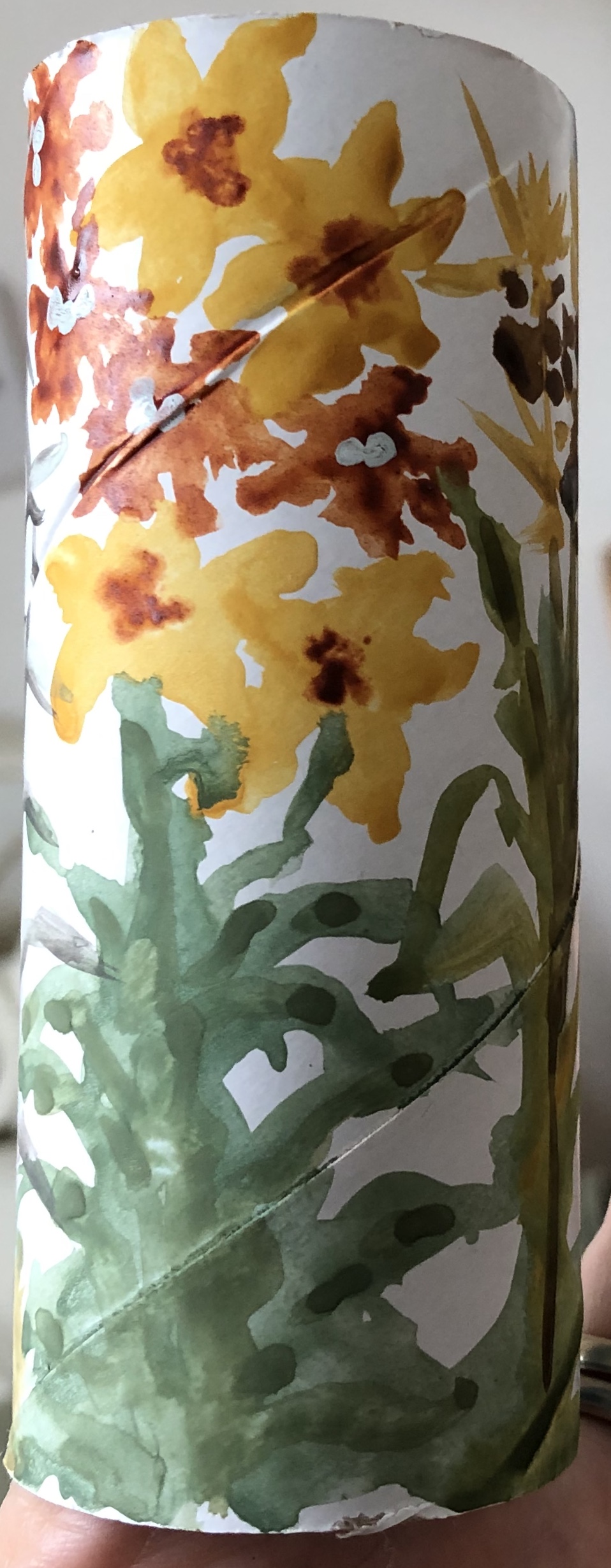
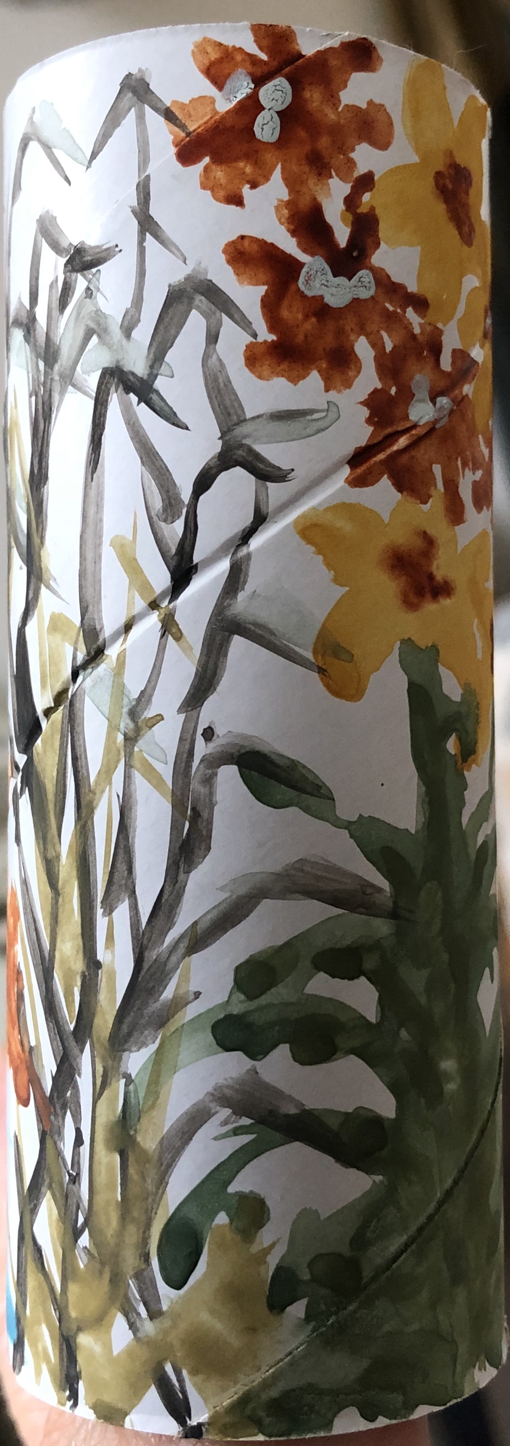
I looked at the work of Paul Westcombe on www.paulwestcombe.com and also on www.saatchigallery.com. His ideas are inventive – to create a work of art on something usually considered “throwaway” like a paper cup or a ticket, i.e. to give a value to something otherwise valueless (although the saatchi gallery suggests that this is actually not the significance and his work is simply a demonstration of his compulsive need to draw) – and the pieces are colourful and inviting to the initial glance, although his subject matter did not appeal to me close up.
SO WHAT?
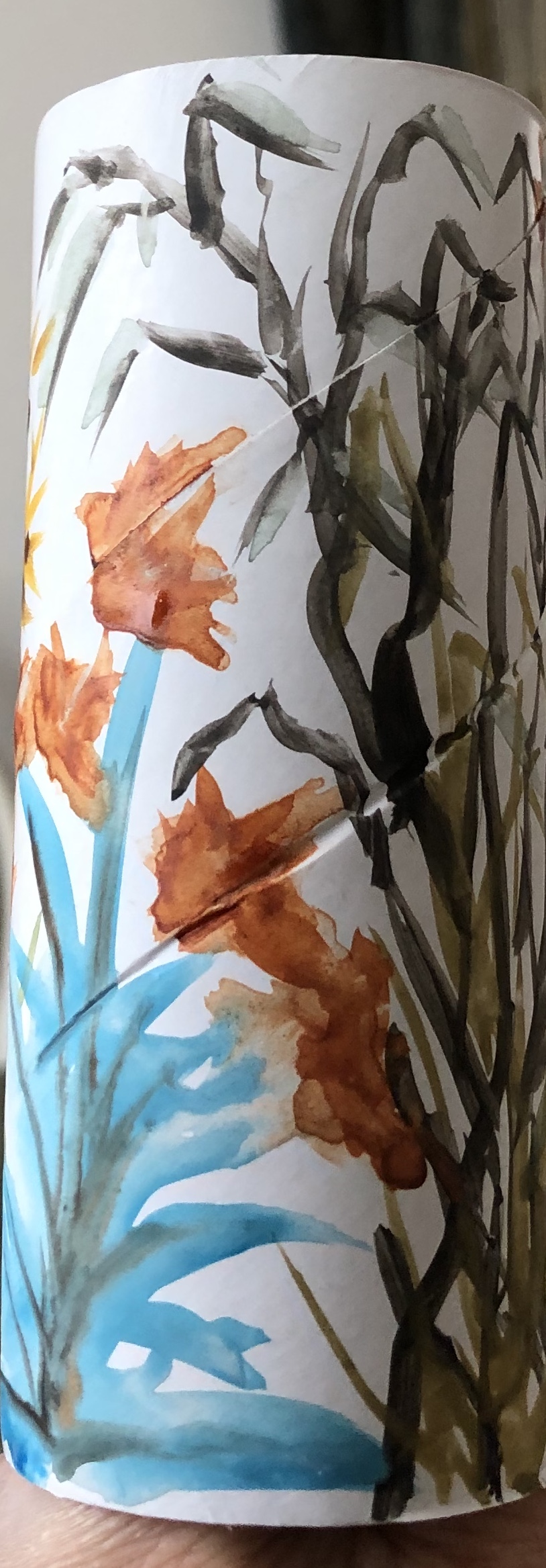
Wasn’t quite sure how to respond to this apart from the obvious – only had a cardboard roll to hand, so tried a quick design on that of plants in the garden with leftover gouache paint in my palette plus raw sienna and burnt sienna watercolour.
My design was very adaptable to that tricky part of painting round a cylinder, i.e. meeting up with where you started – and hats off to Paul W, he was doing figures telling a story of sorts on a truncated cone, so he must have developed a technique for dealing with that.
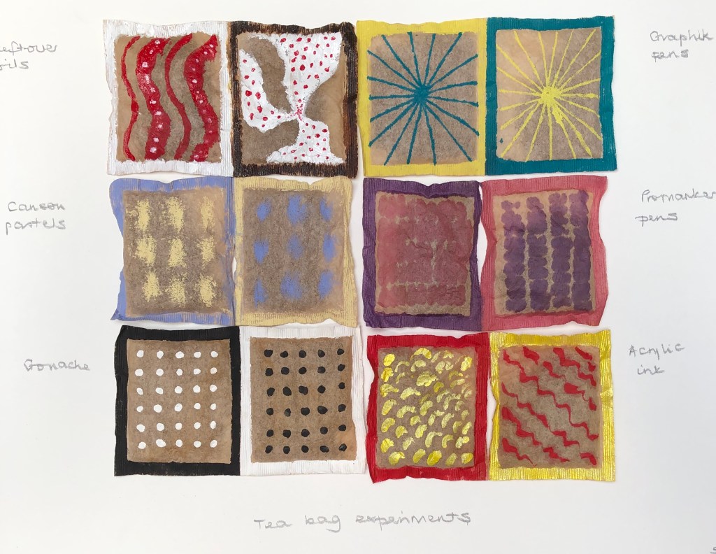
Also had some old dried used teabags (still containing tea) so tried a design on those (using various media – oil paint, Promarkers, Graphix pens, soft pastels, gouache and acrylic ink)….but felt I was playing around with random detritus because I had to.
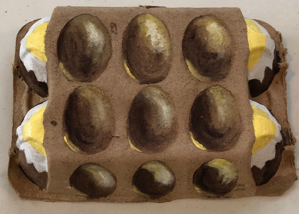
Had a bit of a breakthrough with an empty eggbox though which I was just about to put out for recycling – decided to paint eggs on it – using egg tempera (what else?!) using white, Naples yellow and Vandyke Brown. It is rather surreal (my husband says it’s “a bit Dali”…not sure if that’s good or not), but I was pleased with my eggs which are reasonably 3D – it is displayed on my shelf.
NOW WHAT?
I have learned…. – I’m potentially going to struggle with the “off-piste” aspects of this Part – it’s not apparently in my nature…or rather, it feels a bit like the sort of thing I would have done with the children back when I was teaching, and therefore not proper “Art”. Guess I need to loosen up a bit and let go – I did enjoy the eggs, so it can be done.
I looked up the Ornament exhibition held at the Transition Gallery in Huntergather, London, Oct-Nov 2013, and found examples of painting on handbags by various artists, including Cathy Lomax and Alli Sharma.
They have all painted to the theme of handbags as part of female adornment, whereas I decided just to experiment to see if I could actually physically paint on a handbag, and how this might be done.
SO WHAT?
After a recent sort-out we had a few bags which were designated for Oxfam – including one small leather/leather effect handbag (not sure which) – so this was my experimental support. The surface had a kind of raised floral chasing, so I decided to try and create some fantastical and shiny flora, in the style of Raqib Shaw (not following the existing chasing). I picked acrylics for robustness when dry, choosing some old Chroma acrylics as they were fairly liquid – this way I thought I would be able to apply them easily undiluted. I wasn’t sure if I needed to prepare the surface with gesso or something beforehand, so just went straight in and tried applying the paint so see if it would stick; and it did. It sunk into the surface a little but not too badly, retaining most of its wet colour.
Pleased with this, I thought I would go the whole Raqib-Shaw-hog and add sparkle – the gold acrylic ink stood out much better than the silver watercolour silk ink I tried, but even that showed up reasonably, although better when applied over the top of the dried acrylic paint.
NOW WHAT?
I have learned:
– Making up doodly out-of-my-head images is not a strength, I am better at painting “something” defined – my foliage and flowers are more folk art than fantastical Raqib Shaw.
– I should not dismiss supports other than paper/board/canvas as too difficult to try painting on.
Julian Walker has made some interesting collections. I thought his: Detail from Collection: Acts of Faith by Julian Walker(Series: Living with medical science), 2003object, Hand-carved pills, glass and board Medicine Now (Permanent exhibition) 2015-16 Wellcome Collection, Londonwas fascinating – he has taken all sorts of pills and carved into them the part of the body they are intended to fix (based on a
medieval doctrine that the efficiency of a medicine depended on how closely its shape resembled that of the ailing body part). Appealed to me, as the taker of many pills!
I also enjoyed his site-specific collections, such as this example: Collection: Norwich Street A site-specific installation for the offices of Macfarlanes,
10, Norwich Street, London EC4 Joint First Prize-winner in the 2002 Art & Work Awards
He has taken ordinary everyday objects and turned them into a work of art by his meticulous
arrangement.
SO WHAT?
I laid out in a grid and photographed some objects from my drawer of bits which I fondly imagined I would use as props for drawing or painting one day. To make it more Julian Walker-ish, I would (a) give the relative placements more thought (as to what went beside/above/under what) and (b) consider something to make each component individual as well as part of a whole, e.g. a label with place of finding, or a quotation from a poem….possibilities are endless
NOW WHAT?
– This whole “grid” mentality is interesting…I am a very organised person and it is second nature to me to arrange things tidily in grids…..so the making of grids from collections of things is going to be my ideal…..but on the other hand, I am rather an impatient painter, and am aware that I can be a bit “right, done that, what’s next?”. Painting a few things as a collection in a grid should be fine (e.g. the paint tubes and bottles in the Lisa Milroy section, above)…but will I become a bit frustrated with a bigger collection in one picture? I thought back to the 20-piece work I did for Assignment 1, but my interest was maintained throughout that by the fact that each individual picture was very different. Self-knowledge can sometimes be an unsettling thing….
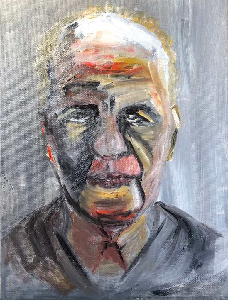
I looked at several of David Dipre’s paintings online, particularly on www.saatchiart.com. His favourite subjects are portraits, including self-portraits, with heavy impasto brushstrokes.
SO WHAT?
I had been studying the work of Frank Auerbach and, as part of my practice reflecting on my tutor’s feedback on Assignment 1, I had tried an oil portrait of Auerbach painted only from a drawing (see separate blog post).
I decided to use this painting as a basis for a new painting in the style of David Dipre. My support was a small thin wooden pot (previously used to hold a Camembert), and I wanted to paint the right-hand side of the face (as you look at it) onto the side of the pot so that you had to turn it to get the full image.
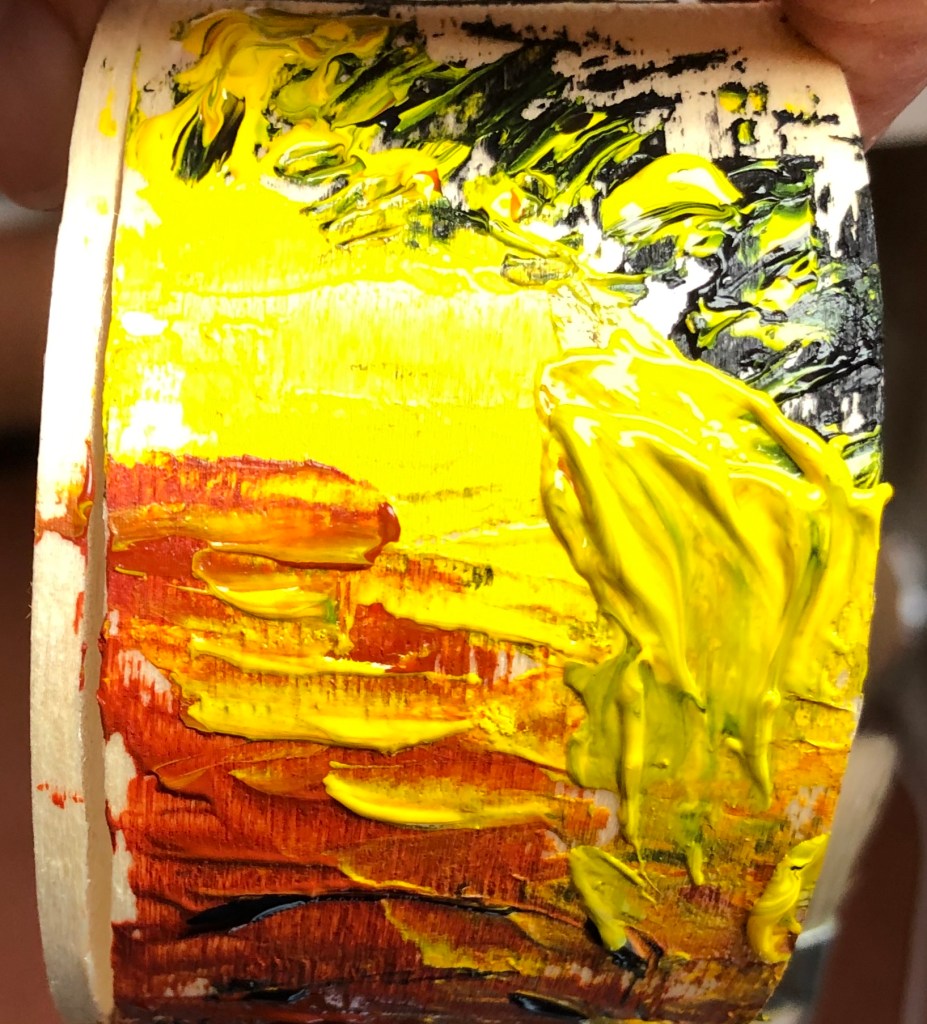
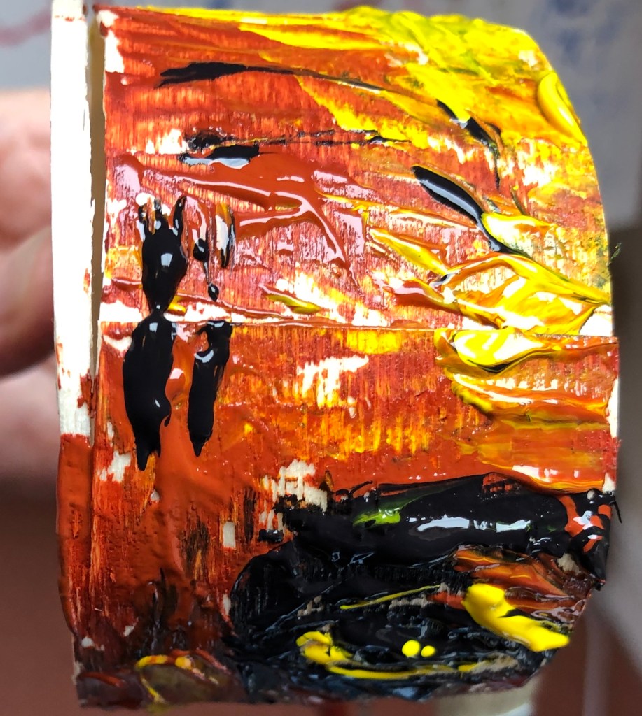
I used acrylic paint in a limited palette of three colours (roughly based on the Zorn palette work I had also been doing as part of my “feedback” action points) – Payne’s Grey, Burnt Sienna and Cadmium Yellow. Using a springy palette knife I applied the paint thickly and quickly, going more for an impression than a faithful representation.
This is the start – top of the head and hair, moving down to forehead wrinkles…..
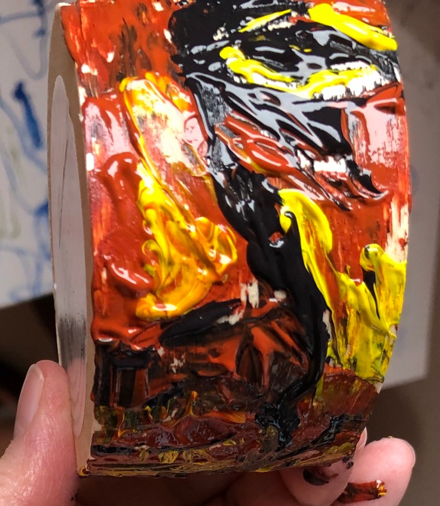
down to eyebrows and mid-brow furrows…
…..eye and nose….
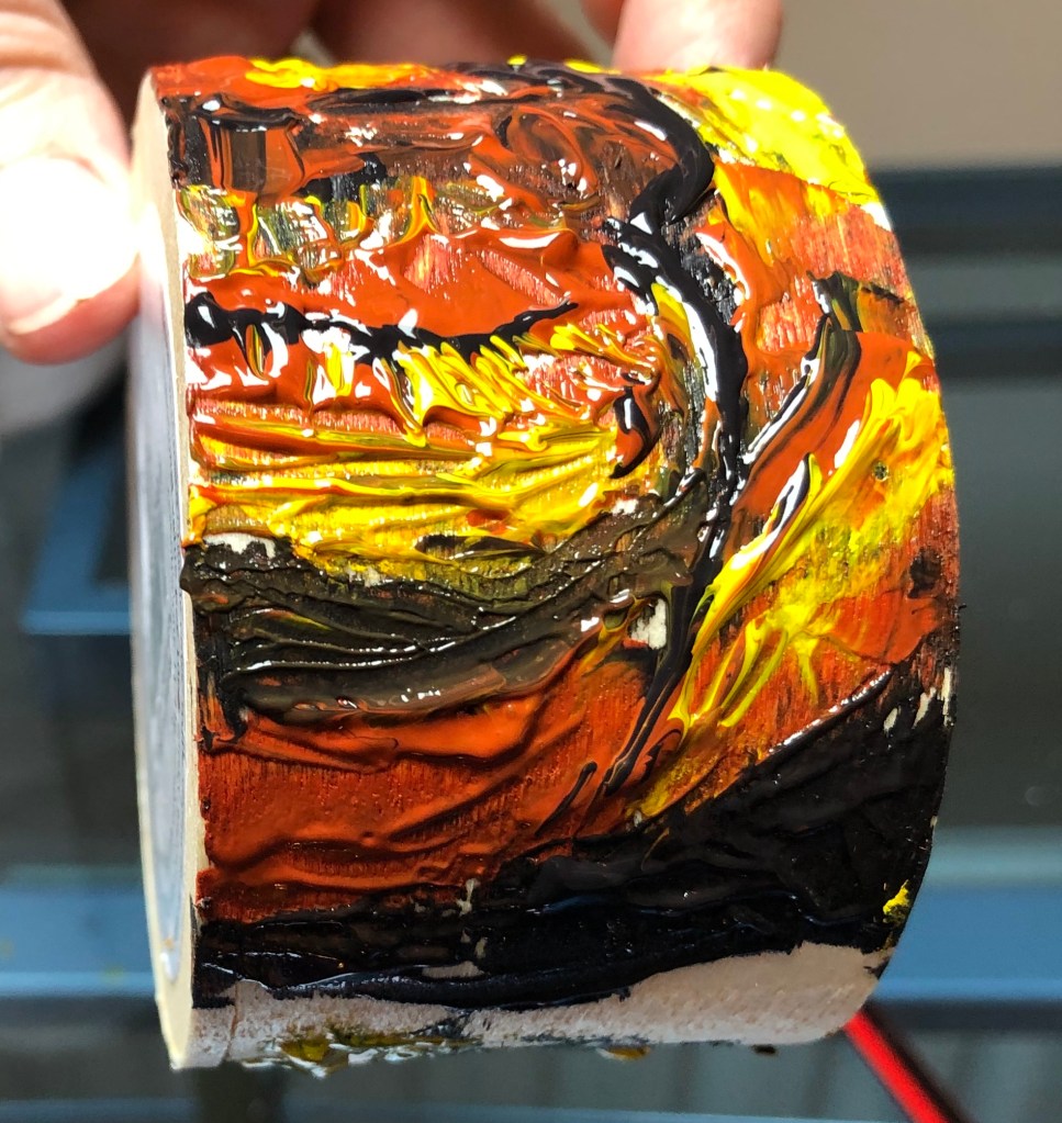
…..mouth and chin – you can just see the start of the hair at the top of the head starting again at the bottom.
Some bits went well:
– Enormous fun
– Eye and nose
– Overall placement, i.e. it filled the space and was reasonably wellproportioned ….and some less well:
– Mouth and chin
– Green hair (grey and yellow mix)
NOW WHAT?
– I’m gradually getting into the idea of painting on non-traditional supports – am starting to look around my studio and think “Hmm….wonder what it would be like to paint on that…..”
– I have been trying to make paintings being decisive and economic following my feedback from Assignment 1. “Decisive” is going well and I am feeling bolder about making bold marks. “Economic” is going less well, for two reasons:
– In trying to loosen up my mark-making I have got into a “go for it” trance-like mode, when I’m in the moment and almost instinctive rather than thoughtful – it all has to happen now
– I’m aware of the above and I have tried to make myself pause, step back and take note, when I’ve completed the image if not before – but when I’ve done so I’ve found a “decisive” mark which I don’t like, and am then in a dilemma as to whether to let it stand as honest and authentic, or sort it out, which is when I fall to tweaking and fiddling and trying to wipe bits out and the thing becomes a bit of a mess and decidedly un-economic.Not quite sure how to sort this out…more practice…? ******************************************************************************
WHAT?
Lee Edwards’ work is quite wide ranging, but I particularly enjoyed his little figures emerging from wood, e.g.“Fades to memory”
2011 Oil on oak 18 x 15 x 2 cm seen on his website, www.leeedwardsart.co.uk
I like the way he has used the pattern of the support as part of the image, almost as though his figure were conjured up like a genie from under the surface.
SO WHAT?
Seems a bit of a trite connection, and I do want to try painting using wood like this for a support later, but for now I had just received a few tiny pots of Humbrol enamel paint – so was looking for a tiny project to try them out. An interesting cork from a wine bottle was my support, and I applied my paints using a rigger. The paint sticks well to the surface, but really doesn’t do well mixing with water and I got my brush into rather a mess and had to find some turps, which I hate, at the back of a cupboard to get it clean (I have ordered some Zest-It as I enjoyed the vibrant colours of the paint and want to experiment with it more).
NOW WHAT?
– Well, painting as small as this certainly makes for decisive and economic mark making! – The enamel paint has a solid opacity to it
which I find pleasing – it’s a bit like liquid gouache or runny acrylic. I have bought a small and quite random selection of matt, gloss and metallic finishes, so will be interested to play more and see if I can tell the difference once the Zest-It cleaner arrives.
– The paint is quite smelly which might prove an issue for me personally due to my asthma; however, I have been attracted to the enamel paint pictures by Raqib Shaw who does get some very vibrant effects, and I hope to be able to achieve something working towards his style (if much less detailed and intricate!).
Really glad my tutor found the images to be a coherent whole
I can see what my tutor means by saying I could have pushed aspects like tools, gestures and grounds further – I did get a bit buried in working in the original artists’ styles and lost sight a bit of the main focus of my learning – although I think I did learn a lot from trying all those styles (just possibly not what I was supposed to be learning!)
Feedback on assignment….
Demonstration of technical and visual skills
Quality of outcome
Demonstration of creativity
NEXT ASSIGNMENT: note to self – make own work, not derived from other artists – use what I learn from them to create something completely my own
Sketchbooks….
Demonstration of technical and visual skills
Demonstration of creativity
I need to get some tone into my continuous line drawings, which are MUCH better when I keep them loose and flowing and don’t fall into my fussier default of broken scribbly lines
In other words, have confidence in my observation – look carefully, make bold clear lines – decisiveand economic are the watchwords
Interesting that tutor recommends “research into painters’ drawings” (my italics) – I have so far in Drawing 1 done drawings as ends in themselves and not really thought in terms of drawing for painting
I will practise drawing, adding tone, and lifting out with a rubber so that I can see how to be decisive and economic with my brushstrokes
Need as a bit of a priority to look at colour mixing – will follow up guidance given. My experience thus far, prior to Part 1, was with watercolour, and a lot of mixing on the paper by dropping colours in – I do need a system to help me be more organised using a palette.
Tutor makes the point that I am not consistent in looking back to my learning points and using them….I was aware of this as a problem in Drawing 1 where I would hop from thing to thing; have tried to get better and follow things through, but obviously haven’t achieved this sufficiently.
SO, IMMEDIATE ACTIONS:
Look back over my evaluations to understand what I haven’t taken forward enough
Waddington Galleries, London and The Saatchi Gallery, London
Not sure I’m reading this one right, but it was one that I liked because his use of the fruit shadow twice makes me think that someone is going to walk through the yellow door, thinking it’s all OK because they can see the shadow of the fruit and yes, there it is – but then suddenly the second darker shadow jumps out behind them, as if it’s been lying in wait.
Yes, I know I should take more water with it…..
Gary Hume – Four feet in the Garden
1995
Glass paint on aluminium
Arts Council Collection, South Bank Centre, London
This one appealed to me as it reminds me of one of those “optical illusion” pictures – is it a picture of feet, or is it a picture of two old crones with long noses and warty chins facing each other?
Not sure it’s something I’d immediately be tempted to have a go at myself, although admittedly the image does draw you in and make you take a good look at it and ponder.
Gary Hume – The Flowered Hat
2002
Gloss paint on aluminium
The artist and Jay Jopling/White Cube, London
This one, however, is something which did appeal to me as a style which I might think about trying to develop. It’s called “The Flowered Hat”, but to me it also looks like a flower arrangement on a white tablecloth with long lacy curtains behind.
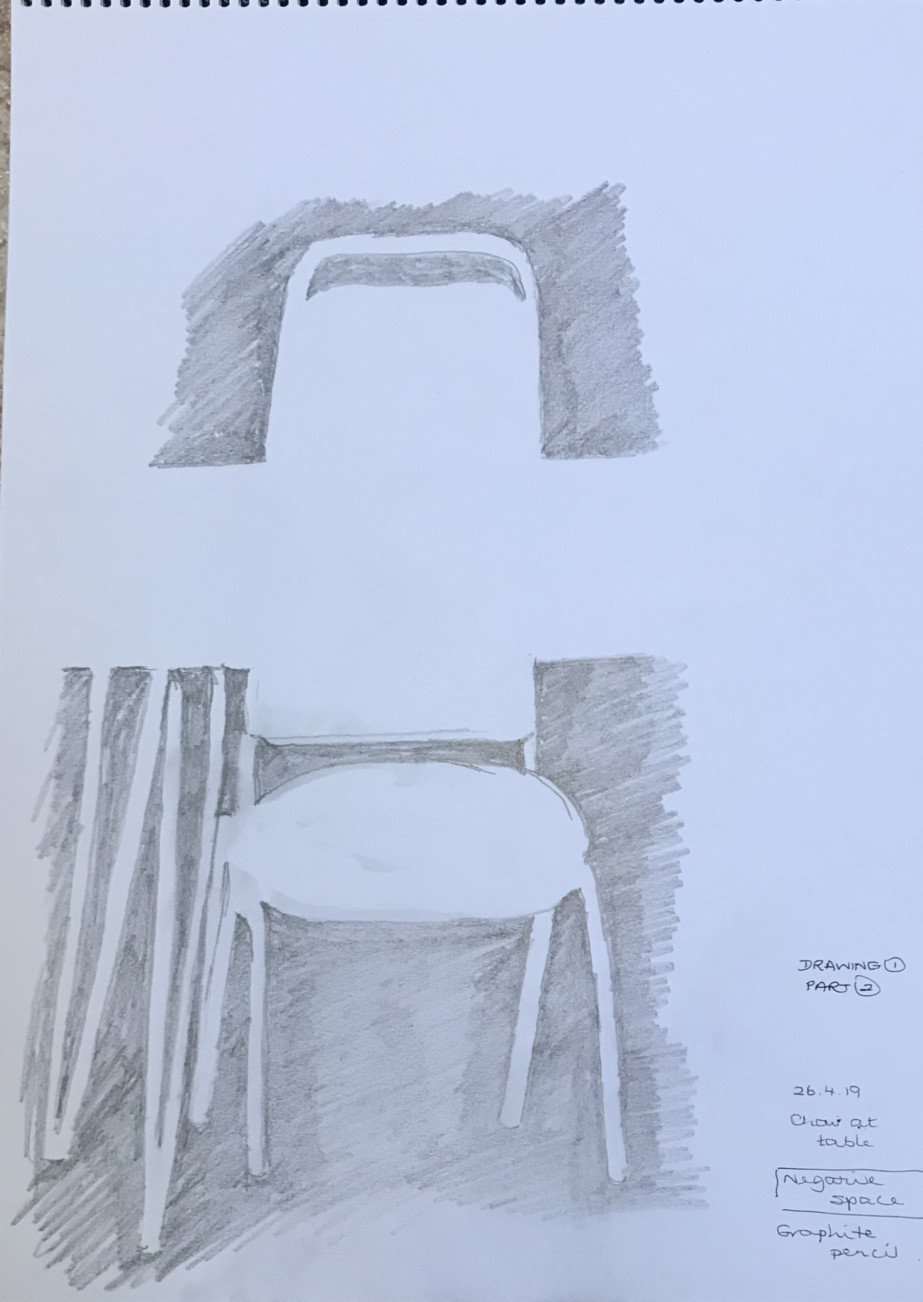
At this point I thought I ought to try and get my head around negative space. As always, I went in at the deep end and thought I would try a negative space version of Van Gogh’s Sunflowers, thinking to do something a bit Flowered Hat-y. Needless to say, I found it really difficult to look at the spaces rather than the flowers, but actually the complex subject broke the negative spaces down into small manageable bits so that, although the proportion is out in places, the overall effect is recognisable, I think, although I was so traumatised by the concentration needed that I didn’t get anywhere near adapting it to be Hume-like. Instead, I tried something a whole lot easier – a chair and table – more within my capabilities. Quit while you’re ahead.
Negative space is something I’m struggling to get to grips with example-wise; a lot of the things I have found have been in old printed posters (e.g. those by William Nicholson and James Pryde, who signed themselves J&W Beggarstaff after the name they had seen on an old sack – see article in my cuttings folder about the recent exhibition of their work at the Fitzwilliam Museum, Cambridge, May-August 2019), or in work like linocuts (see e.g. article by Rosemary Waugh on the work of Paul Catherall as seen in Artists & Illustrators magazine, November 2018, pg. 56-9).
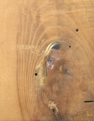
I thought this image (by Kinska from My Opera House exhibition, 4th July-22nd September 2019 at Now Gallery, taken from Aesthetica Magazine, June/July 2019, issue 89, www.aestheticamagazine.com) showed how clever our brains are at interpreting minimal images (the black on the right clearly being intended as her hair, whereas the black on the right is just space); but then I looked at a similar (but different) image by her from the pages about her exhibition on www.nowgallery.co.uk, where this wasn’t the case and the space on both sides of her face look like hair just by being a slightly different shape…..clearly our brains are very nuanced and bring a lot of extraneous knowledge to their interpretation of images!
But there is hope for me yet on my understanding and use of negative space – it’s gradually seeping into my psyche. The other day I was down by the River Tavy with the granddaughter – she was busy skimming stones, falling in the water, etc while I thought I’d do a really quick scribbled sketch of the view down the river. It was late afternoon/early evening and the sun was shining down through the leaves, making some really bright, almost gleaming, whilst other bits of the view were in dark shadow. I was struggling to depict this when I had my eureka moment – just scribble in the dark shadowy negative spaces! And it worked (see above)…even if very scribbly…but at least I can see what I meant….
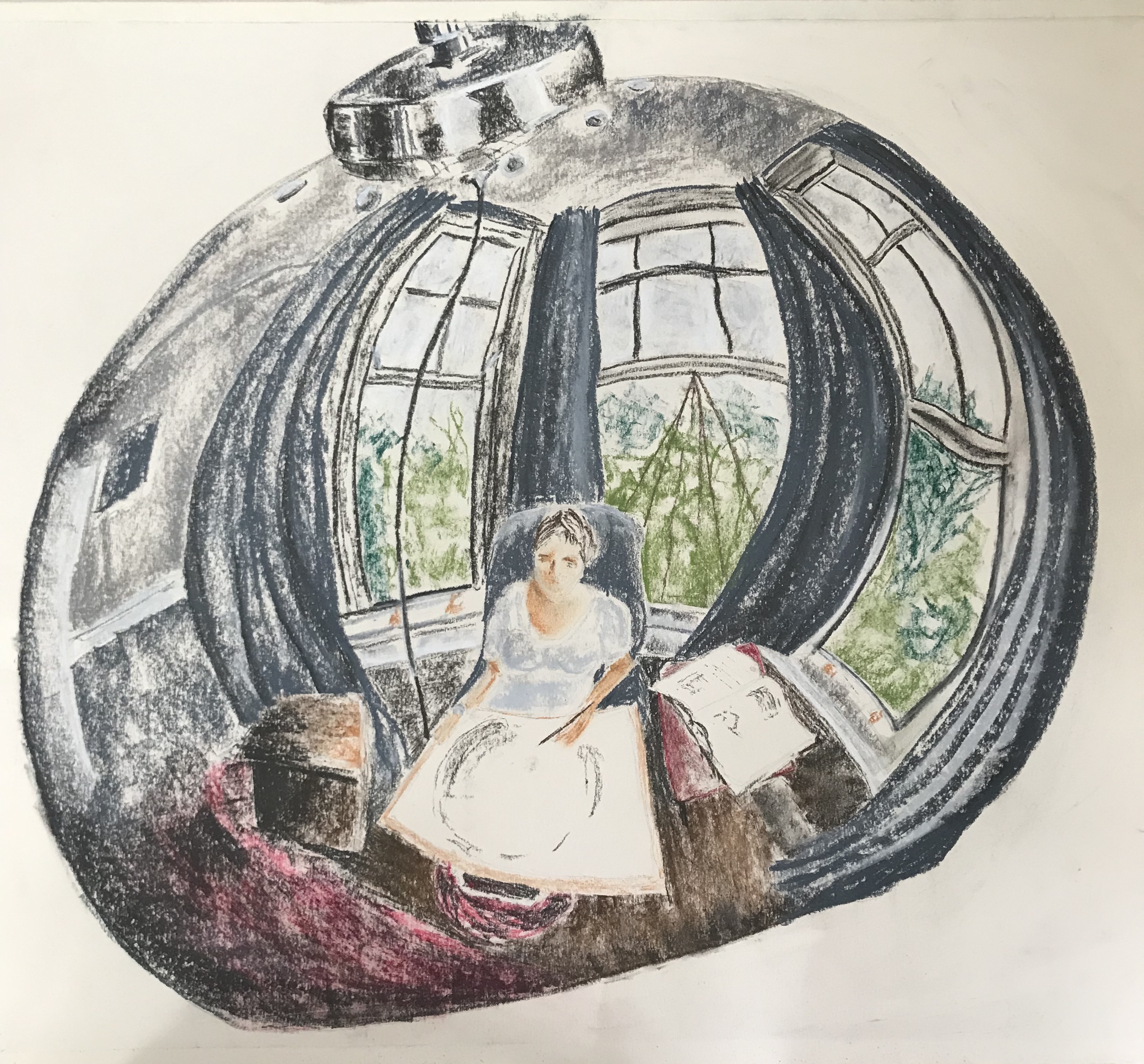
I agonised for a while over the choice of material for this picture. Had the format been smaller (A4 or less) I think I would have gone for something I felt confident with, such as ink with a light wash. However, I had been asked to work on a large scale and, on looking carefully at my subject, the reflections in the curved metal were very slightly “fuzzy” and not always true, i.e. small dents in the metal caused various distortions and wobbly lines. I decided to go for Conte crayons, as they would give the varied and “un-crisp” lines I was after. I had originally intended to work just with the greyscale crayons and add a tiny bit of watercolour or ink wash for the blues, reds and greens; however, when I got to that stage, it felt more appropriate to stay with the crayons…so, another change of mind!
I have to say, I am really pleased with the outcome, it is better than I had hoped for or envisaged. There are of course lots of niggles – e.g. the lamp is not quite symmetrical despite my best efforts (I drew it in 2H pencil and rubbed it out about 15 times!!) – but I think the overall effect is striking and I hope it draws the viewer in to try and identify details.
I was concerned that I had chickened out a bit of tackling my bete noir, perspective, but this image had other challenges thrown up by the convex surface, mainly because nothing was quite where you thought it would be. In several places, I found that the curvature really exaggerated the perspective, thus helping me out. A real learning curve! Terrible pun, apologies.
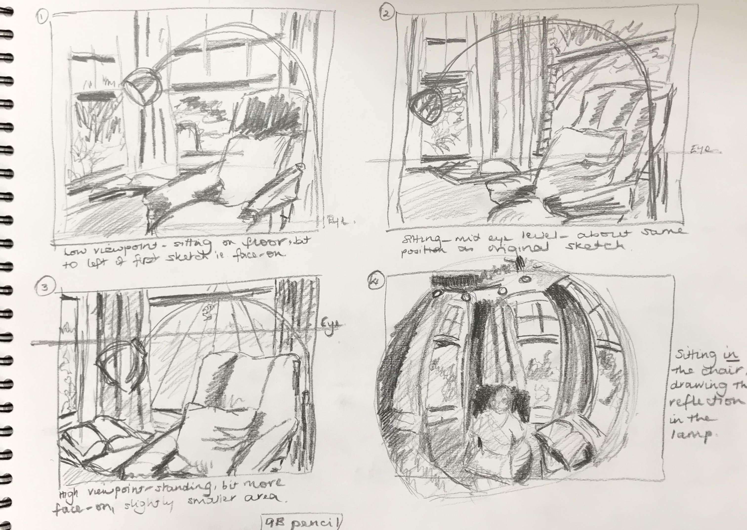
I tried playing about with different angles (to the side, straight on) and different viewpoints (sitting on the floor, sitting on a chair, standing) in small sketches using a 9B pencil. They all had their merits – I liked the diagonal lines of sketch 2, but was intrigued by the slightly more cropped and manageable face-on composition in sketch 3; sketch 1 I had almost dismissed as soon as I sat down to draw it, but I can see that the foreshortening of the chair would have been a good test.
Then, oddly enough, while I was deciding where to do my fourth sketch from, I realised that, in each of the preceding sketches, I had drawn the whole picture and then added the lamp in, almost as an after-thought, to literally round each picture off. Of course, half the time I hadn’t left a space for the lamp so was drawing it over what was already there, thinking that when I did the proper drawing, I would need to have a better look at the lamp.
Inspiration struck then when I actually took the time to look at the lamp, and I realised I could get the whole view in one fell swoop in the lamp’s reflection. The downside was having to include the artist (who was wearing her most unattractive and slouchy, but comfy, art gear) – but no gain without pain. I had a go at it, and have decided to throw all my reasons for choosing this corner slightly out of the window – now there are no straight lines at all because of the curvature of the surface of the lamp, and the different textures will not be quite so much of a challenge as hardly any of the chair is clearly visible (although I’ll still have to get to grips with the fabric of the curtains). I really liked the overall effect, so have decided to work up this sketch into the final drawing. I didn’t really feel that decisions about portrait or landscape came into this as I think that the important thing is that the lamp head just completely fills the page – so will probably go landscape as I think the lamp is slightly wider than it is tall. I experimented a bit with cropping in the sketch, and I might shave a little of that bottom left-hand corner off as the reflection is quite blurred there so it’s hard to know what you are actually drawing. However, I want to keep it really clear what the overall object is, so I think I won’t crop the top as this is the bit that makes it obvious that it’s a lamp.
As promised in the text, this exercise was a bit of a roller-coaster ride.
Good things about it:
I have finally got the hang of the importance of viewpoint (hooray!)
I have appreciated the wealth of subject matter for drawing within my house – I feel as though I literally need never step outside my door again to find something to draw!
I do feel that the free-er approach to drawing ellipses has loosened me up and I am beginning to feel much more confident with these now
Less good things about it:
I have realised what a challenge perspective is for me – I am hanging on to the strategy of “drawing the eye-line first” for grim death
I have struggled with proportion – I think this is particularly where I have become dragged into detail – so I draw the object a bit bigger so I can get all the interesting detail in – and then it’s too big and the whole picture ends up skewed. And even though I recognise this, I can’t seem to stop myself from doing it…..
The light at the front of the house is difficult to manage – it is south-facing, so when the sun’s out you get great shadows, but then it goes in and the whole scene looks completely different. By contrast, the back of the house (which includes the garden room, where I have hitherto done a lot of my drawing) is north-facing – so the light is much more reliable, but doesn’t give such good shadows
I have annotated the drawings in my sketchbooks as I’ve gone along with my feelings about the subject-matter (have tried to keep it suitable for polite society) – but where things have gone wrong it is almost invariably an issue with perspective or proportion (one generally leading to the other). I have largely followed the advice about going for corners as they are more interesting – in my house this has more often than not involved doors or windows, which I hadn’t particularly considered before as a subject for drawing – they are quite intricate when you look properly at them! – fortunately ours are all quite similar so I’m starting to get the hang of them.
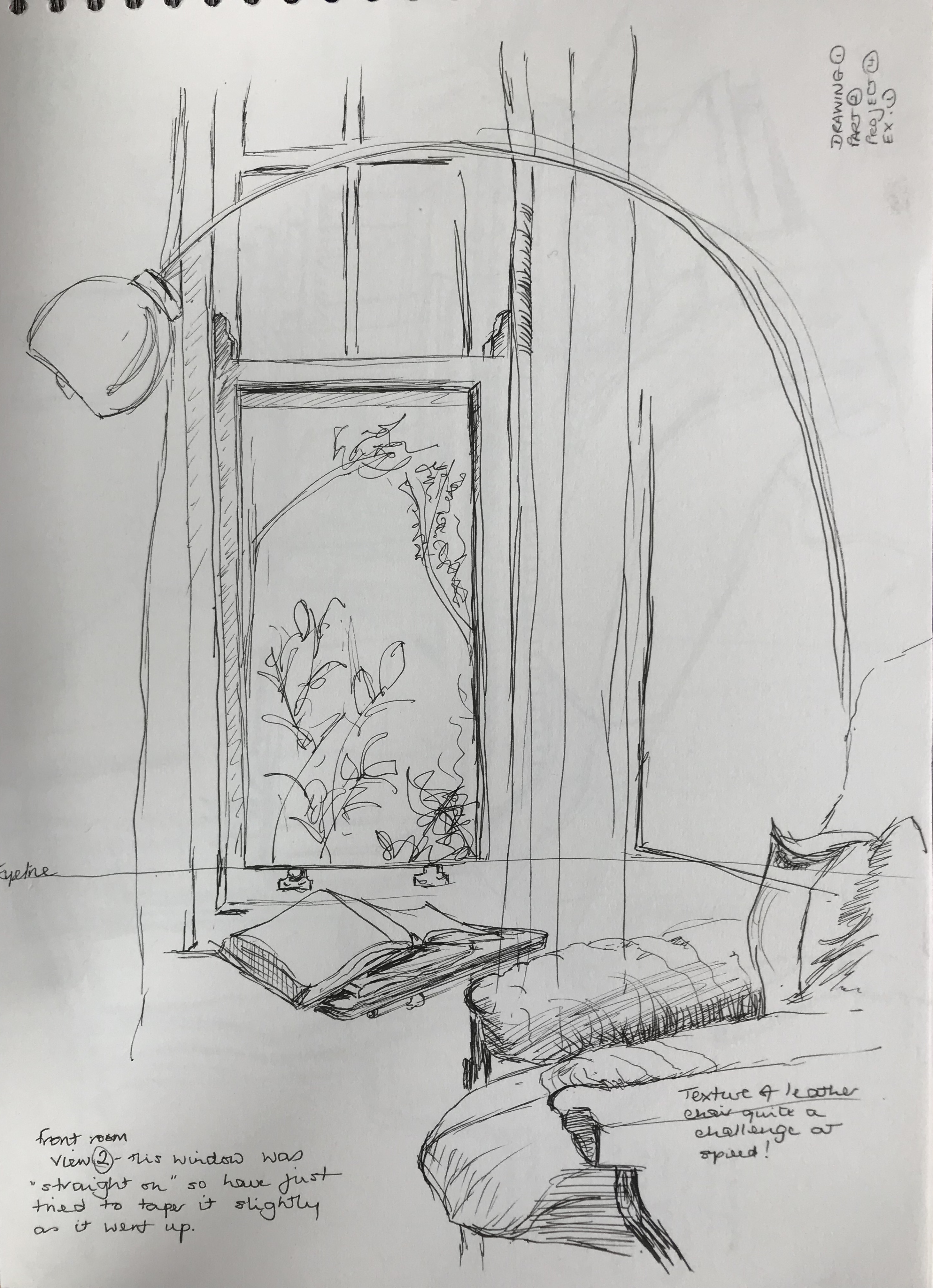
As far as choosing an area to work into a finished picture…some things I have tried (e.g. the staircase) have proven just too complex for me at the state I have reached – I have to say that it was when I was trying (and failing at) the view down the stairs that I really appreciated the complexity of Anthony Green’s Study which was given in the Research point – he must be quite something to have unravelled all that! On the other hand, I wanted to pick something which would push me a bit rather than playing safe. Hence I have chosen the bay window corner in the front room (view 2).
I’ve particularly gone for this one because:
I always like sitting in the front room, it’s light and has a good feel to it
This corner has a variety of shapes – the straight regimented lines of the windows contrasted with the folds of the curtains and the mass of the swivel chair, along with the arcing semi-circles of the lamp
There will also be a range of textures to convey – all through my notes on this exercise I’ve been saying I need to do a lot more work on depicting fabrics and leather…so here it is….
The Anthony Green image to which I was directed in the text is lovely, hugely detailed and would be a brilliant, highly-personal birthday gift. It captures the room perfectly – you feel that you are being parachuted in through the opening ceiling, a bit like Thunderbird 2. It reminds me of the Hockney and the Picasso images which I looked at in the research into the history of still life at the start of this Part, except that, despite the bright colours which initially give you the impression of something almost child-like, this has been carefully thought through – if all the flaps and folds were pushed back into place correctly, you feel you would have a perfectly assembled room with the correct proportion and perspective. Impressive. Way beyond me at the moment, but…….
In my sketchbook I have scrapbooked some images of pictures, including some photographs, (see flagged pages in A3 scrapbook for annotations) which have made me look towards my Assignment in two respects:
Overall composition and importance of viewpoint…..hitherto I have thought a bit about composition and very little about viewpoint, which is part of the reason why I haven’t really grappled very well with perspective, as I’ve tended to draw things which are right there on the table in front of me. I am beginning to appreciate the differences which a high and low viewpoint can bring (quite apart from anything, they are often exaggerating the perspective and making it easier for me to see and draw).I have gone off-message slightly in my research into and collection of images as I find that, as I have gone through Exercise 1, I have been drawn to windows and, particularly, open doors; this started as a bit of an exercise in getting the perspective correct (which is still frankly a bit hit and miss), but has led me on to an interest in the “possibilities” offered by doors and windows, both composition-wise (diagonals etc) and also asking-a-question/telling-a-story-wise. Hence my image collection became increasingly skewed in this direction, and I should like to explore it more as I go through this project and final Assignment.
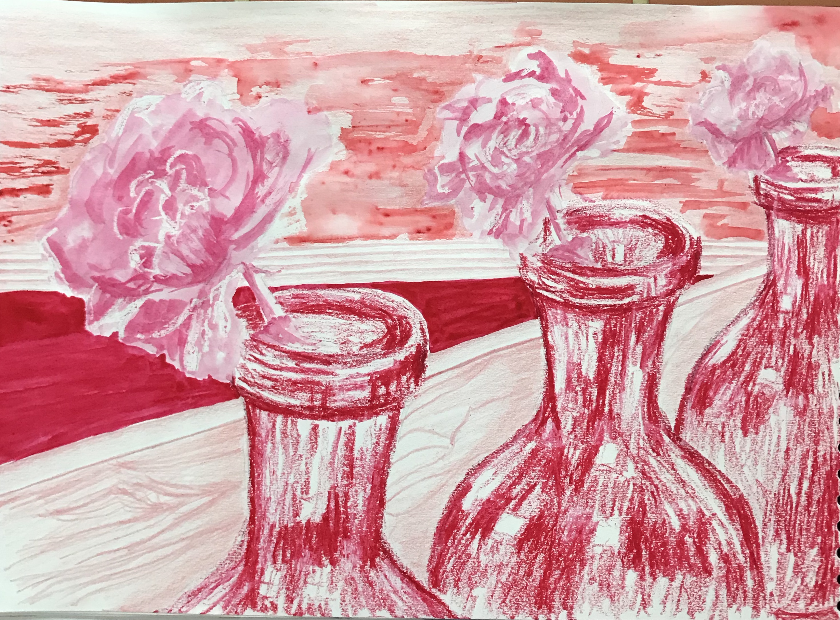
I have really branched out and experimented with this one. Gut feeling would have been to go for a monochrome blue (because I like blue and probably feel most confident with it), so I thought I should push myself to try something different and go for red. My natural/non-natural objects were a red/grey vase and a red (well, technically, pink – magenta) rose in full bloom – I thought it would help me having things already tending to red, but I suspect that, by using magenta ink for the rose, I have cheated somewhat by technically having two different colours.
I played around with the materials I had taken with me (did this at an art group again) – I was tempted to reconsider right there and then as the range of darks and lights I could make was not terribly wide – but decided to go for it anyway. I did a couple of sketches as I wasn’t confident in drawing the rose – have always hitherto put off choosing roses due to their apparent complexity – but by reducing it to a simple ellipse it became much less threatening, and I decided to go for a loose rendition so as not to get bogged down in detail. Having made this decision, ink with a wax resist seemed an obvious choice of medium.
I was going to tinker with the composition and create something, but actually my preparatory sketches suggested something a little different – a repeating (and retreating) motif of just the rose and vase, with two plain wood-effect tables set at an angle as support. The composition is therefore an invention based on observation of the one motif.
I wanted the texture of the vase to feel very different to the flower; the pattern on the vase was streaky, but actually the glaze was smooth and it was very reflective, so I wanted to be able to leave lots of light areas. Hence I chose the wax crayon – I felt I could be quite bold and expressive with this.
So the picture started with the roses, followed by the vases. I was quite pleased with it up until then, and nothing felt overworked. Then came my nemesis…..the background……
I freely admit that I had been really caught up with the rose and vase and, left to my own devices, I almost certainly would have left it there with a fairly nebulous and undefined background just to indicate a bit of shadow. However, the brief was to include a background. So I had to tackle it. I wanted to keep it fairly simple and bland so as not to detract from the liveliness of the main motif, and I still liked the idea of the strong diagonal. The main area of dark was between the two tables, so I put in a solid wash of dark ink, flanked by the ridged metal strips rendered in coloured pencil, and this still felt OK. I then made a poor choice – the two table surfaces seemed like a large area to have all the same, so I decided to make the nearer table quite detailed and the further table a bit rougher. The front table was done in coloured pencil, showing some of the wood-effect streaks of the surface, and this was still fairly OK; I experimented with some rougher streaks on the back table by sweeping on a bit of Terracotta Brusho. A step too far – (a) too much busy-ness in the background, which detracts from the flowers, and (b) a much more orangey red which does not sit well with the others.
So, a bit like the curate’s egg – good in parts. At least I feel the overall “monochrome” brief has been mainly fulfilled, if a passing colleague’s comment is to be believed as we were clearing up: “Gosh,” he said, “that’s very…….red!”