I found a helpful book – Saumarez Smith, C. (2005), John Virtue, London Paintings, National Gallery Company, London. Saumarez Smith, the Director of the NG, talks therein about how he would often go and chat to Virtue during the latter’s tenure as Associate Artist, describing him as “…painting every day in dialogue with his heroes from the past; in particular, Constable and Turner, black-and-white photographs of whose works he keeps on the walls of his studios.” He goes on to describe how Virtue would sketch from the top of Somerset House and the NG buildings (…”leaning against the dome…”). I have thought I should like to try drawing from high up – one does it out on the wilds all the time, e.g. on Dartmoor, but less so where buildings are involved. I did try drawing the view down the stairs in my house with slightly disastrous effect (although my tutor kindly assured me it was worth persisting), and am now eyeing up the view through our attic window as a possibility for Assignment 3….
What is the appeal of John Virtue’s art?
Saumarez Smith says he produces a gestalt view, drawing straight onto the canvas, based on a multitude of drawings done in situ so that the final version is indeed greater than the sum of its parts. In addition, he thinks that the London rendered by Virtue is “…an intense visualisation of the remembered experience of particular buildings, of their visual relationship to one another……in other words…..its abstract, visual pattern.”
Saumarez Smith goes on to say: “It is big art, deeply imaginative…”. I am beginning to think that, eventually, that is what I’d want someone to say about my art – I’ve not hitherto classed myself as imaginative, quite the reverse, but it is what I aspire to.
In another book I found, (Michael Hue-Williams Fine Art, 1999, John Virtue, LA Louver, Venice, California) which relate to his series of paintings of the Exe estuary over the period March 1997-January 1999, twelve of his sketches are included from his numerous sketchbooks which held over 5000 sketches! – that’s a lot of sketches, I clearly need to get out and sketching more. Most of them just look like squiggles and scribble (fine for my style, then), but he is clearly trying to remind himself of a moment rather than something more figuratively observational.
I have also been drawn to the work of Julie Mehretu – I like the marks which are almost figurative but not quite, the map-like quality of many of her pictures, and the way she layers her work. She too mentions JMW Turner as an influence, as well as abstract artists such as Kandinsky, but she has taken these influences and turned them into something all her own, e.g. Transcending: The New International 2003, ink and acrylic on canvas, seen in Chapter 9 of Stout, K., 2014, Contemporary Drawing from the 1960s to Now, Tate Publishing. I also watched several videos of her talking about her approach on www.art21.org. _____________________________________________________
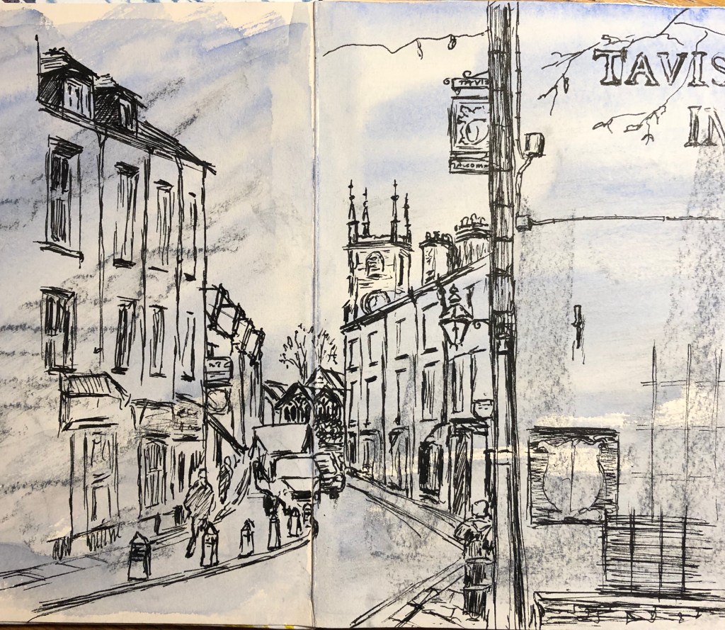
I had done lots of drawings of the parish Church, both in my little home-made sketchbook and my A3 sketchbook, so wanted to make this the focal point of this study. We walk into town most days and, as you get into the high street, this is the view we see, with the Church just visible at the distant curve in the road.
I drew this into the last double page in my home-made sketchbook with a Uniball drawing pen. It’s funny how you only see all the glaring mistakes once you think you’ve finished and have taken the photo – the perspective error of the awning on the far left of the drawing really jumps out at me, and I realise I have omitted to complete the string of fairy lights at the top of the drawing leading from the Tavistock Inn across the road to the buildings on the other side. (Interestingly, I went to a workshop yesterday led by a local artist, Rob Dudley – see blog notes on this elsewhere – he and his wife are both well-known artists, writing often in the Artists and Illustrators Magazine amongst others. They have an agreed practice in their house, which is to prop any supposedly finished artwork up on their bookcase in the lounge, and then live with it for a few days, which he says is just perfect for helping to spot all the little imperfections – think I might need to start doing something similar…).
Generally, I am fairly pleased with the drawing; it’s a bit cramped, but then it’s a bit of a cramped, foreshortened view. Apart from the one glaring error I was reasonably happy with the perspective – I have taken the window arches of the Church as my eyeline, and have been doing bits of crafty angle checking using the edge of the page from my file.
What would I do differently another time?
Definitely not try to do a small detailed drawing with the focus right on the fold of a double page!
Decide when to stop – what I mean by this is that, I had decided I had finished, then at the last minute threw in details of the furthest building of the left – it is scrappy and is the bit that’s gone wrong.
I know I didn’t need to take this title literally, but…..it just so happened that, at one of our art groups, we had a workshop on making our own concertina books – so I decided to use my newly-minted product to take round and about sketching in town; it was really light, and not too conspicuous when sitting in cafes etc. I wanted to kill two birds with one stone and see if Conte crayons and charcoal were “fixed” to the page by covering them with a watercolour wash, so that one could then draw over them – so I did exactly that, scribbled randomly on all the pages and covered the scribblings with a wash before taking the book out sketching.
Results? – frankly, mixed. First of all, both the Conte crayons and the charcoal were partially fixed down with the watercolour – good to know. What I did learn was some random scribbles are better than others to draw over – horizontal lines and gentle curves (although beware curvy words – they bring their own baggage) better than strong uprights as a general rule – so, uprights ONLY if you know they’re specifically going to help a particular sketch. Also, the first time I went out I only had a biro (which I usually quite like drawing with) – but this wasn’t beefy enough to make itself felt over the underdrawing/painting – see dress shop drawing above. Second time – took a drawing pen – much better and clearer results – see church here.
I did a few sketches of the church from various angles, including from photos (it started to rain…). I especially liked the view of the tower from below, and tried quite a detailed drawing in pen…
I liked the drama of this, so I decided to use it to experiment with a different support – a sheet of newspaper painted over roughly with gesso and left overnight to dry. The newspaper was from travel supplement, and I had chosen this page as it already carried photos of large buildings; so I tried to leave gaps in the gesso here and there to see if the photos coming through would help or hinder the drawing.
I drew very quickly, simplifying the image considerably – first with tabac ink applied with a brush for the main shapes, then drawing in to this (very) wet ink straight away with a black drawing pen. The effect of this was interesting (including tearing the paper in several places) but I persisted to make sure I had strong darks where I wanted them. I think the result is quite powerful.
I used photos of landscapes which went to a far distant horizon so I could really try and get the hang of this.
First up was a couple of views of St. Ives. The top drawing is a sunrise over Porthminster Beach to the distant headland by Godrevy lighthouse (of Virginia Woolf’s “To the Lighthouse” fame). The photo I worked from was taken from a hotel balcony, which has given it a rather “Titanic” feel. I worked with water-soluble pens in a limited range of colours – three blues, a yellow and a flesh-colour just to get the orangey cloud colour. I think it’s quite effective as an image, but the thing with felt pens is that it’s quite difficult to fade the colour in the distance – the colours more or less are what they are. I also had a photo over the roofs of St. Ives taken from the upstairs cafe in Tate St. Ives, so couldn’t resist a take-off of the Barnes-Graham illustration in the notes. Again a limited palette of water-soluble pens – black, yellow, light green and brick-red, together with a drawing pen for thin-line details. I kept detail to a minimum for all but the closest buildings, just suggesting the far buildings with a few lines, and added a bit of colour to the roofs of the near buildings to depict that classic greeny-orangey-yellow of St. Ives. I had indicated the clouds in black felt pen so put an experimental wash of water over these and was delighted with the resultant purplish result which I have then pulled down over bits of the town. Great fun.
Next up was an image of the cliffs off Fistral Beach at Newquay. I wanted to try oil pastels for this, and worked quite quickly.
By blending and overlaying the colours I have managed to get the changes in the sea colour (hazy blue to dark then to greenish blue coming from back to front), and the grain of the paper in my sketchbook gave quite an interesting broken effect of light reflecting from the water. However, that same effect rather did for my sky, which on that day was cloudy and actually rather a strange completely flat matt grey-blue, and I couldn’t get that flatness on this paper with this medium. A passing co-painter at my art group suggested that I put a watercolour wash over it; didn’t have watercolours with me, so I did a quick re-drawing in pastel and tried a wash using the water-soluble pens, but still not right – think I should actually not have attempted the sky in pastel at all, and just used a wash.
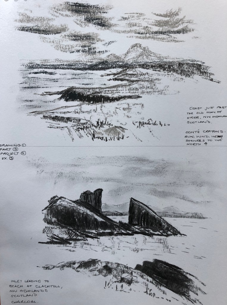
Finally, I tried a couple of photos from our trip in May up to the far North-West Coast of Scotland. Everything is quite dramatic up there – white beaches, black cliffs, looming mountains in the distance wherever you look – so this seemed a good opportunity to experiment with monochrome. The first drawing was done in Conte crayon using shades of grey. I have tried to vary the darkness of a single crayon so that the darkest dark is reserved for the nearest cliffs. The clouds were actually touching the far mountains on this particular day, so I hope I have caught that distant melding of cloud and land.
The final drawing has turned out to be my favourite of the lot, and probably the most effective in showing great distance. The drawing was done in charcoal with nothing else apart from the odd smudge with a finger. The near really dark rocks frame the entrance to the white sand beach of Clachtoll (“Broken Rock”), and by decreasing size and intensity I have tried to show the distant headlands and then the far mountains behind – they are quite hard to spot on this photograph – perhaps I have made them too faint – but they show up better on the original.
TAKE AWAY POINTS from this exercise:
Mediums with “pre-fixed” colours e.g. felt pens, oil pastels, can make it tricky to fade the distance, especially if you have a limited range
How is my support helping/hindering? – consider!
Charcoal gives real drama and makes an almost infinite variety of depth possible
Maybe therefore use a combination of charcoal for drama/depth, with ink/pen for detail and crispness? – try this combination out in the exercises in Project 5
I tried this exercise looking through from my kitchen to the garden room, which has a tiled floor. I did stand in the centre of the doorway to look but I can see that the drawing was slightly skewed sideways because I was resting the sketchbook on a work surface by my side.
The angles of the mat were not too bad – it’s such an optical illusion, isn’t it, you look at the mat and your brain tells you it’s a rectangular mat – so I tried to angle the lines a bit, but didn’t actually trust my measuring – a lesson there.
The doorway again was tricky – it was actually knocked through what was originally an outer wall so it’s quite thick, and again I didn’t trust my eye with the angles. This error has then thrown out the angle of the floor tiles – but at least I was fairly consistent with them, and they nearly all met at a point (just not the point where they should have met!)
I have tried some exercises in my sketchbook to practise this skill – see A3 sketchbook. Obviously using a ruler helps enormously, and I have also tried using a pin and string (pin at the horizon line and string leading from that to indicate the angle at which to draw your line) – see earlier blog entry on a talk on Perspective by Ian Pethers.
N.B. I was also interested to stumble across the artist Fred Ingramsafter seeing an example of his work in the Telegraph (see A3 sketchbook) – I Googled him and find that a lot of his work makes a real feature of converging “parallel” lines towards the horizon – see e.g. his drawings and paintings of the Fens at www.watermarkgallery.co.uk.
Raining again so I had a go at this exercise at art group, piling up boxes and tins from my art bag. Slightly discouraged when other members of the group went off into the mutters when they asked me what I was doing this week and I said a perspective exercise….
Attempt 1 – I wasn’t quite sure where I was going with this exercise at first, and it was only when I drew the eyeline in at the end that I could see where I had been accurate and where I was wildly out. I’d known the drawing wasn’t correct, but couldn’t see why. On the plus side…..when I sent my first assignment to my tutor, she drew lines like this all over it (a copy of it, I hasten to add!) so that I could see that my perspective had been very wide of the mark, and in several cases the continuations of my parallel lines were actually diverging, not converging – but at least I have managed to get them converging here!
Attempt 2 – I tried from the start to be more rigorous about the relationship of length versus width in the bottom box, and this led to a more successful drawing, although the second box up is significantly wrong. I had established the eye-line in my head from the start (couldn’t quite draw it on as it was a couple of cm above the top of the page), so as I was drawing I was tweaking the angles based on the rough relative trajectory of paired parallel lines, which generally worked well except right at the end for that second box, where tweaking in one direction threw the converging of the parallel lines at right angles way out…which must mean that the right angle at the front of the picture, which I drew first and didn’t measure and check, is incorrect. Amazing how just one wrong angle can come back to haunt you…just as well I’m not an architect.
Moving forwards, though, I can see that this is a useful check to have in the arsenal, and will try to continue to use it.
I found the suggested images online, and also looked at two useful books; one on Georges Seurat’s drawings (for text reference, see notes in A3 sketchbook), and one on the work of Tacita Dean – Harris, Hollinghurst & Smith, 2018, Tacita Dean, Landscape, Portrait, Still Life, Royal Academy of Arts, National Portrait Gallery and National Gallery.
I tried to copy some images from these books in order to get a feel for their drawing styles and composition choices…see A3 sketchbook for exact details of the original drawings.
My quick attempt at The Montafon Letter (see sketchbook for details)……
…and Tacita Dean’s.
My quick sketches in the style of Georges Seurat………
…..and the originals (see sketchbook for details).
Seurat -v- Dean: Similarities…
Their drawings are generally in black and white, often with strong contrasts
…and Differences
Seurat started with a light background and drew onto it with charcoal; Dean uses a blackboard as a support and draws with chalk (sometimes using chalk spray which I hadn’t heard of), some gouache and charcoal pencil
Having tried to draw in their style, Seurat’s drawings are quick, sketchy almost, very loose, suggesting their subject; Dean’s drawings are detailed and must surely take a great deal of time and care
Seurat’s subject interest (from the set of over 150 drawings I looked at) seemed predominantly to be with people; for her drawings, Dean is very taken with natural objects (apparently she has an impressive collection of 4 and 5 leaf clovers) and phenomena – clouds, of course, and geological features (as seen in The Montafon Letter and Fatigues, the reference piece).
Seurat’s compositions are of everyday scenes from the point of view of a passer-by; Dean’s drawings of mountains and clouds are set in lots of space, without a hint of the human race
****************
Comparison between Albrecht Durer and Ernesto Caivano
Despite my own (current) default style, best described as “sketchy”, I can draw with clear lines if I have to, and I always find myself personally drawn to clear, clean-lined drawings. I have chosen to compare two artists who draw in this style and whose work I greatly enjoy looking at, Durer and Caivano; in particular, Durer’s 1514 engraving, Melancolia I (see early research blog in this Part on landscape painters) and Caivano’s 2003 drawing The Land Inhibited, ink on paper, as seen in our recommended text – Dexter, 2005, Vitamin D, New Perspectives in Drawing, Phaidon Press Ltd.
Similarities…..
Imaginary scenes
Dramatic black/white drawings
Meticulous and highly-detailed
….and differences
Medium – Durer’s is an etching, whilst Caivano uses pen and ink
Mark-making; Vitamin D describes Caivano’s as “a hyper-detailed accumulation of short, micro-thin lines”, whereas Durer’s etching shows a range of lines and dots
Caivano produced blocks of flat uniform tone, whereas Durer’s tone is more “moulded”
On a recent visit to the far end of Cornwall we visited Bedruthan Steps – this is a dramatic section of coastline where the Cornish giant Bedruthan is said to have thrown huge boulders into the sea just off the cliffs so that he could use them as stepping stones from one headland to the next. Whilst my husband undertook a precipitous descent down to sea level, I decided that here was a good subject to use for this exercise.
My on-the-spot sketch from my perch on a rock at the cliff-top (see A4 sketchbook) was done with the only pencil I had in my pockets, a 4B, so it is dark and dramatic. I thought I had expertly dashed it off in the blink of an eye until a group of walkers came over and said “You’ve obviously been here ages – has the tide started going out yet?” Grr. I am finding that by far the greatest hazard in working outdoors is the random comments I get from passers-by.
This image seemed to have an obvious foreground (the fence and cliff-edge), middle ground (the rocks) and background (the far headland). When doing my drawing inside, I decided to work from the back forwards, starting with a very hard pencil (2H) and gradually changing to an HB and then up through the B range as I came further forward, with just a little colour in the immediate foreground. I have tried to use some directional marks and shading – on a visit to the Penwith gallery in St. Ives I found a card drawn by an artist called Mary Ann Green – see notes in A3 sketchbook. I googled her – she is not particularly famous, but I really liked the style of her landscapes, which depended on strong dark areas as against some light, almost blank, areas, directional lines, and the use of bits of colour. Thought I’d give it a go – what could go wrong?
So, how did that go?
Positive – I think the brief of demonstrating aerial perspective has been met in the drawing and I have established a sense of distance which was not so clear in the sketch.
Less positive – I feel the drama and energy of the original sketch has been lost to some extent in the worked-up drawing.
Reflections on exercises 1 & 2
Simplifying and selecting: this is always a struggle and I haven’t yet tried out the grid method which would provide, amongst other things, a natural frame. I have relied on looking at a wide landscape (as in the Ex1 ink pictures of the moor, and the coastal scene in Ex2), deciding which part of the landscape must be in the composition come hell or high water, then scanning the vista from there and deciding “well, I’ll go up to here and here but no further” so that I had mental boundary edges before I started. Simplifying is definitely a target to work on – I am starting to leave things out – think this went well with the moor pictures, less well with the charcoal/rubber garden drawing, where I needed to lose most of the background but faithfully put it in anyway….
Sense of distance and form – think I managed this better in the Ex 2 work – but then I had a BIG distance to work with. The “photo negative” style drawings in Ex 1 have got some nice 3D variations in tone which I am pleased with, although attempts to put less details in the background, especially the garden picture, have made it look a bit flat and child-like and would have been better omitted or just suggested.
Use of light and shade – I suppose it is because it’s October, but none of these drawings were done on bright sunny days which would have offered dramatic shadow areas; so shadows have been caused more by structures such as rock formations. I know that in the moor drawings (Ex 1), my inexperience with the Chinese brush technique led me to work very quickly and wetly which means that some of my shade is not consistent within the picture – live and learn.
Additional preliminary work – I did take a photo of Bedruthan Steps, although from slightly higher up than my initial viewpoint, so this was some use as reference. I had also been looking so hard at form, shape and shade that I didn’t pay too much attention to colour, and wished I had made a few notes about that on my initial sketch.
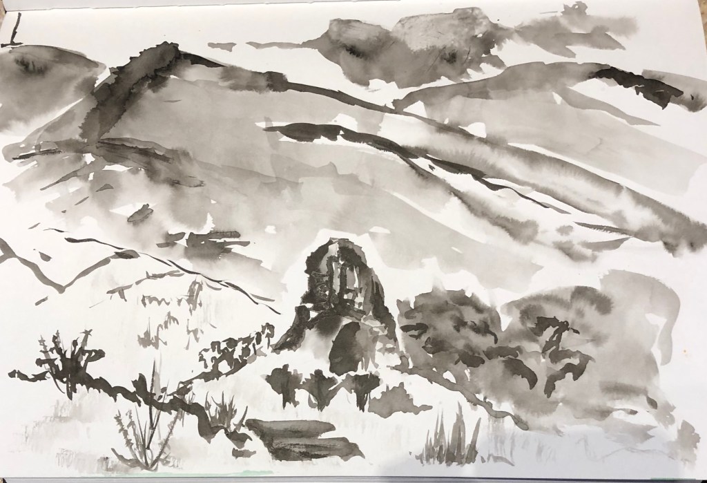
It’s been rainy so I started out working up some of my existing sketches. I have been interested in the work of John Virtue which I found in my research (see blog noteson artists working in series in the landscape), so I had a go at working in black and white. I used two different media, charcoal with a putty rubber, and Chinese ink and brush, but I have tried to use expressive strokes with both.
I re-worked two of my Dartmoor 360-degree views using the ink – tried to be very loose, working quickly using wide gestural strokes, suggesting rather than describing in detail. Both efforts look fairly awful close-up, but not bad from a distance, much more recognisable features.
I made the first effort too wet so it was a bit uncontrollable and I haven’t quite got the darks in the right place (e.g. the darks on the hill don’t match up with the darks under the clouds) so I tried to strike a bit of a balance in the second attempt – but looking back at it I think the drier foreground is the weakest feature. More practice needed! Once you start with this medium it seems to need to go very quickly, but I believe that is a consequence of my inexperience, and I need to think through each part of the painting before committing the ink.
The composition of the first picture is Ok but not gripping – Pew Tor, my main focus, is bang in the middle, although it is on the upper-third-line, but I think it might have been better a bit lower and moved slightly off centre, with some better-planned dramatic clouds as a counterpoint. In the second picture, Vixen Tor (lower, mid-ground) and Kings Tor (distant left) I had intended as a kind of paired focus (one very upright, the other much more rounded), but I have got a bit muddled in the contrast between mid- and fore-ground, and definitely think I needed to give more space for the sky – the whole picture feels a bit squashed.
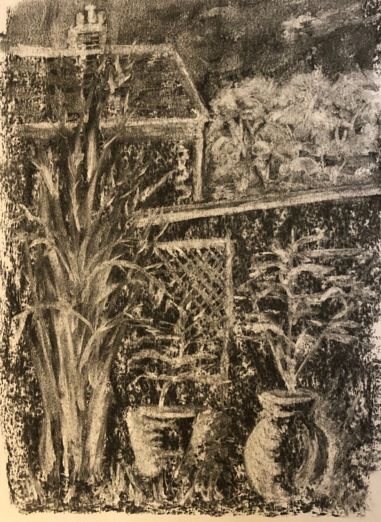
I had a go at drawing into a charcoal background using a putty rubber to work up two of my other sketches. The first was the interior of the mediterranean biome at the Eden Project – I had done a quick scribbly sketch of a cypress which caught my eye, so I tried to render it as a kind of “photo negative” image. I wanted the tree to dominate so I put it bang in the centre. The cypress itself was great fun and I could really use expressive strokes and swirls; I did it at an art group and was quite pleased with it until a fellow group member went by and said “I really like your waterfall.”
Back to the drawing board……
So I tried out the same technique with one of the views from the “garden” series of my 360-degree sets of sketches. I narrowed this one down to focus on the large pots and the bamboo at the end of the garden. I’m pleased with the pots and the trellis, but don’t think the bamboo is quite recognisable if you hadn’t been told what it was, and the neighbouring house (apart from the chimney which I like) looks a bit child-like – possibly the whole distant background would have been better off left much more undefined. I think it’s not missing an obvious foreground, though.It’s a really enjoyable technique – somehow drawing with a rubber is very freeing because if you do something wrong, you can easily replace the charcoal and carry on.
Hadn’t come across this artist or his work before. The webpage quoted in the notes actually took me to the artist’s Amalfi series – I have to say I first opened the pictures up on my iPad in a gloomy room and was slightly taken aback as I could hardly make them out at all….happily I am now in better light and really like his range of colours. You can clearly see he uses a wide range of materials and marks, and he says that sometimes works into the paper so hard it tears, which he feels is all part of the making of the picture. I also found the Chiltern series on a different site – he says he has considerably reduced his colour range here and deliberately chosen “…organic, natural, desaturated and and ‘unpretty’ pigments….” for these – I was tempted to have a go at re-interpreting a drawing of a familiar place using his style, but really not sure where or how to start – the process seems as important to him as the outcome…he says: “Creating these landscapes is instinctive and intuitive, a direct, visceral engagement. Through a process of mark-making, sedimentation of material, textural surface layering and modulated monochromes, I seek to interpret the fundamentals of the topography, in particular revealing its underlying, elemental nature…”(www.nicholasherbert-drawings.co.uk). You can certainly feel that he gets into the zone.
John Virtue
Enormously dramatic landscapes in black ink and white paint – apparently he regards colour as a distraction, and one can quite see why when he is able to produce these hugely atmospheric pictures without it. The landscape pictures give me a much better insight into how to go about abstracting a view, which is often suggested in our notes, but was not sure how to do.
Black ink, shellac and acrylic on canvas (see on Annandale Galleries website)
But my favourites are his scenes of London, possibly because they are sufficiently on that line between abstract and representational to allow me to pick out bits I can recognise.
When reading about him I also followed up on one of the artists from whom he draws inspiration – Philips Koninck, 1619-1688, whom I hadn’t previously come across – huge dramatic skies – for example his An Extensive Landscape with a Road by a River………– now that’s a study in clouds for you.
Monet
Monet is famous for his series paintings….I have sat in the Orangery in Paris and immersed myself in his lily ponds, and stood for a good while in the Musee d’Orsay staring at one of his Rouen Cathedral series – you have to see a painting like this close up to realise just how magical it is that artists turn something which looks like a random set of blobs and strokes close up into this fantastic picture full of light and shadow – there seems to be a key point as you gradually step back from it when it all snaps into focus.
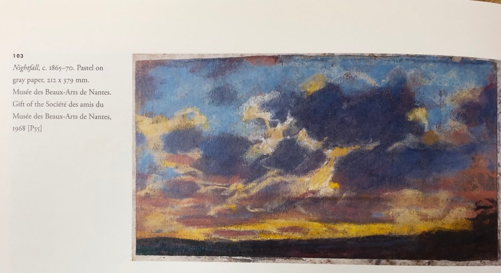
I found a great book – Ganz & Kendall (2007), The Unknown Monet, Pastels and Drawings,Yale University Press – which talked about the way Monet had “managed” his personal image, not liking to acknowledge that he drew, but that on a visit to London his canvases hadn’t arrived and so he did a series of drawings in pastels – this led the authors to seek out Monet’s other pastel drawings, many of which had gone almost unacknowledged by him and of which little is known about many. I found the book very heartening – his pastel drawings are loose and scribbly, rather like mine! – this one of several of clouds is an example.
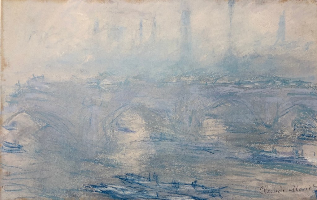
His Waterloo Bridge, (1901), Pastel, Villa Flora, Winterthur, Switzerland, has the same misty atmosphere with recognisable features emerging from the gloom the more you look, as the drawings of John Virtue a century later.
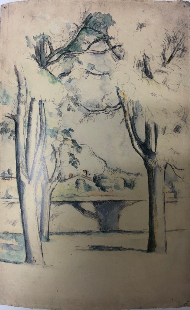
Cezanne
I looked for information about Cezanne’s works in series in the landscape in C. Lloyds, 2015, “Paul Cezanne, Drawings and Watercolours”, Thames and Hudson Ltd.
A good example was his Mont Sainte-Victoire pictures, “which soon became a symbol of such personal significance for the artist” – he would draw a range of different subjects, e.g. a Chateau, an abandoned quarry, his studio – all in view of Mont Sainte-Victoire. Gasquet wrote: “…..everywhere, at the horizon of every plain, at the end of every road, from one hill to another, the sight of Saint-Victoire entered Cezanne’s fresh eyes.”
I particularly liked this drawing: Mont Sainte-Victoire seen beyond the wall of the Jas de Bouffan, 1885-88, pencil and watercolour, National Gallery of Art, Washington DC; I liked the way he has fitted his focus mountain in between the foreground tree trunks, showing minimal foliage except mid-top, effectively creating a framing arch for his focus, drawing the eye throughthe trees to the mountain in the distance.
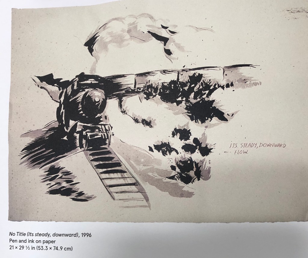
Raymond Pettibon
I hadn’t heard of this artist and didn’t know his work at all; but I soon found a massive book about his work: Gioni & Carrion-Murayari (eds)(2017), A Pen of all Work, Raymond Pettibon, Phaidon, The new Museum. All the artist’s work is annotated by him to a greater or lesser extent (although I have to confess that the messages the annotation was meant to convey weren’t always clear to me), and his works are mostly entitled “No Title” followed by remarks in brackets. The editors seem to have selected works around a theme and the book presents them together, e.g. the “train” pictures. This one: No Title (Its steady, downward), 1966, pen and ink on paper, reminded me a bit of the JMW Turner painting, Rain, Steam & Speed(1884), oil on canvas, National Gallery, London.
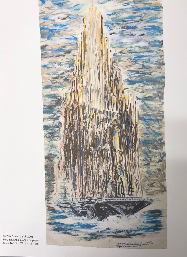
I also found a series of “cathedral” pictures (which made me think of Monet and his Rouen series), e.g. No Title (If we can…), 2008, pen, ink and gouache on paper, Private collection, courtesy Houser and Wirth.
Clearly speculating here, but looks as though Pettibon was good at what we art students are urged to try – studying the works of historic painters and then developing their ideas further to suit his own style and convey his own messages.
Kurt Jackson
This contemporary painter is a great favourite of mine and has been for many years; he was based in the far West of Cornwall and has now opened his own gallery in St-Just-in-Penwith. His current exhibition (see postcards and notes in my A4 sketchbook) is a whole series of paintings on the Helford River (Daphne du Maurier’s Frenchman’s Creek), which have been done at different times of day and night, different states of the tide, different times of year, and different viewpoints. I particularly enjoy his pictures depicting mud and rotting trees – he has been known to incorporate bits of the physical landscape (mud, twigs, stones, feathers, etc) into his work – something which I might consider trying.
David Hockney
I saw a David Hockney exhibition a couple of years ago in Paris at the Pompidou Centre – it was a retrospective going back to his very early pictures, but I have to say the work I liked best was his most recent iPad landscapes. I found out on www.royalacademy.org.uk that his series of pictures of Yorkshire was commissioned by them in advance – as he says in a video on the website, a gamble on their part and his, with so much space to fill; but fill it he did. His work is bright, vibrant, done with zingy acidic colours that often don’t quite fit the object/place they are depicting – but the images have defined a little-known area for many art-lovers.
Peter Doig
Some of Doig’s work seems very strange and otherworldly – more than a touch of Odilon Redon about him. He often has you looking through things or around things to get to the focal point of the picture. In the book J. Nesbitt (ed) 2008, Peter Doig, Tate, I found a series of landscapes where (rather in the fashion of Cezanne and his Mont Sainte-Victoire) a particular building is the focus but is seen from different angles and vantage points. Doig calls the building the “Concrete Cabin”, although it was actually l’Unite d’Habitation, the last of Le Corbusier’s buildings to be built, and intended for itinerant workers – see here, Concrete Cabin, 1991-2, oil on canvas, Leicester Arts & Museums Service.
Doig said: “instead of painting the facade of a building and then shrouding it with trees I would pick the architecture through the foliage, so that the picture would push itself up to your eye. I thought that was a much more real way of looking at things, because that is the way the eye looks: you are constantly looking through things, seeing the foreground and the background at the same time.”I can appreciate what he has done, but not sure I would want to draw or paint in his style; I find it somewhat unsettling, almost as if someone is standing right behind you whilst you’re looking at it – I think he means you to have an almost visceral reaction to his images, but to be drawn to look further into them despite yourself.