Drawing 1; Part 4; A useful book

For Christmas I was given Bell, Balchin & Tobin (eds for the Royal Drawing School), Ways of Drawing – Artists’ Perspectives and Practices,  (2019). Thames and Hudson, London. This is just a fantastic book, so many ideas, takes and styles, and loads of great advice. This little extract was perfect inspiration for life drawing – it’s from an essay by Ishbel Myerscough called “Focusing on the Individual”:

“I try to encourage the alchemy of concentration. Drawing is like magic. If we allow ourselves to detach from the world around us and form a perfect bubble between ourselves and the object, to shake off feelings of expectation or embarrassment or indeed our own hope for brilliance; if we stay calm, treat the viewed in an almost abstract fashion, focus on the essential; if, at first deliberately and then unconsciously, almost meditatively, we remove the fact that we are looking at a nose or an eye, or even a head or a person; if we watch the way that the line of the inner eyelid lifts at the corner, the improbability of the shape of the shadow under the nose – if we concentrate that hard, not making judgments while we are doing so but forging ahead until the trance is broken, when there will be an opportunity to stand back and assess – if all that is truly achieved, then magic is made. Whether or not the observation is right, in proportion or even has a likeness, an intensity has been achieved, a point of fascination. And that is what a drawing really needs.”

Brilliant advice.

Drawing 1; Part 4; Research point – The face

Graham Little’s portraits of striking women are frankly fabulous. Done in coloured pencil, they take – according to a Guardian review I read by Skye Sherwin (Nov 26th 2010) – many months to complete; remembering how stir-crazy I went trying to complete the first version of my Assignment 2 in coloured pencil, I think however that this method of drawing is not for me.

Elizabeth Peyton in some ways represents the opposite – her drawings and paintings appear much more rapidly rendered, using big watercolour strokes or strong and definite pencil/charcoal/crayon strokes. I found a book in the library about an exhibition of her work in New York’s New Museum entitled “Live Forever – Elizabeth Peyton” (pub Phaidon), and had a go at trying to draw in her style:

The charcoal drawing, using strong strokes, felt comfortable to me; the use of big brushstrokes in the copy of the Hockney portrait was less so, partly because it’s not how I’ve previously worked with a brush, and also because I haven’t done much brush work since breaking my shoulder as a brush feels more difficult to control with my left hand.

David Hockney’s upcoming exhibition at the National Portrait Gallery, “Drawing from Life” was favourably reviewed in the Daily Telegraph (26th Feb 2020 by Alastair Sooke), although at the end he remarks “Hockney is no Rembrandt, we realise, heroically grappling with old age. Unlike Lucian Freud, he can’t convey the coarse density of lived-in flesh. No, Hockney is – or rather was – all ethereal refinement and sunlight.”  I have to agree with Alastair Sooke here – I find Hockney’s portraits quite flat, a little like Gaugin’s – I did see a retrospective of his work in the Pompidou Centre, Paris, a couple of years ago, and this was my abiding impression, which hasn’t changed. A friend gave me a cutting of a review in The Times (Feb 24 2020) which compared a previously unseen version of a portrait of Hockney’s parents with a version exhibited in the Hayward Gallery in 1977 – we had a bit of “spot-the-difference” fun wondering why subtle changes in composition had been decided upon. His father had clearly become fed up with sitting and was engrossed in a newspaper in one version – something to bear in mind when asking people to sit!

(See cuttings scrapbook for both articles).

Looking back at the catalogue of the exhibition Pushing Paper – Contemporary drawing from 1970 to nowwhich I saw at the British Museum in January 2020 (see separate blog post on Museum visits), the portrait which still strikes me most is by Maggi HamblingMy Mother Dead, 7, 1988, graphite. The way the strokes are built up remind me a little of my own rather scribbly drawing style when I’m “reaching” for an image, and the fact that she has literally just drawn the face is very compelling.

On the subject of “floating” faces and heads, I was struck by Michael Landy’s portrait of his father, Daily Mirror, from the series “Welcome to my World”, 2004, crayon on paper, as seen in our recommended text, Vitamin D – New Perspectives in drawing. The way the carefully-observed drawing stops at the jawline really focuses attention on the face as we try to work out the nature of the sitter without the prompts of clothes, props, background, etc – the only clue given being the title of the work.

I looked at Nina Mae Fowler’s work online after listening to a BBC Radio Four podcast of a broadcast conversation between her and Nick Park (Only Artists – 26th June 2019). Like me, she enjoys drawing in graphite and charcoal, and is slightly embarrassed – as am I – over her excitement about her wide variety of erasers. She says that she spends 50% of her drawing time taking graphite and charcoal off the page to make the image. Nick Park was talking about his attempts to make a portrait of his wife (“she looks like Yoda sometimes”, which I felt very encouraging), and said that the portrait artist was surely trying to depict something beyond a mere likeness – NMF agreed but said that she felt that this came with practice…back to work then…. 

Chris Legaspi, author of Life Drawing for Artists – Understanding Figure Drawing Through Poses, Postures and Lighting, 2020, Quarto Publishing Group USA Inc, has honed his drawing method down to a formula of procedures which he can articulate and demonstrate, which has been very helpful for me as a beginner. His style has become recognisable to me, particularly I suppose because of his parallel shading technique using long lines – he sometimes uses these in his portraits to shade out a part of a face, which leaves the viewer to add in the details whilst highlighting the details in the rest of the face which is depicted.

Drawing 1; Part 4; Research point – Self-portraits

Tracey Emin:

Now she’s a very unusual one. I went right through all 259 pages of the book: 

“Tracey Emin love is what you want

Author

Ralph Rugoff 1957-

Hayward Gallery

Publisher

London : Hayward Publishing

Creation Date 2011”

…and I could not find a single drawn self-portrait of just her face. Her drawings of her body look quickly executed and her use of line is strong, almost visceral, but when it came to her face, this was either blank or very roughly indicated – as opposed to the rest of the body, especially genitalia, which are abundantly represented in the fashion of Gustave Courbet’s L’Origine du Monde, 1866 (which I saw a couple of years ago in the Musee d’Orsay – or maybe the Orangery – oh dear, premature senility – in Paris), and Egon Schiele was one of her influences. Possibly this is due to the title of the book, which was also the subject of an exhibition – the book suggests that in this exhibition, the artist is revisiting the trauma of her past in an attempt possibly to accept it and not be dominated by it.

Looking online I found a self portrait of her as a Little Owl, 2005, etching, which does bear an uncanny likeness!

***********

Lucien Freud and Paul Gaugin: see my notes in my blog post on trip to the London Galleries in January 2020 – the exhibition on Freud’s self-portraits was a masterclass in drilling into the soul – total determination to see everything there was to see and commit it to paper in bold brushstrokes. I found Gaugin rather the opposite – bold confident strokes in his drawings, yes, but his depictions felt flat and shallow and he often depicted himself as a character, almost caricature, rather than himself.

************

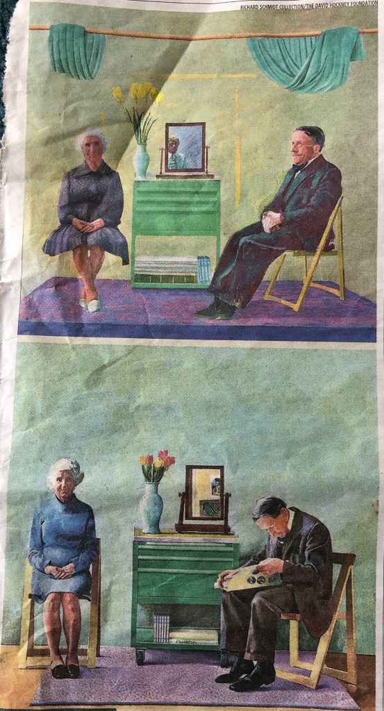
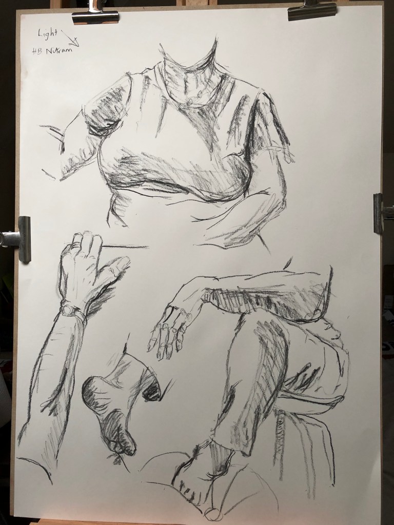
I found an absolute gem of a book: Kinneir, Joan (ed), The Artist by Himself, 1980. Granada Publishing Ltd, Herts and London. The book consists of self-portraits by famous artists both current (e.g. Hockney) and historical – back to Durer in the 1400s. Accompanying each image is a text written by the artist him/herself – extracts from letters, diaries, exhibition notes and so on – which give an insight into the mind of the artist at or about the time when the self portrait was made. Absolutely fascinating. I had a go at copying several of the self-portraits – see my A4 sketchbook – just to experience drawing using their styles. I fondly imagine my own personal style is a bit of Odilon Redon with a splash of Egon Schiele…….

**************

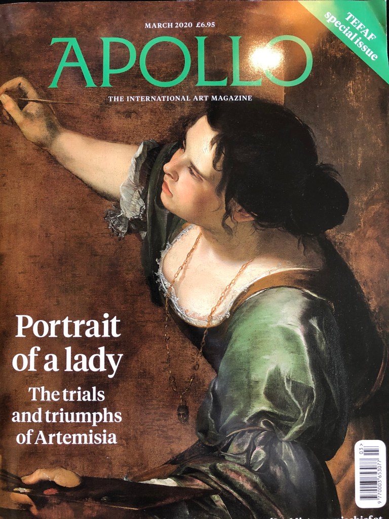
There is an interesting article in March 2020’s Apollo magazine by Breeze Barrington entitled “Becoming Artemesia” – all about Artemisia Gentileschi, as a preface to the National Gallery’s exhibition of her work in April-July 2020 (nationalgallery.org.uk). She had, as Barrington describes, “..a penchant for self-portraiture..” – I really liked her Self-Portrait as the Allegory of Painting (la Pittura), c. 1638-39, oil on canvas, Royal Collection – contrary to many of her other character paintings where she gazes placidly out of the frame dressed up in real Lucy Worsley-style – this is an action shot painted from an unusual angle – as is her Judith beheading Holofernes, c.1613-14, oil on canvas, Uffizi Galleries, Florence.

***************

On the subject of good books, another interesting one I found is by Borzello, Frances, Seeing Ourselves – Women’s Self-Portraits, 1998. Harry N. Abrams, Inc., New York. This traces the history of self-portraiture by women from the 16th century to the end of the 20th century. The older paintings are in the style of their times – many conforming to the mores of the day, with a few, e.g. Anna Dorothea Therbusch, Self Portrait, 1762, oil on canvas, Staatsgalerie, Stuttgart, showing herself warts and all – short-sighted and middle aged.

Berthe Morisot had a lovely use of light and line in her unfinished Self Portrait with her daughter Julie, 1885, oil on canvas, private collection.

The twentieth century opens up a whole new chapter in women’s art. 

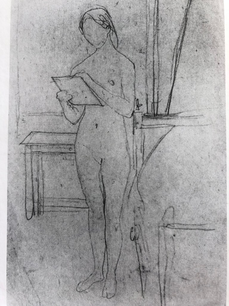
Gwen John shows an enviable confidence in her clear and simple line drawing, Self-Portrait Nude, Sketching, 1908-9, pencil on paper, National Museum and Galleries of Wales, Cardiff – obviously the result of much, much practice – no hesitant scribbly lines here.

Laura Knight’s Self portrait, 1913, oil on canvas, The National Portrait Gallery, London, which depicted herself looking at 2 nude female models, is a statement of intent.

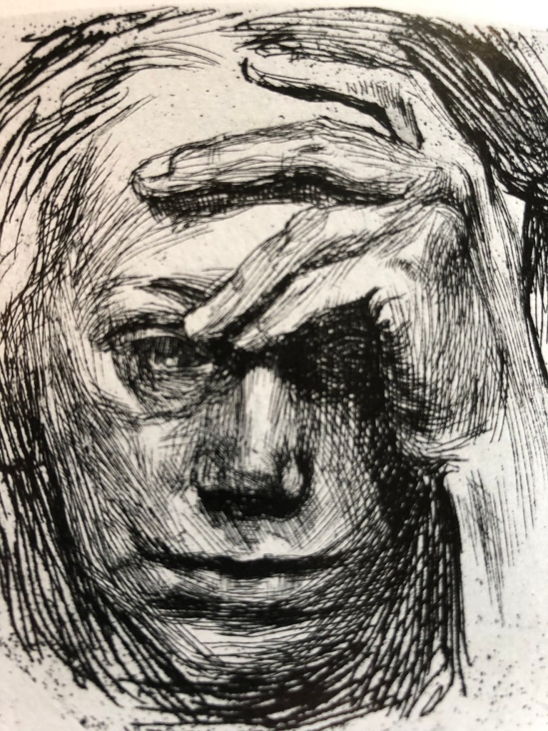
Kathe Kollwitz, of course, portrays herself with strong directional lines and some dramatic cross-hatching in Self Portrait, 1910, etching, Fine Arts Museum of San Francisco. 

And Helene Schjerfbeck depicts herself almost disappearing in the skull-like An Old Woman Painter, 1945, oil on canvas, private collection, Sweden.

Strange and otherworldly shapes and surreal images start to appear under the hands of the likes of Leonora Carrington, Kay Sage and Louise Bourgeois.

Alice Neal, in Nude Self-Portrait, 1980, oil on canvas, Robert Miller Gallery, New York, bravely bares all at 80 in a clear and lively painting.

Drawing 1; Part 4; Project 6 – The Head; Ex 2 – your own head

I had tried drawing self portraits before, years back – think everyone has a go at some time, don’t they? – but they were scary and severe efforts and I was determined to be a bit kinder to myself by trying to approach the exercise crabwise, almost creep up on it unawares, so to speak; so I chose an old battered piece of blue sugar paper from the bottom of the pile and a purple felt pen. I was drawing left-handed so knew there would be mistakes and a bit of a temptation to tinker – hence the choice of a support which was highly disposable and a medium which was fairly tinker-proof. What was going on the paper would be there, warts and all….oh dear….

I set myself up with a mirror propped slightly below my eye line and a little to my right – my memories of my previous full face attempts were not happy. I tried to relax and just go for it, letting the pen travel around the page so that nothing got too boxed in. I even left my glasses on, determined that I was going to rise to the challenge and not be fazed – if it was wrong, then that was ok.

Well, the outcome looked like someone, I think, although not me. Eyes definitely too close together, neck not wide enough. I showed the drawing to my husband and he agreed that it wasn’t quite me – I asked him to discount the cross eyes and the chicken neck and see if anything else was wrong, and he said he thought possibly the overall shape of the face. I left the drawing propped up somewhere and my husband did come back an hour or so later and said he had been looking at it again and he did think it was a bit like me after all (which was pleasing, although I hope he’s not referring to the cross eyes and the chicken neck…). 

Getting out the battered blue paper reminded me though of all the more experimental stuff that I did in Part 3, so I decided to try a bit of that for my second self-portrait. I stuck down a piece of A3 paper at a skewed angle and laid down a background all over it in Conte crayon which I put on and then rubbed in with my hand.  My art room has a fairly steeply pitched attic roof and I draw/paint underneath a wood framed Velux skylight; I didn’t want this to be a detailed background, so I chose the three colours of the wood (a yellow, a sienna and a dark brown) and laid them in stripes to indicate the Velux frame, then used a light grey for the sky outside and the white painted walls and ceiling. I propped up a mirror so that I had to look down and round into it, and drew myself using sienna Indian ink applied with a small flat brush.

The outcome is a little crazy-looking, and obviously the Velux background shows through the ink, but I didn’t mind that – I had to keep moving my head to see in the mirror, so I thought this sort of gave the idea that my head was the transient feature in the image, the background being fixed and therefore immutable.

It’s better – the nose is too wide and the right cheek (as you look at it) is too prominent – but I feel the odd angles and cropping give it energy and, better yet, my husband says that this one looks much more like me. On the basis of this, I’m thinking of trying for a similar cropped or skewed image for Assignment 4.

Drawing 1; Part 4; Project 6 – The head; Exercise 3 – Portrait from memory or imagination

I had half an hour at an art group session after finishing something else, and started to sketch a face using a 5B pencil. I had no intention of it being anyone in particular – however, I had recently tried a self-portrait (see first effort in Exercise 2) so a slightly off-centre pose was in my mind, and I concentrated on trying to get features in the correct places (e.g. eyes not too close together, which is a bit of a failing of mine) and bone structure correct (including a decent sized neck). I kept the hairstyle and earrings I had drawn onto the self-portrait, still not intending the drawing to be me, but just because I had drawn them recently so had an idea of how they went (or at least, I wanted to see if I could remember how they went).

I am quite pleased with the result, in that it was fairly well proportioned (apart from the nearer eye being too big), I had avoided most of the traps fallen into previously, I had introduced a feeling of solidity through the use of tone and had produced a drawing which I thought could definitely be “somebody”. The comments of passing art group members however were interesting – a couple looked around at other members facing me round the table to try and work out which one of them I was drawing, and were a bit mystified when it wasn’t any of them – someone said “she knows all her facial proportions” – nobody suggested it looked anything like me or even that it reminded them of anyone else. 

So have I drawn a portrait, or a head?

I think I’ve drawn a head. When I tried a self-portrait, even the one with the cross eyes and chicken neck, I think there was a sense of a person “present”, even if less perfectly conveyed – although I’m not sure why – the slightly anxious look in the eyes, maybe? My imagined ideal has no particular expression. I think, to me, that any portrait I made of a real person, whether it was myself or someone else, would conjure up to me the experience of painting and any relationship (close or transient) with the sitter, and I hope I would put something in it which I had closely observed to convey a fleeting glimpse of that person to the viewer.

Drawing 1; Part 4; Project 5 – The moving figure ; Exercise 1 – Single moving figure

Due to our ongoing deluge of late I haven’t been out and about watching people moving much (and in fairness, people haven’t been out moving for me to draw), so I have done quite a bit of sketching from photographs – left is a group of walkers, joggers, rugby players and hurdlers.

I have also been setting myself challenges such as 3 min drawings from the sports section of the newspaper, trying to get proportion in quickly, taking particular note of examples of foreshortening, and making my marks dynamic to indicate movement, as I hope can be seen from this example of footballers in action. 

These drawings are in a little A6 sketchbook which I have made specifically for the purpose of carrying around in my pocket and surreptitiously taking it out to sketch unwitting bystanders – in a coffee shop, for example. Unfortunately, in coffee shops, people really sit and drink coffee and chat so many of my sketches from this sort of situation are of static poses, save for waitresses and baristas.

I have also had a go at sketching from TV programmes – had a go at “The Antiques Roadshow last night (it was on because my husband likes it and I was dozing off) – but actually there’s not a lot of action there either, mainly people standing in thoughtful poses or expounding….I feel the way forward is to rent a DVD of Die Hard or take out a subscription to Sky Sports…….

…but will keep on going with my little book, even if a lot of the time what I am catching is more poses than moving figures – it’s all useful stuff.

Drawing 1; Part 4; Project 5 – The moving figure; Exercise 2 – Groups of figures

I am always people watching, so this was, I thought, an exercise which would come easily to me; however, I find that my people watching is much more about trying to infer (or, if more interesting, invent) peoples’ back stories, rather than observing all the bits of their bodies in relation to each other and other people…so back to the drawing board.

 I started off with jazz club – a monthly event on Monday evenings in Tavistock in a rather dingy and ill-lit basement room, and a rather esoteric assemblage of quixotic characters. My husband (whom, I hasten to add, is completely normal) was giving the talk this time (it falls to a different member each session – apart from me, who could fit my knowledge of jazz comfortably on a postage stamp with room to spare) so I sat at the front with him and thus had leisure to survey the group and surreptitiously sneak a couple of photos, which I joined together at home in my drawing to make a panorama of the room.

 I started off with quick portrait sketches of the characters before trying to fit them into the scene. I made the cardinal error of making the central standing figure too large, and they have all ended up looking rather like one of those odd cartoons you used to get in Punch magazine lampooning a particular set of people. Hmm….

I moved on to sketching West Devon Art Group members standing around and chatting, waiting for a demonstration to begin. I did them as individuals rather than forming a scene – some of them clocked me sketching, others were blissfully oblivious.


Next attempt was members of the Saltash Scottish Country Dancing group – I wanted to catch some action, but wasn’t confident they wouldn’t be inhibited by my sketching (some I knew would be fine, but a few others might be uncomfortable), so again, I took a couple of photos and drew them up afterwards.


The gentlemen did not come out of it too badly, but I struggled a bit with the proportions of the ladies – apparently after all this life drawing I really can’t draw figures with clothes on!! – and found it a bit difficult to place the knees which were hidden by skirts, so that the legs of the ladies look rather stunted.

I was happier in the second drawing that I’d caught a sense of movement through the swing of the clothing, though.

How successful were my attempts to retain an image of the scene to draw later on?

I find at the moment I am a bit “one thing or the other” – I either look really carefully at the people, making a few notes or sketches where possible, or I look at the background scenery and lose the details of how the people fit together in my head. The only time so far that I’ve made a real attempt to fit the people into the scenery was in the jazz club drawing (not terribly clear from this photo as I did the scenery in pencil and the people in pen, but can be seen better in the original – see A3 sketchbook), and for this I relied on my memory and knowledge of the people plus photographs. I think, for me, this is going to be the way forward for a while – I am probably still too slow a sketcher to get down with some accuracy the people and the background without either making them uncomfortable or unrealistically raising their expectations of the end result!

Drawing 1; Part 4; Project 4 – Structure; Exercise 1 – The structure of the human body

 I find that, when I am working in the life drawing group, the things which I always put in as a block, and leave till last to define, are hands and feet. Hence, I decided it was high time I did a bit of practise with my own hands (a la Kathe Kollwitz – see my notes in A3 sketchbook)

  I also tried some feet at odd angles (from photos – my feet always seem to be wrapped up warm in this atrocious weather – should have done this Part in the summer!). 

Hopefully it is obvious that these are two different sets of feet from different photos….

In the first picture, as a bit of a sideshow, I tried marking in the knuckles and joints of the hand in order to try and get the correct relationships between the fingers; this is something Egon Schiele seems to exaggerate, and I can now see why – it certainly helps, even though it makes the hands look a bit ghostly and skeletal – A3 sketchbook. 

I’ve also had a go at drawing bits of me reflected in a mirror – I was sitting at my easel drawing large and found it quite tricky whilst at the same time looking in a mirror which I had set up just to the right of my easel, facing slightly inwards – I was finding I had to have a good look, then turn and draw, then re-set myself and look at the next part and so on – seemed to produce the best results. It’s all quite loose and free, which I am enjoying.


I feel as if I am writing this particular blog post up “out of time” – I have looked at all the parts of the body in various poses in the life drawing groups, and also in random poses in my sketchbooks (see e.g. elbow and wrist in my A6 handmade sketchbook) , without consciously assembling all the elbows in one place in the knees in another; this sounds as if I am being hugely “know it all – move on”, whereas I know I still have a vast amount of experience still to amass – just need to get on with doing that now.

Drawing 1; Part 4; Project 6 – The Head; Exercise 1 – Facial features

I began some of the individual feature studies during our Fine Art group Studio day (see separate blog post)…..tutor Caroline made an interesting remark when looking at a page of ears – she said that she was looking at each of the different ears and picturing the face which went with them – I hadn’t thought of it like this before.

So, noses, ears, eyes, mouths…….

They’re all rather weird when you look at them in isolation, so I sometimes put them into context just to get a sense of how one related to another.

 I then used a couple of life drawing poses at different sessions to try assembling all the bits into whole heads. The first was a lady, and she was not quite facing square on, but level enough for all the features to be fairly regular. Overall proportions are not bad, but she has the appearance of a rather poorly matched assemblage of features from an Identikit parade – oh dear. I had been experimenting with styles of eyes drawn in self-portraits by well-known artists (see separate blog post on artists’ self portraits and my A4 sketchbook) and tried some of these out on this poor lady – her left eye was ok but the right just got blobbier the more I tried to alter it as it was much too big. The mouth and the nose are not quite aligned – I find mouths very hard – and her ears did stick out a little with her hair tucked behind, but I think I’ve made the visible ear a bit too dominant. On the plus side, I was pleased with the overall face shape and the bone structure.

 Next up was today’s effort – a gentleman who, because he was up on a stage and I was sitting down drawing, was slightly above me (at least, his head was), which I thought was interesting and has had some unusual effects – for example, I measured the ear position carefully, but it looks too high. The proportion is good I think and the head sits believably on the neck and shoulders. Frustratingly, however, it really doesn’t resemble the chap at all, and I’ve been trying to analyse what’s wrong; definitely the nose is the culprit, I think – I haven’t made it long enough (he did have quite a Roman nose), which has made the whole mouth and chin combo too big by comparison. Again, looking for positives, I am getting better at thinking about the underlying skull structure when placing the eye sockets, which I have hitherto found difficult.

Fine art group critique session with Helen Rousseau, 19.2.20

We were quite a small group today which allowed us to have breakout groups of 3 or 4 people, enabling us to look at a range of work with very differing styles and to have a bit of a conversation. It was interesting the way Helen asked us to present our work initially without an explanation and just invited the others to say what they saw – this was easier in some cases than in others. Helen pointed out that, if you eventually put your work out into the wider world, it must stand on its own and speak for itself – you can’t always be there to speak for it. Everyone seems to be pushing the boundaries and trying to use either unusual materials, or more usual media but applied in a different way, so I am glad to be reminded of this – in my current Part 4 work on life drawing, it is very easy just to snatch up the standard charcoal stick by default.

In a discussion on whether a work is finished, it was helpful to hear that others had a similar experience to mine, of a tutor feeling that the final piece submitted for assignment was overworked and quicker, freer work was thought to be as good, if not preferable.