This afternoon the Whitchurch art group had a session with Richard Woodgate, a local artist who runs a gallery in the Ox Yard at Buckland Abbey, a nearby National Trust property – “The Woodgates’ Gallery” – see www.nationaltrust.org.uk.
Richard comes to us fairly regularly; his specialism is atmospheric landscapes and he generally runs a paint-along session on a theme we have requested, e.g. clouds or trees. Today was a little different however in that he picked up on various odd queries which we had made along the way, and dealt with them. Three aspects were covered, all of which were useful to me:
Putting figures into a landscape. He talked about tops of heads being roughly at the same height on a level landscape (ie, not looking up or down on the scene), so that all you then do is change the size of the figure. Dots and smudges in one colour for distance – slightly bigger blobs and a bit of colour variation for mid ground, and then heads, bodies, stronger colours for foreground. He doesn’t do feet, but rather grounds the figures with a bit of shadow – see experiments in my A4 sketchbook.
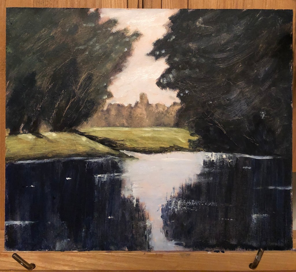
Someone had sent him a very bucolic photo of a local stream with trees and fields and asked how he would turn it into a painting. He demonstrated by showing how he works things through quite meticulously in his sketchbook, trying out compositions and making notes on colour choices and what does and doesn’t work. He explains his choices on moving features of the landscape, or removing some bits altogether, or combining them with another photo or sketch very well, and stresses the importance of planning a picture before starting – I don’t think I do nearly enough of that.
Someone had asked about making greens. Richard’s palette only contains shades of red, blue and yellow, and he mixes all the colours he needs from these. He showed us how to make a colour chart – see A4 sketchbook. He says that colours need to look fresh so you should only mix two (this is watercolours he is talking about) – more leads to mud. He emphasises the importance of taking the time and trouble to really get to know your colours well and what they can and cannot do – that way you identify gaps in your palette and know what to go and buy, rather than buying all sorts of ready mixed colours that you don’t need. He showed us one of his colour charts where he mixes various reds and blues to make greys – he calls this his “50 shades of grey” chart – boom boom!
I joined this meeting about half an hour in, unfortunately, as I had a hospital consultation which couldn’t be missed.
When I joined, I think it must have been into group members’ presentation time. Useful snippets gleaned:
Karl Schmidt-Rottluff’s ink still lifes – bright and vibrant
Croquis Cafe – I have not seen this before, so had a look a one of the videos on Vimeo – feels very slightly creepy, but might be useful for Part 4 sketches
Work of Josephine Halvorson – brought up in response to Emma (student) showing her paintings done on a walk – JH has done a similar sort of thing
Other interesting points:
David’s sketchbooks of repetitive drawings and how these led him to simplification and almost abstraction; he got the idea for some of this from Kaupelis (recommended text)
Felicity’s discussion of a photograph as being taken in a split second, and how the painter (painting from the photo) nevertheless aims to impart much more information than which is therein. It was pointed out that even minimal information, e.g. date or title, can change the way the viewer sees it.
My contribution to the discussion when it was my turn to start was based on:
the research material we had been given on the work of Sol Lewitt
The emailed suggestion for discussing artist books as methodology and questions around singular ”final piece” versus sketchbook experiment and process.
I, like David, had done several repeated sketches of one subject and had found that, as I got to know it, I was able to simplify it, adapt it, and felt moved to experiment with different ways to represent it. I am also learning how to make books. I wondered therefore whether a handmade book charting an investigation into ways of looking at, drawing and representing a particular subject, without having a finished final drawing or painting, could still be regarded as “a work of art”. After some discussion, basically the jury’s out – so I might try it and see.
Iain is a local artist involved in many local art groups; he has experimented with many materials and styles, and sells a lot of his work in local exhibitions and galleries.
Today he was demonstrating in pastels, in a particular style – what he calls “dark sky, white cottage”. He brought some examples of his work, and the style certainly is very eye catching – he doesn’t claim by any means to have invented it, and indeed I have seen similar paintings on various websites, as well as owning a painting by John Piper in this mould. However, it was good to watch someone create something like this from scratch.
He worked from a photograph of a cottage he knows well in the Scottish Islands.
He likes his paper to have plenty of tooth so that he does not need to use fixative; he recommends Pastelmat by Clairefontaine, and also Colourfix, which is Australian (this latter manufacturer also produces pastel primer which can be used on more or less anything, and can be mixed with a little acrylic paint if you want a coloured ground). His favourite pastel manufacturer is Sennelier, but he also uses a lot of Unison.
The technique I learned was rubbing the pastel into the paper using the heel of your hand – he suggests you can also cover the drawing with glassine and repeat, helps to obviate the need for fixative.
His key bit of advice: make confident marks even if you don’t feel confident, they look better. This is important for me and something I have discovered for myself only recently, since having been forced into using my left hand by virtue of a broken right shoulder – big clear left-handed marks have more impact than my little tentative and scribbling right-handed style. Every cloud…..
This took place between 6-8.50 pm – there were 6 students plus Helen the tutor. After introductions and explanations of the working of the software, we had a “quick” reaction to each others’ work, followed by more in-depth critique, first with a partner and then the group as a whole.
My piece was this 15 min sketch from a recent life drawing class. I am currently labouring under the handicap of a broken right shoulder (yes, I’m right-handed, wouldn’t you know…) so am having to draw, very inaccurately, with my left hand.
Immediate responses to the “quick” showing were:
Solid strength mood
Balanced
Perched, roughness
Uncomfortable
Both subjects solid
Strong position
An interesting and helpful discussion among the group followed my showing of my work (presented by my work partner for the evening, Felicity): if one lets go of – is freed from – the possibility/necessity of getting a drawing “right”, as I am having to do – where can you go? What other representations are there? What actually is right? – what other things can one convey apart from photographic accuracy? I confirmed that the experience is certainly making me observe much better, in order to give myself the best chance, and I am almost being forced to look much more in terms of shapes and their relation to one another. This conversation very much reflects a comment from my own tutor in response to my plight, who said she frequently advises students to work for a while with their non-dominant hand for these same reasons.
Other people’s work was diverse and we were all at very different points along the pathway, which afforded those further along to give the benefit of some nuts and bolts advice to those less advanced. We had a sculpture, a set of drawings, a large drawing telling a story, a still life and a portrait. Points for me to come out of these other discussions:
It can be helpful to work on several versions of a subject at the same time, allowing one to compare/contrast
Look for work of these artists, admired by other group members:
Jenny Saville (have done so – reminiscent of Freud?)
Maria Lassnig (have done so by looking at report of retrospective in 2016 at Tate Liverpool – apparently this was linked with work by Francis Bacon, and I can see why)
A defining characteristic of a fine art student is the ability to be critical (not quite sure how well I have achieved that by my slightly throwaway remarks above – must try harder).
Other points:
Need to install Chrome on laptop in hope of making Zoom work – it didn’t like Safari.
We were asked not to go into precise details about this in our blogs as the work Lydia shared was part of her still-to-be-published doctoral thesis. Suffice to say that I took from it her interest in recording walks in different media and forms. She too (see earlier blog notes on John Virtue, Rob Dudley, Emma Carter) talked about making work “responding to a place” rather than “a painting of a place”; she referenced some of John Virtue’s early work – small paintings of his postal round which he assembled as a tessellation (e.g. Landscape No 87, 1988). For more detail, see handwritten notes in my A4 hardback sketchbook.
Group discussion on working outside – problems and solutions
Lack of confidence – persevere – try drawing with others – take limited kit – work simply and smallish
Lone worker safety protocols, e.g. tell people where you’re going
Put the jacket of a book round your sketchbook when drawing people, e.g. in a cafe
People don’t bother you so much if you look as if you belong at what you’re doing (consider a yellow vest!)
Note how you’re feeling when you are working – this can become part of the work
Don’t let your mind limit you with worries about what might happen – give yourself permission to be there, and think in advance about what you might say if spoken to or challenged
Give yourself permission to go out and either draw or just look and get ideas – ‘how will I do this? ‘- rather than ‘what stops me?’
Critiques of work with a particular focus
Well, I was first up – guaranteed to get over nerves! I had already done some sketches thinking towards Assignment 3, and had initially intended to ask the group which sketch best fit the brief. However…having listened to Lydia this morning and thought about her references to John Virtue’s work, as well as her own, I had a bit of a lightbulb moment – so I read the group the brief, showed them all the sketches from different views, and then asked them if they thought it would be ok to present the pictures as a series. Their response was very positive – they felt the idea of multiple images was fine; the work didn’t need to be pristine and finished; I should be experimental with my support and materials (I showed them my ink and pen sketch on gesso-ed newspaper as an indication of where I was thinking of taking this – group thoroughly approved.)
See handwritten notes in A4 sketchbook for more details on others’ work – difficult for me to type with one left hand! – see notes on Assignment 3 for explanation.
Emma Carter-Bromfield is a South Devon artist working in acrylics and oils – see her website, www.emmasisland.com.
I took notes on her demonstration (see hardback A4 sketchbook) and don’t propose to regurgitate them here. What struck me about her painting was her freedom alongside her apparent enjoyment, almost need, to do it. As with several other painters I have experienced recently (e.g. Rob Dudley, John Virtue, see blog posts) she is aiming to capture the spirit and essence of a part of the world she loves, rather than trying to represent a particular fixed view.
This was as far as she got in the time available – quite something given the size of the canvas – enough to provide real inspiration.
I found a helpful book – Saumarez Smith, C. (2005), John Virtue, London Paintings, National Gallery Company, London. Saumarez Smith, the Director of the NG, talks therein about how he would often go and chat to Virtue during the latter’s tenure as Associate Artist, describing him as “…painting every day in dialogue with his heroes from the past; in particular, Constable and Turner, black-and-white photographs of whose works he keeps on the walls of his studios.” He goes on to describe how Virtue would sketch from the top of Somerset House and the NG buildings (…”leaning against the dome…”). I have thought I should like to try drawing from high up – one does it out on the wilds all the time, e.g. on Dartmoor, but less so where buildings are involved. I did try drawing the view down the stairs in my house with slightly disastrous effect (although my tutor kindly assured me it was worth persisting), and am now eyeing up the view through our attic window as a possibility for Assignment 3….
What is the appeal of John Virtue’s art?
Saumarez Smith says he produces a gestalt view, drawing straight onto the canvas, based on a multitude of drawings done in situ so that the final version is indeed greater than the sum of its parts. In addition, he thinks that the London rendered by Virtue is “…an intense visualisation of the remembered experience of particular buildings, of their visual relationship to one another……in other words…..its abstract, visual pattern.”
Saumarez Smith goes on to say: “It is big art, deeply imaginative…”. I am beginning to think that, eventually, that is what I’d want someone to say about my art – I’ve not hitherto classed myself as imaginative, quite the reverse, but it is what I aspire to.
In another book I found, (Michael Hue-Williams Fine Art, 1999, John Virtue, LA Louver, Venice, California) which relate to his series of paintings of the Exe estuary over the period March 1997-January 1999, twelve of his sketches are included from his numerous sketchbooks which held over 5000 sketches! – that’s a lot of sketches, I clearly need to get out and sketching more. Most of them just look like squiggles and scribble (fine for my style, then), but he is clearly trying to remind himself of a moment rather than something more figuratively observational.
I have also been drawn to the work of Julie Mehretu – I like the marks which are almost figurative but not quite, the map-like quality of many of her pictures, and the way she layers her work. She too mentions JMW Turner as an influence, as well as abstract artists such as Kandinsky, but she has taken these influences and turned them into something all her own, e.g. Transcending: The New International 2003, ink and acrylic on canvas, seen in Chapter 9 of Stout, K., 2014, Contemporary Drawing from the 1960s to Now, Tate Publishing. I also watched several videos of her talking about her approach on www.art21.org. _____________________________________________________
Rob is a well known local artist; he and his wife, Sian, have written several books and feature in magazines such as Artists and Illustrators – see their website at https://www.moortoseaarts.co.uk.
He came to do a demonstration followed by a workshop in the use of water mixable oils. I made notes which can be found in my A4 notebook so I won’t repeat them all here – except for three key points which need repeating to make me hold on to them:
He is beginning to paint the essence of the landscape, rather than the exact landscape there in front of him, and is feeling happy with his work as a result
You don’t need to put in everything that you see – just enough for it to be understandable to the observer. Does putting detail X in add anything to the overall effect? – if it detracts or complicates, best to leave it out. A message for me, I think!
Know where you’re going with a picture – always do a thumbnail sketch with your horizontals, verticals and diagonals first so that you are clear about the underlying structure.
The workshop was an “I do- you do” session, but his aim was to teach us a way of working with these materials which were unfamiliar to many of us (including me), so that was quite a useful way of working, and he was happy for us to go a bit off-piste if we wanted to experiment. Here’s my final outcome….
I found the suggested images online, and also looked at two useful books; one on Georges Seurat’s drawings (for text reference, see notes in A3 sketchbook), and one on the work of Tacita Dean – Harris, Hollinghurst & Smith, 2018, Tacita Dean, Landscape, Portrait, Still Life, Royal Academy of Arts, National Portrait Gallery and National Gallery.
I tried to copy some images from these books in order to get a feel for their drawing styles and composition choices…see A3 sketchbook for exact details of the original drawings.
My quick attempt at The Montafon Letter (see sketchbook for details)……
…and Tacita Dean’s.
My quick sketches in the style of Georges Seurat………
…..and the originals (see sketchbook for details).
Seurat -v- Dean: Similarities…
Their drawings are generally in black and white, often with strong contrasts
…and Differences
Seurat started with a light background and drew onto it with charcoal; Dean uses a blackboard as a support and draws with chalk (sometimes using chalk spray which I hadn’t heard of), some gouache and charcoal pencil
Having tried to draw in their style, Seurat’s drawings are quick, sketchy almost, very loose, suggesting their subject; Dean’s drawings are detailed and must surely take a great deal of time and care
Seurat’s subject interest (from the set of over 150 drawings I looked at) seemed predominantly to be with people; for her drawings, Dean is very taken with natural objects (apparently she has an impressive collection of 4 and 5 leaf clovers) and phenomena – clouds, of course, and geological features (as seen in The Montafon Letter and Fatigues, the reference piece).
Seurat’s compositions are of everyday scenes from the point of view of a passer-by; Dean’s drawings of mountains and clouds are set in lots of space, without a hint of the human race
****************
Comparison between Albrecht Durer and Ernesto Caivano
Despite my own (current) default style, best described as “sketchy”, I can draw with clear lines if I have to, and I always find myself personally drawn to clear, clean-lined drawings. I have chosen to compare two artists who draw in this style and whose work I greatly enjoy looking at, Durer and Caivano; in particular, Durer’s 1514 engraving, Melancolia I (see early research blog in this Part on landscape painters) and Caivano’s 2003 drawing The Land Inhibited, ink on paper, as seen in our recommended text – Dexter, 2005, Vitamin D, New Perspectives in Drawing, Phaidon Press Ltd.
Similarities…..
Imaginary scenes
Dramatic black/white drawings
Meticulous and highly-detailed
….and differences
Medium – Durer’s is an etching, whilst Caivano uses pen and ink
Mark-making; Vitamin D describes Caivano’s as “a hyper-detailed accumulation of short, micro-thin lines”, whereas Durer’s etching shows a range of lines and dots
Caivano produced blocks of flat uniform tone, whereas Durer’s tone is more “moulded”
Hadn’t come across this artist or his work before. The webpage quoted in the notes actually took me to the artist’s Amalfi series – I have to say I first opened the pictures up on my iPad in a gloomy room and was slightly taken aback as I could hardly make them out at all….happily I am now in better light and really like his range of colours. You can clearly see he uses a wide range of materials and marks, and he says that sometimes works into the paper so hard it tears, which he feels is all part of the making of the picture. I also found the Chiltern series on a different site – he says he has considerably reduced his colour range here and deliberately chosen “…organic, natural, desaturated and and ‘unpretty’ pigments….” for these – I was tempted to have a go at re-interpreting a drawing of a familiar place using his style, but really not sure where or how to start – the process seems as important to him as the outcome…he says: “Creating these landscapes is instinctive and intuitive, a direct, visceral engagement. Through a process of mark-making, sedimentation of material, textural surface layering and modulated monochromes, I seek to interpret the fundamentals of the topography, in particular revealing its underlying, elemental nature…”(www.nicholasherbert-drawings.co.uk). You can certainly feel that he gets into the zone.
John Virtue
Enormously dramatic landscapes in black ink and white paint – apparently he regards colour as a distraction, and one can quite see why when he is able to produce these hugely atmospheric pictures without it. The landscape pictures give me a much better insight into how to go about abstracting a view, which is often suggested in our notes, but was not sure how to do.
Black ink, shellac and acrylic on canvas (see on Annandale Galleries website)
But my favourites are his scenes of London, possibly because they are sufficiently on that line between abstract and representational to allow me to pick out bits I can recognise.
When reading about him I also followed up on one of the artists from whom he draws inspiration – Philips Koninck, 1619-1688, whom I hadn’t previously come across – huge dramatic skies – for example his An Extensive Landscape with a Road by a River………– now that’s a study in clouds for you.
Monet
Monet is famous for his series paintings….I have sat in the Orangery in Paris and immersed myself in his lily ponds, and stood for a good while in the Musee d’Orsay staring at one of his Rouen Cathedral series – you have to see a painting like this close up to realise just how magical it is that artists turn something which looks like a random set of blobs and strokes close up into this fantastic picture full of light and shadow – there seems to be a key point as you gradually step back from it when it all snaps into focus.
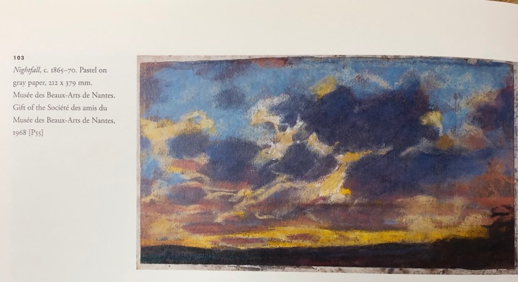
I found a great book – Ganz & Kendall (2007), The Unknown Monet, Pastels and Drawings,Yale University Press – which talked about the way Monet had “managed” his personal image, not liking to acknowledge that he drew, but that on a visit to London his canvases hadn’t arrived and so he did a series of drawings in pastels – this led the authors to seek out Monet’s other pastel drawings, many of which had gone almost unacknowledged by him and of which little is known about many. I found the book very heartening – his pastel drawings are loose and scribbly, rather like mine! – this one of several of clouds is an example.
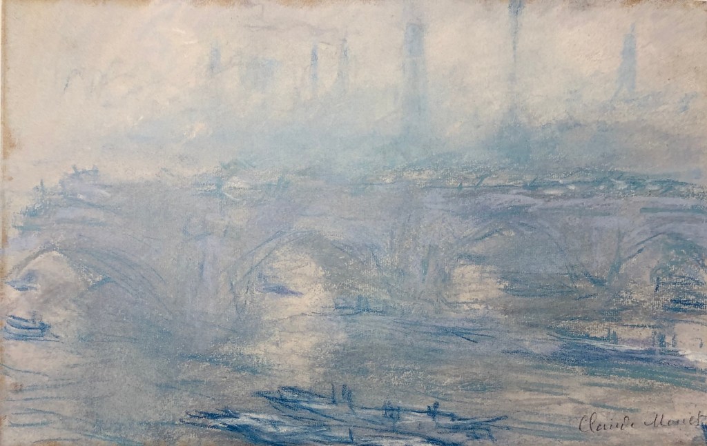
His Waterloo Bridge, (1901), Pastel, Villa Flora, Winterthur, Switzerland, has the same misty atmosphere with recognisable features emerging from the gloom the more you look, as the drawings of John Virtue a century later.
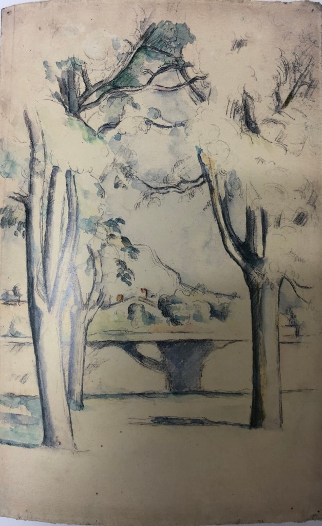
Cezanne
I looked for information about Cezanne’s works in series in the landscape in C. Lloyds, 2015, “Paul Cezanne, Drawings and Watercolours”, Thames and Hudson Ltd.
A good example was his Mont Sainte-Victoire pictures, “which soon became a symbol of such personal significance for the artist” – he would draw a range of different subjects, e.g. a Chateau, an abandoned quarry, his studio – all in view of Mont Sainte-Victoire. Gasquet wrote: “…..everywhere, at the horizon of every plain, at the end of every road, from one hill to another, the sight of Saint-Victoire entered Cezanne’s fresh eyes.”
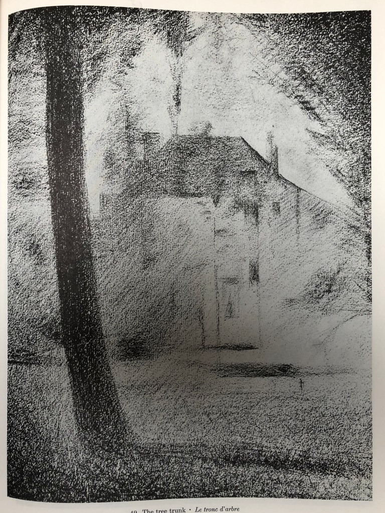
I particularly liked this drawing: Mont Sainte-Victoire seen beyond the wall of the Jas de Bouffan, 1885-88, pencil and watercolour, National Gallery of Art, Washington DC; I liked the way he has fitted his focus mountain in between the foreground tree trunks, showing minimal foliage except mid-top, effectively creating a framing arch for his focus, drawing the eye throughthe trees to the mountain in the distance.
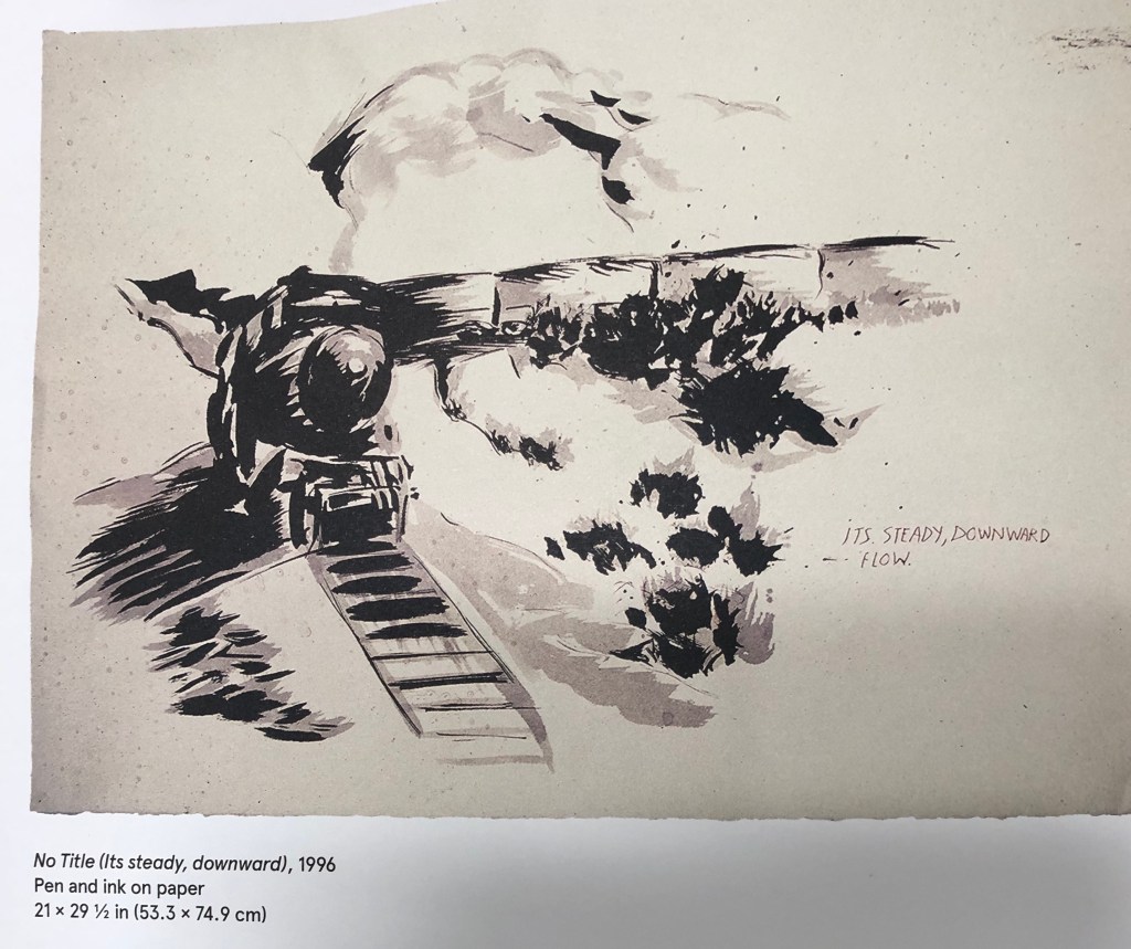
Raymond Pettibon
I hadn’t heard of this artist and didn’t know his work at all; but I soon found a massive book about his work: Gioni & Carrion-Murayari (eds)(2017), A Pen of all Work, Raymond Pettibon, Phaidon, The new Museum. All the artist’s work is annotated by him to a greater or lesser extent (although I have to confess that the messages the annotation was meant to convey weren’t always clear to me), and his works are mostly entitled “No Title” followed by remarks in brackets. The editors seem to have selected works around a theme and the book presents them together, e.g. the “train” pictures. This one: No Title (Its steady, downward), 1966, pen and ink on paper, reminded me a bit of the JMW Turner painting, Rain, Steam & Speed(1884), oil on canvas, National Gallery, London.
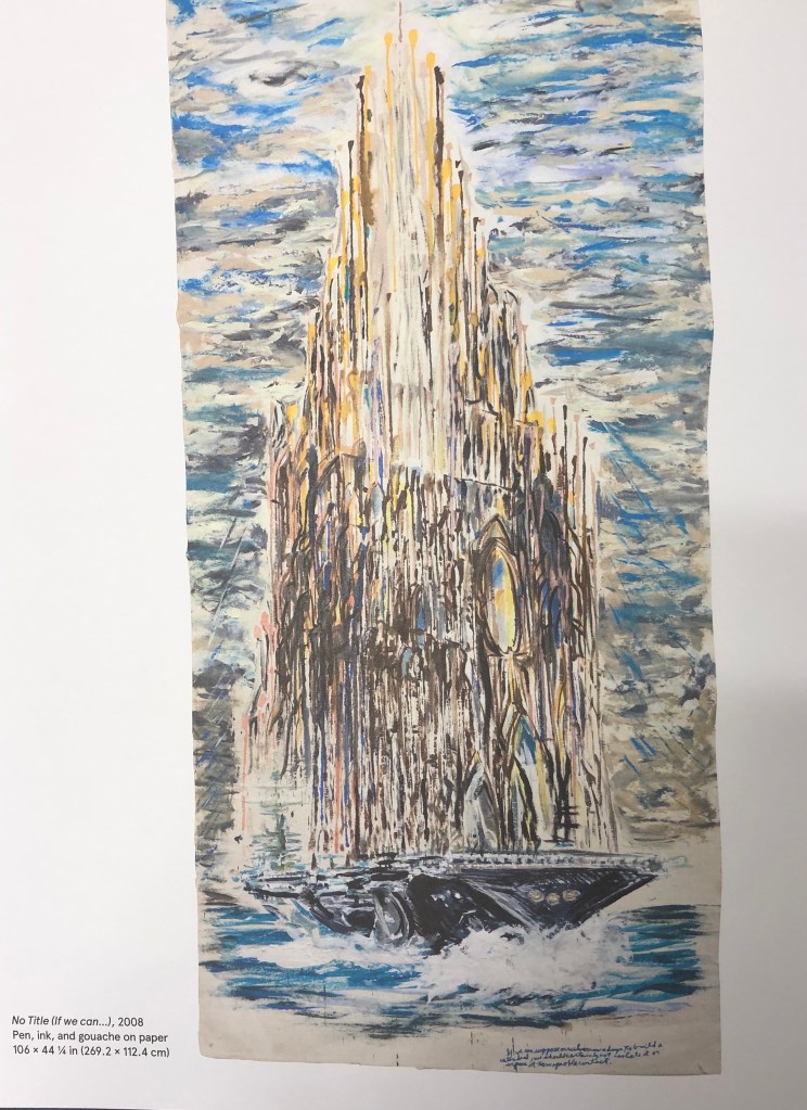
I also found a series of “cathedral” pictures (which made me think of Monet and his Rouen series), e.g. No Title (If we can…), 2008, pen, ink and gouache on paper, Private collection, courtesy Houser and Wirth.
Clearly speculating here, but looks as though Pettibon was good at what we art students are urged to try – studying the works of historic painters and then developing their ideas further to suit his own style and convey his own messages.
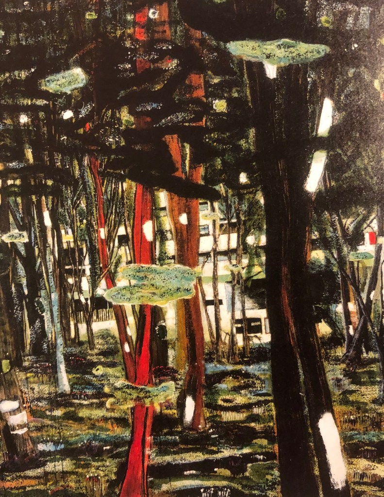
Kurt Jackson
This contemporary painter is a great favourite of mine and has been for many years; he was based in the far West of Cornwall and has now opened his own gallery in St-Just-in-Penwith. His current exhibition (see postcards and notes in my A4 sketchbook) is a whole series of paintings on the Helford River (Daphne du Maurier’s Frenchman’s Creek), which have been done at different times of day and night, different states of the tide, different times of year, and different viewpoints. I particularly enjoy his pictures depicting mud and rotting trees – he has been known to incorporate bits of the physical landscape (mud, twigs, stones, feathers, etc) into his work – something which I might consider trying.
David Hockney
I saw a David Hockney exhibition a couple of years ago in Paris at the Pompidou Centre – it was a retrospective going back to his very early pictures, but I have to say the work I liked best was his most recent iPad landscapes. I found out on www.royalacademy.org.uk that his series of pictures of Yorkshire was commissioned by them in advance – as he says in a video on the website, a gamble on their part and his, with so much space to fill; but fill it he did. His work is bright, vibrant, done with zingy acidic colours that often don’t quite fit the object/place they are depicting – but the images have defined a little-known area for many art-lovers.
Peter Doig
Some of Doig’s work seems very strange and otherworldly – more than a touch of Odilon Redon about him. He often has you looking through things or around things to get to the focal point of the picture. In the book J. Nesbitt (ed) 2008, Peter Doig, Tate, I found a series of landscapes where (rather in the fashion of Cezanne and his Mont Sainte-Victoire) a particular building is the focus but is seen from different angles and vantage points. Doig calls the building the “Concrete Cabin”, although it was actually l’Unite d’Habitation, the last of Le Corbusier’s buildings to be built, and intended for itinerant workers – see here, Concrete Cabin, 1991-2, oil on canvas, Leicester Arts & Museums Service.
Doig said: “instead of painting the facade of a building and then shrouding it with trees I would pick the architecture through the foliage, so that the picture would push itself up to your eye. I thought that was a much more real way of looking at things, because that is the way the eye looks: you are constantly looking through things, seeing the foreground and the background at the same time.”I can appreciate what he has done, but not sure I would want to draw or paint in his style; I find it somewhat unsettling, almost as if someone is standing right behind you whilst you’re looking at it – I think he means you to have an almost visceral reaction to his images, but to be drawn to look further into them despite yourself.