Drawing 1; Part 5; Where have I moved on to?

Quite a bit of reflecting has gone on as a result of a flurry of group discussion sessions. I feel I have been blundering around somewhat, largely because of my very wide initial question which sent me off in myriad different directions. Thinking has now gone as follows:

– I have really come down to being able to define what I actually want my question to be: how can I depict the essence of the river water in a drawing/series of drawings?

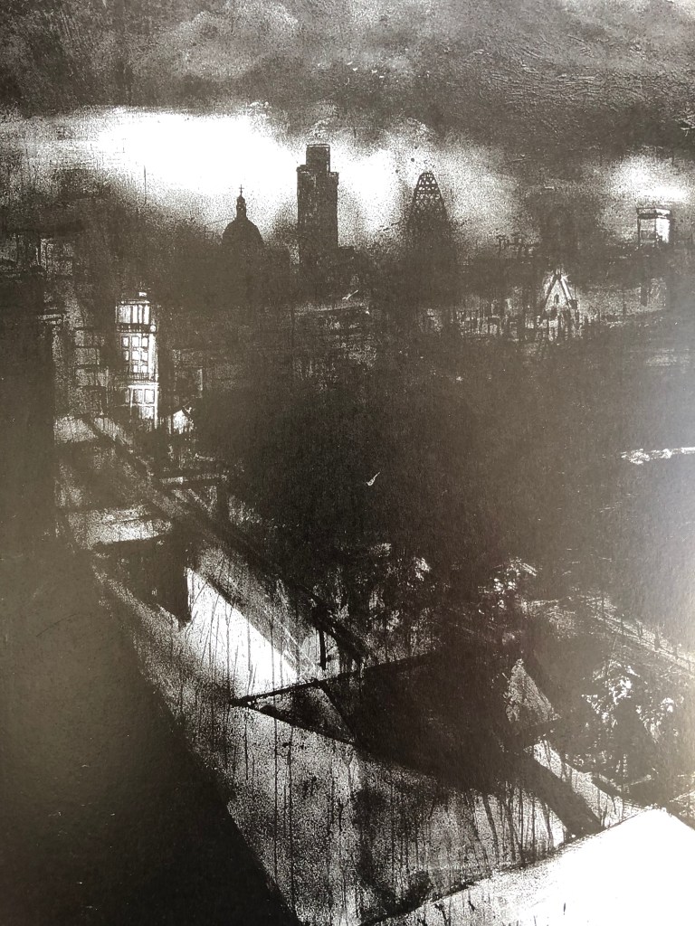
– This slight obsession I have (from looking at the Hockney iPad drawings – see separate blog posts) about the various layers of the river (river bed – water- reflections on surface – movement of surface – things on/over the surface) has to inform my final outcome.

– My first potential solution to this was some sort of collage-type image, where I would do a loose, fairly abstract depiction of the movement of the water in the style of John Virtue, and overlay it in parts with small detailed vignettes, in the style of Albrecht Durer; these would in part be cut out in water-drop shapes from my drawings resulting from the Tyga Herme exercise (see separate blog post) and arranged in a semi-tessellated pattern. This would combine my two strands which I had been following: loose semi-abstract work versus detailed representational work.

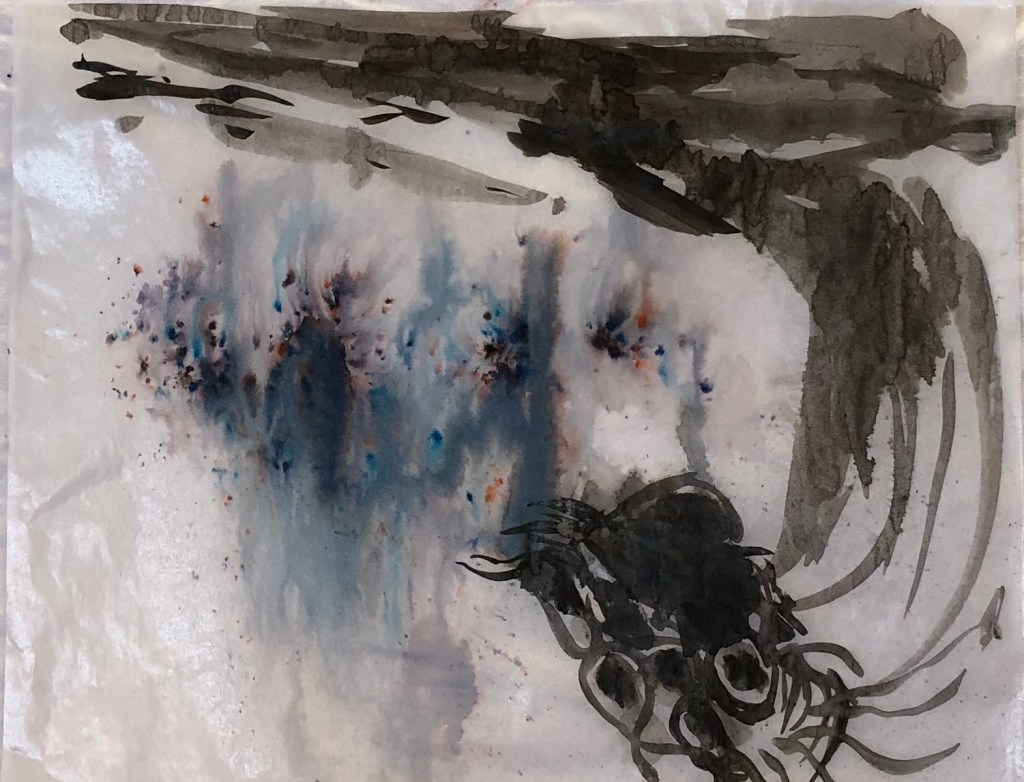
– Something was still niggling though. We sat the other day in the sun on a tiny island in the river (we went for a picnic lunch under the trees), and I did a couple of ink drawings:

…the first being a shady section of river right in front of us..

.

and the second was the river coming through a rocky section in full sun about ten yards to the left. Both just use FW acrylic inks in sepia and indigo applied with the stopper, spread about with a water pen and spray and drawn into with a black ink drawing pen. They are very different, which reinforced to me the differing characters of the river just over the space of a few yards; one is about dappled light and sometimes seeing the river bed, while the other is all action and surface.

  • This set me thinking about my layers again, and finding some way of showing this ever changing and sometimes transparent aspect of the water.
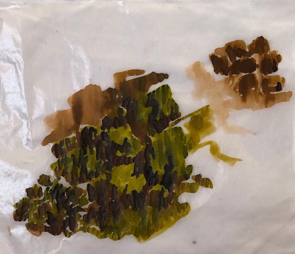
  • I took a couple of scrap pieces of glassine and drew on them with ink; on one I did some “river bed” marks,
  • and on the other some “surface” marks. It was a quick experiment and I was fairly free with the ink, which I put on with a Chinese brush – fortunately I had stuck the edges of the glassine down as it buckled up considerably and made the images very blurry, although they did settle down a bit once dry. My idea was to overlay the “river bed” sheet with the “surface” sheet and see if the idea of layers could be achieved. Mixed results…..

……when one sheet was just placed over the other like this the effect was not very clear (left).

However, when the two sheets were overlaid and held up to the light, the effect of layering was much clearer (below right).

I felt I was onto something here, although glassine wasn’t the right support. More thinking needed…

  • In the light of all the above, I decided that I wouldn’t cut up the Durer-style Tyga Helme exercise drawings after all, but would do what I had originally intended to do with them, which was to make them into a John Virtue-ish tessellation
  • I tried out various possible layouts, as John Virtue had done,
  • and decided that I liked them best in the cross – they run in a sweep from top row left to bottom row right. My plan is therefore to experiment with a background (I’m thinking either plain white so as not to detract from the drawings, or maybe a light streaky indigo wash to suggest river) on which to mount the drawings. Watch this space.
  • And I’ve also been thinking about PVA glue as a support for my transparent layers…another space to watch.

Fine Art Group discussion with Dan Robinson – “Mountains and Mythologies” – 18.5.20

This was an interesting discussion – Dan had provided a lot of stimulus material for us to look at and load up our thoughts and own resources onto a padlet beforehand, which is becoming increasingly useful now I am beginning to get the hang of it. The subject matter was evocative, the resources quite “out there” and thought provoking…..but in the end we talked largely about our processes and how to frame a good question – which I don’t think any of us particularly expected, but was interesting and helpful in a completely different way.

Points arising:

  • Dan started off by explaining his setting of the task and his framing of questions to start us thinking; this type of activity is very useful for research. Coming up with a good question can be key to help you apply for things, e.g. finding for a research fellowship at a university (Dan did this). It’s a good way to pull together information, ideas different, media and disciplines, e.g. writing, performance.
  • The assemblage of information which as a group we had generated on the padlet is a way of showing different kinds of knowledge,
  • Looking at people’s work digitally throws up questions of scale which we can either play with or fight with – it will affect how people read the work. In a sequence of images, one leads into an expectation of what the next will be like (which may be quite wrong!)
  • A quote from Roman Signer: “Incredible things happen in a moment.”
  • When coming up with a question for research, it’s good to have a wide one, but then you can then break it down into sub questions to explore – so, in a dissertation, this might form subheadings – e.g., in my case, I might be exploring particular media or portraying a particular aspect of the river (e.g. my thing about layers). Ask yourself; “What will this project ask?” By asking questions you are embracing the fact that you don’t yet know – to give yourself a genuine journey of discovery.
  • Collage – cutting things up and then moving them around – a very useful artistic device.
  • Choosing something that gives you a constraint – e.g. I’m only going to use a 2B pencil – can lead to some very creative work.
  • It can also be a good idea when framing your question to list the things that you will not do.

Photography lecture by Anna Fox – “Fact and Fiction in Contemporary Photography” 16.5.20

This was very kindly opened out to other groups by the Thames Valley group – I was interested in what Holly (see SW group hangout blog entry) had said about photography so thought I would turn up to this Zoom meeting and see what I could learn.

Very interesting and chatty lady. Brief notes:

  • Her text books: “Langford’s Basic Photography” and “Behind the Image” (research into photography)
  • She is taking part in a project called “Women in photo” run by a group called Fast Forward
  • Fiction is her inspiration. She derives ideas from the work of Cartier-Bresson and De Guerre.
  • A photo goes at a speed of 1/125 of a second – the eye can’t see this, so the image captured in a photo is not something you would “see”
  • Historically, photos began to be staged rather than “real”, see e.g. Edward Curtis and Dorothea Langer, and the question of paying the subjects was very controversial at the start, although it happens a lot now
  • One of her students used Old Master images, e.g. Vermeer, as inspiration for his own work, and he would try to set up staged poses to produce a similar scene
  • She collects bits of texts and photographs and then marries them together – she tried taking photos to specifically illustrate a piece of text but this didn’t work for her. She says that, if you choose to add text, it should be not too direct, not an afterthought, and as important as the image – so need to give thought to layout, typography, etc.

She shared with us the making of a piece called “My Mother’s Cupboards, My Father’s Words”. Her father’s words were actually quite abusive – she was very open with us in talking about the family’s experiences of living with her father and their various reactions to him, which was quite moving

Drawing 1; Part 5; South West Group hangout crit 11.5.20

Nice small group (me, Holly and Ruth) so time for some good discussion.

Holly is doing photography and has a landscape project where she has to produce a group or series of a dozen photos evoking the sublime – she has some lovely circular images which she is going to crop and make them look like planets by making them into vignettes. She said something interesting about photography as a discipline as against fine art – artists start with nothing and add stuff to make an image, whereas photographers start with loads of information and remove stuff to make an image. She had put up a draft of her artist’s statement explaining that she was going for round images as if someone was looking at a picture of a landscape through a magnifying glass, which rather chimed with my thoughts about putting some of my smaller drawings into my bigger drawings.

Ruth was doing illustration and had an exercise to do making comparisons between a portrait and a caricature (both of which she had to generate). We talked about life drawing and a website – lineofaction.com – was recommended (I did have a quick look but couldn’t immediately find it…?)

I talked about my current project and the way I have two strands to my work, the loose and large abstract representations and the small tight detailed illustrations. We talked about how to combine these – Holly suggested putting the abstract within a detailed drawing, or vice versa. She mentioned another student, Jane Coxhill, who is also looking at depicting water, so I have emailed her and am awaiting a reply.

Drawing 1; Part 5; Where am I now??

I am pausing in my investigation to try and draw thoughts together.

I haven’t at all followed my initial plan, which was to work through a stated list of artists, try out their work, and see what resonated with me as being the best way of achieving my goal, namely, to describe this stretch of the river in a drawing.

That’s not quite true – I started on the plan but was quickly diverted into a focus on particular key artists whose work I am finding most helpful – so I am deciding here to “park” experimenting with maps, diagrams and land art, and the artists associated with those. I am also “parking” Kurt Jackson, which is quite annoying as he is a favourite of mine and one I should like to come back to, perhaps in the Painting module – but I think I have more than enough to work with here and any extra would just confuse me more than I’m confused already.

So, which influences am I keeping?

It really comes down to four, although they are quite contradictory in style and somehow I need to resolve that conundrum. Lydia Halcrow and Tyga Helme have very been helpful to me on the path, but I am sticking with:

  • Vija Celmins and David Hockney for water. This is a rather odd pairing, but they go together as helping me with my depiction of water, which has become (unexpectedly) a real fascination. Vija Celmins made me look at it carefully and try to analyse it in all its complexity. David Hockney is here because he led me into iPad drawings and the idea of layers. I freely confess that I cannot for the life of me understand how to make my iPad drawing app work as it’s supposed to,  but I do get that it works on the principle of superimposing layers, which has made me really think about all the layers you have to consider when drawing water: the underlying rocks etc, which often you can’t see, but sometimes you can; the reflections on the water; the surface movements (with consequent impact on the reflections); and anything overhanging/above the water.
  • Albrecht Durer for his amazingly detailed drawings using line and tone, which I am determined I will be able to emulate eventually if only I can look better.
  • John Virtue. His tessellations initially pulled me in – I have an infernally organising nature – and then I was astounded by his sudden jump to these huge free loose black and white paintings. I have been reading (in Paul Moorhouse, 2019, John Virtue, Albion Barn Publishing, Oxford and Ridinghouse, London) about his London pictures, which have moved on again, are often very dark and suddenly, as if a mist clears momentarily, includes very detailed snatches of drawing – such as this one, which is a section of Landscape No 710, 2003-4, black ink, shellac and emulsion on canvas, 305 x 610cm, Queensland Art Gallery.

So, somehow, I think I want to:

  • Practise more drawing of water, which can be in quite an abstract way
  • Practise more detailed drawings of landscape features
  • Marry the two together somehow!

Drawing 1; Part 5; 2 South West Group meetings, mainly about assessment

14.4.20 – Group Hangout on Meet

This was a small group of us who ostensibly just met up to chat about how we are coping with COVID and any issues which had arisen …and the main issue was upcoming assessment for some and the introduction of purely digital assessment in the light of the lockdown. Points arising:

  • Look on the OCA Forum for a thread about assessment
  • If you’re taking photos of your work and some features, eg texture, don’t show up well in the photo, use text to explain the qualities you want to bring out
  • You could also make videos, eg of your sketchbook, but make them non-boring!
  • Assessors only have a relatively short time per student, so catch their interest and showcase what you want them to see

Also, one of the group pointed us towards the short workshops on the OCA student site, which we might find of interest to kick-start those who are floundering a bit.

5.5.20 – Zoom group specifically looking at new assessment regs

Most attending were going for July assessment but there was one other, like me, who was down for November assessment and just trying to pick others’ brains and get our heads round it in advance. Points arising:

  • Check that the learning outcomes shown online are those which you had been working towards from your printed folder (someone had found theirs was different!!)
  • Going forwards to next unit – write your blog posts with a view to covering specific learning outcomes, so these posts can be used as evidence
  • If you make a video of your sketchbook, this would fall in the blog category – the images they ask for are resolved final outcomes
  • Write against the LOs for the reflective evaluation
  • You need to make it easy for your assessor to find things
  • One student had put lots of images and films in a folder and was submitting that as one work (e.g. lots of close ups and then the whole piece)
  • Your learning log selection, portfolio and reflection can overlap
  • Possible follow-up meetings: 11th May for people with WIP to crit, and 18th and 25th May for people going for assessment – Karen will set up a GDrive where people can put their draft statements to share.

SW Group hangout on Meet – 14.4.20

Useful group chat with Holly, Karen, Ruth, Kate and Catherine.

A lot of the discussion centred around the new digital assessment, how we’re going about that and what clarification we need from the OCA. Useful points arising:

  1. Look on the OCA Forum for a recent thread about digital assessment.
  2. If you’re taking photos of your work and some features or qualities don’t show up well in the photo, use text to explain.
  3. Could also make short, non-boring but focused videos – this sometimes works well to show your sketchbooks.
  4. Make sure that you include any work that supports the final pieces.
  5. The assessors only have about 30-40 min to look at each student’s work, so it’s important to catch their interest and draw their attention to the things you most want seen
  6. The OCA has also recently put out some little workshops – look in News on the student site.

Drawing 1; Fine Art online group Zoom meeting with Dan Robinson on 23rd March 2020 – Art, Fiction and Place

A variety of useful points came up, some of particular relevance to me now at the start of Part 5 – these are in bold:

  • As we are not currently allowed to send our actual sketchbooks to our tutors due to the coronavirus restrictions, we can video a “walk-through of our sketchbooks and send that to our tutor, either by email or uploaded to the blog.
  • We could also video ourselves with particular artworks, e.g. A1 drawings, to give a sense of scale or particular physical qualities
  • New assessment guidelines are coming out, and digital assessment is highly likely
  • It is important anyway to develop our skills in creating digital images of our work as that is what happens in the real world (e.g. submitting entries for competitions)
  • I explained my idea for Part 5 of an investigation into ways of documenting my responses to a particular location through drawing – Dan referred me right back to the beginning of Part 1 and suggested that I consider the “temporary drawings” exercise, which might lead me to consider the question “What is drawing?”
  • Could I consider using some text extracts in my drawing, e.g. as part of a collage? (see Eduardo Recife)
  • Suggested artists to look at in connection with other people’s projects:
    • Xavier de Maistre’s “A Journey Round my Room” – an example of a jumping-off point for the imagination
    • Jo Spence and Terry Dennett
    • Helen Chadwick – Wreaths to Pleasure
    • Marina Abramovic
    • oca.padlet.org/stefanart/gkea8d4uaa87
  • Dan or someone in uni will send out details of Global Earth Day activities – or it will be on the blog – it’s a collaborative event

Drawing 1; Part 4; A useful book

For Christmas I was given Bell, Balchin & Tobin (eds for the Royal Drawing School), Ways of Drawing – Artists’ Perspectives and Practices,  (2019). Thames and Hudson, London. This is just a fantastic book, so many ideas, takes and styles, and loads of great advice. This little extract was perfect inspiration for life drawing – it’s from an essay by Ishbel Myerscough called “Focusing on the Individual”:

“I try to encourage the alchemy of concentration. Drawing is like magic. If we allow ourselves to detach from the world around us and form a perfect bubble between ourselves and the object, to shake off feelings of expectation or embarrassment or indeed our own hope for brilliance; if we stay calm, treat the viewed in an almost abstract fashion, focus on the essential; if, at first deliberately and then unconsciously, almost meditatively, we remove the fact that we are looking at a nose or an eye, or even a head or a person; if we watch the way that the line of the inner eyelid lifts at the corner, the improbability of the shape of the shadow under the nose – if we concentrate that hard, not making judgments while we are doing so but forging ahead until the trance is broken, when there will be an opportunity to stand back and assess – if all that is truly achieved, then magic is made. Whether or not the observation is right, in proportion or even has a likeness, an intensity has been achieved, a point of fascination. And that is what a drawing really needs.”

Brilliant advice.

Drawing 1; Part 4; Research point – The face

Graham Little’s portraits of striking women are frankly fabulous. Done in coloured pencil, they take – according to a Guardian review I read by Skye Sherwin (Nov 26th 2010) – many months to complete; remembering how stir-crazy I went trying to complete the first version of my Assignment 2 in coloured pencil, I think however that this method of drawing is not for me.

Elizabeth Peyton in some ways represents the opposite – her drawings and paintings appear much more rapidly rendered, using big watercolour strokes or strong and definite pencil/charcoal/crayon strokes. I found a book in the library about an exhibition of her work in New York’s New Museum entitled “Live Forever – Elizabeth Peyton” (pub Phaidon), and had a go at trying to draw in her style:

The charcoal drawing, using strong strokes, felt comfortable to me; the use of big brushstrokes in the copy of the Hockney portrait was less so, partly because it’s not how I’ve previously worked with a brush, and also because I haven’t done much brush work since breaking my shoulder as a brush feels more difficult to control with my left hand.

David Hockney’s upcoming exhibition at the National Portrait Gallery, “Drawing from Life” was favourably reviewed in the Daily Telegraph (26th Feb 2020 by Alastair Sooke), although at the end he remarks “Hockney is no Rembrandt, we realise, heroically grappling with old age. Unlike Lucian Freud, he can’t convey the coarse density of lived-in flesh. No, Hockney is – or rather was – all ethereal refinement and sunlight.”  I have to agree with Alastair Sooke here – I find Hockney’s portraits quite flat, a little like Gaugin’s – I did see a retrospective of his work in the Pompidou Centre, Paris, a couple of years ago, and this was my abiding impression, which hasn’t changed. A friend gave me a cutting of a review in The Times (Feb 24 2020) which compared a previously unseen version of a portrait of Hockney’s parents with a version exhibited in the Hayward Gallery in 1977 – we had a bit of “spot-the-difference” fun wondering why subtle changes in composition had been decided upon. His father had clearly become fed up with sitting and was engrossed in a newspaper in one version – something to bear in mind when asking people to sit!

(See cuttings scrapbook for both articles).

Looking back at the catalogue of the exhibition Pushing Paper – Contemporary drawing from 1970 to nowwhich I saw at the British Museum in January 2020 (see separate blog post on Museum visits), the portrait which still strikes me most is by Maggi HamblingMy Mother Dead, 7, 1988, graphite. The way the strokes are built up remind me a little of my own rather scribbly drawing style when I’m “reaching” for an image, and the fact that she has literally just drawn the face is very compelling.

On the subject of “floating” faces and heads, I was struck by Michael Landy’s portrait of his father, Daily Mirror, from the series “Welcome to my World”, 2004, crayon on paper, as seen in our recommended text, Vitamin D – New Perspectives in drawing. The way the carefully-observed drawing stops at the jawline really focuses attention on the face as we try to work out the nature of the sitter without the prompts of clothes, props, background, etc – the only clue given being the title of the work.

I looked at Nina Mae Fowler’s work online after listening to a BBC Radio Four podcast of a broadcast conversation between her and Nick Park (Only Artists – 26th June 2019). Like me, she enjoys drawing in graphite and charcoal, and is slightly embarrassed – as am I – over her excitement about her wide variety of erasers. She says that she spends 50% of her drawing time taking graphite and charcoal off the page to make the image. Nick Park was talking about his attempts to make a portrait of his wife (“she looks like Yoda sometimes”, which I felt very encouraging), and said that the portrait artist was surely trying to depict something beyond a mere likeness – NMF agreed but said that she felt that this came with practice…back to work then…. 

Chris Legaspi, author of Life Drawing for Artists – Understanding Figure Drawing Through Poses, Postures and Lighting, 2020, Quarto Publishing Group USA Inc, has honed his drawing method down to a formula of procedures which he can articulate and demonstrate, which has been very helpful for me as a beginner. His style has become recognisable to me, particularly I suppose because of his parallel shading technique using long lines – he sometimes uses these in his portraits to shade out a part of a face, which leaves the viewer to add in the details whilst highlighting the details in the rest of the face which is depicted.