The London Galleries – a January 2020 exploration – “seeing” superpowers

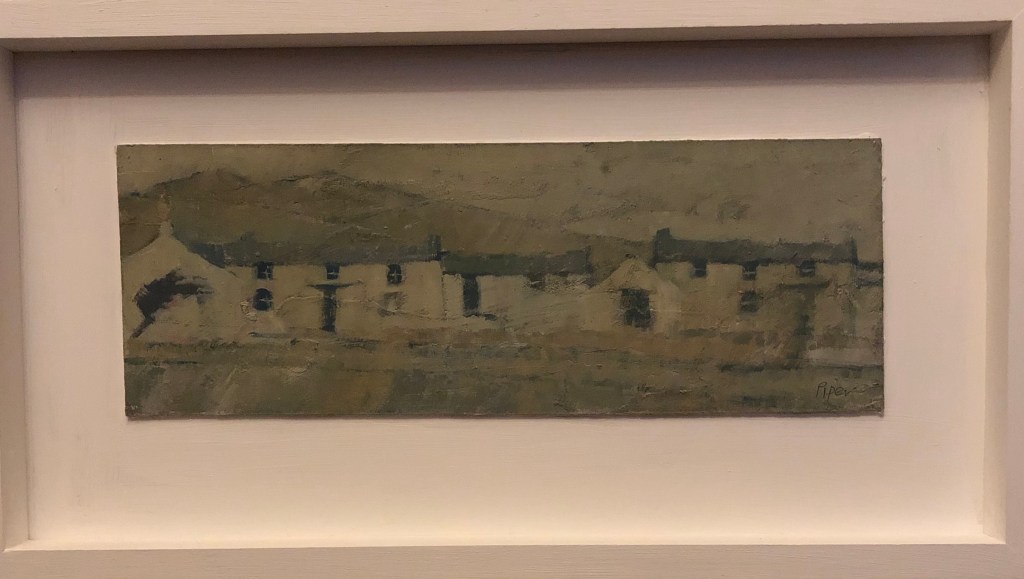
We went on our annual culture fest to London 6-10 January this year, trying to walk the tightrope of visiting as many exhibitions as possible without getting brain freeze.

Tate Britain – William Blake

This is quite brain freezing by the time you get even halfway round – I noticed several people pausing and looking around, taking a deep breath and clearly thinking Oh my goodness – there’s more!?

I don’t think I’ve ever seen a body of work quite like this. It spans Blake’s life, and he was prolific, meticulous, talented……and yet his art didn’t seem to me to develop and grow. His figures, whether drawn or painted or printed, are all in the same mould – tall, highly muscled, thick-necked, either nude or diaphanously clad, with straight Roman noses and pointed chins, staring dark eyes and often dark open mouths. Females and angelic types have hugely long thighs; heroic looking men have thick, muscular thighs. His favourite of all appears to be the man with the flowing beard, who at some stage in each series (he painted loads of series telling stories, some intelligible, others less so) is bound to feature sitting staring out of the picture full face with his knees tucked up under his chin. Gestures are sweeping, bodies are either oddly contorted or else gracefully flowing. He often drew or painted to illustrate a text, which is meticulously written, often tiny.

The only sets of pictures where individuals seem to depart from his “standard” faces are (a) the Chaucer series, where one can easily pick out particular characters, and (b) his late pictures of his visions, such as The Flea.

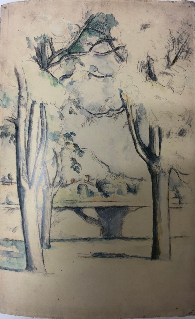
It was all so, so strange – one felt compelled to get to the end and give it all one’s full attention, and yet there was a feeling of drowning in it and disappearing into his, obviously brilliant, yet surely disturbed, psyche. But his influence on artists to follow, whether consciously or unconsciously, is there for those who look – surely Byrne Jones was attracted by the tall, sweeping ladies with the slightly bowed heads; Ronnie Mackintosh by the symmetrical angels in The angels hovering over the body of Christ in the sepulchre, c.1805, ink, watercolour on paper; Gaudier Brzeska in his more twisted forms?

Royal Academy – Lucian Freud self portraits

Inspiration!

The progression here was so startling – from line to paint, sort-of-good-ok to wonderful.

The drawings at first were average art student standard but grew in confidence as he started to experiment with composition, often having himself peering into drawings rather than being the obvious subject, and his use of varied mark making became an object lesson. An oddity was his facial proportion; his eyes were often set way above halfway up, making the top of his head seem artificially flattened or squashed – surely not a mis-seeing as his seeing becomes his superpower?

As soon as he jumps to painting, the oddity of proportion disappears. His experiments with watercolour are interesting as he does achieve lights and darks and gradations of colour, but the oils are what blows you away. The “seeing superpower” is highlighted by the way he works – a quick scrappy charcoal sketch, and then straight in with the painting which appears to grow out fully formed from the centre – the complete opposite of the advice I’ve always been given about working all parts of the image at once for harmony and continuity. Uncanny. Sheer brilliance. Unusually though, he never puts highlights in the eyes, making them seem like wells of dark, which all adds to the compelling quality of the images.

Royal Academy – Laura Knight

This was just a one-room exhibition, but was of great interest to me as it featured many of her drawings and sketchbooks from her interest in life drawings of circus performers, dancers etc – hence very relevant to my current work on Drawing 1 Part 4. At first it seemed to me as if she had two styles of sketching which was a little confusing – but I think it’s because, when she has a moderately static scene in front of her, she has time to put in shading (which she often does quite heavily – see e.g. Figures by the pool, c 1959, black biro in a sketchbook, Royal Academy of Arts, London), whereas when the subject is highly mobile, she focuses a lot of information into clean single lines (e.g. Drawing of ballet dancers, c. 1930s, pen and ink on paper, Royal Academy, London – about which she says: “..found the value of what I call rhythm, repetition of line, accented beat and cross rhythm, as in music”.) Lots of useful similar examples to be found in Valentine & Wickham, 2019, Laura Knight, A working life. Royal Academy of Arts, London.

National Gallery – Paul Gaugin – Portraits

When this exhibition was first reviewed in the national press, it seemed as though the gallery was very anti Gaugin’s attitudes and morals on the basis that he had taken advantage of young girls in Tahiti – and so I went with a positive mindset, determined to form my own opinions. I have never been completely sure about Gaugin anyway, he has always been in my mind the less talented half of the short-lived partnership with Van Gogh. The way the exhibition notes were written harped on rather about how frankly self-obsessed Gaugin was, how he was forever depressed about his lack of commercial success, etc, which did little to bolster my opinion of him – it felt they were showing his works almost in spite of themselves.

So, what of his actual work? Bright colours abound, and nearly every painting had a main pair of colours which were complementaries; blue and orange dominated, but there was also much red and green, and only a smattering of purple and yellow, although this was the dominant pairing on one of my favourites, Woman of the Mango, 1892, oil on canvas, Baltimore Museum of Art. He is a capable draughtsman, although there was not too much simple drawing to go on; my favourite was of a sketch of a face, or parts thereof, which he executes in very clear bold lines, and in which he was practising a nose which I could then identify about three paintings along – so he obviously did use drawing to work through tricky bits. His drawings of his erstwhile friend, Meijir de Haan (1889-90) and L’Arlesienne, Madame Ginoux, 1888, depict strong characters with a few bold confident lines. In his early days his paintings shimmered and had the short dabbed directional brushstrokes of Van Gogh, and I preferred those – for example, Interior with Aline, 1881, oil on canvas, private collection; and his still lifes are very Cezanne-like, e.g. Still Life with Profile of Laval, 1886, oil on canvas, Indianapolis Museum of Art. I suppose the later paintings feel as if they lack life because they look very flat, being painted apparently in thin washes; it seems that he disapproved of Van Gogh’s habit of applying paint thickly. And yet, by far my favourite painting in the whole exhibition is the last one, rendered shortly before his death; it is a self-portrait (Self portrait, 1903, oil on canvas, Kunstmuseum, Basel), looking directly out, no side, no weird objects in the background, no assumption of a character, no artifice, no bright colours (although he returned in a muted way to his apparent favourites, orange and blue) and I thought – here is the man – shame he didn’t do loads more of this.

National Portrait Gallery – Pre-Raphaelite Sisters

This was a spur of the moment afternoon visit after the Gaugin in the morning – we wondered if we had the brainspace and concentration to do it justice,  but it was as a well constructed exhibition with (good from my point of view) several excellent portrait drawings which have illustrated to me only too plainly just what can be achieved with graphite, charcoal and chalk. Back to the drawing board, then….

A couple which blew me away by the way of illustration are both by Dante Gabriel Rossetti;

Fanny Cornforth, 1874, coloured chalks on paper, Birmingham Museums and Art Gallery

Christina Rossetti, 1866,  coloured chalk on paper, private collection.

British Museum – inspired by the East

This exhibition looked at the effects of Islamic art from about 1500 upon us in the West. It explores the fascination we had with the Ottoman (Turkey etc) and Sarafid (Iran) empires (and indeed their gradually growing interest in us) and how this was fed by artists who went out and drew and painted somewhat idealised scenes, and of course, other artists who never left their studio but drew from a jumbled mismatched set of objects acquired from dealers. Some great drawings from life by Delacroix, but slightly disappointed by Ingres who totally invented harem odalisque drawings as Westerners were not allowed access and they therefore used their imaginations and used this as a bit of an excuse for female nude life drawings (in fairness, he was by no means alone in this, but I had thought better of him). Interestingly, the image on the publicity material which had drawn me in in the first place, a beautiful turquoise ceramic decorated vase, turned out to be 1800s European and based on the revival of ceramic, enamelling and glassware skills inspired by the Oriental Islamic craze. Stand out object by far for me was a set of 4 decorated tiles from 1500 – all the Western replicas and offshoots were around, but couldn’t match it for brilliance and sheer joyousness.

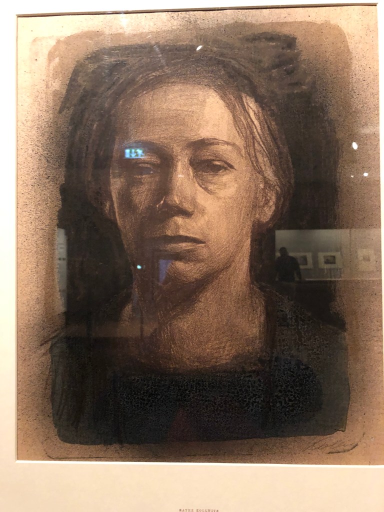
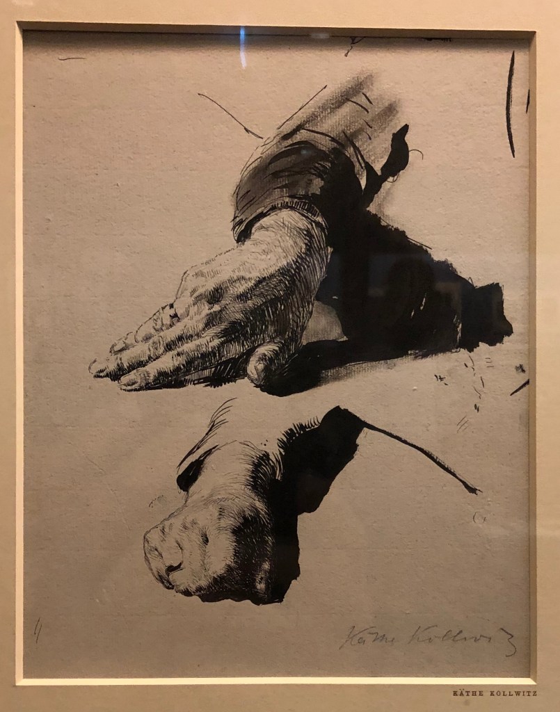
British Museum – Kathe Kollwitz

Unexpected and only open for two more days! I hadn’t known that this German artist of prints and etchings. Much of her work on show related to the First World War and was rather harrowing, as was her work on the death of a child (she had lost her son Peter) and, very self-indulgently, I wasn’t feeling in the mood for being harrowed. But there were a few excellent life drawings and portraits which drew my attention – specifically……

Self portrait in full face, 1904, crayon and brush lithograph in three colours overworked with black wash, British Museum

Studies of the artist’s left hand (or her right hand drawn as a mirror reflection) 1891, pen, black ink and wash, British Museum.

British Museum – Pushing Paper

I had already purchased the book accompanying this small exhibition (Seligman, Isabel (ed.)(2019), Pushing Paper, Contemporary drawing from 1970 to now, Thames and Hudson Ltd, London) so had an idea of what to expect, although art is almost invariably much more striking in real life, and that proved to be the case here.

Several pieces one ‘gets the hang of’ better, for example: David Nash’s Wooden Boulder, 1981, black-and-white photograph with graphite, charcoal and gouache on cream card – in the book I hadn’t appreciated the map-like quality of the drawings, which stand out much more in the (much larger) original – maps in drawings always appeal to me for some reason, think I must try them out for myself… My favourite after looking round though was still the image they have chosen for the back cover – Minjung Kim’s Mountain, 2009, ink on hanji paper – a demonstration of how knowledge and experience of materials and supports can make or break a drawing.

Notes on fine art group critique session on Zoom with tutor Helen Rousseau, 18.12.19

This took place between 6-8.50 pm  – there were 6 students plus Helen the tutor. After introductions and explanations of the working of the software, we had a “quick” reaction to each others’ work, followed by more in-depth critique, first with a partner and then the group as a whole.

My piece was this 15 min sketch from a recent life drawing class. I am currently labouring under the handicap of a broken right shoulder (yes, I’m right-handed, wouldn’t you know…) so am having to draw, very inaccurately, with my left hand. 

Immediate responses to the “quick” showing were:

  • Solid strength mood
  • Balanced
  • Perched, roughness
  • Uncomfortable
  • Both subjects solid
  • Strong position

An interesting and helpful discussion among the group followed my showing of my work (presented by my work partner for the evening, Felicity): if one lets go of – is freed from – the possibility/necessity of getting a drawing “right”, as I am having to do – where can you go? What other representations are there? What actually is right? – what other things can one convey apart from photographic accuracy? I confirmed that the experience is certainly making me observe much better, in order to give myself the best chance, and I am almost being forced to look much more in terms of shapes and their relation to one another. This conversation very much reflects a comment from my own tutor in response to my plight, who said she frequently advises students to work for a while with their non-dominant hand for these same reasons.

Other people’s work was diverse and we were all at very different points along the pathway, which afforded those further along to give the benefit of some nuts and bolts advice to those less advanced. We had a sculpture, a set of drawings, a large drawing telling a story, a still life and a portrait. Points for me to come out of these other discussions:

  • It can be helpful to work on several versions of a subject at the same time, allowing one to compare/contrast
  • Look for work of these artists, admired by other group members:
    • Jenny Saville (have done so – reminiscent of Freud?)
    • Maria Lassnig (have done so by looking at report of retrospective in 2016 at Tate Liverpool – apparently this was linked with work by Francis Bacon, and I can see why)
  • A defining characteristic of a fine art student is the ability to be critical (not quite sure how well I have achieved that by my slightly throwaway remarks above – must try harder).

Other points:

Need to install Chrome on laptop in hope of making Zoom work – it didn’t like Safari.

SOUTH WEST GROUP MEETING AT BRISTOL, 9.11.19 – LED BY LYDIA HALCROW, DRAWING AND PAINTING TUTOR

Lydia’s own work

We were asked not to go into precise details about this in our blogs as the work Lydia shared was part of her still-to-be-published doctoral thesis. Suffice to say that I took from it her interest in recording walks in different media and forms. She too (see earlier blog notes on John Virtue, Rob Dudley, Emma Carter) talked about making work “responding to a place” rather than “a painting of a place”; she referenced some of John Virtue’s early work – small paintings of his postal round which he assembled as a tessellation (e.g. Landscape No 87, 1988). For more detail, see handwritten notes in my A4 hardback sketchbook.

Group discussion on working outside – problems and solutions

  • Lack of confidence – persevere – try drawing with others – take limited kit – work simply and smallish
  • Lone worker safety protocols, e.g. tell people where you’re going
  • Put the jacket of a book round your sketchbook when drawing people, e.g. in a cafe
  • People don’t bother you so much if you look as if you belong at what you’re doing (consider a yellow vest!)
  • Note how you’re feeling when you are working – this can become part of the work
  • Don’t let your mind limit you with worries about what might happen – give yourself permission to be there, and think in advance about what you might say if spoken to or challenged
  • Give yourself permission to go out and either draw or just look and get ideas – ‘how will I do this? ‘- rather than ‘what stops me?’

Critiques of work with a particular focus

Well, I was first up – guaranteed to get over nerves! I had already done some sketches thinking towards Assignment 3, and had initially intended to ask  the group which sketch best fit the brief. However…having listened to Lydia this morning and thought about her references to John Virtue’s work, as well as her own, I had a bit of a lightbulb moment – so I read the group the brief, showed them all the sketches from different views, and then asked them if they thought it would be ok to present the pictures as a series. Their response was very positive – they felt the idea of multiple images was fine; the work didn’t need to be pristine and finished; I should be experimental with my support and materials (I showed them my ink and pen sketch on gesso-ed newspaper as an indication of where I was thinking of taking this – group thoroughly approved.)

See handwritten notes in A4 sketchbook for more details on others’ work – difficult for me to type with one left hand! – see notes on Assignment 3 for explanation.

Drawing 1; Part 3 – Expanse Tavistock Group of Artists demonstration – 12.11.19 – Emma Carter

Emma Carter-Bromfield is a South Devon artist working in acrylics and oils – see her website, www.emmasisland.com.

I took notes on her demonstration (see hardback A4 sketchbook) and don’t propose to regurgitate them here. What struck me about her painting was her freedom alongside her apparent enjoyment, almost need, to do it. As with several other painters I have experienced recently (e.g. Rob Dudley, John Virtue, see blog posts) she is aiming to capture the spirit and essence of a part of the world she loves, rather than trying to represent a particular fixed view.

This was as far as she got in the time available – quite something given the size of the canvas – enough to provide real inspiration.

Drawing 1; Part 3 – Expanse; Project 5 – Townscapes; Research point

John Virtue

I found a helpful book – Saumarez Smith, C. (2005), John Virtue, London Paintings, National Gallery Company, London. Saumarez Smith, the Director of the NG, talks therein about how he would often go and chat to Virtue during the latter’s tenure as Associate Artist, describing him as “…painting every day in dialogue with his heroes from the past; in particular, Constable and Turner, black-and-white photographs of whose works he keeps on the walls of his studios.” He goes on to describe how Virtue would sketch from the top of Somerset House and the NG buildings (…”leaning against the dome…”). I have thought I should like to try drawing from high up – one does it out on the wilds all the time, e.g. on Dartmoor, but less so where buildings are involved. I did try drawing the view down the stairs in my house with slightly disastrous effect (although my tutor kindly assured me it was worth persisting), and am now eyeing up the view through our attic window as a possibility for Assignment 3….

What is the appeal of John Virtue’s art?

  • Saumarez Smith says he produces a gestalt view, drawing straight onto the canvas, based on a multitude of drawings done in situ so that the final version is indeed greater than the sum of its partsIn addition, he thinks that the London rendered by Virtue is “…an intense visualisation of the remembered experience of particular buildings, of their visual relationship to one another……in other words…..its abstract, visual pattern.”
  • Saumarez Smith goes on to say: “It is big art, deeply imaginative…”.   I am beginning to think that, eventually, that is what I’d want someone to say about my art – I’ve not hitherto classed myself as imaginative, quite the reverse, but it is what I aspire to.

In another book I found, (Michael Hue-Williams Fine Art, 1999, John Virtue, LA Louver, Venice, California) which relate to his series of paintings of the Exe estuary over the period March 1997-January 1999, twelve of his sketches are included from his numerous sketchbooks which held over 5000 sketches! – that’s a lot of sketches, I clearly need to get out and sketching more. Most of them just look like squiggles and scribble (fine for my style, then), but he is clearly trying to remind himself of a moment rather than something more figuratively observational.

   _________________________________________________________

I have also been drawn to the work of Julie Mehretu – I like the marks which are almost figurative but not quite, the map-like quality of many of her pictures, and the way she layers her work. She too mentions JMW Turner as an influence, as well as abstract artists such as Kandinsky, but she has taken these influences and turned them into something all her own, e.g. Transcending: The New International 2003, ink and acrylic on canvas, seen in Chapter 9 of Stout, K., 2014, Contemporary Drawing from the 1960s to Now, Tate Publishing. I also watched several videos of her talking about her approach on www.art21.org.   _____________________________________________________

Drawing 1; Part 3 – Expanse; Demonstration and workshop with Rob Dudley on 6.11.19 at West Devon Art Group

Rob is a well known local artist; he and his wife, Sian, have written several books and feature in magazines such as Artists and Illustrators – see their website at https://www.moortoseaarts.co.uk.

He came to do a demonstration followed by a workshop in the use of water mixable oils. I made notes which can be found in my A4 notebook so I won’t repeat them all here – except for three key points which need repeating to make me hold on to them:

  • He is beginning to paint the essence of the landscape, rather than the exact landscape there in front of him, and is feeling happy with his work as a result
  • You don’t need to put in everything that you see – just enough for it to be understandable to the observer. Does putting detail X in add anything to the overall effect? – if it detracts or complicates, best to leave it out. A message for me, I think!
  • Know where you’re going with a picture – always do a thumbnail sketch with your horizontals, verticals and diagonals first so that you are clear about the underlying structure.

The workshop was an “I do- you do” session, but his aim was to teach us a way of working with these materials which were unfamiliar to many of us (including me), so that was quite a useful way of working, and he was happy for us to go a bit off-piste if we wanted to experiment. Here’s my final outcome….

Drawing 1; Part 3 – Expanse; Project 3 – Composition; Research point

Comparison between Tacita Dean and Georges Seurat

I found the suggested images online, and also looked at two useful books; one on Georges Seurat’s drawings (for text reference, see notes in A3 sketchbook), and one on the work of Tacita Dean – Harris, Hollinghurst & Smith, 2018, Tacita Dean, Landscape, Portrait, Still Life, Royal Academy of Arts, National Portrait Gallery and National Gallery.

I tried to copy some images from these books in order to get a feel for their drawing styles and composition choices…see A3 sketchbook for exact details of the original drawings.

My quick attempt at The Montafon Letter (see sketchbook for details)……

…and Tacita Dean’s.

My quick sketches in the style of Georges Seurat………

…..and the originals (see sketchbook for details).

Seurat -v- Dean: Similarities…

  • Their drawings are generally in black and white, often with strong contrasts

…and Differences

  • Seurat started with a light background and drew onto it with charcoal; Dean uses a blackboard as a support and draws with chalk (sometimes using chalk spray which I hadn’t heard of), some gouache and charcoal pencil
  • Having tried to draw in their style, Seurat’s drawings are quick, sketchy almost, very loose, suggesting their subject; Dean’s drawings are detailed and must surely take a great deal of time and care
  • Seurat’s subject interest (from the set of over 150 drawings I looked at) seemed predominantly to be with people; for her drawings, Dean is very taken with natural objects (apparently she has an impressive collection of 4 and 5 leaf clovers) and phenomena – clouds, of course, and geological features (as seen in The Montafon Letter and Fatigues, the reference piece).
  • Seurat’s compositions are of everyday scenes from the point of view of a passer-by; Dean’s drawings of mountains and clouds are set in lots of space, without a hint of the human race 

****************

Comparison between Albrecht Durer and Ernesto Caivano

Despite my own (current) default style, best described as “sketchy”, I can draw with clear lines if I have to, and I always find myself personally drawn to clear, clean-lined drawings. I have chosen to compare two artists who draw in this style and whose work I greatly enjoy looking at, Durer and Caivano; in particular, Durer’s 1514 engraving, Melancolia I (see early research blog in this Part on landscape painters) and Caivano’s 2003 drawing The Land Inhibited, ink on paper, as seen in our recommended text – Dexter, 2005, Vitamin D, New Perspectives in Drawing, Phaidon Press Ltd.

Similarities…..

  • Imaginary scenes
  • Dramatic black/white drawings
  • Meticulous and highly-detailed 

….and differences

  • Medium – Durer’s is an etching, whilst Caivano uses pen and ink
  • Mark-making; Vitamin D describes Caivano’s as “a hyper-detailed accumulation of short, micro-thin lines”, whereas Durer’s etching shows a range of lines and dots
  • Caivano produced blocks of flat uniform tone, whereas Durer’s tone is more “moulded”

******************

Drawing 1, Part 3 – Expanse; Project 2 – Landscape; Research point – artists working in series with the landscape

Nicholas Herbert

Hadn’t come across this artist or his work before. The webpage quoted in the notes actually took me to the artist’s Amalfi series – I have to say I first opened the pictures up on my iPad in a gloomy room and was slightly taken aback as I could hardly make them out at all….happily I am now in better light and really like his range of colours. You can clearly see he uses a wide range of materials and marks, and he says that sometimes works into the paper so hard it tears, which he feels is all part of the making of the picture. I also found the Chiltern series on a different site – he says he has considerably reduced his colour range here and deliberately chosen “…organic, natural, desaturated and and ‘unpretty’ pigments….” for these – I was tempted to have a go at re-interpreting a drawing of a familiar place using his style, but really not sure where or how to start – the process seems as important to him as the outcome…he says: “Creating these landscapes is instinctive and intuitive, a direct, visceral engagement. Through a process of mark-making, sedimentation of material, textural surface layering and modulated monochromes, I seek to interpret the fundamentals of the topography, in particular revealing its underlying, elemental nature…”(www.nicholasherbert-drawings.co.uk). You can certainly feel that he gets into the zone.

John Virtue

Enormously dramatic landscapes in black ink and white paint – apparently he regards colour as a distraction, and one can quite see why when he is able to produce these hugely atmospheric pictures without it. The landscape pictures give me a much better insight into how to go about abstracting a view, which is often suggested in our notes, but was not sure how to do.

Landscape No. 536

© John Virtue 1997-8

27.6 x 37.8 cm

Black ink, shellac and acrylic on canvas (see on Annandale Galleries website)

But my favourites are his scenes of London, possibly because they are sufficiently on that line between abstract and representational to allow me to pick out bits I can recognise.

When reading about him I also followed up on one of the artists from whom he draws inspiration – Philips Koninck, 1619-1688, whom I hadn’t previously come across – huge dramatic skies – for example his An Extensive Landscape with a Road by a River………– now that’s a study in clouds for you.

Monet

Monet is famous for his series paintings….I have sat in the Orangery in Paris and immersed myself in his lily ponds, and stood for a good while in the Musee d’Orsay staring at one of his Rouen Cathedral series – you have to see a painting like this close up to realise just how magical it is that artists turn something which looks like a random set of blobs and strokes close up into this fantastic picture full of light and shadow – there seems to be a key point as you gradually step back from it when it all snaps into focus.

I found a great book – Ganz & Kendall (2007), The Unknown Monet, Pastels and Drawings,Yale University Press – which talked about the way Monet had “managed” his personal image, not liking to acknowledge that he drew, but that on a visit to London his canvases hadn’t arrived and so he did a series of drawings in pastels – this led the authors to seek out Monet’s other pastel drawings, many of which had gone almost unacknowledged by him and of which little is known about many. I found the book very heartening – his pastel drawings are loose and scribbly, rather like mine! – this one of several of clouds is an example.

His Waterloo Bridge, (1901), Pastel, Villa Flora, Winterthur, Switzerland, has the same misty atmosphere with recognisable features emerging from the gloom the more you look, as the drawings of John Virtue a century later.  

Cezanne

I looked for information about Cezanne’s works in series in the landscape in C. Lloyds, 2015, “Paul Cezanne, Drawings and Watercolours”, Thames and Hudson Ltd.

A good example was his Mont Sainte-Victoire pictures, “which soon became a symbol of such personal significance for the artist” – he would draw a range of different subjects, e.g. a Chateau, an abandoned quarry, his studio – all in view of Mont Sainte-Victoire. Gasquet wrote: “…..everywhere, at the horizon of every plain, at the end of every road, from one hill to another, the sight of Saint-Victoire entered Cezanne’s fresh eyes.”

I particularly liked this drawing: Mont Sainte-Victoire seen beyond the wall of the Jas de Bouffan, 1885-88, pencil and watercolour, National Gallery of Art, Washington DC; I liked the way he has fitted his focus mountain in between the foreground tree trunks, showing minimal foliage except mid-top, effectively creating a framing arch for his focus, drawing the eye throughthe trees to the mountain in the distance.

Raymond Pettibon

I hadn’t heard of this artist and didn’t know his work at all; but I soon found a massive book about his work: Gioni & Carrion-Murayari (eds)(2017), A Pen of all WorkRaymond Pettibon, Phaidon, The new Museum. All the artist’s work is annotated by him to a greater or lesser extent (although I have to confess that the messages the annotation was meant to convey weren’t always clear to me), and his works are mostly entitled “No Title” followed by remarks in brackets. The editors seem to have selected works around a theme and the book presents them together, e.g. the “train” pictures. This one: No Title (Its steady, downward)1966, pen and ink on paper, reminded me a bit of the JMW Turner painting, Rain, Steam & Speed(1884), oil on canvas, National Gallery, London.

I also found a series of “cathedral” pictures (which made me think of Monet and his Rouen series), e.g. No Title (If we can…), 2008, pen, ink and gouache on paper, Private collection, courtesy Houser and Wirth.

Clearly speculating here, but looks as though Pettibon was good at what we art students are urged to try – studying the works of historic painters and then developing their ideas further to suit his own style and convey his own messages.

Kurt Jackson

This contemporary painter is a great favourite of mine and has been for many years; he was based in the far West of Cornwall and has now opened his own gallery in St-Just-in-Penwith. His current exhibition (see postcards and notes in my A4 sketchbook) is a whole series of paintings on the Helford River (Daphne du Maurier’s Frenchman’s Creek), which have been done at different times of day and night, different states of the tide, different times of year, and different viewpoints. I particularly enjoy his pictures depicting mud and rotting trees – he has been known to incorporate bits of the physical landscape (mud, twigs, stones, feathers, etc) into his work – something which I might consider trying.

David Hockney

I saw a David Hockney exhibition a couple of years ago in Paris at the Pompidou Centre – it was a retrospective going back to his very early pictures, but I have to say the work I liked best was his most recent iPad landscapes. I found out on www.royalacademy.org.uk that his series of pictures of Yorkshire was commissioned by them in advance – as he says in a video on the website, a gamble on their part and his, with so much space to fill; but fill it he did. His work is bright, vibrant, done with zingy acidic colours that often don’t quite fit the object/place they are depicting – but the images have defined a little-known area for many art-lovers.

Peter Doig

Some of Doig’s work seems very strange and otherworldly – more than a touch of Odilon Redon about him. He often has you looking through things or around things to get to the focal point of the picture. In the book J. Nesbitt (ed) 2008, Peter Doig, Tate, I found a series of landscapes where (rather in the fashion of Cezanne and his Mont Sainte-Victoire) a particular building is the focus but is seen from different angles and vantage points. Doig calls the building the “Concrete Cabin”, although it was actually l’Unite d’Habitation, the last of Le Corbusier’s buildings to be built, and intended for itinerant workers – see here, Concrete Cabin, 1991-2, oil on canvas, Leicester Arts & Museums Service. 

Doig said: “instead of painting the facade of a building and then shrouding it with trees I would pick the architecture through the foliage, so that the picture would push itself up to your eye. I thought that was a much more real way of looking at things, because that is the way the eye looks: you are constantly looking through things, seeing the foreground and the background at the same time.”I can appreciate what he has done, but not sure I would want to draw or paint in his style; I find it somewhat unsettling, almost as if someone is standing right behind you whilst you’re looking at it – I think he means you to have an almost visceral reaction to his images, but to be drawn to look further into them despite yourself.

Drawing 1; Part 3: A trip to St. Ives……Cornwall in October

Just back from lovely St. Ives in Cornwall where we stayed for a couple of days to celebrate our anniversary.

Weather was mixed, sometimes glorious and sometimes pouring, but got some lovely photos from our hotel which I am considering for foreground-midground-background analysis at some stage.

We had a very arty time; some notes here, and see also those in my A4 and A3 sketchbooks.

Tate St. Ives was showing an exhibition of the work of Otobong Nkanga, called “From where I stand”; it’s been on since 21st Sept and will be there until 5th Jan 2020. I read the gallery’s introductory information leaflet over a cup of coffee upon arrival and decided that this was going to be the sort of rather worthy-yet-preachy sort of thing that I wasn’t going to enjoy – so I was delighted to find that I was absolutely wrong….her basic theme was on the taking of minerals from the ground and people’s consumption of those minerals and the effect thereof, but:

  • She works in a huge diverse range of media – performance, woven textiles, drawing, photography, video and audio, installation…..
  • The size and scale of her work – the new wing at Tate St. Ives is pretty big, but her work filled it
  • Her interest in mapping and representing complex interrelationships and connections between people and the land in map-like diagrams was something which appealed to me (being a bit of a map nerd myself) – her pictures really clearly laid out all aspects of a complicated, and global, issue, and presented them for the viewer to reflect on and draw their own conclusions, rather than attempting to impose the artist’s opinions
  • Her clean lines and neatness and attention to detail also appealed to my tidy nature
  • I loved her use of bright clear colours – it was interesting the way she had blobs of all the colours she used in the corner of a picture, almost as if recording her palette for posterity

************

We mountaineered up Stennack Hill in torrential rain to the Leach Pottery– erstwhile home of the potters Bernard Leach and Shoji Hamada, their work being continued today by many visiting and resident potters. Quality and style of pottery as wide as ever; was struck by a display about a local lady potter – shame on me, I was sure I would remember her correct name but can’t quite, it was something like Sarah Davidson (oh dear) – anyway, she says that all her designs are based on her drawings, and that even though sometimes it looks as if a design is coming out of her head, she finds she can invariably trace it back to an earlier drawing in one of her sketchbooks – they had a couple of examples of her sketchbooks there, which looked as if they had been constantly carried around in her pocket, they were very battered and absolutely stuffed with reference material – a role model if ever I saw one.

*************

The Penwith Gallery was having its 70th Anniversary Exhibition (5th October – 2nd November) – an old pilchard factory has been converted into a beautiful space, surprisingly large and well-lit. A wide range of paintings, ceramics and sculpture was there to wander amongst, but I found three contemporary artists, all of differing styles, whose work I liked, and whose styles were very clearly developed:

  • Sally Spens: she had a set of etchings on display relating to the Venice Biennale, where she had observed corners, gateways and so on – but she had a series of moon jar designs which I loved – the shape of moon jars has always appealed to me, and her oriental designs were very pleasing – she obviously draws carefully with clean lines. On her website,www.sallyspens.com, she says: “Drawing has always been central to my practice, both as a textile designer and as a painter/printmaker. It is important to me that the images are handmade, and originate from my drawings and experience. “
  • Mary Ann Green: I found a card of hers, a picture called “In the Silent Fold of the Land” – it’s a landscape with not much obviously going on, but she has made it interesting by shading some parts in detail and others not at all, and by introducing little bits of colour into what is overall a black and white drawing. I looked her up and found that she is a member of the St Ives Society of Artists; many of her other pictures include this same folded hillside motif.
  • John Piper, a member of the Penwith Society, also has a motif that appears many times in his work – little rows of Cornish cottages, battered by wind and weather, hunkering into the landscape, absolutely characteristic of West Penwith, the far end of Cornwall. He paints in oil and we liked one of his paintings so much that we bought it! This is “Soft Carn”, and is painted in oils on board. First time I’ve ever owned a painting with a sealed provenance before! Its tones are muted but if you look at it carefully you find little patches of bright pinks and blues – and the view is of an area very close to my heart.

Drawing 1; Part 3 – Expanse; Project 2 – Landscape; Research point – Landscape artists of different eras

Albrecht Durer

In Silver & Smith, 2011, The Essential Durer, University of Pennsylvania Press, reference is made to how central drawing was to Durer’s practice, and how he would draw every day regardless of the other work in which he was currently engaged, and this must have supported the accuracy and detail of his etching and engraving work in particular. His drawing materials were wide-ranging; basically all the materials we have been encouraged to use in the course so far with the exception, interestingly, of red chalk, which he is not known to have employed. It is said that his choice of drawing medium was always suited to the subject and that for natural subjects including landscapes he would use a brush (allowing for wide sweeps) and watercolour and body colour. His breadth of choice of subject matter is very wide, and no doubt partially dictated by the religious upheavals and scientific blossoming of this day, but apart from his print work he is also known for his watercolour landscapes including weather effects such as The Willow Mill:

Albrecht Dürer, The Willow Mill, 1498 or after 1506, watercolour, bodycolour, pen and ink on paper, 25.3 x 36.7 cm. , Bibliotheque Nationale, Paris

I particularly liked this one for it’s sky and it’s foreground tree, both of which I feel I am “working towards” being able to produce.

However, a lot of his landscape work in his etchings and engravings seems to be as the background to a foreground human event, either real or imagined; I watched a video on YouTube about the etching: Durer, 1518; Landscape with Cannonput up by the Clark Art Institute, Williamstown, Massachusetts, in which a huge amount of background landscape detail is put into a scene populated by numerous figures as well as said cannon.

 I was fascinated also by the engraving: Durer, 1514; Melancolia I which, as pointed out by Hockney & Gayford in their 2016 work A History of Pictures, Thames and Hudson, contains a massive amount of hatching detail – just look, for example, at that calendar on the rear wall!

I was also attracted to Durer’s 1503 work, The Large Piece of Turf, watercolour and gouache on paper, Grafische Sammlung Albertina, Vienna – so fresh, looks as if it were painted yesterday. According to de Botton & Armstrong, Art as Therapy, Phaidon, “..Durer hoped that, having looked at his work, one would head outside and do what he had originally done: to look with great care and devotion at some significant aspect of the natural world.” 

Well, it’s done it for me.

Claude Lorrain

Claude became famous for his works evoking “nostalgic beauty” (E.H. Gombrich, 1988, The Story of Art, Phaidon). He likes, as de Botton & Armstrong (see above) suggest, “…glimpsing a horizon through a cluster of trees,,,” – and his trees are certainly very lifelike. Gombrich says “It was Claude who first opened people’s eyes to the sublime beauty of nature, and for nearly a century after his death travellers used to judge a piece of real scenery against his standards. According to Franny Moyle, 2016 in The Extraordinary Life and Momentous Times of JMW Turner, Penguin, Turner was exposed to Claude’s print works as a child and, as an adult and already established artist he showed that he admired Claude’s work and tried to emulate something of his grand style.

Hockney and Grayling (see above) point out the beauty of Claude’s composition, saying that his paintings were very theatrical: “His placing of trees or architecture on the right and left and the deep space in the middle is very much like a set behind a proscenium arch” – an example seen here in Claude’s 1682 painting, Landscape with Ascanius shooting the stag of Sylvia, oil on canvas, Ashmolean Museum.

I think this last remark chimes with me – I can appreciate the complete virtuosity of Claude’s rendition of trees, clouds and the like, but his paintings overall don’t particularly appeal to me as they feel very posed. I also have a horrible feeling that, if I sat down to paint “a landscape”, my initial attempts at composition would be very similar – something I must bear in mind.

L.S.Lowry

I think of Lowry initially as a set of stick figures in grim Northern industrial streets with no trees or gardens, or coming out of mills. His L.S. Lowry, Industrial Landscape 1955. Tate. © The estate of L.S. Lowrywas rather different, an apparently invented view which for some reason immediately brought JMW Turner’s “Fighting Temeraire” to mind. Interestingly, thevarious art books I havehere do not show Lowry at all in their indexes, which invites one to think that either they are old (which they aren’t – at least some), or they are snobbish or they find Lowry’s work difficult to use to illustrate a point. The online article where I found the above image, www.tate.org.uk, is part of the promotion for an exhibition of Lowry’s work in 2013, and says that it aims to argue for Lowry’s place as “..Britain’s pre-eminent painter of the industrial city” ; it goes on to list the paintings to be shown, but does not do much more to make the argument. Maybe they assume that the paintings speak for themselves? – I’m not sure…

In an online article by Jeanette Winterson from The Guardian, 13th June 2013   it quotes Lowry as saying: ““It would be about four o’clock and perhaps there was some peculiar condition of the atmosphere or something. But as I got to the top of the steps I saw the Acme Mill; a great square red block with the cottages running in rows right up to it – and suddenly I knew what I had to paint.” She describes him as “popular, but unfashionable – a deadly combination in the art world”, but she finds the rather repetitive nature of his paintings fascinating, showing what happens to people when they have to deal day-in-day-out with repetitive machines. I found her article brought him to life a bit for me and made me see the point of his flat paintings (she urges us to look for the flash of colour in the flowers in an upstairs window as a sign that the humans are secretly fighting back against the machines) – but I’m not sure that I would want to paint in his style.

George Shaw

I hadn’t come across George Shaw before, and I can see that, in a way, he is the natural successor of Lowry. My initial reactions to his landscape paintings were, I suppose, surprise – he paints realistically, yet why does he paint the landscapes he chooses? Apparently he paints in Humbrol modelling paint, which gives his pictures a modelled sheen – almost as if he were trying to preserve the crashingly mundane scenes around him for posterity, as images to be valued because they represented his life and environment exactly as he saw it. I found an interesting review of his exhibition at the Holborne Museum in Bath written by Johnathan Jones published in the Guardian on 7th February 2019 , very much trying to set Shaw as a product of the dreadful Brexit times we are all going through. This extract caught my eye:

“Yet his meditation on what the art historian Nikolaus Pevsner called “the Englishness of English art”goes deeper than that. Shaw revisits the landscape art of Gainsboroughand Constable that is so often taken as quintessentially British, or English. He haunts the same kinds of woodlands they did and shares their eye for nature; the trees in his paintings have such vivid personalities they can stand in for the absent people. Blossoming in spring or bereft in winter with black finger-like branches twisting against the sky, they are witnesses to his state of mind.

And what a troubled state of mind it is. John Constablesaid he was inspired to paint by his “boyhood scenes”, and so is Shaw. But while Constable grew up in the Suffolk countryside that his paintings immortalise, Shaw grew up in the 1970s and 80s on Tile Hill estate on the outskirts of Coventry. This is the place he obsessively paints. He depicts the house where he lived as a child, a tree he could see out of his window, and woods close to the houses. Tile Hill was designed as a pastoral blend of nature and modern planning. As it has decayed before Shaw’s eyes, it has become a monstrous landscape of disillusion and betrayal.”

In an extract from a statement by Shaw in 2002 I found on www.tate.org.uk, when he was talking about his series of pictures called “The Passion”, he said:

“I started to make these paintings out of a kind of mourning for the person I used to be: an enthusiastic, passionate teenager who read art books and novels and poems and biographies and watched films and TV and listened to music and dreamed. They are paintings of places that were familiar to me in my childhood and adolescence, places in which I found myself alone and thoughtful. They are places in which I forgot things. … I paint the paintings of all the times and all the thoughts I lack the language to describe.”

Many of his paintings do have that kind of “bemoaning lost youth” initial feel. However, many of his works seem to me to have a light corner or patch of sunshine somewhere or other which possibly points to a more cheerful, less morbidly fatalistic view of life….(just like Lowry with his flowers in the window)?

Sarah Woodfine

Sarah was another contemporary artist whose work I hadn’t come across before. I read a brief biography of her on the Wimbledon College of Arts website (www.arts.ac.uk). It talks about her “heavy and precise” pencil drawing, which combines with her chosen subject matter to “explore imaginary worlds that sit between the familiar and fantastical.”

A picture of hers which I was particularly drawn to (pun!!!) showed a black background with a full moon in one corner and a small caravan in front of what might be fence posts, or might be a stone circle – I can’t immediately find the name or reference for this – but it is a very striking image constructed out of a white circle, a whitish caravan and a few white lines, from which one could develop all sorts of stories.

I did like the recent work she had done using pencil on paper and a range of materials such as steel, perspex and MDF (see details of this work on the Danielle Arnaud gallery website, www.daniellearnaud.com), e.g. Untitled (Branch) II  2015  pencil on roll of Saunders Waterford paper, steel and perspex, apparently incorporating the careful looking and recording advocated by Albrecht Durer and Vija Celmins.

TAKE AWAY POINTS:

  • The artists that I most relate to from those I have looked at here are Albrecht Durer and Sarah Woodfine; some of their work I find rather fantastical and weird, but their look-see-record ethos (which chimes in also with Vija Celmins’ approach) is to be developed
  • From my rather unexpectedly adverse reaction to Claude (which I did have beforereading Hockney and Gayford, honestly…), I need to think more carefully about compositions other than the traditional which first present themselves