We’ve been away to the wilds of the Scottish Highlands.
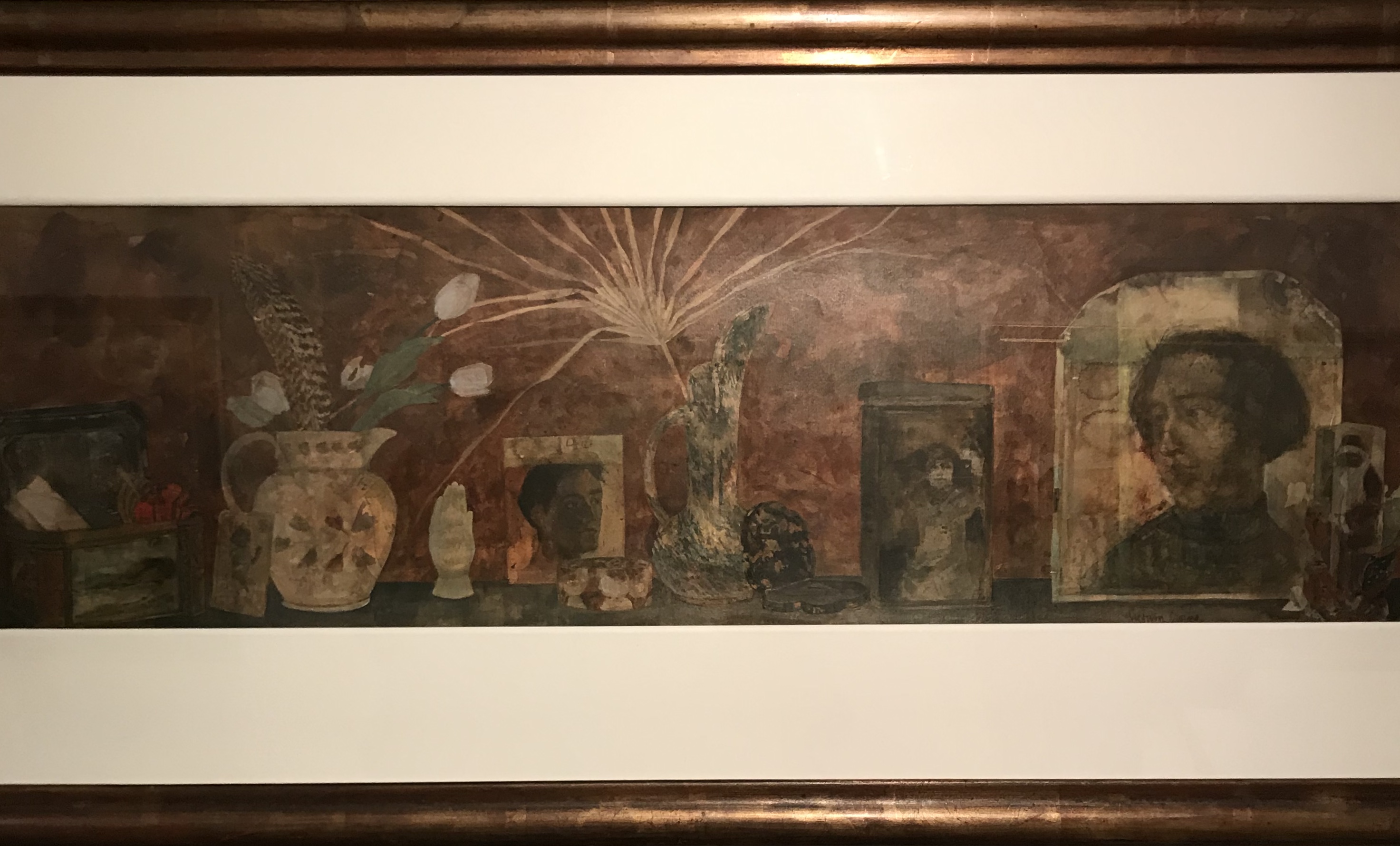
Whilst in the moderate civilisation of Inverness, went to an exhibition of Victoria Crowe’s paintings and drawings at the Inverness Art Gallery. These were mainly portraits, predominantly of older people although not exclusively, and she likes to try and tell the sitter’s history by the choice of pose together with what’s in the background (through the door, out of the window, etc). However, she also had a few still life paintings – these were mainly long and thin, as if painting the contents of someone’s mantlepiece. I found these rather odd as compositions, the objects didn’t seem to relate to each other particularly, they were a bit like horizontal lists. I wondered if, again, she was telling the story of the owner of the objects by using this method. The lighting in the exhibition room was rather poor in that I often had to move to the side to be able to see the painting or drawing because of the reflections of the spotlight, so it was hard to get a decent photo…
I found it quite a static presentation of a series of objects though, it didn’t especially appeal to me, although that may have been at least in part due to frustration at the lighting.
Most of the time spent out in the wilds we spent walking, but I tried to do some still life at our cottage every day. I worked on two particular things:
Some blind contour drawing as explained in Kaupelis, R (1980) Experimental Drawing. Watson Guptill Publications. I found these difficult but fun; what they are really good for is making me draw a line rather than a fidgety set of scrappy lines for an outline, and also for little details – because I am reallylooking at how an object appears, rather than having a glance and then drawing what I think.
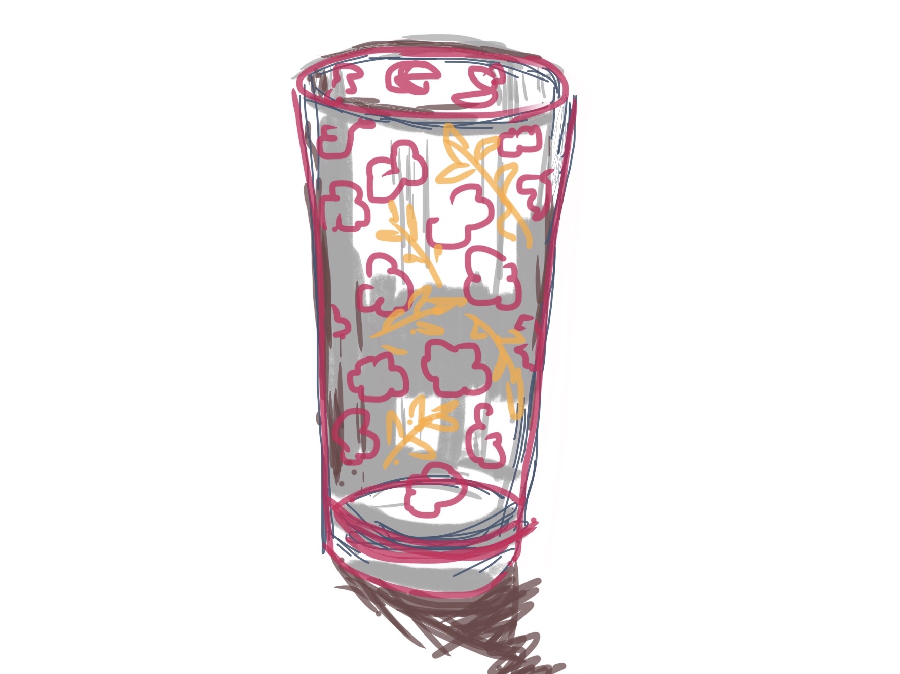
Some thumbnail sketches for various compositions of found sets of objects – see Still Life Sketchbook. Because I didn’t particularly like the way Victoria Crowe had composed her “long, thin” horizontal pictures, I tried to make mine different by enlarging and cropping, rather than lining things up in the way I had found too static.
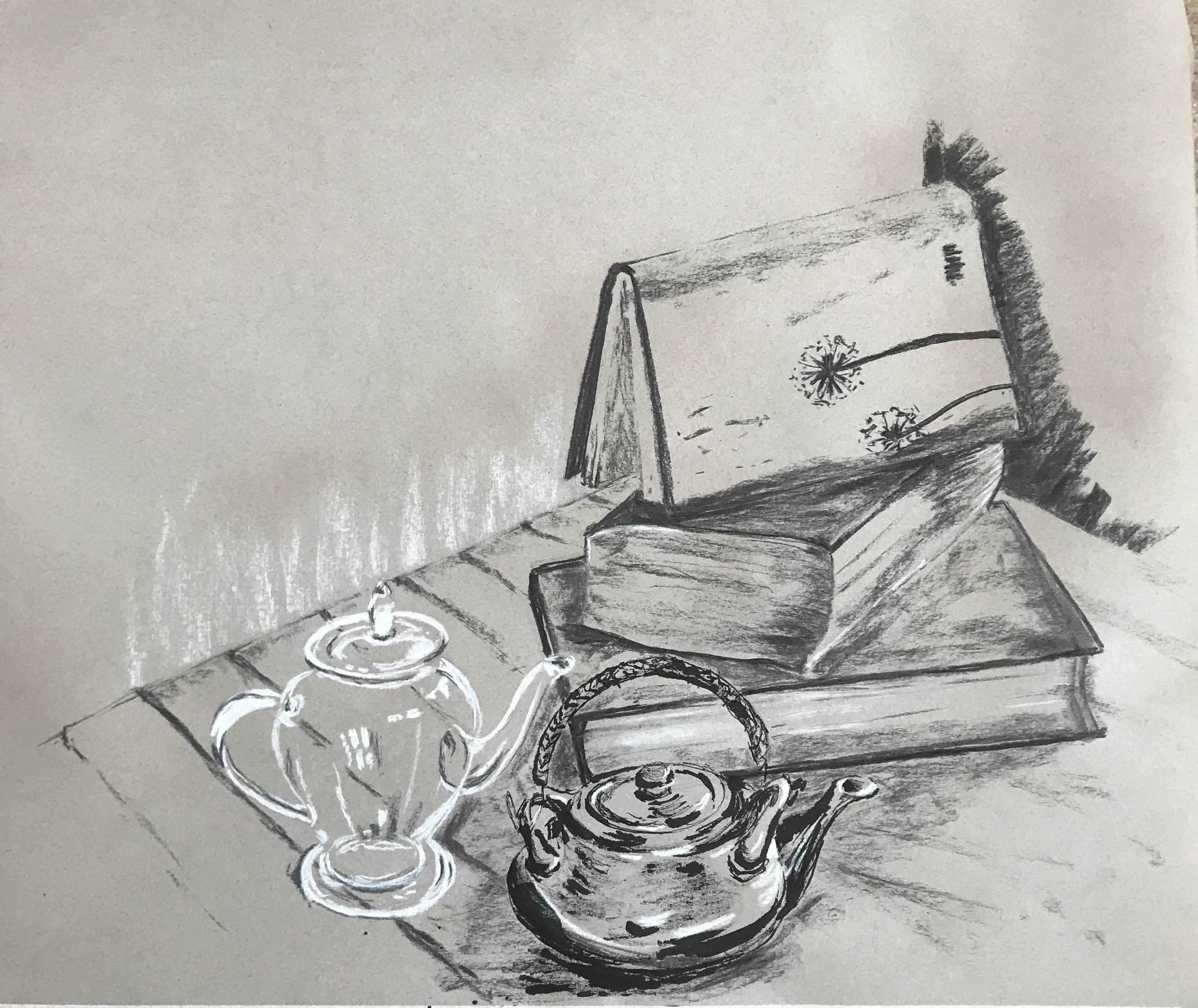
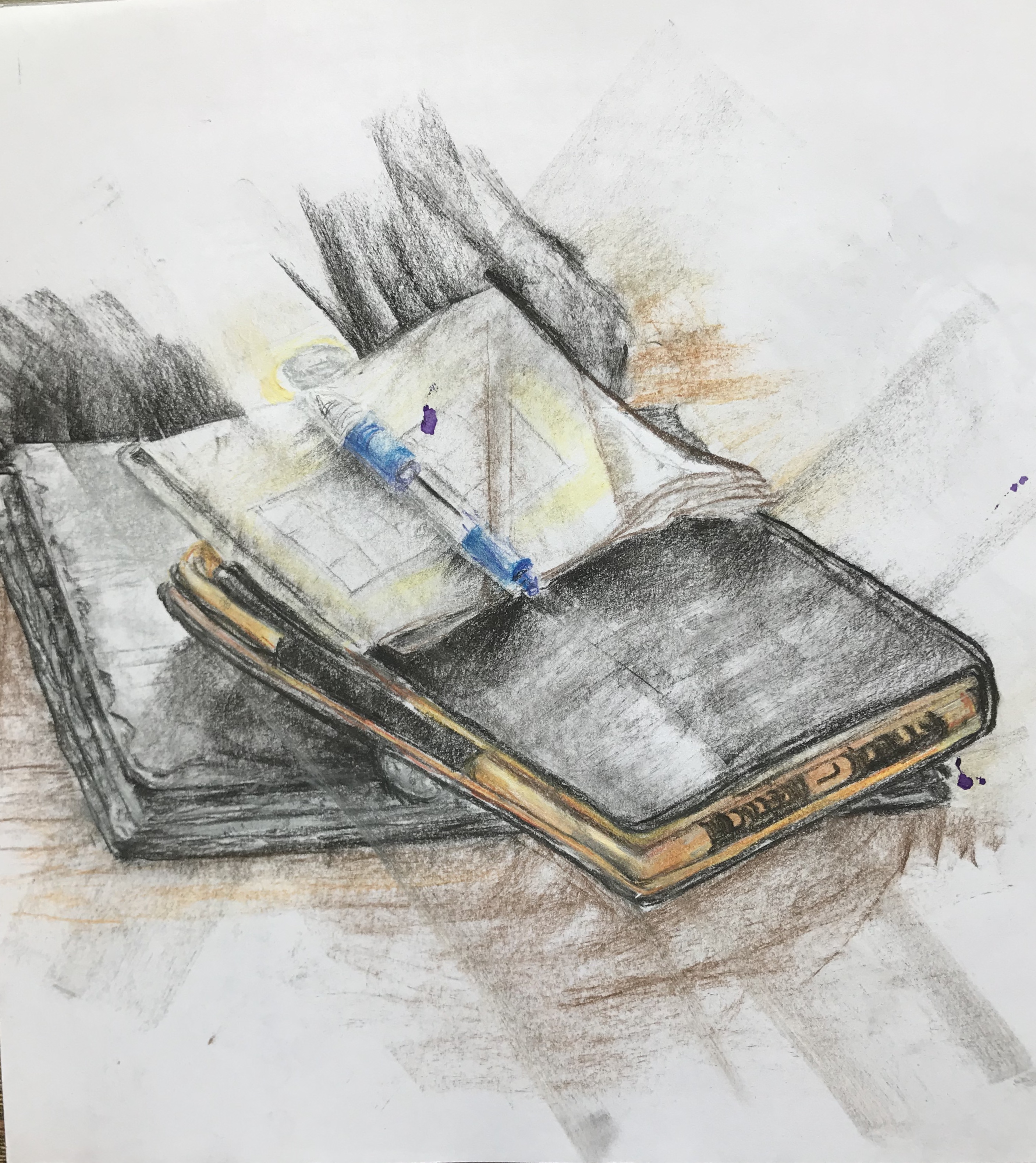
I have been an inveterate bibliophile since I was a child, and my husband will tell you that I cannot pass a bookshop without going in – hence our house is full of piles of books. I am also a lover of random teas, and a bit of a teapot collector. In fact, what better way to spend an afternoon than sitting in our garden room with some books and a brew…….
….so this seemed an obvious still life setup for me. I liked the curves and ellipses of the pots, contrasting with the rectilinear shapes of the books, and have tried to arrange it in a fairly pleasing triangular composition.
See what you think……
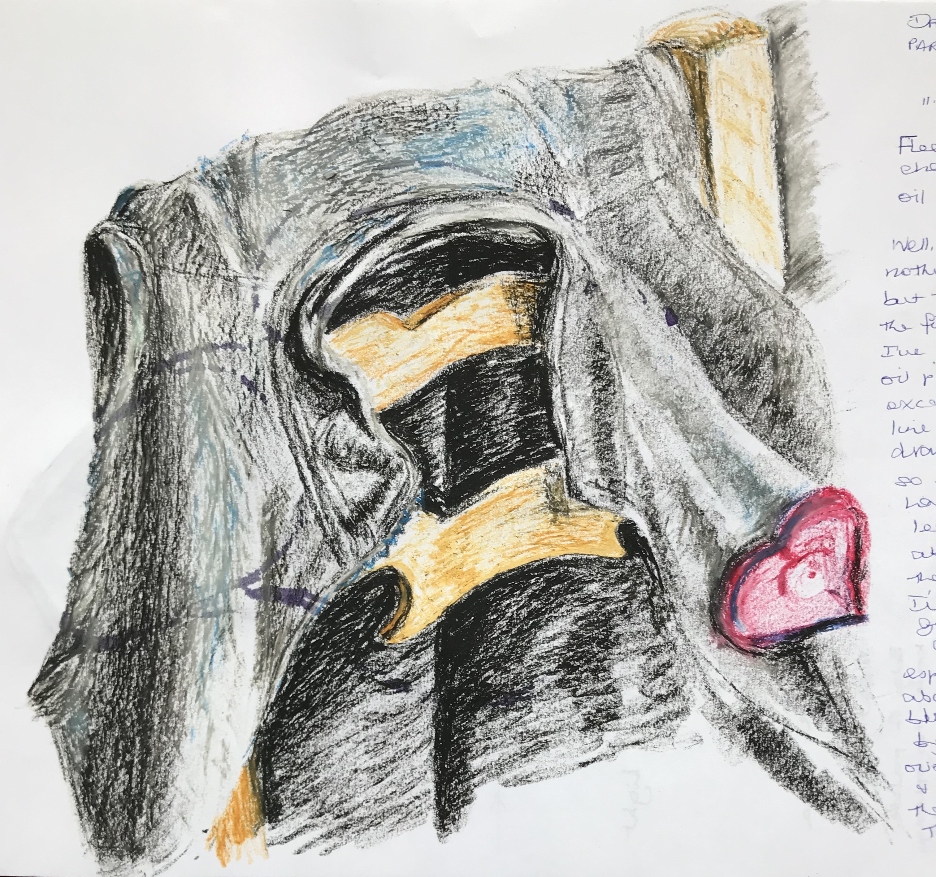
I tried to select my materials to match the different objects:
My favourite ink and a stick for the oriental ceramic teapot, to give it solidity and to evoke ritualistic tea ceremonies/Chinese brush painting
White and grey conte crayons for the rather fugitive and ghostly glass teapot
Charcoal for the “wood-derived” objects – the books, the table and the shelves in the background
I chose a mid-tone sugar paper as support to allow me to focus particularly on the lights and darks
So, how did it go?
Overall, I am pleased with the composition and think I have produced a fairly vibrant drawing.
I am particularly happy with the ceramic pot at the bottom foreground – I enjoyed this the most (maybe because I feel quite free using the ink and stick – it is such an unpredictable medium that I feel able to go with the flow and not panic at unexpected splodges and blots, just trying to weave them into the image).
I have done a bit of practice with the glass teapot and feel happier with its shape than I have hitherto; I am slightly concerned that it does look rather too ghostly and floating, but it gave very little shadow to anchor it down.
The pile of books – aarrgghh! – thought this would be the easy bit but it always seems to go slightly awry, I think I have a bit of an issue with perspective which will need work as the course progresses. I sprayed the drawing with fixative and put it on the floor to photograph it, when I immediately saw the angle of the right-hand corner of the bottom book was not right – I have tried to draw over it and improve it, but didn’t want to make too much of an issue with it as it would spoil the rest of the drawing.
I have just suggested the table, shelves and wall in the background to fix the objects in space, as obviously the books and pots were my focus. I’m never quite sure how much to put in, and will often just indicate tone contrasts between background and focus objects, rather than making the background too fussy and detracting from what I want the viewer to concentrate on.
I have been away from home helping with my new-born baby granddaughter and so I have been using odd bits of available time to experiment a little with some of the recommended materials for this part of the course, some of which were very familiar to me, but others of which I have used rarely, if at all. I have learned a little more about ease of use, appropriate (or sometimes, inappropriate papers), qualities of colour-mixing and overall effect generated. I have generally used “found” still life compositions -which is a nice way of saying “whatever was lying around” – so the final products vary in the interest of the outcome – but that was not my concern for these exercises, it was simply to learn the materials.
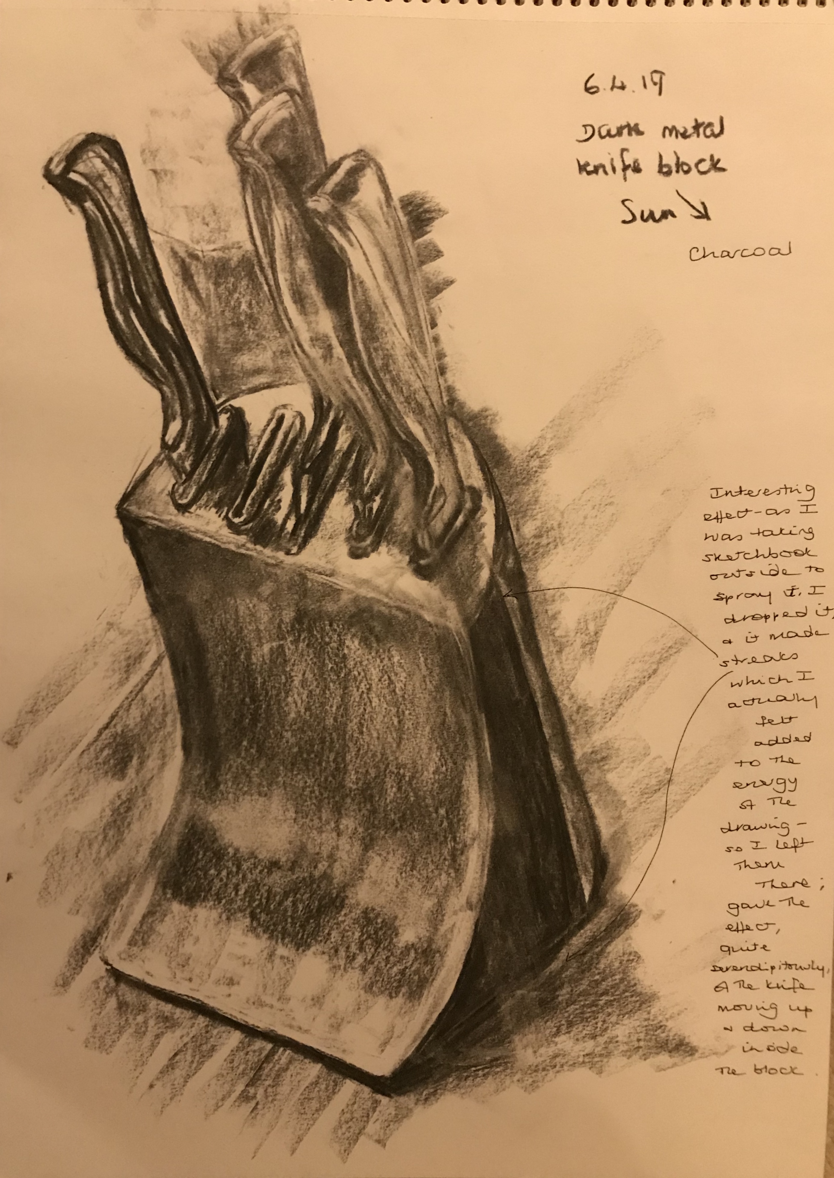
Charcoal is a medium I have definitely grown to love since I began the course – it’s particular strength to me is in the dramatic tones available – which made it seem very appropriate for this rather murderous-looking set of kitchen knives in their very solid black metal block!
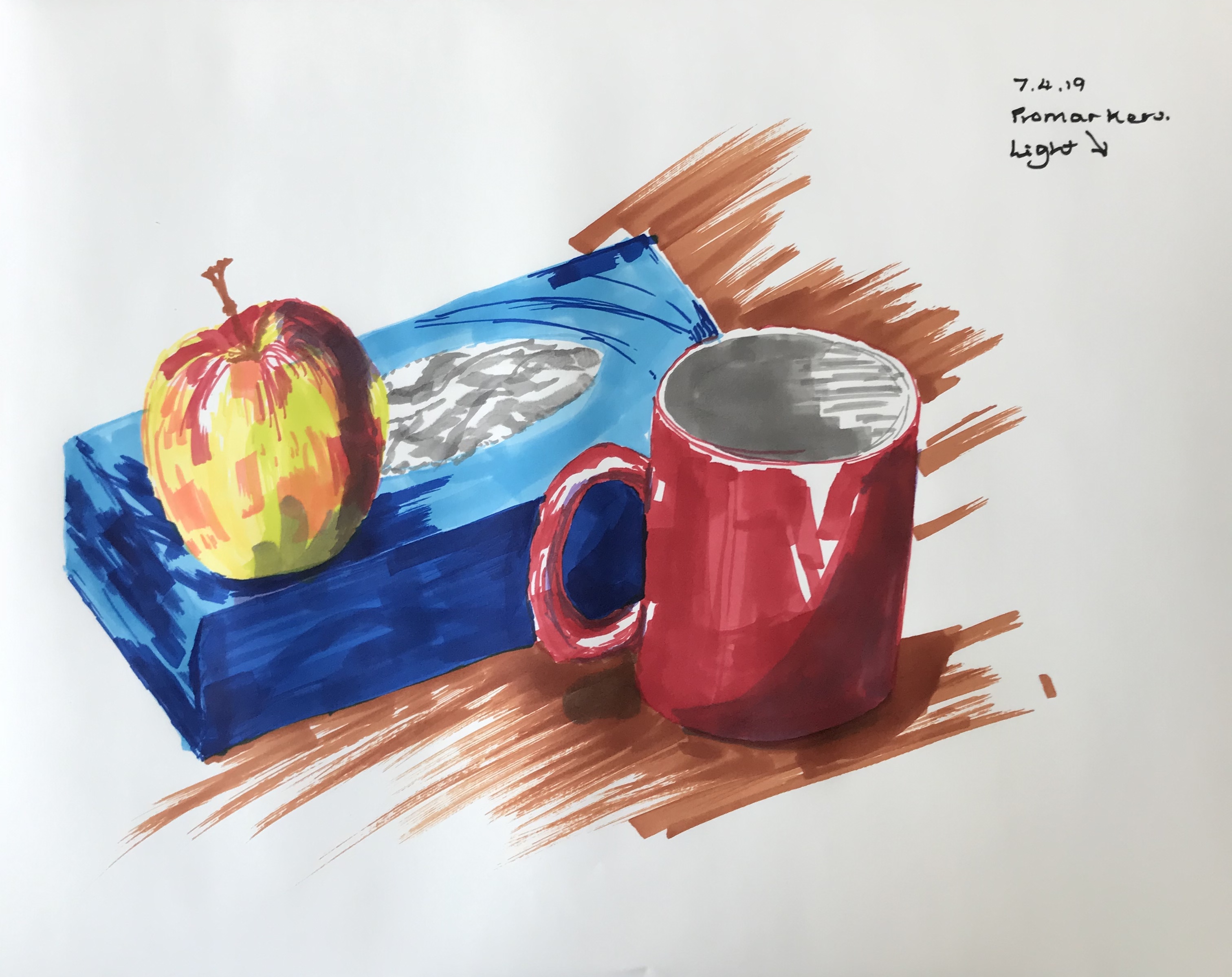
Having read in the documentation that marker pens are thought too harsh and lifeless, I immediately wanted to be awkward and try them out. They are indeed bright and it’s quite tricky to moderate the colour by overlaying without ending up with sludgy mud, but I feel I have at least managed to generate differences in tone here. Definitely these are to be reserved for effect – I do feel I’ve conveyed a fairly bright, cheery mood here.
Having watched the Great Celebrity Painting Challenge one evening, I was inspired to try drawing on my iPad using the Sketchbook app. I hadn’t used it before so trying to learn it was a bit painful, but I did enjoy it and again have come up with a fairly lively image. At the moment I am constrained by having to draw either with my finger or a very blunt-ended stylus, so accuracy is a real issue.
This was done with coloured Conte crayons. A little like charcoal, I have learned to break them into pieces a cm or two long, which then makes them useful for edges but also shading large areas. I got into a bit of a smudgy mess in places, but found I could create new colours by overlaying, so this was fun.
I wasn’t especially looking forward to trying out the oil pastels – not quite sure why they persistently don’t appeal to me; perhaps because I struggle to make accurate marks with them, it feels a bit like using those awful crayons you used to be given in school and could never do anything decent with. I also picked what turned out (for me, anyway) a very difficult subject and I found it difficult for a while to moderate the colours – although after a bit of experimenting I found that the best way of obtaining both gradations in tone and colour was to use the pastels on their side – so after that, I got along a little better. The drawing still look at bit like nothing on earth viewed close up; but from a distance, it is better and I hope you can work out what it’s meant to be!
I tried doing a china jug using ink and a small palette knife. My initial idea was to have big clear sweeps of ink, created by dragging the side of the knife, to represent the darker tones – but it almost immediately became apparent that the paper in my sketchbook was MUCH too thin for this and it was all running through – so this was rapidly abandoned, and I finished off the sketch using a dip pen and hatching.
Demonstrate drawing skills using a wide range of media
I have used charcoal, dip pen and ink, stick and ink, palette knife and ink, oil pastel, chalk pastels, Conte crayons and pencil throughout the course of this first part of Drawing 1.
Use drawing, tone and colour to represent three dimensions
I have used line and various shading techniques such as hatching and blocking to show tone. I haven’t investigated colour much – believe this is to come.
Explain the rudiments of linear perspective and other drawing systems
This isn’t something which has specifically come up as a requirement; it is certainly something I have grappled with when setting up and representing still lifes; foreshortening is an aspect which needs work
Reflect perceptively upon your own learning experience
I certainly feel I have learned over the course of this first part, and have tried to incorporate notes to this effect, either within my blog, or as notes on my sketches
Assessment criteria
Demonstration of technical and visual skills – materials, techniques, observational skills, visual awareness, design and compositional skills
I have used a range of materials and drawing techniques (see above). I am learning the importance of careful observation; I certainly go around now looking at everyday objects and thinking about how I would represent them on a page. I think my sense of design and what makes a good composition are things for me to be more aware of – I was having tea with an artist friend the other day and she randomly exclaimed what a great composition a blue vase of orange tulips framed by a doorway would make, and as soon as she said it I could see it was very Vermeer-like; but I haven’t got to the stage of automatically seeing these things for myself yet.
Quality of outcome – content, application of knowledge, presentation of work in a coherent manner, discernment, conceptualisation of thoughts, communication of ideas
I believe the quality of my drawing has improved over the course of this part, and I have enjoyed using and applying techniques and materials I had not tried before; particularly using ink other than with a pen, and using charcoal or crayons to create blocks of tone. I hope my work is presented in a fairly orderly manner organisation-wise, although the presentation of drawing on a page is not always quite what I intended, sometimes not the size I originally intended or centred as I had meant it to be – usually because of the first element in the drawing being mis-sized or mis-placed on the page. “Conceptualisation of thoughts and communication of ideas” I have taken as meaning having an idea of what to draw and then conveying that as a realistic image – I think I am in the early stages of this – I not longer cast around for what to draw, having fallen in with the idea that anything is fair game for drawing – but I need a lot more work on taking it further and conveying a mood or a message.
Demonstration of creativity – imagination, experimentation, invention, development of a personal voice
Hmm….I wouldn’t say I am able to demonstrate much imagination as yet, my work is still very representational. However, I have enjoyed experimenting with different media and I hope this shows in my work. Invention…I have tried bits of this when doing the experimental mark making; it was fun, I enjoyed it, but I can’t say I was always delighted with the quality of the outcomes. Development of a personal voice…. Again, don’t think I have a lot of evidence for this – I think I have a default style of drawing, but this is not the same thing.
I have enjoyed thinking about what I have done, and putting critical thoughts into words, more than I thought I would – hitherto I would paint a picture from a photo and either think “yes, that’s not bad” or “back to the drawing board”, and cast about for the next photo to copy. My research so far has included books recommended by my tutor, books on the essential reading list, and other texts I have found from libraries (both the OCA online library and the Plymouth University library, which I have joined for a year.) I feel my reading has been quite scattergun at the moment, there seems to be just so much out there to lap up and take in; I have tried to absorb and use some key messages (keep collecting good examples, try different styles of drawing, think about composition, mood and message), but early days yet.
I have just been reading Drawing on the Right Side of the Brain (see blog post), which puts forward the proposition that, by making art, you reveal yourself.
This book, Art as Therapy, looks from the perspective of the viewer and what they might expect to get from art. The writers make the point that, hitherto, there was an agenda for the making of art, set by religions and states, which artists would draw upon for subject matter, and then interpret in their own way; thus the “messages” of the agenda-setting organisations were propagated to the masses. Nowadays, however, the idea of an agenda “dictated” by organisations smacks of propaganda, which is generally regarded as something untrustworthy and to be avoided.
However, the writers suggest that the general principle of a universal agenda of inspiration for artists to draw upon is not a bad thing, and they go on to say that this agenda could be driven by the basic human needs of the viewers.
“Artworks would look to commemorate, give hope, echo and dignify suffering, rebalance and guide, assist self-knowledge and communication, expand horizons and inspire appreciation.”
“We should dare to conceive of art as more than just the fruits of the irregular imaginations of artists. We should channel and co-opt artworks to the direct task of helping us achieve self-knowledge, remember forgiveness, and love – and to remain sensitive to the pains suffered by our ever-troubled species and its urgently imperilled planet……..If we want art to be more powerful, and of more consequence in our individual and collective lives, we should be ready to embrace this unfamiliar strategy.”
Stirring stuff – a call to arms. I have to say that some of the practicalities which they go on to argue, e.g. about the commissioning and showing of art, sound rather far-fetched and tortuous. But as an artist, how do I feel about the general proposition?
It is undeniably true that sometimes, when looking at pictures officially designated as “great”, one does find oneself underwhelmed – often one can appreciate the high levels of skill and technical expertise, whilst not really connecting with what the artist was trying to put over – and maybe that’s because they weren’t trying to put over anything more than a doctrine or teaching which they didn’t necessary choose or agree with.
But as an artist (albeit not great and only just starting out), would I want always to be having to put over a message? Sometimes the satisfaction of representing an object well (i.e. believably) is enough for me as artist. But what about my viewer? – what do they get from looking at my object?
I am sitting in my garden room, where two pictures hang which I have painted (they have been chosen to put up by my husband). One is a picture of leaves in a jug and some garden twine. My husband finds it a pleasant picture to look at, and other visitors have admired it. What do they get from it? – it evokes a gentle gardening scene, and we all know that gardening is good for you, both health-wise and mood-wise – the act of gardening is an expression of hope, a looking forward to the time when one’s effort will be rewarded by beautiful blooms or a trug-full of runner beans. I think this qualifies as the authors’ second suggested purpose of art (see pg.65) – “A purveyor of hope.” The other picture is of a dish of sardines – actually my husband’s lunch during a much-enjoyed holiday in Portugal, quickly snapped on my phone and then rendered in watercolours once we got home. And look, this qualifies as the first of the authors’ stated purposes: “A corrective of bad memory….a mechanism to keep precious things in good condition.”
So, maybe the artist’s need to express a particular thing in a particular way, and the viewer’s need for the artwork to fulfil a specific therapeutic need, are compatible? One can choose to keep for oneself the things you paint/draw/make purely for yourself, and put “out there” the things you think other people might derive some benefit from.
This is a fascinating book, which develops at length the proposition which I have often see, that anyone can draw if only they can learn to see.
She takes the view that art is a non-verbal and revealing language: I particularly found this comment very interesting…
“The object of drawing is not only to show what you are trying to portray, but also to show you. Paradoxically, the more clearly you can perceive and draw what you see in the external world, the more clearly the viewer can see you, and the more you can know about yourself. Thus, drawing becomes a metaphor for the artist…..As your skills in seeing increase, your ability to draw what you see will increase, and you will observe your style forming. Guard it, nurture it, cherish it, for your style expresses you.”
This is a heady and somewhat unsettling suggestion. I am just looking at my most recent drawing, done this afternoon, and wonder what this says about me?
Not a great one for navel-gazing, but I do have to say that I feel I have been quite freed up by the requirements of the first part of the course to work on big pieces of paper – it has been very liberating and has encouraged me to make big, bold marks; not always accurately, but this hasn’t worried me and I have been confident to overdraw them and make corrections without a feeling of failure.
§§§§§§
“New evidence found by Jerry Levy in her doctoral studies showed that the mode of processing used by the right brain is rapid, complex, whole pattern, spatial and perceptual – processing that is not only different from but comparable in complexity to the left brain’s verbal, analytic mode.”
She goes on to quote from J.E. Bogen’s “Some Educational Aspects of Hemisphere Specialisation”: “Parallel Ways of Knowing:
Intellect Intuition
Convergent. Divergent
Digital Analytic
Secondary Primary
Abstract. Concrete
Directed. Free
Propositional. Imaginative
Analytic. Holistic
Lineal. Non-lineal
Rational. Intuitive
Sequential. Multiple
Objective. Subjective
Successive. Simultaneous”
I have to say that, until signing up for this course, I would have identified myself very much with the verbal, analytic left brain camp – but think I have made a good start on letting the “whole pattern, spatial and perceptual” side have a bit of a go – it feels rather daring and rebellious at the moment, but I’m hoping I can keep it going, free myself up and learn to express myself clearly in a mode other than verbal.
“How tone is made is determined by what the tone is for in the drawing, what materials are being used, and…what the artist wants to communicate. What tone communicates is different from what line communicates. Line indicates the shape of something, the edge between form and space, the movement of a form, or even movement itself. Tone tells us about lightness or darkness, weightlessness or heaviness, and dullness or shine. It can tell us depth in space or it can be space itself. Line and tone are often worked together in drawing, but each can also stand alone…” – Davidson, M. Contemporary Drawing – Key Concepts and techniques.(2011) Watson-Guptill Publications.
Odilon Redon is obviously a master at the use of tone for so much more than just an indication of solidity, texture and properties as described above; he draws you into a picture and makes you wonder, particularly, about his darks and what might be concealed within – usually unsettlingly- see blog article on Redon.
Other artists use tone for a range of atmospheric effects. Honore Daumier, in his pen drawing Four Lawyers, circa 1867-70, The Art Institute of Chicago, could presumably have left it at a plain drawing, but has chosen to add tone via washes; obviously this adds solidity and 3D-ness to the figures, but to me it also imparts a certain air of weighty pomposity to the gentlemen, almost as if Daumier is having a bit of a laugh at their expense.
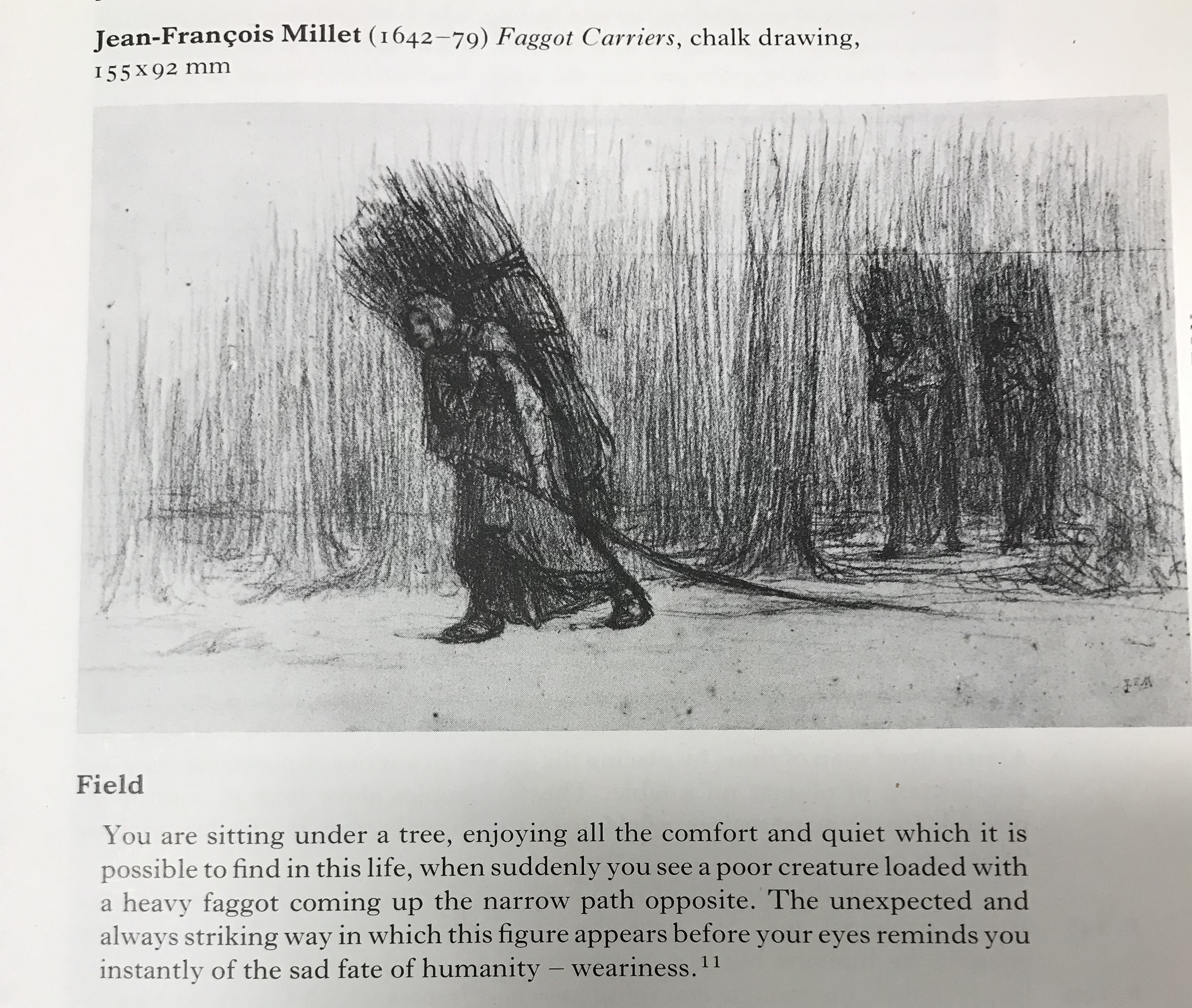
The quote below from Millet (taken from Rawson, P. (1979) Seeing through Drawing, BBC) sums up the feeling about the figures which is generated by their dark tone against their surroundings:
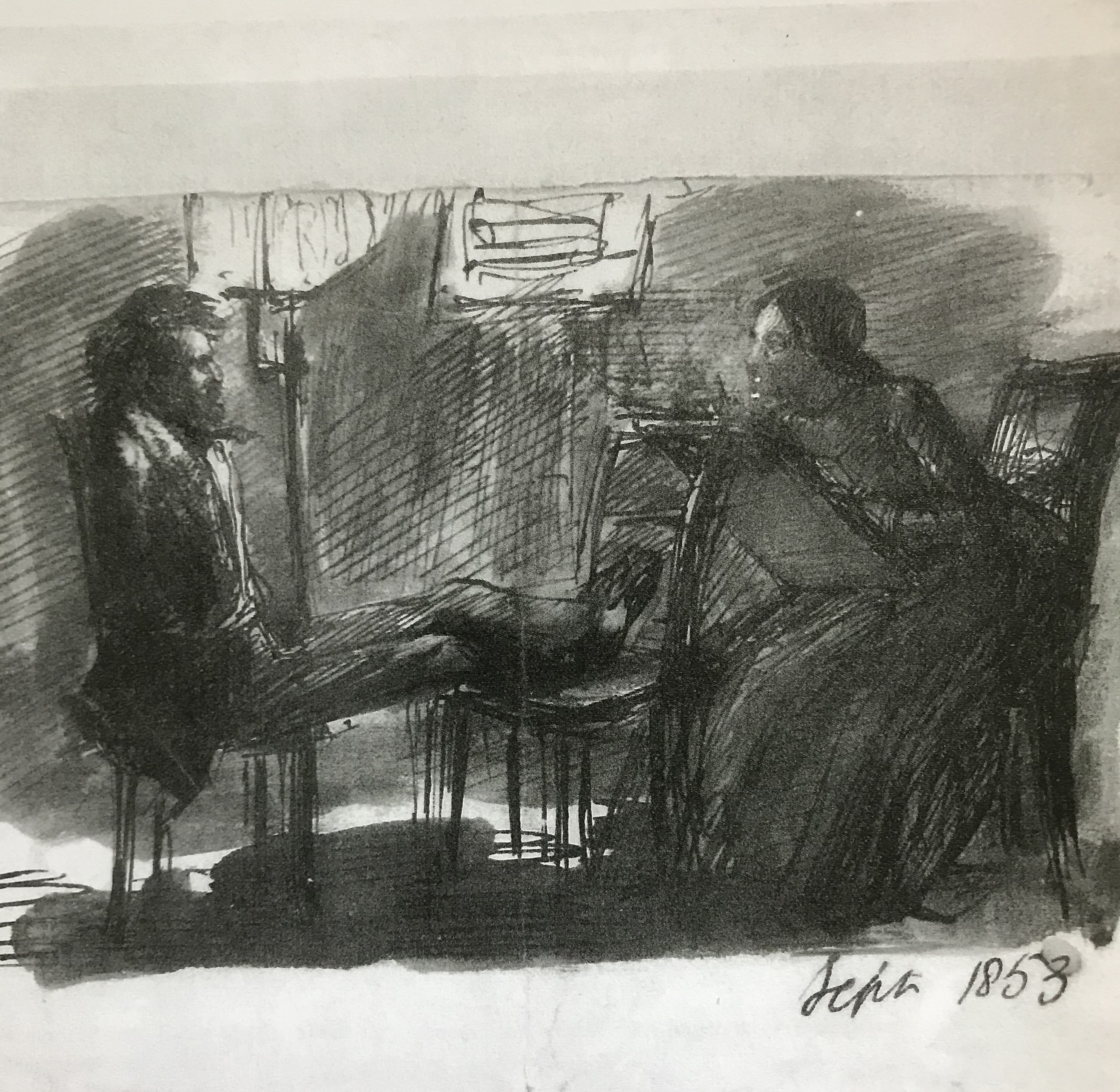
Dante Gabriel Rossetti’s Rossetti Sitting to Miss Siddal, 1853, Birmingham Museum and Art Gallery, a pen and ink drawing apparently shaded with his finger, depicts Rossetti sitting whilst Lizzie Siddal draws him. The darkness of the drawing, along with the energy of the lines, suggests to me an intense and slightly controlling relationship between the two.
There are also numerous paintings using chiaroscuro, meaning light-dark, which throw the figures almost into your lap with dramatic and often emotional effect – for examples,Leonardo da Vinci’s The Virgin of the Rocks, 1491-2&9 and 1506-8,S. Francesco Altarpiece, Milan…
Leonardo da Vinci, 1452 – 1519
The Virgin with the Infant Saint John the Baptist adoring the Christ Child accompanied by an Angel (‘The Virgin of the Rocks’)
about 1491/2-9 and 1506-8
Oil on poplar, thinned and cradled, 189.5 x 120 cm
Bought, 1880
NG1093
This painting is part of the group: ‘Panels from the S. Francesco Altarpiece, Milan’ (NG1093; NG1661-NG1662)
https://www.nationalgallery.org.uk/paintings/NG1093
…and Caravaggio’s Salome Receives the Head of John the Baptist, 1609-10, National Gallery
Michelangelo Merisi da Caravaggio, 1571 – 1610
Salome receives the Head of John the Baptist
about 1609-10
Oil on canvas, 91.5 x 106.7 cm
Bought, 1970
NG6389
https://www.nationalgallery.org.uk/paintings/NG6389
What does this all mean for me and my art? At the moment I am struggling enough with the use of tone to simply depict a fairly realistic 3D image of an object – but I do see the potential for its use to convey so much more as my style emerges. I need to learn to start thinking about what I mean my picture to convey APART from just the image of an object which is in front of me – as has been suggested to me in the very first exercise in the course, about using gesture to convey feeling – tone of course can do this too.
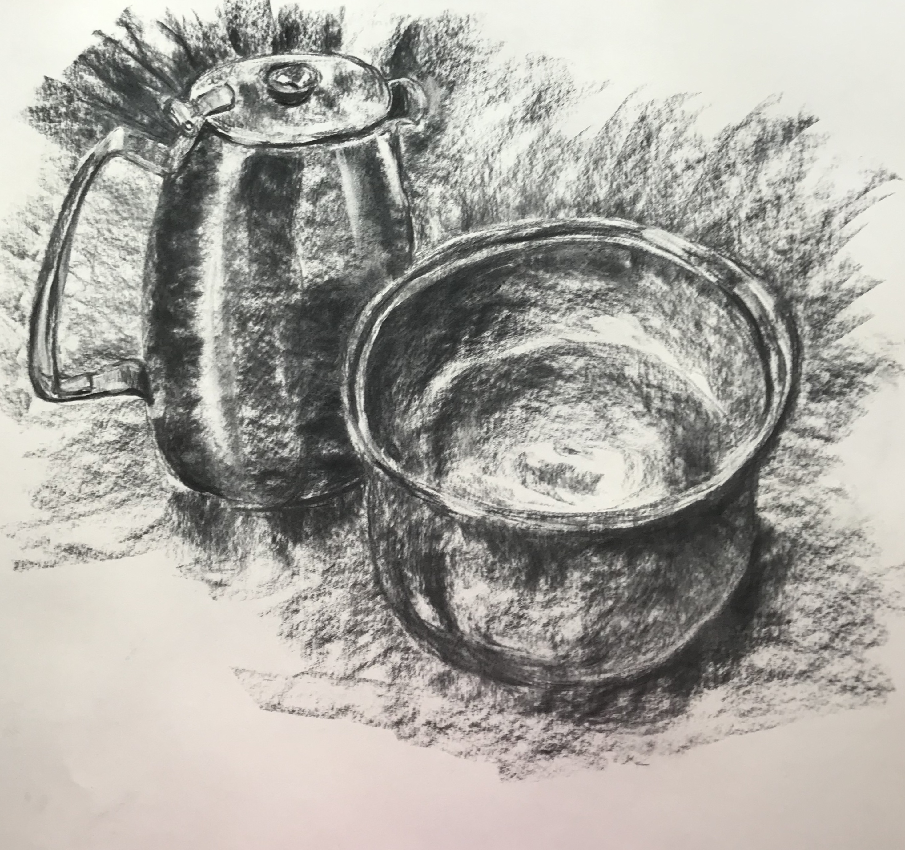
For this exercise I used a metal coffee pot as suggested – ours has a slightly matt finish – and a ceramic bowl with a wide mouth – dark in colour- but with a strong glaze.
The strong light was from behind me. I did this drawing at art group and, due to constraints of space, the still life was very close to me, the bowl being closer, so I have ended up with some perspective issues, along with my struggles over ellipses, made more obvious because of the large size of the drawing. Someone in the group told me that they had been taught that, when drawing an elliptical object, the curve nearer to you “looks” flatter, and the curve further away “looks” curvier – he cited the example of the gunwales of a boat – intuitively I could see what he was saying, but didn’t try it out with the bowl since it was so close to me that I was practically on top of it.
I feel I have achieved some clear lights and darks, with a wide range of mid-tones. I have picked up the reflected light from the surface on the left side of the jug and the right underside of the bowl. It feels a fairly dynamic drawing, although I wonder if it is over-busy. In
Guptill, A.L. (1977).Rendering in Pencil. Watson-Guptill Publications, I found a bit of check list for assessing your final drawing, so I thought I would try his checks out on this drawing:
Have you the correct degrees of sharpness and softness?Yes, I think I’ve done that.
Is there too much dark one one side or part of the drawing, or does the whole hold together nicely? I’m quite pleased with the balance, I think it’s a coherent drawing.
Have you succeeded in expressing space, depth, weight and texture? I think I have depth, although the space the objects occupy is not very clear. I think I have weight, but I’m not sure an onlooker would guess the texture of the bowl without being told.
Have you practised economy of tone, or is the drawing confusing because of too many different values? I wonder if this is my issue with the “busy-ness” of the drawing? – or possibly it’s just the directional strokes I have used to show the relative tones of the background?
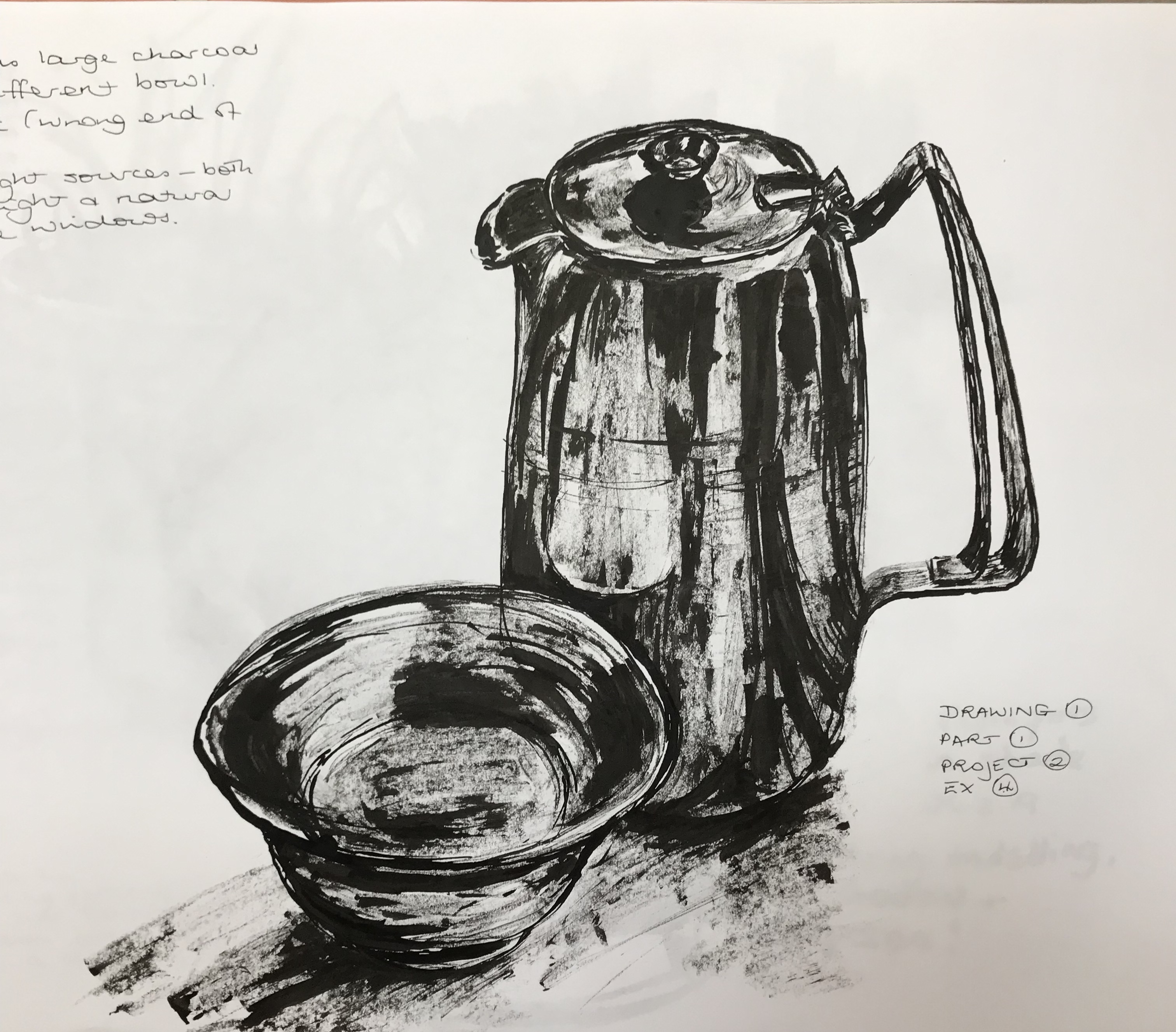
We were asked to do the drawing in charcoal, so I followed the brief, but I also wanted to try a similar drawing in stick-and-ink, which was the other medium I have really enjoyed using throughout this unit so far. So, different art group, same jug, different bowl….
The light directions were various, with big floor-to-ceiling windows and overhead lights, so the shadows were a bit complicated, but I have focused on lights, darks, and the reflection of the bowl onto the jug. Actually, using this medium, I found it easier to have a simple progression of light-mid-dark (simply because ink dripping from the end of a stick is harder to finesse!), and tried not to over-complicate the drawing with too many background tones, just indicating the main areas of shadow, and I am fairly pleased with the outcome (even though I know I still need work with my selection of ellipse thicknesses).
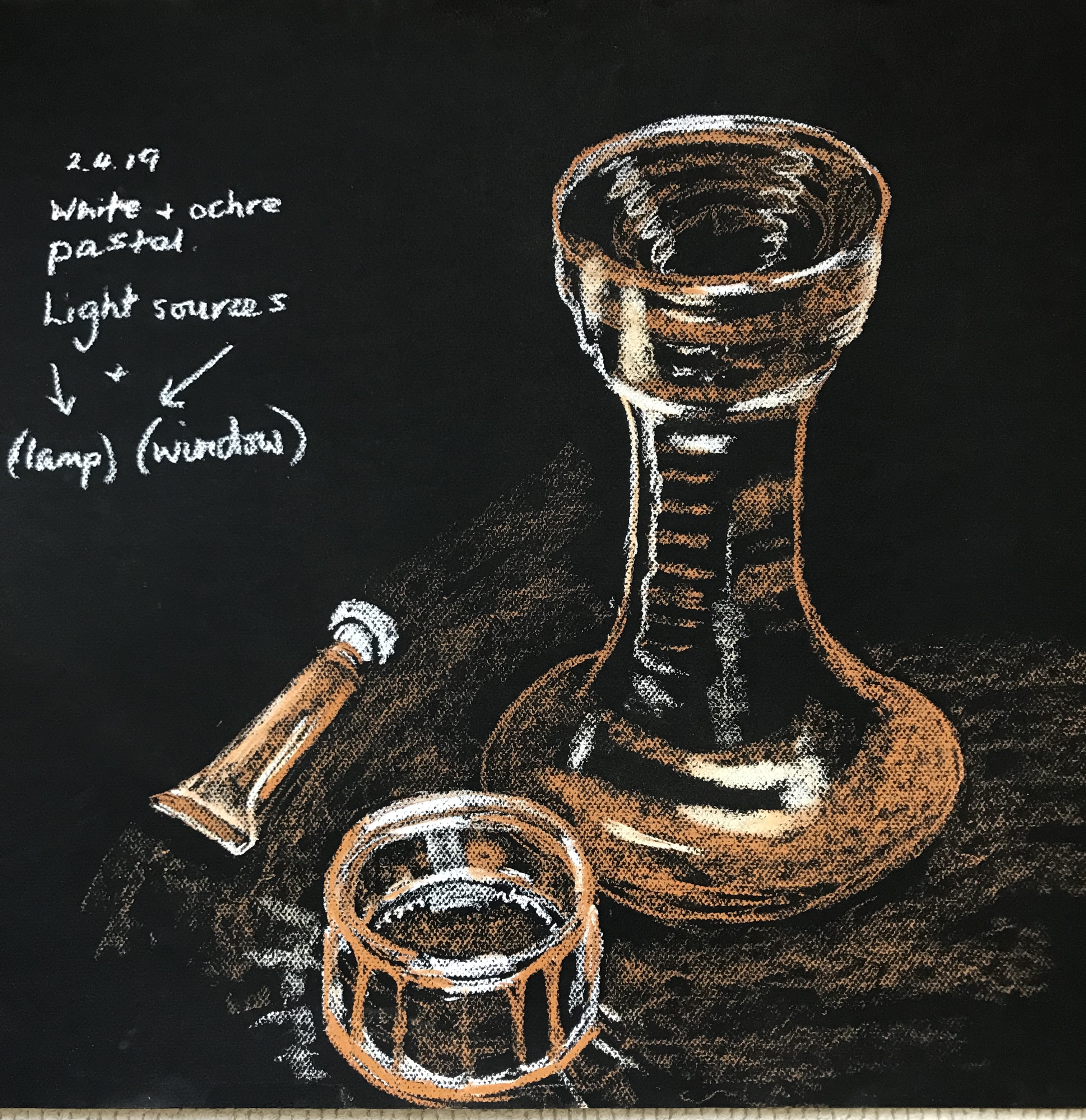
I decided to experiment a little more with different backgrounds too.
First was with a tan/grey piece of sugar paper, which I used as my mid-tone, adding white pastel for light tones and black pastel for dark tones.
It went against the grain at first not to try and add mid tones in!….but as I went on I got better at this, and I am fairly pleased with the result, except for the wonky knife. I experimented with the composition, trying to go for a triangular layout, which I think works if your eye enters the picture from the top, but less so if you enter from the bottom as the eye rather gets led along the knife and then off the right hand edge.
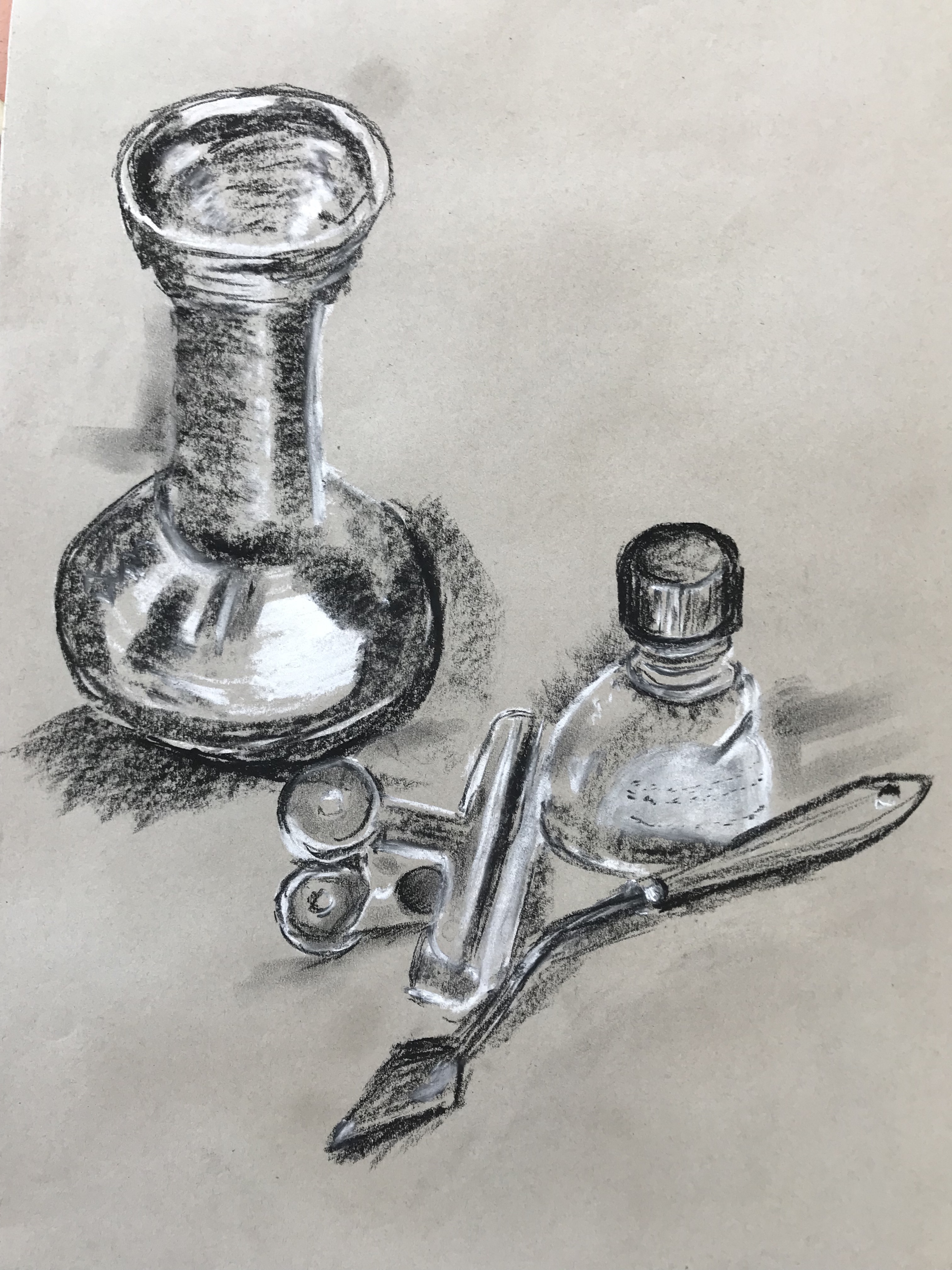
I then found an old piece of black sugar paper gleaned from a scrap store, so I tried a simplified triangular layout, this time with white pastel as before for light and ochre for mid tone, leaving the black paper for dark.
It took a bit of practice to get used to the idea of not being able to “put in” darks but to just leave them blank – hence the shadows cast by the objects on the support are perhaps not very clear, but I was pleased with the ceramic vase (which actually is black and ochre in real life, so it has ended up looking quite realistic.) The metal paint tube also went well – I had finally got the hang of leaving darks blank by the time I got to do the lid – and I think I’ve caught the structure of the glass bowl reasonably well, even though it is a bit skewed.
I found the book, Gombrich, E.H. (2014), Shadows; The Depiction of Cast Shadows in Western Art. Yale University Press, very helpful in thinking about the placement and intensity of shadows. In particular, I liked a pair of very old quotations which made real sense to me:
“Shadow: The darkness created by opaque bodies on the opposite side of the illuminated part.”
“Shadow: In the language of painters it is generally understood to refer to the more or less dark colour which serves in painting to give relief to the representation by gradually becoming lighter. It is divided in three degrees called shadow, half-shadow and cast shadow. By shadow (ombra)is meant that which a body creates on itself, as for instance a sphere that has light on one part and gradually becomes half light and half dark, and that dark part is described as shadow (penumbra). Half-shadow (mezz’ombra)is called that area that is between light and the shadow through which one passes to the other, as we have said, gradually diminishing little by little according to the roundness of the object. Cast shadow(sbattimento)is the shadow that is caused on the ground or elsewhere by the depicted object….”
After Filippo Baldinucci, Vocabularia Toscano dell’Arte del Disegno, Florence 1681.
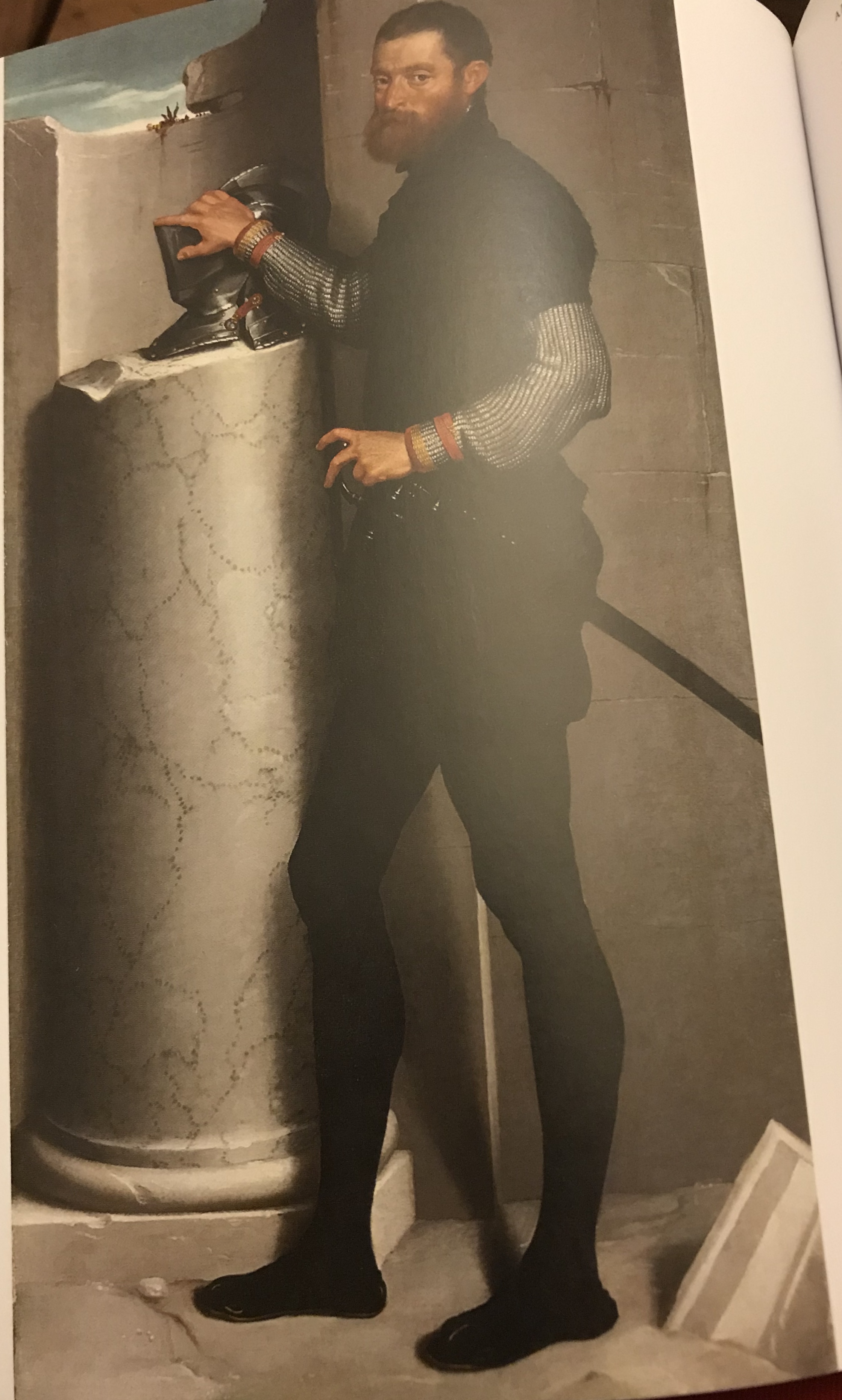
I know this is frightfully wordy and technical, but I hadn’t really thought before about the shape of an object causing its own shadow on itself, and then also being subject to the shadows cast upon it by other things. I have been consciously trying to think of this as “modelling shadow” and “cast shadow” when I have been sketching – as exemplified by the painting by Giovanni Battista Moroni – Portrait of a Gentleman with his Helmet on a Column Shaft, 1555-6.
I shall continue to keep looking really carefully and drawing what I see, but it’s useful to have something which helps you to understand and analyse when you get to that part of a drawing where you have to look over and over to try and make sense of what you’re seeing.
This is a great book, I read it in one sitting. It’ll be one to go back to when I’ve lost my way and can’t see the wood for the trees! I found the first few chapters particularly relevant to me, as it spelled out….well, I quote…”Your job is to collect good ideas. The more good ideas you collect, the more you can choose from to be influenced by.”
I liked the idea of finding out about an artist who interests me…and that leading me on to other artists, till I become part of a “family tree” of artists…I have already found this working out a bit with my research into Odilon Redon, in particular his use of tone to create atmosphere – am writing another blog post on this as we speak!