ODILON REDON

“(Bordeaux, 20 Apr. 1840; Paris, 6 July 1916).

French painter, draughtsman, and printmaker, one of the outstanding figures of Symbolism. He led a retiring life, first in his native Bordeaux, then from 1870 in Paris, and until he was in his fifties he worked almost exclusively in black and white—in charcoal drawings and lithographs. In these he developed a highly distinctive repertoire of weird subjects— strange amoeboid creatures, insects, and plants with human heads and so on, influenced by the writings of Edgar Allen Poe. He remained virtually unknown to the public until the publication of J. K. Huysmans’s celebrated novel A rebours in 1884: the book’s hero, a disenchanted aristocrat who lives in a private world of perverse delights, collects Redon’s drawings, and with his mention in this classic expression of decadence, Redon too became a figurehead of the movement.

During the 1890s he turned to painting and revealed remarkable powers as a colourist that had previously lain dormant. Much of his early life had been unhappy, but after undergoing a religious crisis in the early 1890s and a serious illness in 1894–5, he was transformed into a much more buoyant and cheerful personality, expressing himself in radiant colours in visionary subjects, flower paintings, and mythological scenes (the Chariot of Apollo was one of his favourite themes). He showed equal facility in oils and pastel and after 1900 he carried out a number of large decorative schemes. His flower pieces, in particular, were much admired by Matisse, and the Surrealists regarded Redon as one of their precursors. By the end of his life he was a distinguished figure, although still a very private person.”

Chilvers, I.Redon, Odilon.In  (Ed.), The Oxford Dictionary of Art and Artists.: Oxford University Press,. Retrieved 25 Mar. 2019, from http://www.oxfordreference.com/view/10.1093/acref/9780191782763.001.0001/acref-9780191782763-e-2041.

I have looked at a range of work by Redon, consulting in particular:

  • Bridgeman Education Library
  • Odilon Redon (1985), Galerie des Beaux-Arts (all in French!! – which has considerably tested my recall of schoolgirl French from over 40 years ago…)
  • Leeman, F (undated?): Odilon Redon and Emile Bernard – Masterpieces from the Andries Bonger Collection. Van Gogh Museum, Amsterdam; Wanders Publishers, Zwolle

His earlier work in particular shows very strong tonal contrasts, often placing a figure in half-light, before a dark shaded area adjacent to a bright feature, e.g.

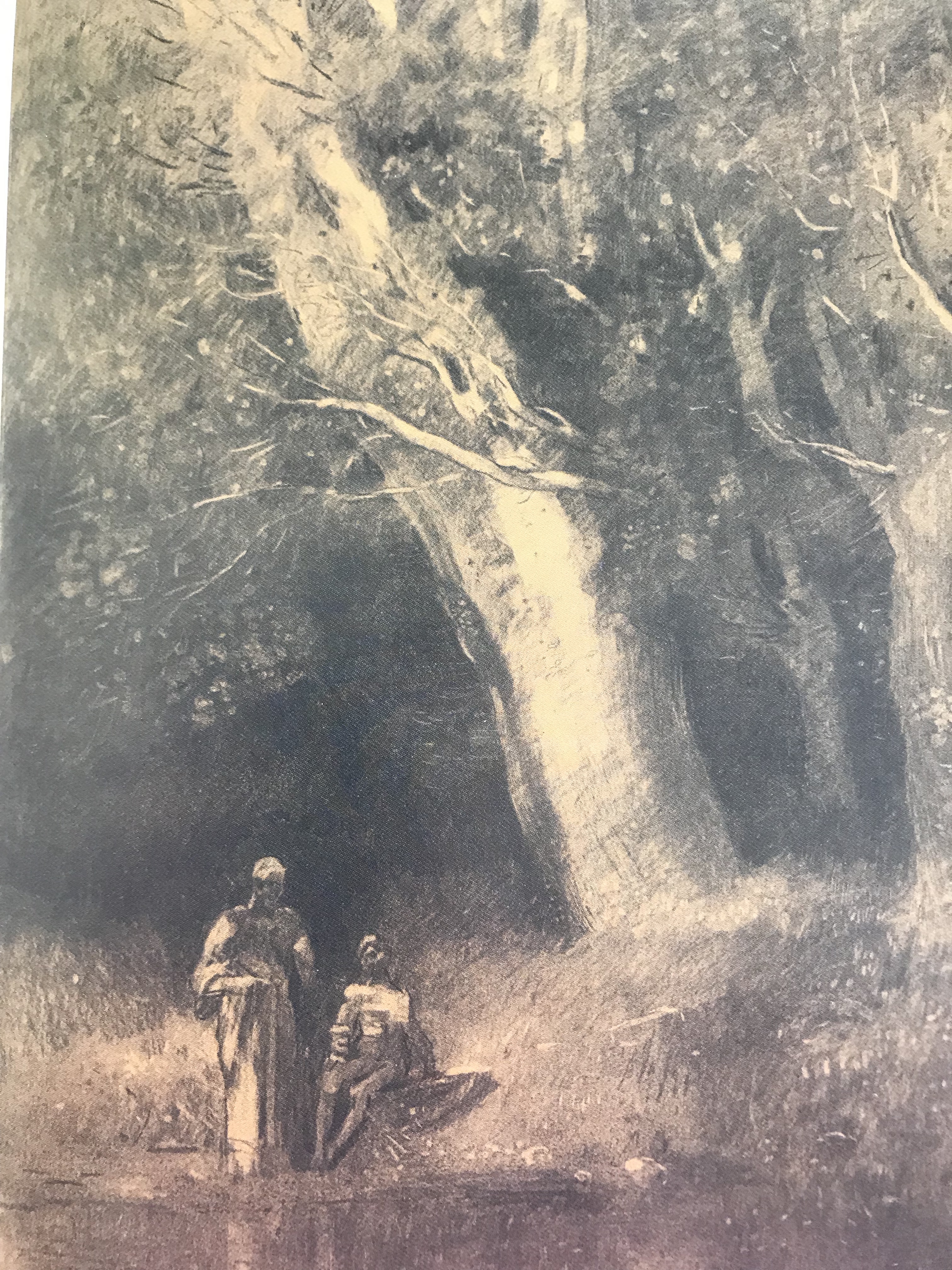
Landscape, two figures, c.1880-1881, Van Gogh Museum, Amsterdam

La foret enchantee, 1870

Bordeaux, Musee des Beaux-Arts

The effect of the dark background in both these pictures imparts a slightly sinister feel – one is made to wonder what is hiding in the shadows.

He also did several pictures which seemed to be looking through a window, with a dark sombre interior contrasted with what seems a dazzling exterior – as if the gloom inside is in tension with the bright hope of the exterior. He also sets people against a window, making it appear as if they are ghostly,  trapped in some way inside.
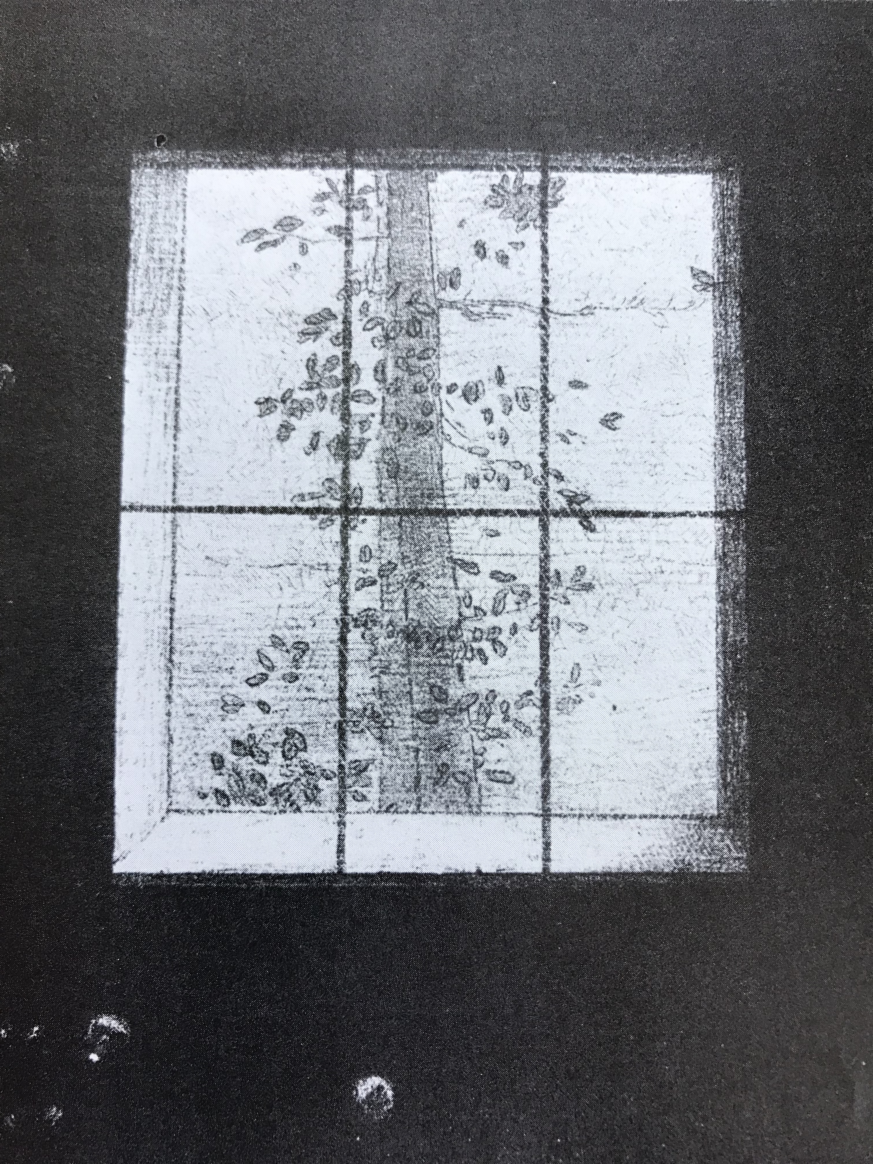
Le Jour, 1891

Paris, Bibliotheque Nationale, Cabinet des Estampes

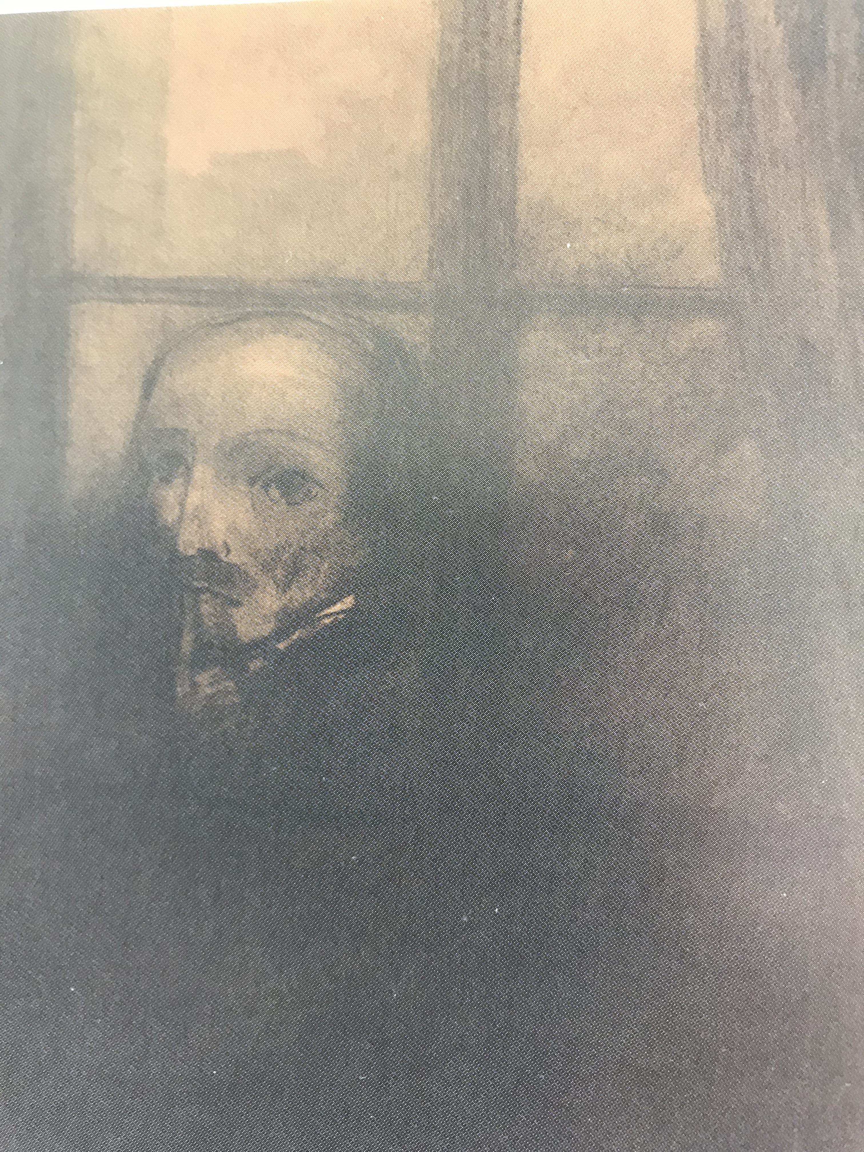
The thinker at the window, drawing in the style of Goya, 1878

Van Gogh Museum, Amsterdam

A review in Nineteenth-Century French Studies, Vol 42, Nos 1 & 2, Fall-Winter 2013-14 of an article by Dario Gamboni: The Brush and the Pen: Odilon Redon and Literature, draws attention to a remark by Gamboni about an unconscious slip in Redon’s early writings, where he puts “peine ombre” (meaning “sorrow shadow”) where he meant “penombre” (meaning twilight or darkness), and suggests that this slip reveals Redon’s painful associations with the shadows in his earlier works.

I made a small slideshow on the Bridgeman Education library with a couple more examples of the points above, plus one of his later flower paintings – even here he often uses dramatic contrasts in tone – this one has a very dark background, making the light tones of the yellow flowers positively “zing” with excitement. I made it public, so am hoping it can be seen at:

Slideshow created on March 25th at 6:15pm

Bridgeman Education Slideshow: Redon’s use of tone

A Pitcher of Flowers Redon, Odilon (1840-1916)

Primitive Man, 1872 (charcoal, black chalk, stumping, wiping & erasing, with white & ochre gouache on paper)

Redon, Odilon (1840-1916)

Lumiere, 1893 (litho) Redon, Odilon (1840-1916)

Drawing 1 Part 1 Project 2 Exercise 3 – shadow using lines and marks

I’ve had a go at shading exercises in boxes or strips like this before, but it was good to revisit and to compare side-by-side the effects which can be achieved using different media. As well as lines and dots I added in a scribbly stroke which I have seen demonstrated at an art group (by local artist Ian Pethers – see www.glenrockstudios.co.ukand  www.drawntothevalley.co.uk/artists/detail/ian–pethers/); I have hitherto used this to some effect in landscape drawings.

I had a go at the mug, a curved shape, using straight hatching lines with a dip pen, some quite long, some very short – not a complete success – I’ve got the lights and darks but not much of a mid-tone. Then I tried the same mug using my scribble stroke; the carpenter’s pencil I was using doesn’t allow much variety of tone by way of pressure, so you have to do it with increased coverage – at close quarters the effect is frankly weird, it looks like a mug made of wool, but at a distance I prefer it to the pen-and-ink version, I think I’ve achieved more gradations of tone.

Next I tried the box in ballpoint pen. I quite often sketch in ballpoint pen when I’m out and about, usually because it’s all I can find in my handbag or pocket – it is good for hatching, but with the downside of the occasional blob. I made my life difficult by drawing my charcoal box, which had a strong black and white design, so much squinting was needed to pick out the bits which really were dark – but I’m pleased with the effect, I do feel I’ve made it 3D.

The bottle of black ink was the last and the quickest drawing (near the end of our allotted art group time) and I wondered if I’d made the same mistake as with the charcoal box – but no, the shiny plastic of the lid and the glass bottle showed clear lights and darks. I used curved lines for the curved surface and I feel that this is the most 3D of all the drawings (even though slightly wonky).

So, what have I learned from this? 

  • Vary the shading mark according to the shape and texture of the object you are shading
  • Look carefully where a light comes up against a dark – is it actually a straight transition from one to the other, or should there be a mid tone in between?

Life drawing class led by Scott Russell at Tavistock Group of Artists, 18.3.19

Scott Russell has worked as an artist in Tavistock for several years; he runs a number of life drawing classes which colleagues at the art group have attended and recommended. His work can be seen at https://cargo-collective.com/scottrussell/About-Scott-Russell.

            He began by demonstrating how to tackle a life picture in oils, but members were free to use any media they like, and of course, I chose drawing. He gave several useful tips on (a) oil painting, and (b) placement within the drawing of features and body parts (e.g. corner of mouth leads up to centre of eye) – see notes in A3 sketchbook for this.

            Two particular things apart from that that I wanted to record here:

(i)  Scott is someone who likes to get over the fear of a blank page by big, sweeping movements, and has some words of advice about freeing up:

  • Failure is a part of the process
  • Let the viewer do some work – makes it more interesting for them
  • Relax and paint how you want to paint
  • Push yourself – surprise yourself – discover
  • Look back at the subject for clues all the time – it’s like a detective game

(ii)  Talking to another member, they recommended watching and working through RA online life drawing classes – NEED TO DO!

Drawing 1 Part 1 Project 2 Exercise 2 – observing shadow using blocks of tone

I have hitherto denoted shadow by shading, usually working on smaller sheets of paper, but I am really growing to enjoy working on large sheets of paper with crayon or charcoal, and so I approached this exercise with a degree of expectation. After a couple of sketches in my A3 sketchbook playing around with the arrangement of my objects (a lidded serving bowl and a gravy boat) I chose the one I preferred (basically where the gravy boat looked the least weird – unless you looked at it exactly side-on, its sweeping curves did notgo where you would have thought they were going to!), I chose to work in charcoal on A2 paper.

            I worked in natural light on a bright day in our north-facing garden room, where the objects were lit from two sides, which made for a lot of unexpected shadow and reflected light. The objects were sitting on a small table of a similar colour, with occasional startling contrasts from the darker terracotta floor. Having chosen two very rounded objects, many of the shadows were also curved, but with some almost-straight lines where the objects reflected the windows. Many quite dark areas had a light sliver right at the edge where light was coming from behind them, and there were several interesting little light areas, eg under the handle of the serving dish.

            The tone of the background was close to that of the objects in several places; in others it was startlingly different. The cast shadows on the table were quite complex with the two light sources (three if you count the skylight above), which added to the interest of the piece.

            I feel my finished drawing shows clear contrast between lights and darks and is quite a strong lively rendering (which of course might not be appropriate to all situations); I think a little more practice in looking at transition through the midtones would be of benefit.

Drawing 1 Part 1 Project 2: Basic shapes and fundamental form Exercise 1: Groups of objects

My initial approach to this was on A2 off-white paper using a Conte crayon. The paper felt big to me but I tried to use bold clear lines, without removing errors but just drawing over them. It was very tempting to do a quick light outline first in pencil to be “safe’, but I resisted it; I wanted to try to be bold and just go for it. These crayons are lovely to draw with, gliding across the page and allowing thick and thinner lines and grades of dark depending on the pressure you use, and I was soon immersed in the exercise. I tried to work top-left to bottom right to minimise smudging. I became aware part-way through the exercise, however, that the junctions between one item and the other were not falling in quite the right place; I tried to rectify this as I went along, but it has left one or two of the items looking a little misshapen.

I decided to have another go with the same layout (the angle was fractionally different due to my change of position) using the medium I had most enjoyed in the previous exercise, namely a stick and ink; this time, however, my stick was the bevelled end of a pencil, which allowed for both broad and very fine lines, whilst still retaining the randomness of the strength of line depending on when the ink ran out. I felt a bit more confident with this. I also tried to look more carefully at the negative shapes around and between objects, which helped me to be a little more accurate. When I’d finished I filled in the negative shapes with ink so I could see them clearly and compared them with the real thing – not perfect, but much closer to it; even though I misjudged the space a little and went off the edge, I was more pleased with this latter effort.

I have been reflecting on the drawing styles I have admired so far in my research, and find that they are actually very contradictory – the smooth, clear, minimalist lines of Nuno DaCosta (see Proj 1 Ex 1)versus the busy, scrappy lines of Susan Kemenyffy (see notes on Downs et al – Drawing Now).Signs of schizophrenia? I decided to experiment a bit more, so I tried this exercise again with each style.

First, I had a go at the Da Costa style using charcoal so that I could get the dark/light contrast:

Deciding which should be light and which dark was made trickier by the fact that I had rather perversely set my still life up under an electric light but also in front of a window – note to self to think better about light sources when setting up next time.  I was reasonably pleased with the effect (although less so with the shape of the sardine tin!), but think that it would have been even better using my ink-and-stick to get really sharp lines.

Next I tried the Kemenyffy style using a dip pen and ink:

The drawing was ok except for the blessed sardine tin, although I haven’t achieved the busy effect that she does, I don’t think – but part of her effect comes from the hatching and shading, which I haven’t tried yet, so will continue to experiment. I feel that, drawing large like this, the scrappy style is more my thing at the moment, but this could just be because I haven’t done much drawing large with solid lines, and practice might improve and change this opinion.

Looking back over all four drawings, I think the one that actually has the most energy and “zing” is the second ink-and-stick one, even though not quite the most accurate. It seems odd that the medium I first thought of as a bit of a laugh has turned out to be the one I enjoy the most! I do however see in this medium a way of uniting the two styles (Da Costa and Kemenyffy), partly because of its unpredictability, which almost enforces a mixture of clear bold lines and broken lines within the same drawing.

Downs et al: Drawing Now – Between the lines of contemporary art (2007, I.B. Tauris)

Random observations:

  • The back cover of the book sent me to the online peer-reviewed journal, TRACEY (lboro.ac.uk) where I browsed some sketchbooks, amongst which was that of Susan Kemenyffy (January 2010). I am currently working on basic shapes and have been trying to make my lines clearer as I’m aware they can be a bit scrappy and overlapping; however, I was drawn to several images in her sketchbooks (e.g. the monument in sketchbook 4) which is drawn with very scrappy lines and yet has, to my eyes, great energy. I am going to keep going with my attempts to make my lines clearer, but will also continue to experiment with my existing default drawing style but try to infuse it with a similar energy.   

The Creative Licence by Danny Gregory (2006 – pub, Hyperion – www.hyperionbooks.com)

I have come to this course later in life than many; I have found this book supportive and inspiring on various levels: first, the determination of the author, expressed and demonstrated with considerable energy, that there is no reason why anyone could not draw at some point every day; second, the number of motivational quotes it contains, amongst which are:

  • “It is never too late to be what you might have been” – George Eliot
  • “Drawing…(makes you)…pay attention in a way you normally wouldn’t…Every line, page, brick, unit of the thing you draw becomes essential. You’re looking to catch each component in order to understand the construction of the object and therefore realise the beauty of its balance, the necessity of each small part.” – Patti Lynn Gregory **(this chimes with what I wrote yesterday about the observational skills of James Lewis – see notes on his demonstration)
  • “I cannot tell you how happy I am to have taken up drawing again. I’ve been thinking of it, but I always considered the thing impossible and beyond my reach” – Vincent van Gogh in a letter to his brother
  • “It is only by drawing often, drawing everything, drawing incessantly, that one fine day you discover to your surprise that you have rendered something in its true character” – Camille Pissarro
  • “Ironically, our society tends to portray artists as dreamers. But those who suppress their creativity are actually the ones living in a dream. An artist is someone who sees and feels reality very intensely” – Danny Gregory

So, having been duly inspired, I am off to do some drawing in my sketchbook…

13.3.19 – Demonstration by James Lewis – Seascapes in acrylic – West Devon Art Group

  • His website is at www.jameslewisart.co.uk
  • He is self-taught – he started by looking at the paintings of local artist Alan Kingwell – see www.alankingwell.co.uk– and copying them. By doing this he learned how to create an image, and he gradually developed his own style. 
  • He looks to convey movement and light
  • See A5 sketchbook 1 for detailed notes on colours and techniques used

Demonstration image created:

The thing which struck me most about his demonstration was the care and hours he has clearly spent in observing a difficult subject, moving water. He did not paint from a reference photo; it came out of his head onto a blank canvas. He was very clear on how he wanted colour gradations, light direction and shadow and highlights. I know I am very reliant at the moment on having an object, person or scene in front of me from which to draw – I need to work a lot more on looking around me more carefully and analyse what I am seeing so that I can generalise and hence invent realistically as he has.

Drawing 1 Part 1 Project 1 Exercise 2 – Experimenting with texture

I went about this exercise backwards rather, in that I started playing about with frottage first. My initial sortie wasn’t always successful as the paper in my sketchbook was too thick and the pencil I randomly chose was too hard (HB). With a bit of trial and error I found I got much better results with a thinner paper (actually a scrap of packing paper from an Amazon parcel) and a 6B pencil – I got slightly carried away then and even ended up in the shower doing a rubbing of the hose! – see A5 sketchbook. Once I started looking around the house there were myriad different textures everywhere – even my husband started spotting them and directed my attention to the glass in our windows and doors (we live in an old early Edwardian house and have most of the original patterned glass). By this time I had remembered some uber-thin paper I bought for Chinese brush painting which is great for rubbings (with care) and adds interest from its own slightly uneven texture.

I wanted to include some of the rubbings in my other work on texture and have done so although the thinness of the Chinese paper is a bit limiting in terms of the robustness of strokes and marks which can be made.

I tried to capture the texture of a piece of knitwear using a Conte crayon; the thickness of it could denote whole individual stitches, and the sharp edges were used to catch the plies of an individual stitch. The rubbing in the centre does not mirror the knitted pattern exactly, but on the other hand I felt it did represent the regular spacing characteristic of a lot of knitted fabric.

            I approached the depiction of the skin of a (slightly dried-up) lemon using my favourite medium from Exercise 1 – the stick and ink. On close inspection of the lemon, the indentations formed themselves into lines and whorls and the pattern was very complex, and I had to play about with the relation between the size of individual dots and the size of “runs” of dots with this medium – not sure I have it entirely right, might need another go. I did this on a sheet of rubbings from a piece of glass – the rubbing pattern again is not exactly the same, although it does indicate to my eye a surface of hills and depressions; but I included it mainly because I felt it depicted that burst of tangy taste in your mouth when you bite on a lemon.

            The bark on a log was fun to try – I used watered ink and made the patches by pressing the paintbrush head flat; the dark shadows at the edges of each patch were drawn in using a thick black marker pen, and I finally found a perfect use of the dreaded black oil pastel, which was perfect for the scumbly areas in-between the bark flakes. Again, I chose to do this on a sheet including a rubbing which gave the impression of a wavy surface, which you get from looking at the bark with half-closed eyes.

            For a smooth and shiny soapstone statuette I wanted to try applying sweeps of ink with a palette knife, so reverted to a sketch book page as a more robust support. This method has the potential to represent planes of light and dark well and to enable clear edges between light and dark (although I think I need more practice in using it accurately). Great fun to do, though!

Finally, I had a go at depicting the surface of a piece of natural sponge – this proved quite a challenge, and again I opted for sketchbook paper. I wetted the paper over an area the rough shape of the sponge, dropped in some ink, and then tried to scrape into it using the end of a paintbrush. I can’t claim this was an overwhelming success; interestingly, it all dried more quickly than I expected, and the scraping soon became rather difficult. I think the overall effect looks more like a negative photograph of a sponge than the sponge itself. 

            It has been helpful to be pushed into experimenting with a wider range of methods of showing texture than I have tried hitherto; some of my experiments have met with some success (particularly the bark and the soapstone), whilst others have been less so. I am aware I have still only basically used ink with a few forays into pastel, crayon and pen – clearly this aspect of drawing is very much the tip of the iceberg as far as I am concerned, and is an area which I shall need to work on a lot more over the coming weeks and months.

11.3.19 – Talk and demonstration by Katy Choroszewska at Tavistock Group of Artists “Use of dyes and colour wheel in art”

Katy began with a brief history of colour.

  • Until the 17thcentury, there was a 4-colour theory from which all other colours were allegedly derived: black, white, red and yellow (no blue) – this fell in with the pattern of the times where lots of things were supposed to go in fours e.g. the humours.
  • In 1664 the scientist Robert Boyle wrote his “Experiments and Considerations Touching Colours”, which said that the 5 basic colours were black, white, red, blue and yellow
  • “Werner’s Nomenclature of Colour” (current edition 2018, pub by Natural History Museum) was handed round – the original edition (1814) was taken by Darwin on the Beagle to help him with identification of exact hues on the animals and plants he found
  • Colours have been demonstrated to affect our mood. An experiment by Baker and Miller (in charge of a prison in Seattle) was carried out, whereby they painted a holding cell in the prison in pink and found that violence disappeared – this became known as Baker-Miller Pink.
  • In the late 18thcentury, Indian yellow became available. In 1883, Joseph Hooker investigated its origins, and found out that it was basically boiled urine of cows from Bengal who were fed on mango leaves.
  • Ultramarine blue was originally made from lapis lazuli from Afghanistan, and was very expensive. People began to use a cheaper alternative – smot- made from cobalt ground glass – but this was less good as it eventually fades to an orangey-yellow.
  • In 1512, the colour orange stopped being called yellow-red with the advent of actual oranges from abroad.
  • Purple was produced from rotting shellfish – it was a long process and therefore very expensive.
  • In 1853, about half of hospital admissions were for ague; the treatment for this was quinine, but again, this was very expensive, and a Professor von Hoffman set his student, William Perkin, to find a cheaper alternative. He researched with coal tar, and unexpectedly ended up with a flask of bright purple liquid (aniline dye) – this was the first synthetic dye.
  • Brown dye appeared on the market from Egypt – called Mummy (literally….)
  • The blackest manufactured black is Vantablack (developed by Surrey NanoSystems in the UK), absorbing 99.96% of visible light. It is not readily available, however, as it has been licensed to Anish Kapoor.

Katy went on to demonstrate the dyeing process she uses (with Procion MX dyes in an alkaline environment created by soda-ash).

She had made the point beforehand that it matters which hues you choose when mixing colours, and went on to create a very pleasing colour wheel by mixing magenta, cerulean and lemon yellow in various proportions.

She dyes fabrics and thread, both of which she sells, and belong to the Embroiderers’ Guild – she is currently involved in designing and creating works for the National Trust depicting the history of Cotehele House in Cornwall.