“Calm”
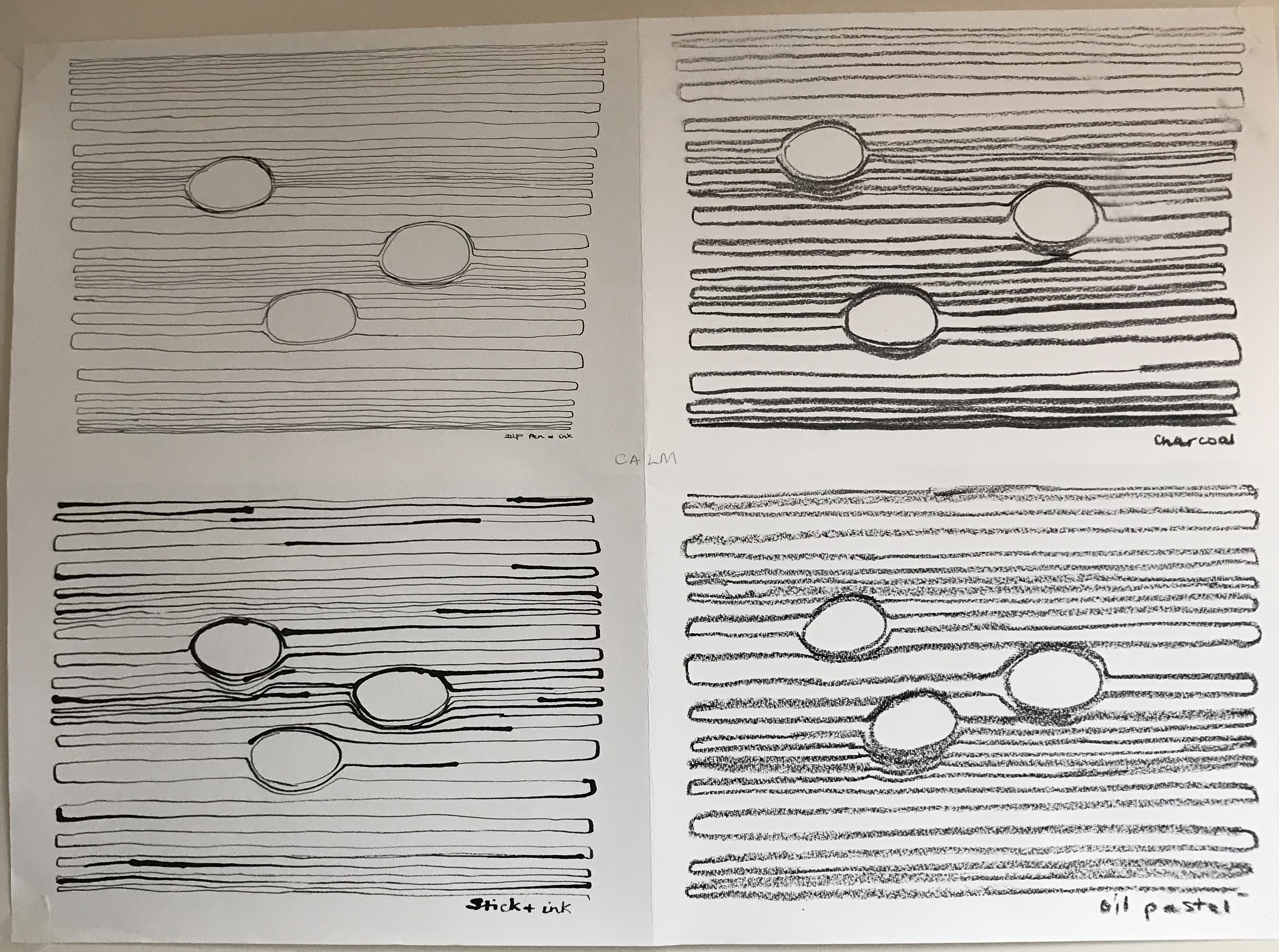
- Most effective as I envisaged it with pen and ink (I wanted to use a continuous line throughout, and imagined it as one of those Zen gardens with the swept sand and boulders)
- Charcoal and oil pastel turned out looking quite similar, although you can make better gradations light-to-dark with charcoal
- I enjoyed doing this – actually did it during an art group session – it was very absorbing (whilst allowing me to listen in to random discussions about squirrels and barn owls in a serene and detached manner)
- The stick and ink was a bit of a surprise – it was hard to control, but felt the most “fun”
- It turns out I’m better and drawing lines left-to-right than right-to-left
- Comments from art group members passing by:
- “Oh dear, what’s that?”
- “Yes, I can see it’s calm”
- “Think I’d need a drink first!” (when asked to guess which emotion)
- “Looks like the grain of wood with knots in”
- “Oceans of tranquility”
- “I thought you were going to write music”
- “Looks like spoons”
- “Like coracles spinning in water”
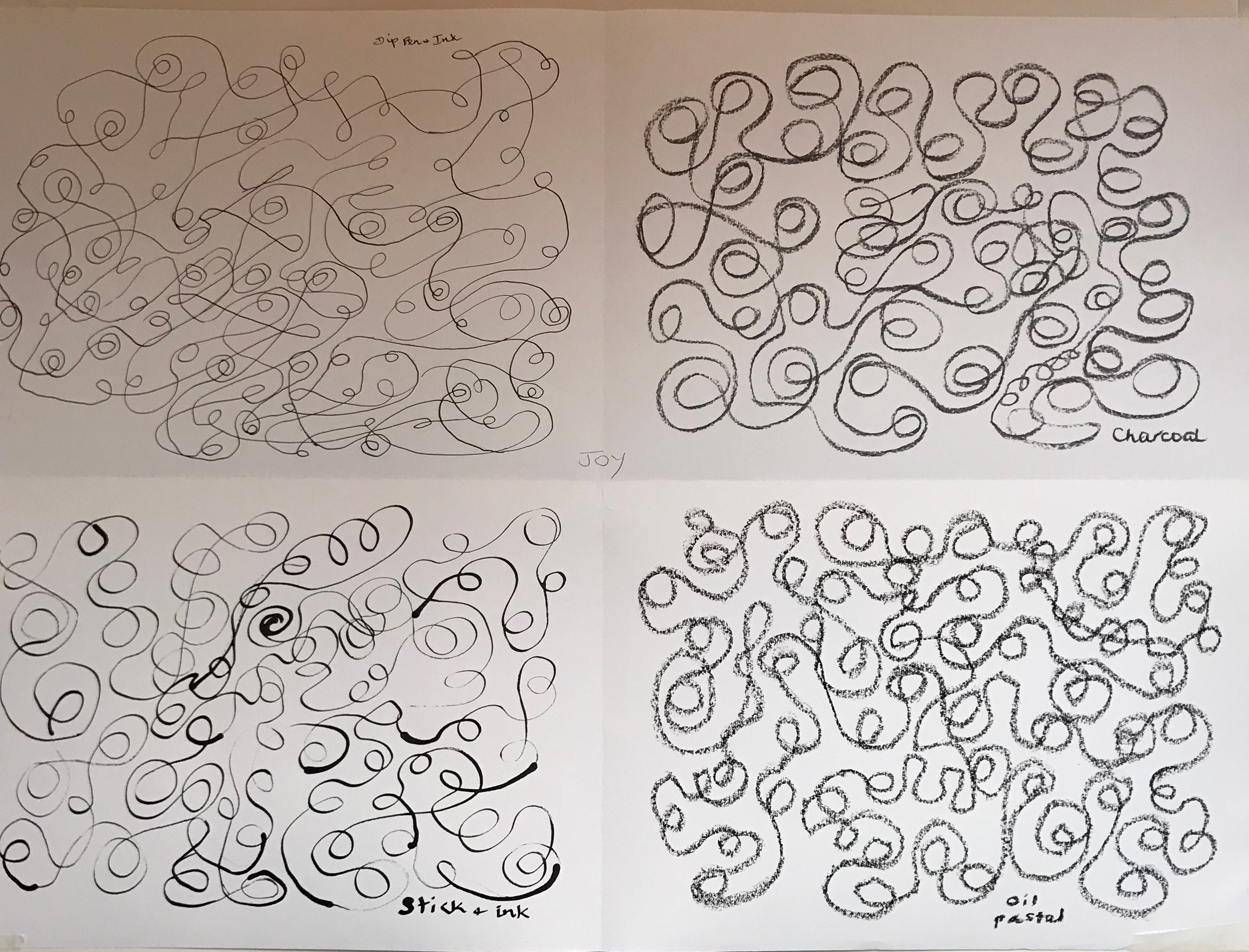
“Joy”
- I felt quite stilted as I started making loopy lines in the centre of the pen and ink drawing, but managed to relax a bit and let go, and the loops gradually developed a life of their own, until they felt like children tumbling head-over-heels in the park
- The charcoal felt like a dream with this sort of mark, much more so than with the straight lines of “Calm” – it ran so smoothly, feeling almost creamy, and the loops and swirls became much curvier as a result
- Again, the stick and ink gave me the permission to be free and mess about and, of the four, I think this is the most appealing image with its unpredictable conjunction of thick and thin lines
- The oil pastel was again my least favourite to use – you feel as if you are having to push it the whole time – but the image turned out better than the straight lines, I think – very round loops with caterpillar-track texture, bit like a drunken earthworm
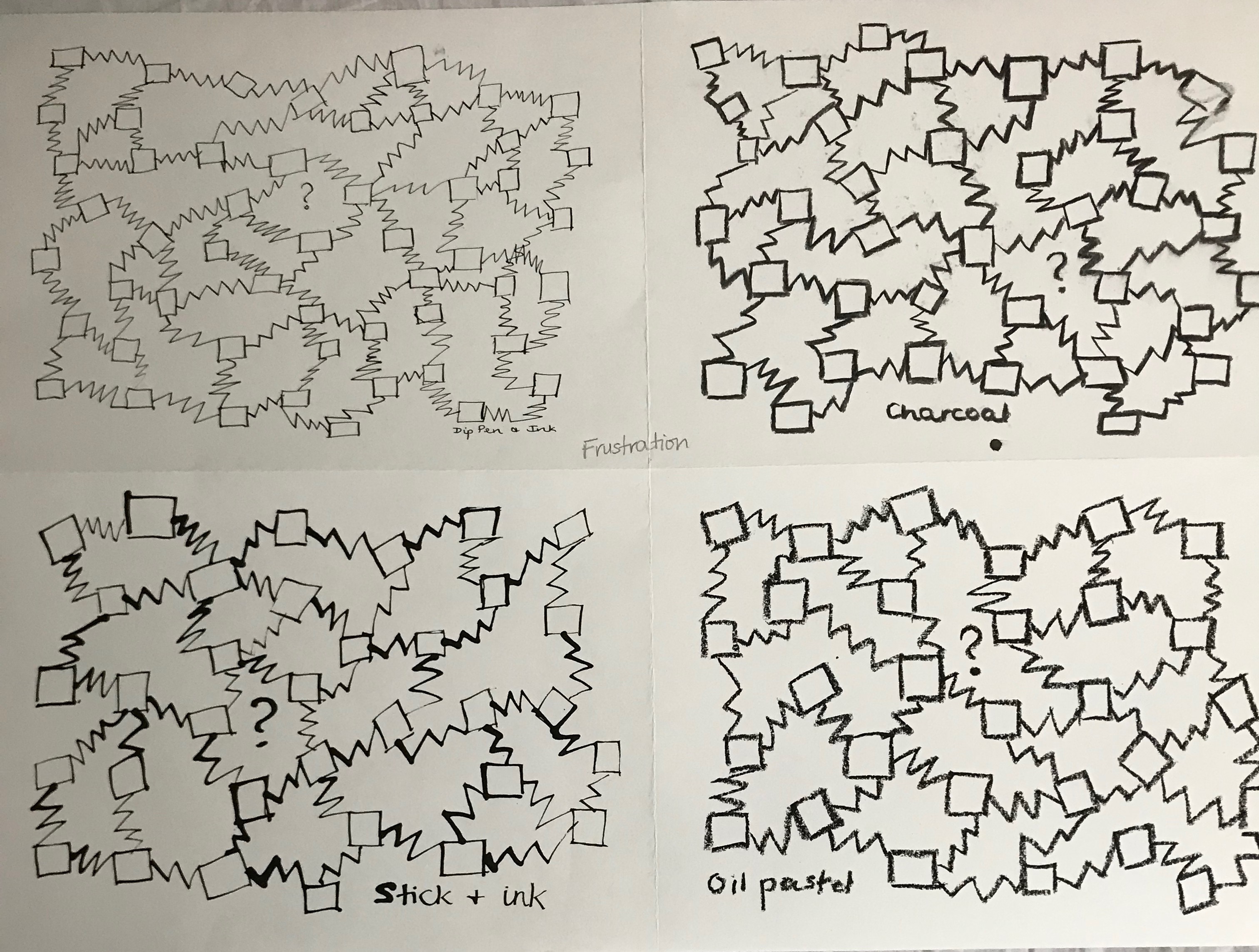
“Frustration”
- Inspired by my attempts to get to grips with WordPress!
- Worked this much quicker -”Calm” was very calm and leisurely by comparison – and the design came to me very rapidly
- The charcoal felt the easiest to express the emotion – could zig-zag at speed!
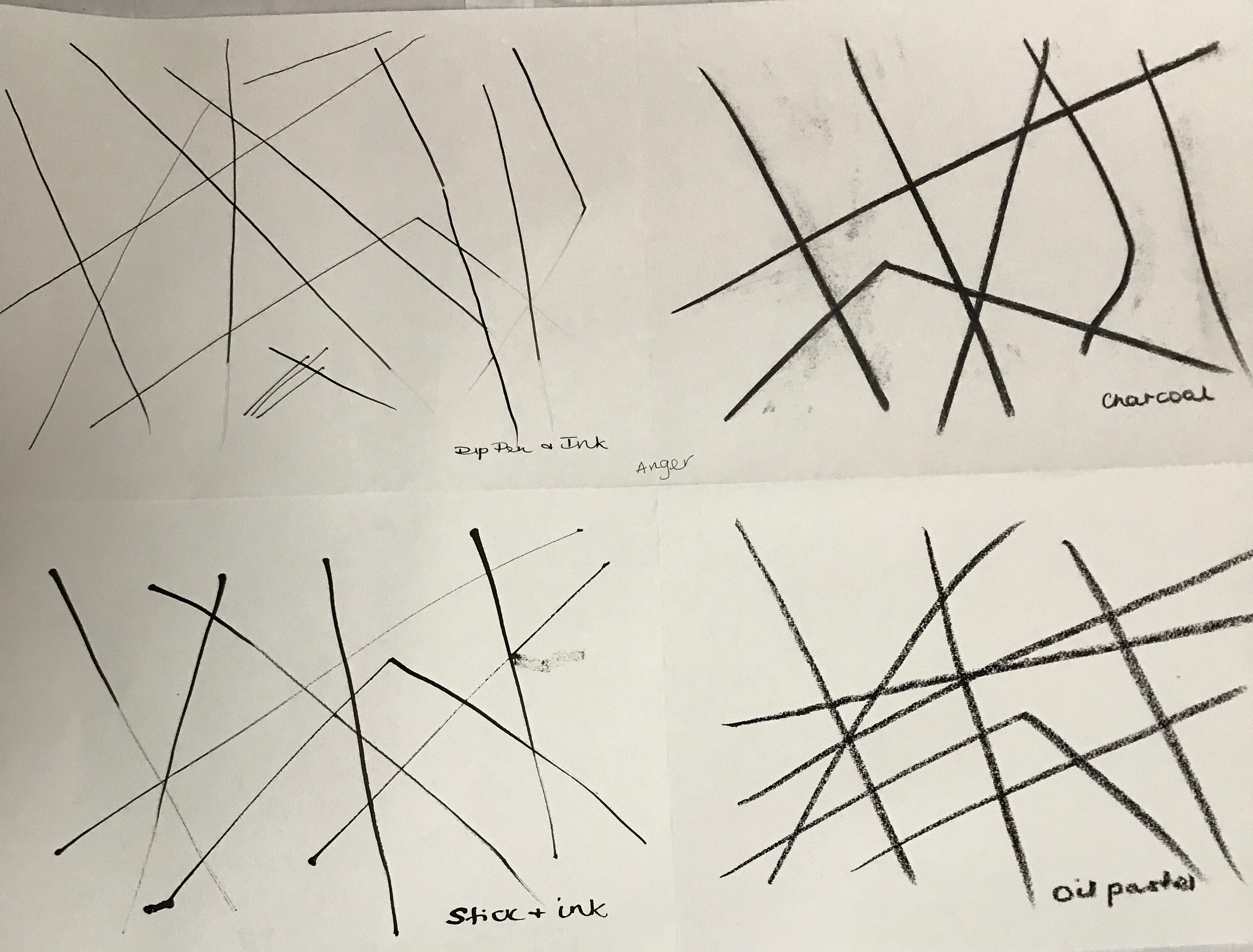
“Anger”
- I chose to interpret this as real anger, rather than just annoyance, and so I had put it off till last as I am not a very angry person and I had to draw deep on memories to get me in the mood (and maintain it)
- The oil pastel feels the only medium where the emotion is not really reflected in the quality of the line
GENERAL REFLECTIONS ON THE EXERCISE
- The preferred order I’ve found overall for effective expressive gestures:
- Stick and ink
- Charcoal
- Dip pen and ink
- Oil pastel
- All the images I have produced are “closed”, ie. ends are joined up, apart from anger – wonder if a psychiatrist would say this reveals that I am very buttoned-up, and only break out when I am really angry! – Oh dear.
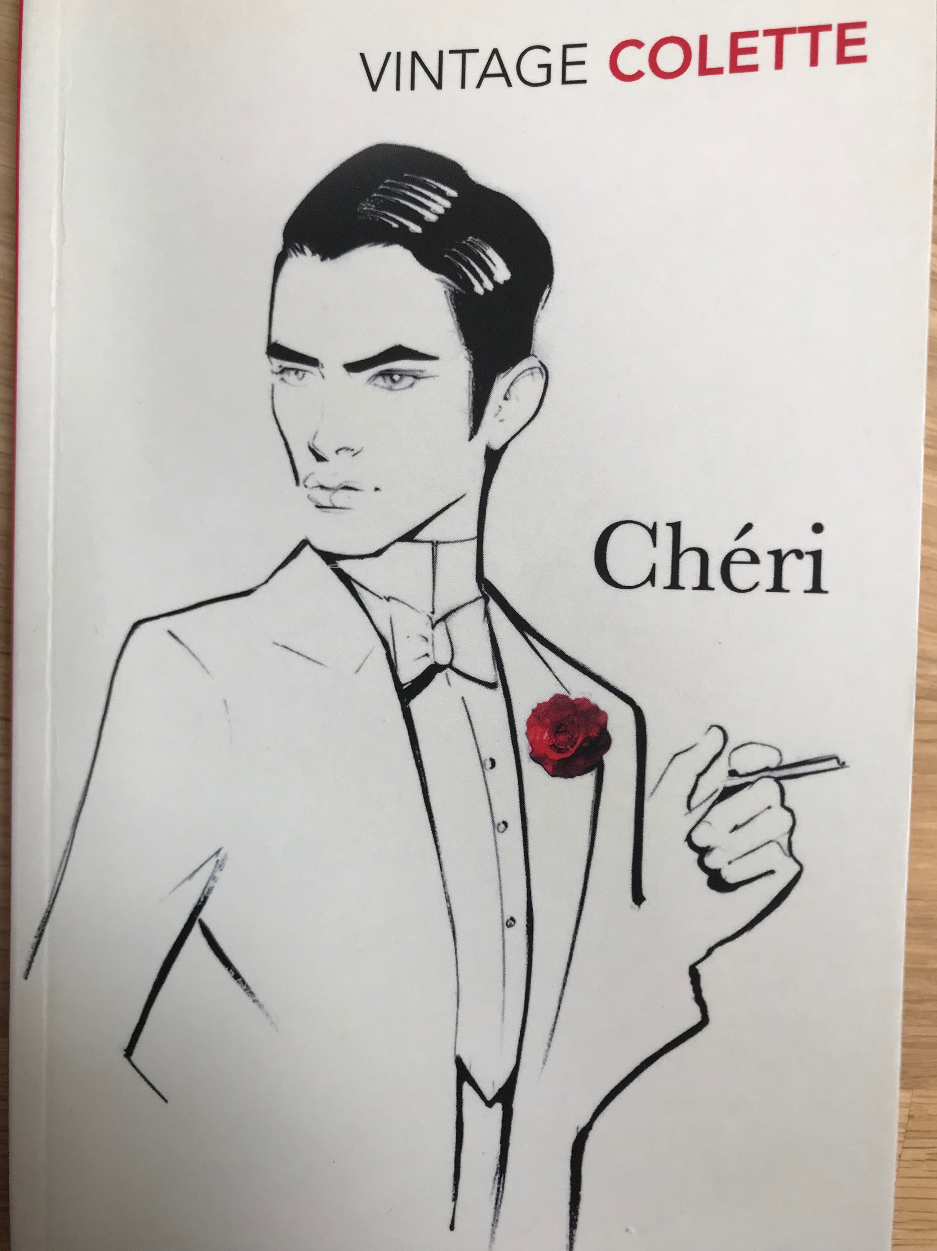
- I was most surprised by the pleasure and effects I derived and achieved from the stick and ink. The contrast of thick and thin lines was completely random in my drawings but I am hoping to use this in some drawings and try and bring it under control a bit. Looking at the illustration on the front cover of the book I am reading ((c) Nuno DaCosta, published by Vintage, 2001), the illustrator has completely conveyed the character as described in the book using very few lines (the most telling detail being that right eye and eyebrow), and I was particularly taken by his mixture of thick single lines to denote shadow, and thinner lines to show light/bring things forward. Looking at the artist’s website (https://www.nunodacosta.com/about) it seems he is the official illustrator for Vogue Portugal along with various other fashion houses and is known, apart from other things, for the stylish simplicity of his line drawings; he claims that a key approach to his work is “solid drawing skills”. Need to keep practising, then!