This week, at this term’s opening meeting of the Tavistock Group of Artists, one of our members (Ian Pethers RMS, SBA) gave a quick talk and demonstration on the basics of perspective. Key things for me to remember from this:
“Art does not follow rules, rules follow art” (although it is good to know the rules, so you know what you are disregarding!)
The horizon moves with the viewer – if two people are looking at a view, their horizons will be different (unless they are of identical height)
He demonstrated using pen on a board which had a pin through the middle to which a string was attached – the pin was the vanishing point, around which he constructed an entire street scene using the string as a guide to the angle of the lines – brilliantly simple, works for my brain! He pointed out how things change as they become more distant, eg it’s not far before you can’t see the actual window glass, only the facing edge of the window recess.
Drawing e.g. tiles on a floor using guide lines – these will be fractionally curved as they near the viewer, due to the movement of the head/eyes
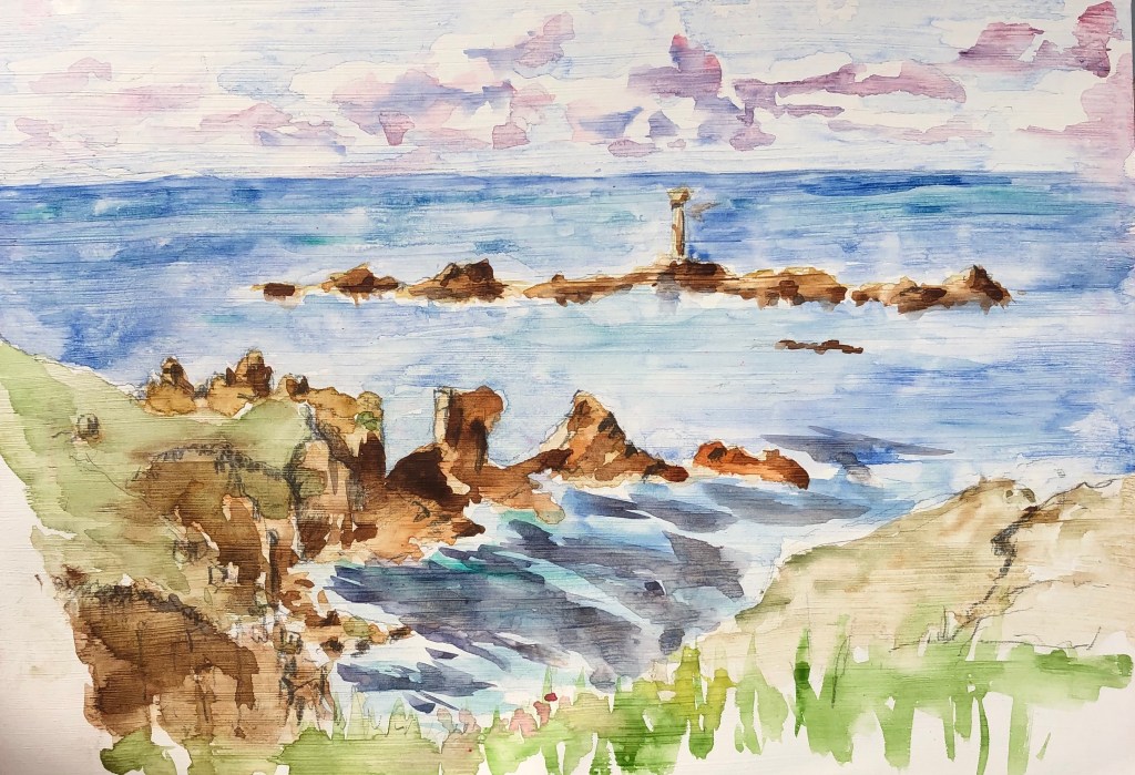
We (my husband and I) went and stayed outside Penzance last weekend to take part in an event jointly organised by the Newlyn School of Art and the National Trust – we were trying to set a world record for the number of people painting along a stretch of footpath between Sennen and Land’s End – see photo of extract from the Daily Telegraph. We were each given a board to paint on, and this was backed in fluorescent pink; a drone went back and forward along the path, which we had to hold over our head as the drone approached – a very unusual method of counting!
It was a lovely day, with a brisk wind to blow one’s board all over the place and lots of scudding clouds in a blue sky – not to mention a choice all along the coast of stunning views, although naturally I chose to try the Longships Lighthouse at Land’s End.
The surface of the board had been primed so this made for a very interesting watercolour painting experience – this was the medium I had brought for ease of carrying but, of course, the paint sat on the surface rather than being absorbed, leading to some rather unpredictable but fascinating effects. We had a great time! – here is my effort (note the clouds) and my husband holding up our paintings:
Whilst down there we managed some other arty activities, notably:
Visit to Penlee Art Gallery in Penzance to see an exhibition of the work of Alfred Munnings and his contemporaries done whilst in Cornwall, mainly centred around the Lamorna group. I made some sketches of the way these artists had tackled the representation of clouds in their paintings – see notes in my hardback A4 sketchbook.
Visit to the Kurt Jackson Foundation in St Just-in-Penwith to see his most recent exhibition based around Frenchman’s Creek. This was a real study in how to paint the same place over and over, and yet create a very different image every time due to variations in viewpoint, weather, time of day, tide, etc. A real chance to observe one professional artist’s methods of rendering massed trees and clouds, and also a study in the careful use of small areas of bright light to lift a picture – see again my A4 hardback sketchbook.
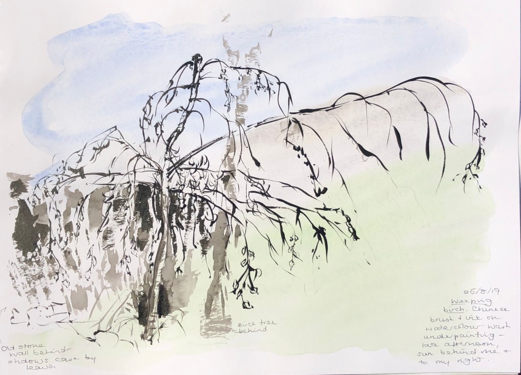
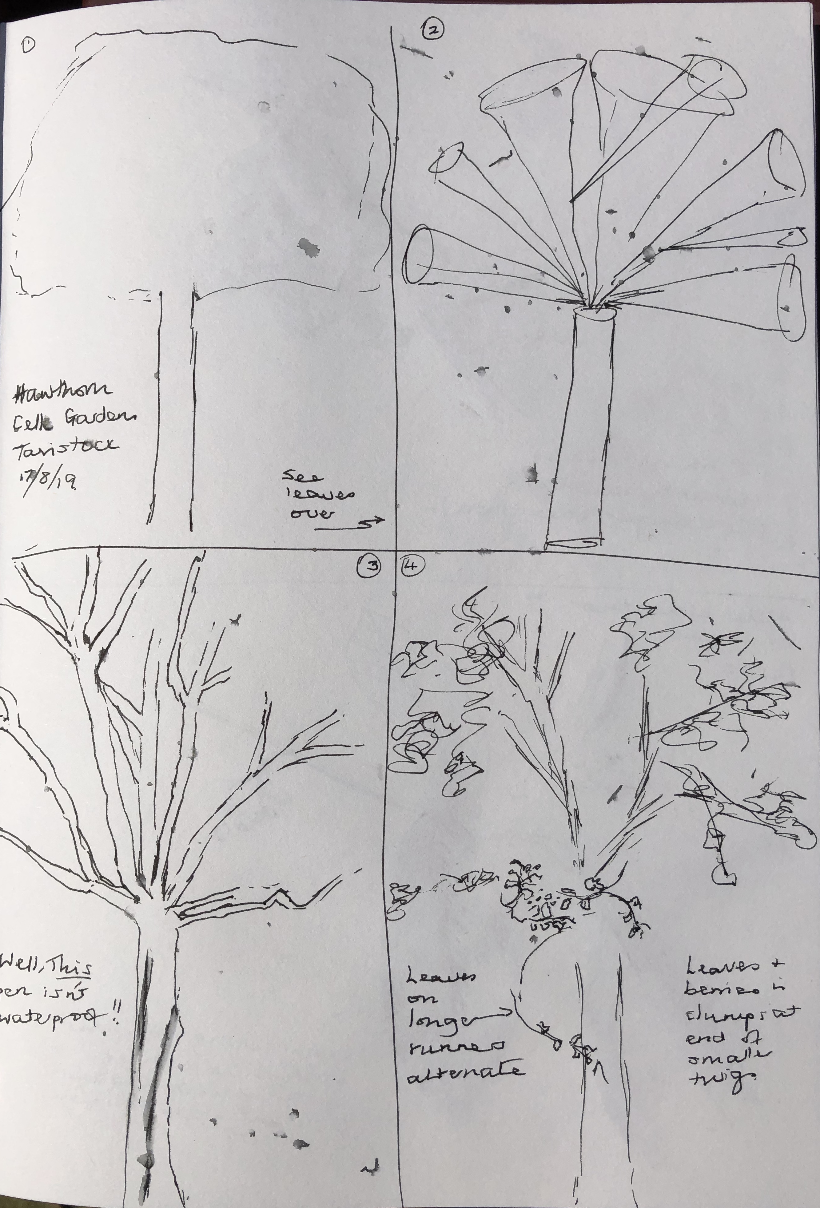
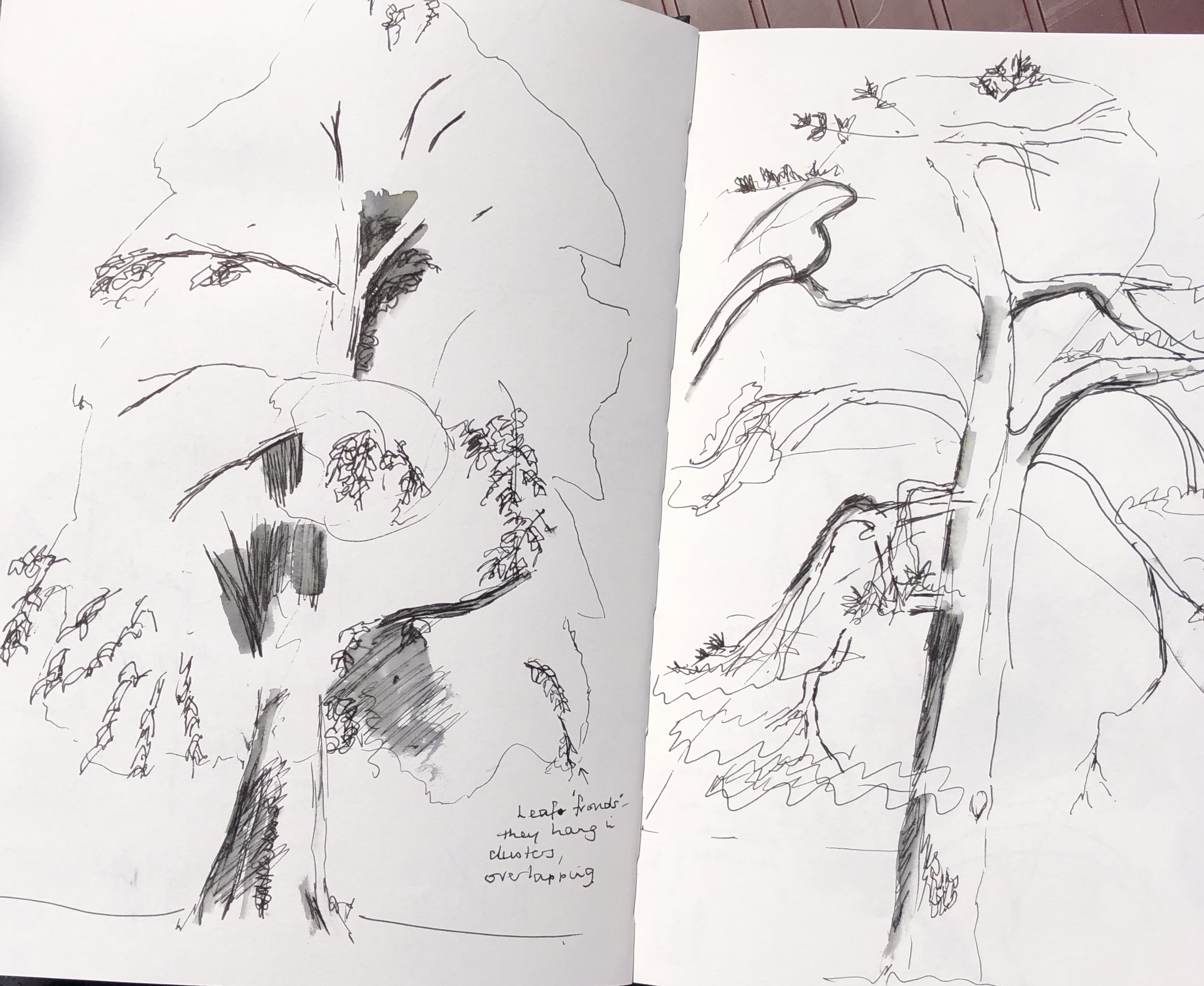
Along the road from us is an old Victorian cemetery – it stopped being used years ago and is now a blue-plaqued monument – but it has lovely old trees, some huge, largely untended, interspersed with rambling grassy paths and crumbling headstones, statues and mausolea. It is caught between the road and a steep embankment of the old railway line, so everything seems close-packed and tumbling over itself. Seemed like a good place to draw trees!
I set off with my large sketchbook, pencils, Conte crayons and water-soluble pens. No-one is ever in the cemetery so it was a bit creepy wandering around, and I was greeted joyfully by a black cat who became my constant companion. I eventually found a small clearing dominated by a fir tree and, behind it, a massive weeping birch. The sun was behind them so their edges seemed to be lit up – doesn’t show up terribly well in the photo which I took to try and capture the light, but the effect was much more marked to the naked eye, particularly as the sunlight trickled through the birch branches and leaves.
I settled down against the boundary wall, ably assisted by my feline friend who kept climbing over me, trying to get into my rucksack before finally deciding to use it as a bed, and batting at my sketchpad – this is my excuse for some rather random “jogged” lines.
The fir and the big background trees (which I think are sycamore) lent themselves to big gestural sweeps with the side of a broken Conte crayon, before working in the light/dark contrasts. The weeping birch and the laurel to the left of the fir tree seemed better represented by the water-soluble pens, which were good for the trailing curtains of branches of the birch and the strong individual shapes of the laurel leaves.
The overall effect feels much more lively than the sedate and elegant original. However, I think I have managed to catch the character of the different trees through my choice of media and the different marks that these encourage.
Reflections overall:
Techniques used to distinguish trees – think I have covered this above, particularly the differing mark-making and the choice of medium
Conveying mass of foliage and spaces between – the fir and background trees were depicted with big wristy sweeps with the side of a crayon. The birch and the laurel were drawn with pen; long trailing marks for the birch, short punchy marks for the laurel – then some water brushed over both in places.
Light on different parts of the tree:
The fir was light around the edges in many places (I left these fairly airy) with some heavy shadows which I tried to indicate using negative drawing – didn’t do this everywhere, just enough to give the viewer the idea of how it went
The birch I found tricky – the light shining through it, especially towards the top, made it look quite ethereal, and I tried suggesting this by leaving spaces. I have to admit it looks slightly odd; but I did look carefully and really couldn’t see the dark background between branches due to the intensity of the reflected light from the myriad leaves – so maybe I should have found a different way of representing all those leaves (watercolour and much thinner pen? – not sure, feel this might quickly become overworked…hmmm..)
The laurel was almost universally dark apart from tiny patches of sunlight reflected off odd leaves – I have tried to indicate this using colour (yellow)
Have I selected and simplified? I think in this drawing I have been forced to by the sheer weight of foliage – I’ve manages to look at patterns in the foliage without getting hung up on each individual leaf.
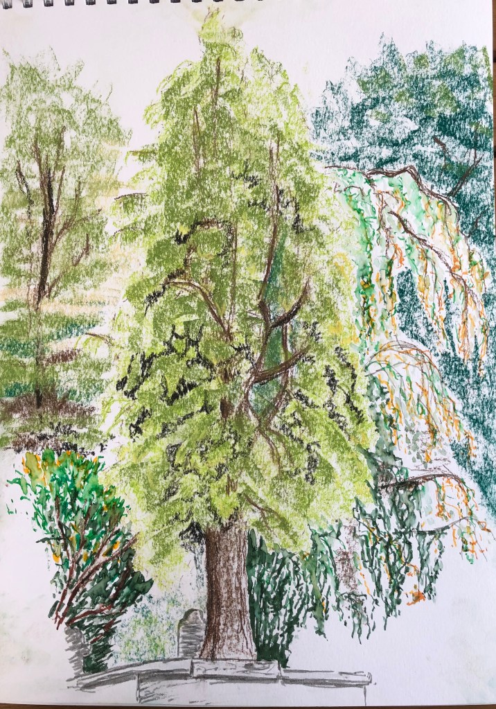
I want to try using the Chinese brushes and ink more, so I decided to have a go at a weeping birch tree in my garden. This little tree is surrounded by maple and beech trees which have overshadowed and squashed it rather until the only way it could grow was out over the path, which it has in fact now done very markedly. We cut back some of the beech and maple around it this summer, removing one of the beeches altogether, so the little birch now stands in a bit of space and has thrived as a result, even though it is still wider than it is high because of its previous fight for light. My husband is threatening to trim the branches that overhang the path now, so thought I had better catch the shape for posterity!
My tutor suggested that I thought more about my support in this Part, so I laid down a light coloured wash underneath the drawing before starting in with the brush and ink.
I think I have captured the unusually extreme shape of the tree well, and the Chinese brush was the perfect tool for those lovely elegant sweeping branches; the leaves were trickier, so I have just suggested their shape at the ends of a couple of the branches. I think I spoilt it slightly by trying to fill in a bit of the contrasting dark of the wall and shadow behind – possibly a different medium was called for there – and I definitely think the wash could have been a little more intense – it is literally wishy-washy. Live and learn.
I also tried a small study of a section of mossy trunk of the apple tree outside our morning room window, which I stare at every day.
Again, I used the Chinese brush and ink, trying to follow the mantra I acquired from D.N. Naylor, 2016; Drawing Masterclass – Trees; Search Press Ltd, of SHAPE → FORM → TEXTURE; I am still terrible at getting sucked into fiddly details very early on which then throws the whole of the rest of the drawing out of kilter, so I am trying to hold this little formula in my head.
I’m getting better at controlling the darkness of the ink, and the point of a Chinese brush is absolutely lovely to draw with when you need a delicate line – but I’m still not always getting there, still quite thick and blobby sometimes, must remember not to have so much ink/water in the brush.
I love trees but they have never been my favourite thing to draw due to what has always appeared to me to be un-tackle-able complexity – I was always getting bogged down in finicky details and – dare I say it – not seeing the wood for the trees.
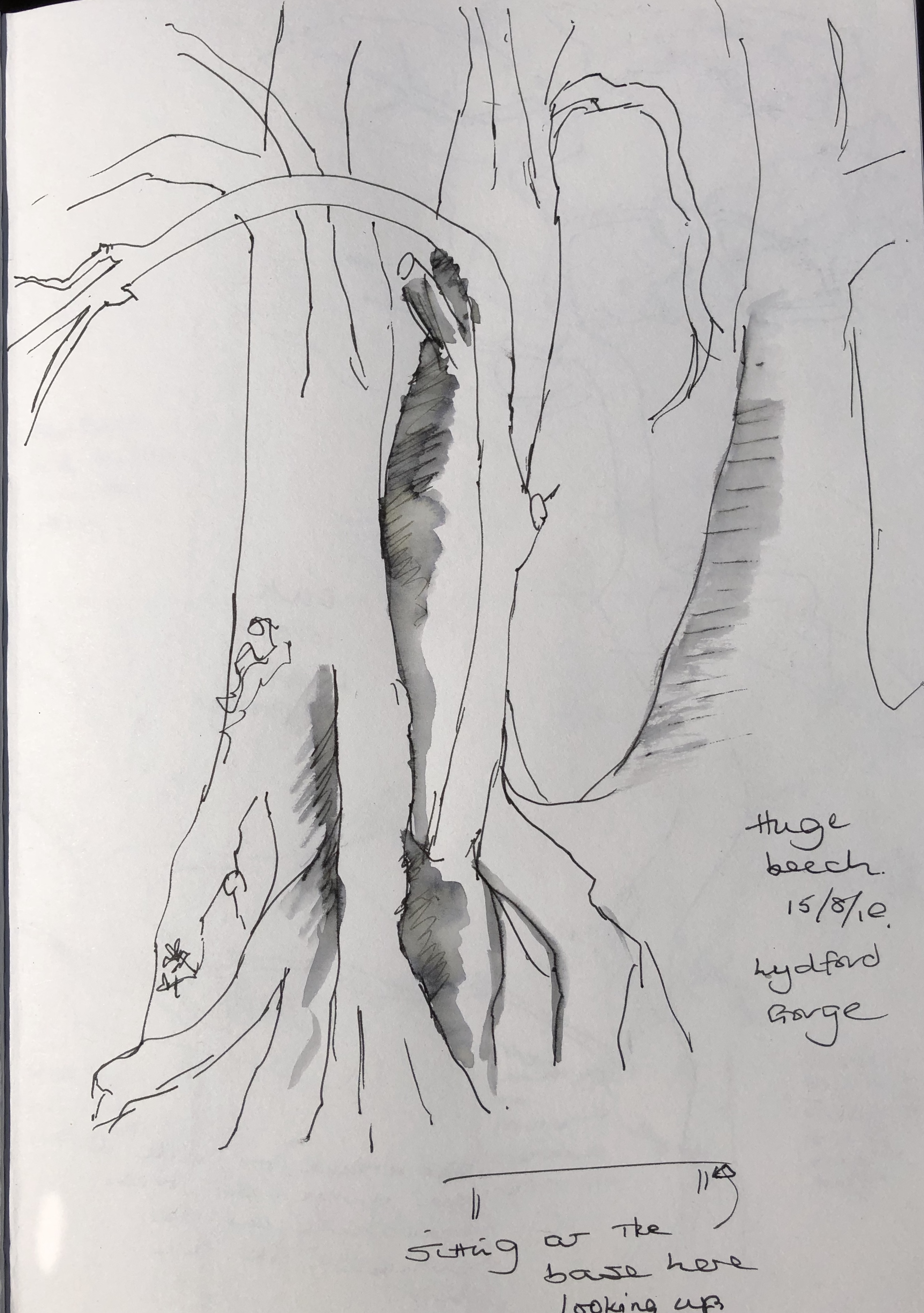
I did a couple of basic line drawings whist out on a walk (see a giant beech tree, above, which towered way above us), trying to keep it simple, before setting off to do some drawings as suggested in the text.
Results were variable, and I have to say that, at first, I couldn’t see the point of starting again each time, and wasn’t quite sure how to do the fourth suggested step about shading in foliage masses, doing side studies of foliage etc to help me..
After doing a few of these I decided to cut to the chase and just do all the steps on one drawing, although I confess I did sometimes miss out the “basic
shapes” one, and it all started to make a bit more sense…..
I experimented a bit with mark-making to convey the essential nature of the leaves (rounded, spiky, clumped, single, etc) and now feel more comfortable with my basic formula for rendering a rapid sketch of a single tree:
Look
Rough measurement, e.g. twice as tall as it’s wide
Light broken marks of basic overall shape
Draw in trunk and a few branches that you can see
Indicate leaf masses, and make shapes of individual leaves clearer at edges
Quick check for light direction and darks
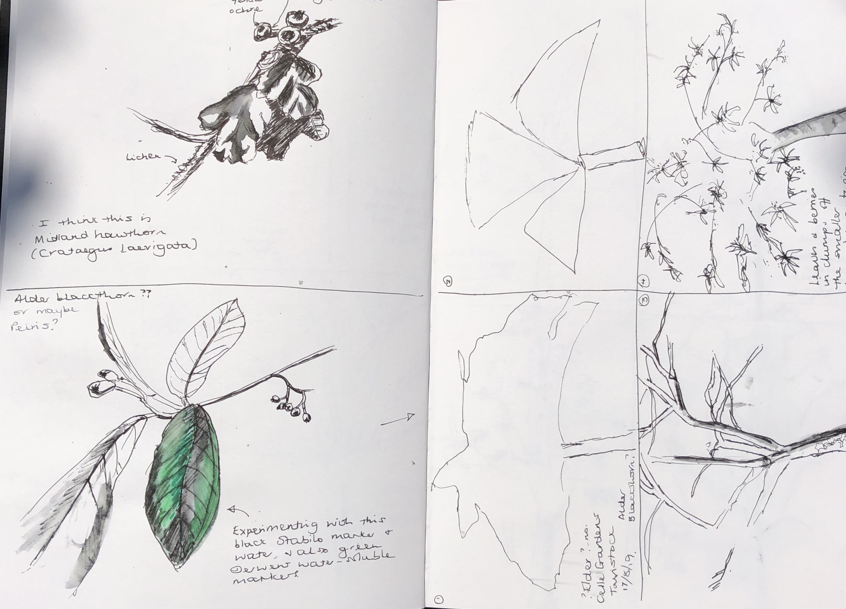
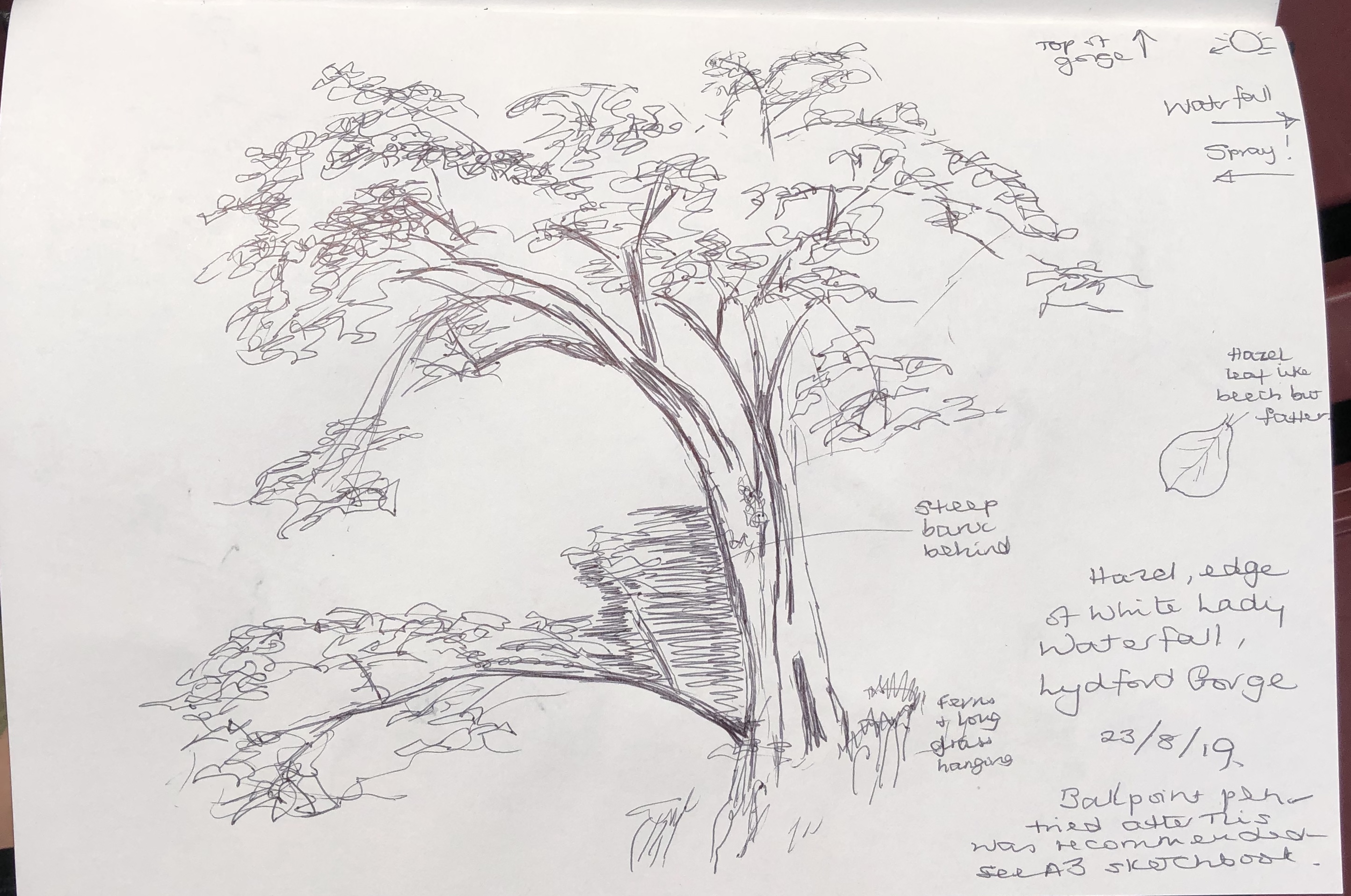
I say a rapid sketch……but to get a clear view of the hazel tree (above), which was growing at the base of the White Lady waterfall at Lydford Gorge in Devon, I had to sit on rocks just at the base of the waterfall, and was rather rudely asked to move on by a charming European gentleman tourist because I had been there “so long!” and he was waiting to take a photograph of the waterfall. I can’t think how the presence of a local artist in his picture would in any way have detracted from it, but there you are…..
Tutor was generally pleased and positive, especially with the scrapbook, which she had had most time to look at
Need to become more efficient in referencing research on work, and vice versa – just a note can be enough
Consider using a colour wash as a frame or a background, and draw over the top
Also consider putting down rough areas of tone and do line drawing over this (as, e.g. in the bark, moss and lichen line drawing)
Drawing from unusual angles, as in the house interior drawings, is going well; tutor particularly liked:
the one from the top of the stairs – maybe try again with better foreshortening
The sketch in the bedroom with diagonal bed worth also working up, maybe in charcoal?
Tutor was interested in the research referencing “meaningful objects” – explore (both research and trying out) a self-portrait made from meaningful objects
Also reference to research – the curved staircase – consider a picture which contrasts correct/incorrect perspective
The inside/outside contrast, and light, are possible aspects of interest for me to develop
Saying I can’t draw fabric! – task to draw a screwed up piece of paper as a start; also using a charcoal background and rubber are helpful with folds and fabric
Try more pastels and more charcoal
Don’t worry about my “scribbly” style – can be used to create tone – need to find a way to use what I naturally do – embrace what I am! – don’t just focus on meeting the course tick-boxes
Think more about the surface I am working on and what it can do and whether I need to adapt it
Assignment 2 picture – she had hoped for more on the basis of the work that had gone before (e.g. the reflection in the lamp, which she really liked), and frankly I so had I – we discussed how I fell into the final piece and found myself a bit trapped in it by time constraints – suggestion was to re-work it in a different medium to give it some zip, possibly considering some asymmetrical cropping
Target: I chose “work more expressively” – make the tasks suit me, not me suit the tasks – make my style and materials do what I want them to do.
Demonstration of technical and visual skills – materials, techniques, observational skills, visual awareness, design and compositional skills
I have expanded my range of materials and techniques since Part 1; I have had a bit more of a go at using marker pens, I have experimented with mixed media, I have completed whole drawings in Conte crayon, finally dug out my Chinese brushes and inks and used them to pleasing effect, and I particularly enjoyed drawing with a putty rubber into a charcoal ground. My observational skills are quite good when I concentrate, although I am still having to consciously analyse perspective, which I suppose leads on to my visual awareness; I often used to think I walked around with my eyes shut, being so involved with what was in my head – but I found myself yesterday brushing my teeth whilst looking out of the window and analysing the perspective of the roof tiles on the house across the road, so the visual must be improving. My design and compositional skills are developing, particularly towards the latter end of this Part of the course.
Quality of outcome – content, application of knowledge, presentation of work in a coherent manner, discernment, conceptualisation of thoughts, communication of ideas
This Part of the course has been very spread out and disjointed for me – I started it waiting for the arrival of my granddaughter (gorgeous, thank you), had a long interruption caused by serious illness and a prolonged stay in hospital, and have slowly had to gear myself up again to studying. I suppose I have developed much more of a sense of what might make an interesting composition; subject matter which seems quite mundane can be made interesting with thoughtful composition. I hope my work is presented coherently. Conceptualisation of thought and communication of ideas…..I think I began this Part very much with the mindset “here’s a group of objects and I’m going to draw them”, but I do feel now, approaching the end of this part, that I am on the edge of something rather more nebulous, which I’d like to talk about more in the two sections below.
Demonstration of creativity – imagination, experimentation, invention, development of a personal voice
I have to say that, the first time I read this criterion, I quailed as I thought that, frankly, I didn’t have a creative bone in my body. However, towards the latter stages of this Part, I have felt braver to depart from the norm, free up and try some things out. I really want to do some more Chinese brush painting, which has the potential to be wildly free and gestural yet minutely exact at the same time. I also want to do more work with charcoal and a rubber; I listened to a podcast the other day, when the pencil artist Nina Mae Fowler was talking animatedly to Nick Park (of Wallace and Gromit fame) because she’d finally found someone who would be enthused about her wide collection of rubbers, and I felt a bit like that, having recently discovered the joys of the Derwent battery eraser. The red monochrome drawing was a departure for me in that I was not completely just drawing what I saw. Project 4 has made me look closer at things which have been in my house all this time (e.g. the lamp and the dressing table mirror), see them differently, and attempt drawing which I would have considered beyond me at the start. Not sure the personal voice is there yet, I still feel there are far too many avenues to explore, but now I at least see the potential for it.
My tutor has modelled the conscious use of research – hand on heart, I have not achieved much of that in this Part because of it’s broken-up nature and the need to crack on with the exercises. However, what I have found is the effect that my reading and research has had on me on a more subconscious and intuitive level; I have found myself interested by particular images and wanted to try out some aspect of them myself. I think this is a good thing and a development; my tutor described my research notes in Part 1 as book reviews, which is exactly how they felt to me – whereas now I feel I am on the road to understanding the point of research, and hope to move forward to being able to use it as a proper resource and jumping-off point for my own work.
I have found writing about my thinking has actually made me think in the first place. My writing can be a bit rambling and stream-of-consciousness, but I have always found writing a good way to work through a difficult place or problem; so, helpful for me, although possibly tiresome for the reader. My next step is more joined-up progress of thoughts – at the moment I am a bit like a child in a sweetshop, jumping from one thing to the next and forgetting what I had just discovered a few minutes earlier.
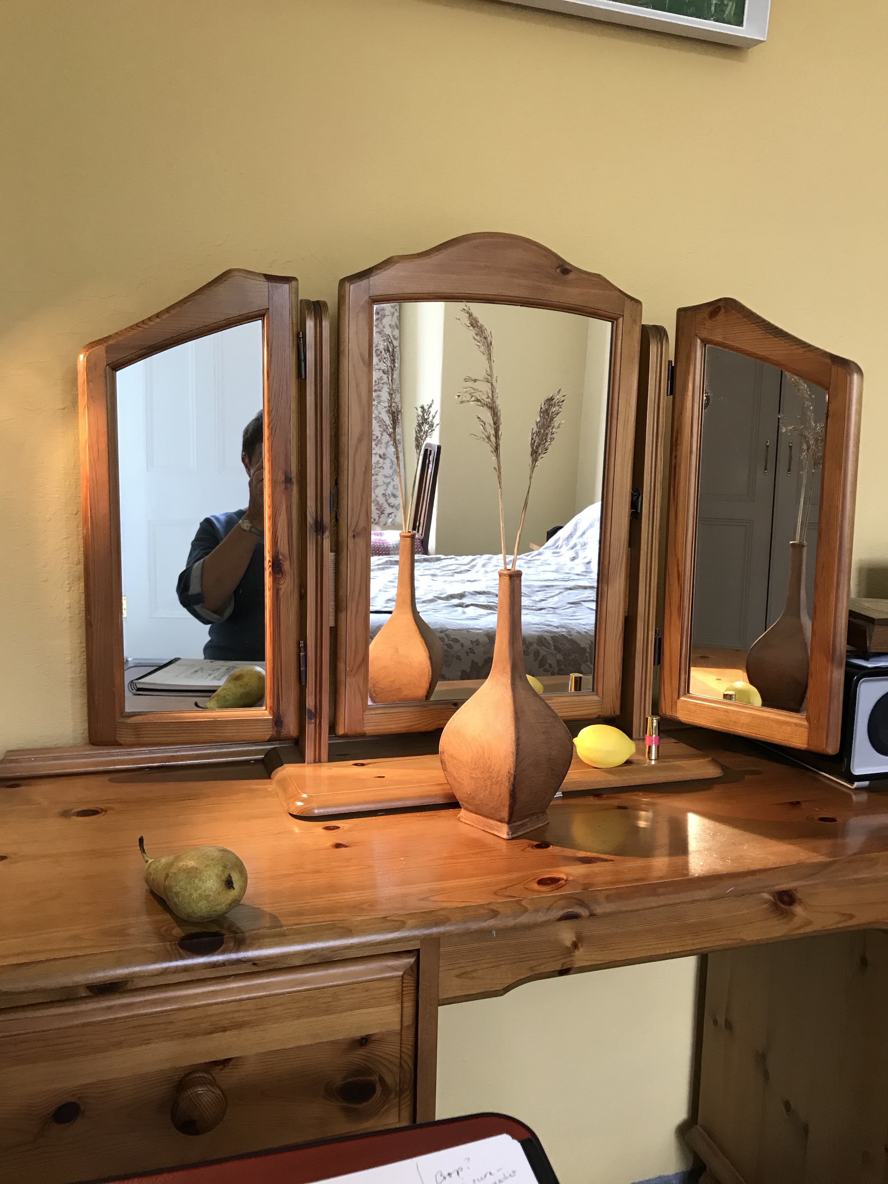
The subject of my drawing is a triptych-type mirror which sits on the dressing table in our bedroom, including the reflections in the three separate mirrors (all of which are facing in different directions) and a simple still life composition placed on the dressing table in front of it – see photo below.
My influences in setting up this particular still life/interior were many, and I can’t in all honesty say they were necessarily in the forefront of my mind as I put it together; images and ideas I have liked as I have worked through this section have obviously seeped into the subconscious, and it was only when it was set up that I have put everything together and thought, “Well…this is like that, and that reminds me of this…”. Not sure if that’s the way it’s meant to be, but there we are. Looking at the piece, I see bits of:
Bonnard’s way of including a figure or part of a figure in a half-glimpsed way, so they are not the main focus of the picture but rather the viewer comes across them almost serendipitously (see A3 sketchbook) – this WAS an intentional feature of the set-up
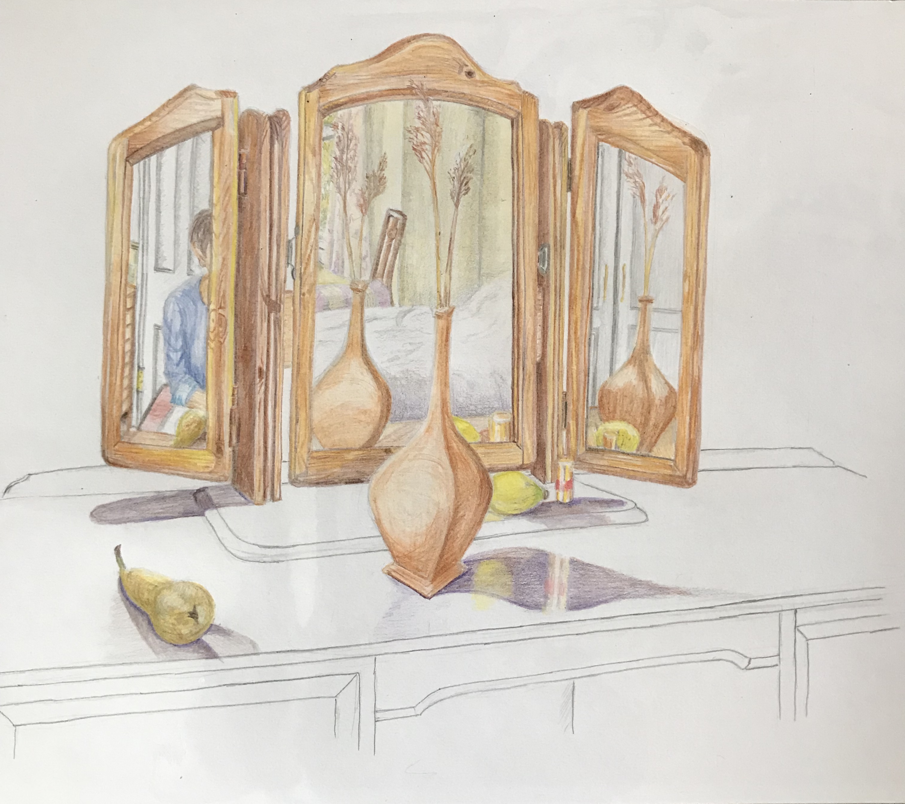
I liked the combination of plain drawn areas with coloured areas in Gary Hume’s “Flowered Hat” (see blog post on Positive and Negative spaces), and have tried it out here; this idea emerged part-way through
I have been drawn to views looking through windows and doors (see A3 Sketchbook and Project 4 research blog post), so again this was an intentional part of the composition; also the use of devices for the showing of a wide range of the interior space as in the Anthony Green image in the text and the David Hockney Large Interior (see blog post on History of still life genre); also again the idea of representing an object from a variety of viewpoints (see research on the History of still life blog post, esp. Picasso and Braque)
I really enjoyed doing my Project 4 Exercise 3 drawing of the reflection in the lamp
My reasoning for and construction of the exact composition is as follows:
The basic idea came when I noticed repeated reflections in the dressing room mirror as I was passing. The motif of repeated images was talked about in the course notes as a way of drawing the viewer’s attention but is not something that I have consciously used much thus far, so this seemed like an opportunity to try and build it in – hence the vase, lemon and lipstick all appear at least in part 3 times
By changing the angles of the side mirrors I found I could see through 2 doors (one out into the passageway and one into the bathroom) and a window
I wanted to keep the still life aspect fairly simple (just the vase, the lemon, the pear and the lipstick) and try to do it well. The pear was included as I really like drawing the shape of pears; the lemon to give a bit of a colour lift, as the dominant colour is terracotta/wood; the lipstick because someone from an art group told me that paintings should always include a little patch of red to draw the eye; and the vase because I recently bought it in an antique shop and was keen to use it in a picture
I wore a blue top for the self-portrait element to complement the orangey wood
I drew the image over several days; the light was coming from the windows behind me, but the days were overcast and I wanted some clear shadows, so I set up a spot-lamp looking down diagonally from behind the top left corner
How have I done against the criteria for the work?
The use of colour in drawing:I feel I have done fairly well in replicating the colours of the objects in the composition, often by blending and overlaying the coloured pencils. The use of the complementary blue has, I hope, lifted what is quite an orange/yellow/brown mode. The thing I really found difficult was replicating the gold of the lipstick, and I don’t think this has been as well done as I would have liked.
The most appropriate medium for the subject: my original intention was to use line and wash on A3 cartridge paper as the composition has a lot of straight lines which I thought would be tricky in pastel or charcoal and could become confused/confusing; however, when it came to it, I decided that lots and lots of ink lines would not give the right feel, so decided to go for coloured pencil. I’m pleased with the overall choice of the pencils, but I did find that progress was very slow as I havered over exactly the right choice of pencil for each little section of wood.
Composition and context: I wanted the foci of the picture to be the still life elements with the sections of interior, so didn’t try cropping the image any further, and kept everything else very simple. If I‘m honest, I think that, in my desire to get the proportions correct, I have made the image too small – I envisioned it filling the page a bit more.
Mark-making and contrasts of line and tone: my marks within thecoloured part of the image are quite uniform, with much blending and overlaying. The lines in the uncoloured part I have tried to keep continuous – my natural default drawing style is somewhat sketchy and scribbly, but I felt this would take focus away from the coloured section. I coloured the whole thing in and then revisited with tone in mind, just to darken the darks and lighten the lights. The idea of the “floating” shadows came to me part-way through (to be honest, the pear was looking a bit dodgy and I thought I should get that bit of the image finished before the pear went off, and then I rather liked the stand-alone shadow, which then was the inspiration for the rest of the uncoloured section).
Accurate and expressive depiction of form: generally I am pleased with the accuracy of the image – there are a few bits not quite right, e.g. the top surface of the mid-section of the mirror which is misshapen – the side panels of the mirror were set at unfamiliar angles (one back and one forward) and the mid-section was tilted ever so slightly, which made several parts not quite as one would have expected. Is it expressive? – I think my rendition has been very controlled, which I felt necessary at the time of working due to the need to make the interior sections clear with the medium I had chosen, and this was hampered by the fact that the whole thing was a bit smaller than I had intended – so possibly not. A bit of a learning curve here – I was a bit pressed for time so I pushed on with what I had – possibly choosing to start again with a larger and free-er drawing in a different medium would have made for an equally, or more, expressive outcome.
Experimentation with idea, material and method: I have covered some of this above. Despite the fact that I have nit-picked the faults in my work, I feel the concept of the drawing that I have come up with is unusual and has arisen out of my learning over this section of the course – it is certainly experimental for me, and is something I would not have dreamt of tackling beforehand.
Waddington Galleries, London and The Saatchi Gallery, London
Not sure I’m reading this one right, but it was one that I liked because his use of the fruit shadow twice makes me think that someone is going to walk through the yellow door, thinking it’s all OK because they can see the shadow of the fruit and yes, there it is – but then suddenly the second darker shadow jumps out behind them, as if it’s been lying in wait.
Yes, I know I should take more water with it…..
Gary Hume – Four feet in the Garden
1995
Glass paint on aluminium
Arts Council Collection, South Bank Centre, London
This one appealed to me as it reminds me of one of those “optical illusion” pictures – is it a picture of feet, or is it a picture of two old crones with long noses and warty chins facing each other?
Not sure it’s something I’d immediately be tempted to have a go at myself, although admittedly the image does draw you in and make you take a good look at it and ponder.
Gary Hume – The Flowered Hat
2002
Gloss paint on aluminium
The artist and Jay Jopling/White Cube, London
This one, however, is something which did appeal to me as a style which I might think about trying to develop. It’s called “The Flowered Hat”, but to me it also looks like a flower arrangement on a white tablecloth with long lacy curtains behind.
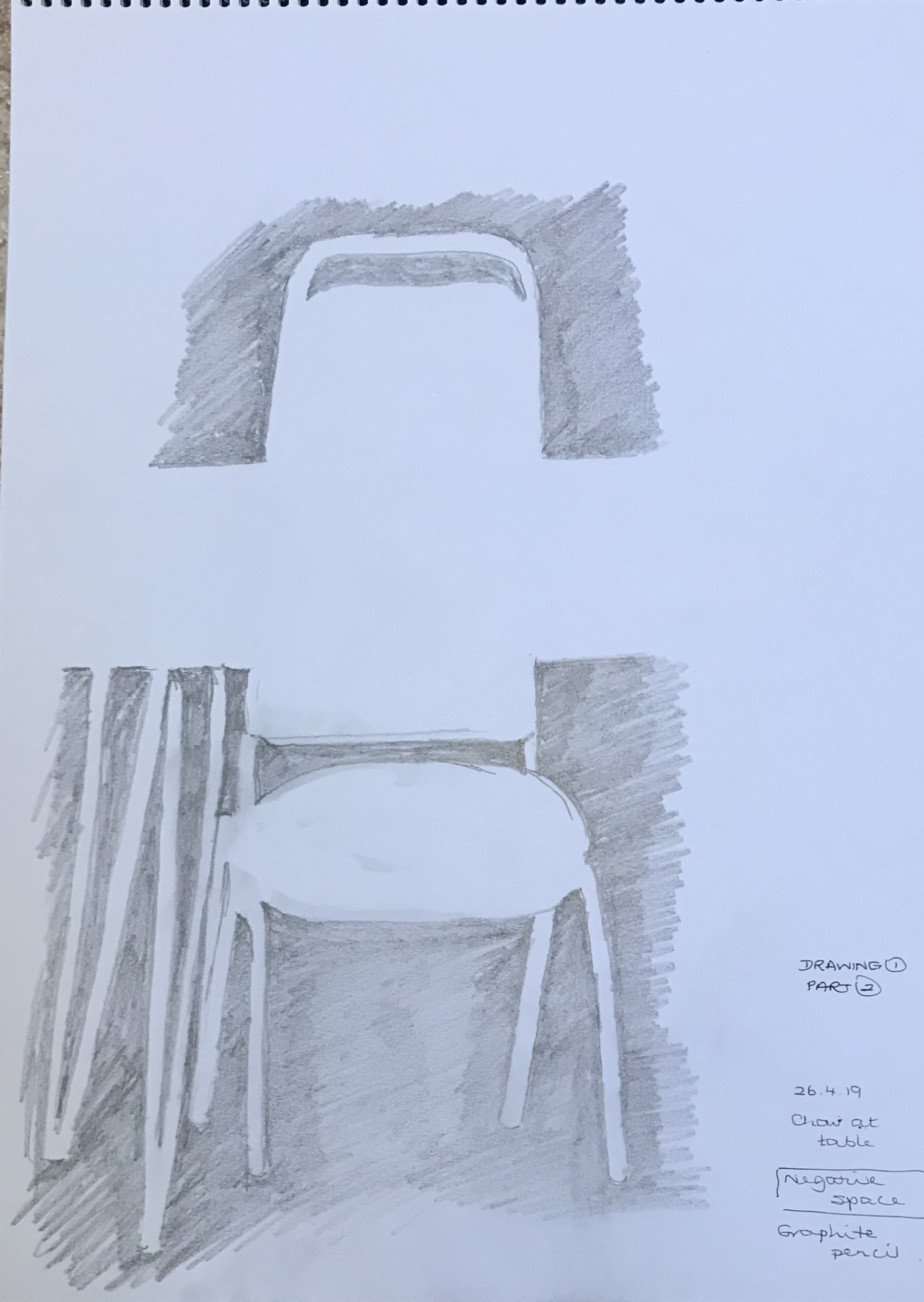
At this point I thought I ought to try and get my head around negative space. As always, I went in at the deep end and thought I would try a negative space version of Van Gogh’s Sunflowers, thinking to do something a bit Flowered Hat-y. Needless to say, I found it really difficult to look at the spaces rather than the flowers, but actually the complex subject broke the negative spaces down into small manageable bits so that, although the proportion is out in places, the overall effect is recognisable, I think, although I was so traumatised by the concentration needed that I didn’t get anywhere near adapting it to be Hume-like. Instead, I tried something a whole lot easier – a chair and table – more within my capabilities. Quit while you’re ahead.
Negative space is something I’m struggling to get to grips with example-wise; a lot of the things I have found have been in old printed posters (e.g. those by William Nicholson and James Pryde, who signed themselves J&W Beggarstaff after the name they had seen on an old sack – see article in my cuttings folder about the recent exhibition of their work at the Fitzwilliam Museum, Cambridge, May-August 2019), or in work like linocuts (see e.g. article by Rosemary Waugh on the work of Paul Catherall as seen in Artists & Illustrators magazine, November 2018, pg. 56-9).
I thought this image (by Kinska from My Opera House exhibition, 4th July-22nd September 2019 at Now Gallery, taken from Aesthetica Magazine, June/July 2019, issue 89, www.aestheticamagazine.com) showed how clever our brains are at interpreting minimal images (the black on the right clearly being intended as her hair, whereas the black on the right is just space); but then I looked at a similar (but different) image by her from the pages about her exhibition on www.nowgallery.co.uk, where this wasn’t the case and the space on both sides of her face look like hair just by being a slightly different shape…..clearly our brains are very nuanced and bring a lot of extraneous knowledge to their interpretation of images!
But there is hope for me yet on my understanding and use of negative space – it’s gradually seeping into my psyche. The other day I was down by the River Tavy with the granddaughter – she was busy skimming stones, falling in the water, etc while I thought I’d do a really quick scribbled sketch of the view down the river. It was late afternoon/early evening and the sun was shining down through the leaves, making some really bright, almost gleaming, whilst other bits of the view were in dark shadow. I was struggling to depict this when I had my eureka moment – just scribble in the dark shadowy negative spaces! And it worked (see above)…even if very scribbly…but at least I can see what I meant….
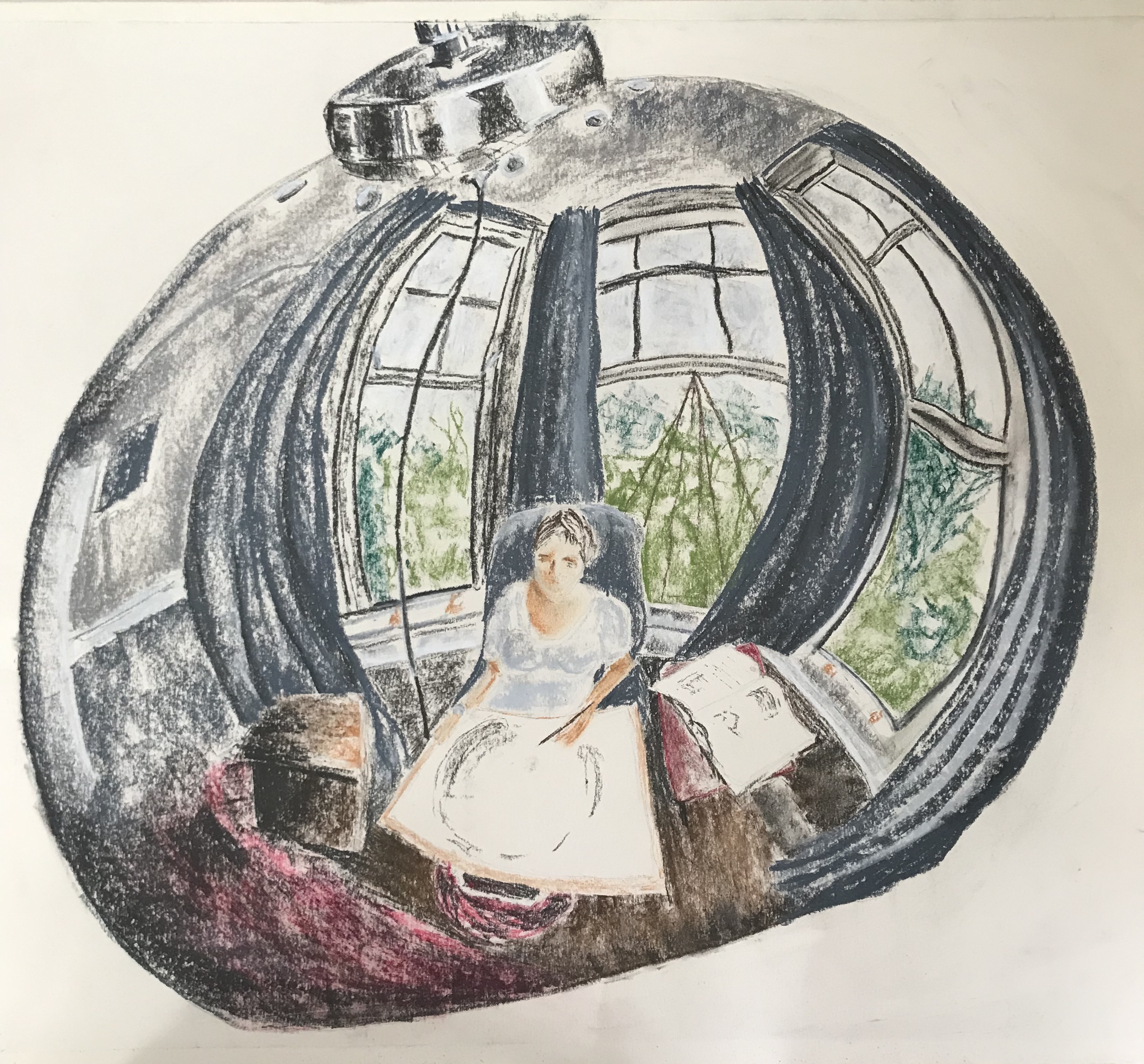
I agonised for a while over the choice of material for this picture. Had the format been smaller (A4 or less) I think I would have gone for something I felt confident with, such as ink with a light wash. However, I had been asked to work on a large scale and, on looking carefully at my subject, the reflections in the curved metal were very slightly “fuzzy” and not always true, i.e. small dents in the metal caused various distortions and wobbly lines. I decided to go for Conte crayons, as they would give the varied and “un-crisp” lines I was after. I had originally intended to work just with the greyscale crayons and add a tiny bit of watercolour or ink wash for the blues, reds and greens; however, when I got to that stage, it felt more appropriate to stay with the crayons…so, another change of mind!
I have to say, I am really pleased with the outcome, it is better than I had hoped for or envisaged. There are of course lots of niggles – e.g. the lamp is not quite symmetrical despite my best efforts (I drew it in 2H pencil and rubbed it out about 15 times!!) – but I think the overall effect is striking and I hope it draws the viewer in to try and identify details.
I was concerned that I had chickened out a bit of tackling my bete noir, perspective, but this image had other challenges thrown up by the convex surface, mainly because nothing was quite where you thought it would be. In several places, I found that the curvature really exaggerated the perspective, thus helping me out. A real learning curve! Terrible pun, apologies.